Developing Full Stack Next.js Web Applications
Chapter 4 — Managing Client State
Dr. Jose Annunziato
In an application, state is the collection of data values stored in the various constants, variables, and data structures while the page is open. Some of that data is relevant across the entire application or a significant subset of related screens; some of it is relevant only to a specific component or a small set of related components. If information is relevant across several or most components, then it should live in application state. If information is relevant only in one component, or a small set of related components, then it should live in component state. The currently signed-in user is a typical application-state value: username, first name, last name, role, and whether the user is logged in all matter on Sign in, Profile, Dashboard, and the course screens. Filling out a shipping form, by contrast, might only be relevant while checking out, so that draft belongs next to the checkout component rather than in a store the rest of the application has to ignore.
Chapter 3 showed how to render content dynamically from JSON: the Dashboard loops over an array of courses instead of eight copies of the same markup, and the Course screen reads an object indexed by an ID parsed from the URL. What we cannot do yet is change that data from the UI. The Add, Edit, and Delete buttons are still for decoration. A module you type on one screen never appears on another, because both pages are still reading from static files and are not connected to each other. This chapter introduces how to maintain state at the application level as well as at the component level so those buttons start to mean something.
The useful question is who needs the data. Local state — component state — is data only one screen cares about, such as a form draft, a dialog that is open or closed, or the course name you are still typing on Dashboard. Nobody else needs that draft until you click Add. Shared state — application state — is data several screens need, such as who is signed in or the list of courses. Sign in, Profile, and Dashboard all need the current user; Dashboard and Home both change the same courses array, so that data belongs where those screens can all reach it. As those values change, the user interface renders again to match, giving the user feedback that their clicks and keystrokes are having the intended effect.
The PDF spine for this chapter is forms and events → Redux → Context → Zustand → Kambaz. This interactive book keeps that coverage and the Redux Hello / Add / Todo labs, then puts Zustand on Kambaz courses and modules because it is the smaller store students will maintain. The PDF's Kambaz screens use Redux reducers for the same lists — same screens, different store. You will still be able to read a Redux slice when you meet one, which is why §4.6 restores the full Hello, Counter, Add, and Todos teaching from the PDF even though Kambaz itself will not use those reducers.
React's useState hook holds local state — a counter, a controlled input, a dialog flag. React Context lets nested components read who is signed in without passing that user through every parent in between. Redux Toolkit is the PDF's application store: a single object, reducers that receive actions, useSelector and dispatch. Zustand is the store this book uses for Kambaz courses and modules. After the labs, §4.10 applies these ideas to Kambaz so Add, Edit, and Delete change the screens that already render from JSON.
4.1 Learning Objectives
By the end of this chapter you will understand state management in React applications well enough to decide where a value belongs, how it is updated, and how the user interface stays in sync. You will handle user input with controlled components, use the useState hook to manage component-level state, explore two-way data binding for form elements, and implement React forms with text fields, checkboxes, date pickers, and other input types. You will also handle side effects with the useEffect hook, add state management to the Kambaz user interface, and render dynamic content based on application state. The lab walk-throughs teach Redux Toolkit as optional literacy — the store, actions, reducers, useSelector, and useDispatch — so you can follow existing codebases, while Zustand holds the Kambaz lists you will keep building in later chapters.
More specifically, you will be able to:
- Handle user events in Client Components and pass both data and functions into event handlers.
- Declare local state with
useStatefor numbers, booleans, strings, dates, objects, and arrays. - Bind form fields to state with
valueandonChangeso the UI and the data stay in sync. - Share state by declaring it in a parent both components can reach, and recognize when that sharing becomes prop drilling.
- Encode optional or structural data in the URL with query parameters and path parameters.
- Share the signed-in user with React Context from the Kambaz layout, without turning Context into a database of courses.
- Put courses and modules in a Zustand store and subscribe from any Client Component.
- Read a Redux Toolkit slice, store, selector, and dispatch so you can follow existing codebases.
- Run side effects with
useEffectafter React paints. - Add, update, and delete Kambaz courses and modules from a shared Zustand store so Dashboard and Home stay in sync.
Those objectives are best achieved by building along with the narration — each Lab 4 component and Kambaz store as it appears — rather than reading first and coding later. Implement the component, import it from the Lab 4 page, and confirm the browser displays as shown before you move on. Glance at the Lab 4 checklist in §4.8 and the Kambaz checklist in §4.11 so the expected coverage is visible from the start. Those lists are recaps, not a reason to skip ahead: work through each section, then use them to confirm what stuck.
4.2 Managing State and User Input with Forms
SlidesThis section presents React examples that program the browser, interact with the user, and generate dynamic HTML. Use the same project you worked on in the last chapter. After you work through the examples you will apply the same skills while creating a stateful Kambaz on your own. Using Visual Studio Code, Cursor, or your favorite IDE, open the project you created in previous chapters. Include all the work in the Labs section as part of your final deliverable. Do your work on a new branch called a4 and deploy it to Vercel as a branch deployment of the same name, the same way earlier chapters deployed a2 and a3.
HTML and CSS describe what a screen looks like. As users interact with the application, they generate a stream of events that describe what the user did. Events change the state of the application and the user interface updates to reflect the new state. To practice managing state and user interaction, create a new lab directory called lab4 in the app/labs directory.
mkdir app/labs/lab4In Next.js, files run on the server by default and cannot handle clicks, typing, or dialogs. Those events need the browser, so Lab 4 starts with "use client". Create app/labs/lab4/page.tsx with that directive and a heading. You will import each new component under that heading as you go, the same implement-import-confirm cadence you used throughout Lab 3:
"use client";

export default function Lab4() {
  return (
    <div id="wd-lab4">
      <h2>Lab 4</h2>
    </div>
  );
}
Add a link to the new lab in both app/labs/page.tsx and app/labs/TOC.tsx, the same two files you updated in earlier chapters. Style the Labs table of contents with the existing Tailwind CSS classes from Lab 2, not a separate Bootstrap pill bar. Confirm you can reach http://localhost:3000/labs/lab4 from the Labs table of contents before continuing. A coverage checklist for Lab 4 is in §4.8 — use it after you have walked through the samples, not instead of building them as you read. Those lab files are throwaway drills — one idea per component. Kambaz, later in this chapter, is the application you keep.
Install the two store libraries now so later sections can import them. Zustand is the store Kambaz will use for courses and modules; Redux Toolkit is the literacy store you will rebuild the Hello, Counter, Add, and Todos examples with in §4.6. Use Lab 2's Tailwind classes for buttons and fields throughout these exercises:
npm install zustand @reduxjs/toolkit react-redux4.2.1 Handling User Events
SlidesUsers interact with the Web application user interface by clicking their mouse, typing at their keyboards, and, on mobile devices, tapping, swiping, and pinching at the screen. As they interact with the graphical user interface, they generate a stream of events that need to be handled by interpreting the user intent, modifying the Web application state, and rerendering the user interface to reflect the new state so the user can see that their actions are having the intended effect. HTML and CSS describe how a screen looks; the event stream describes what the user did. A click, a keystroke, and a form submit are events, and React listens with attributes such as onClick and onChange. The next few sections consider the various types of events users generate and how they can be handled. The next three subsections cover click events, passing data when handling events, and passing functions as parameters.
The onClick attribute declares a function that handles clicks. Those listeners only run in the browser, so the file that uses them starts with "use client" — the same directive §3.6.1 introduced for pathname-aware components. In Next.js, JavaScript files execute on the server by default and cannot interact with the user. User interaction such as mouse clicks, keyboard typing, and dialog windows all need to talk to the browser and the computer hardware, and therefore need to run on the client. Files tagged with "use client" are not executed on the server for that interaction; they are sent to the browser to execute there. To practice handling a click event, create the ClickEvent component below and import it from the Lab 4 page. Confirm the browser displays as shown and that clicking the button opens an alert.
"use client";

const hello = () => {
  alert("Hello World!");
};

export default function ClickEvent() {
  return (
    <div id="wd-click-event">
      <h2>Click Event</h2>
      <button
        type="button"
        onClick={hello}
        id="wd-onclick-hello"
        className="rounded bg-red-600 px-3 py-1.5 text-sm font-medium text-white"
      >
        Click Hello
      </button>
      <hr />
    </div>
  );
}
The handler is a function reference: onClick={hello}, not onClick={hello()}. Parentheses would call hello while React is rendering, before anyone clicks, and the alert would fire as soon as the page loaded. Passing the function by name tells React to invoke it later, when the click actually happens. The PDF also shows wrapping several statements in an arrow when one click should call more than one function — onClick={() => { hello(); lifeIs("Great!"); }} — which you will use as soon as a handler needs an argument or more than one line of code. Click the button and confirm an alert appears:
Click Event
4.2.2 Passing Data on Events
SlidesWhen handling an event, sometimes we need to pass parameters to the function that handles the event — which item to delete, which message to show, which two numbers to add. Write a function that takes those arguments, then wrap the call in a closure, an arrow function that React can invoke later, so the argument is not evaluated during render. If you do not wrap the function call inside a closure, you risk creating an infinite loop or at least running the handler on every render: onClick={add(2, 3)} calls add immediately and passes its return value, which is undefined, to onClick. To practice passing data when handling events, create the PassingDataOnEvent component below and import it from the Lab 4 page. Confirm the browser displays as shown.
"use client";

const hello = () => {
  alert("Hello World!");
};

const lifeIs = (good: string) => {
  alert(good);
};

export default function PassingDataOnEvent() {
  return (
    <div id="wd-passing-data-on-event">
      <h2>Passing Data on Event</h2>
      <button
        type="button"
        onClick={hello}
        id="wd-pass-data-click"
        className="me-2 rounded bg-yellow-400 px-3 py-1.5 text-sm font-medium"
      >
        Pass Data
      </button>
      <button
        type="button"
        onClick={() => lifeIs("Life is Good!")}
        id="wd-pass-data-parameter-click"
        className="rounded bg-blue-600 px-3 py-1.5 text-sm font-medium text-white"
      >
        Pass Data Parameter
      </button>
      <hr />
    </div>
  );
}
The first button still uses a function reference because hello needs no arguments. The second button wraps lifeIs("Life is Good!") in an arrow so the string is only passed when the user clicks. Use that arrow syntax, and not onClick={lifeIs("Life is Good!")}, whenever the handler needs data. Click both buttons and confirm each alert matches the argument you passed:
Passing Data on Event
4.2.3 Passing Functions
In JavaScript, functions can be treated as any other constant or variable, including passing them as parameters to other functions. A child can invoke behavior the parent owns if the parent passes the function as a prop. The example below passes function sayHello to component PassingFunctions. When the button is clicked, sayHello is invoked. That is why the Lab 4 page itself is a Client Component: the parent creates the function in the browser and hands the child a reference. To practice passing functions as parameters, create the PassingFunctions component below, declare a sayHello callback on the Lab 4 page, pass it as theFunction={sayHello}, and confirm it works as expected.
"use client";

export default function PassingFunctions({
  theFunction,
}: {
  theFunction: () => void;
}) {
  return (
    <div id="wd-passing-functions">
      <h2>Passing Functions</h2>
      <button
        type="button"
        onClick={theFunction}
        id="wd-pass-functions-click"
        className="rounded bg-green-600 px-3 py-1.5 text-sm font-medium text-white"
      >
        Invoke the Function
      </button>
      <hr />
    </div>
  );
}
On the Lab 4 page the callback is a small function that alerts "Hello from Lab 4". The child does not know what the function does; it only knows the type () => void and invokes it on click. That same pattern will later let a todo item ask a store to delete a row without owning the array itself. Click the button in the demo and confirm the parent's alert appears:
Passing Functions
4.2.4 useState and the Counter
SlidesWeb applications implemented with React can be considered as a set of functions that transform a set of data structures into an equivalent user interface. The collection of data structures and values is often referred to as an application state. So far we have explored React applications that transform a static data set into a static user interface. We will now consider how the state can change over time as users interact with the user interface and how those state changes can be represented on the screen. Users interact with an application by clicking, dragging, and typing, filling out forms, clicking buttons, and scrolling through data. As they interact they create a stream of events that can be handled by a set of event-handling functions, often referred to as controllers. Controllers handle user events and convert them into changes in the application's state. Applications render those state changes into corresponding changes in the user interface. In Web applications, user interface changes consist of changes to the DOM.
Updating the DOM with JavaScript is slow and can degrade the performance of Web applications. React optimizes the process by creating a virtual DOM, a more compact and efficient version of the real DOM. When React renders something on the screen, it first updates the virtual DOM, and then converts these changes into updates to the actual DOM. To avoid unnecessary and slow updates, React only updates the real DOM if there have been changes to the virtual DOM. We can participate in this process of state change and DOM updates by using the useState hook. The hook is used to declare state variables that we want to affect the DOM rendering. The next subsections declare integer, boolean, string, date, object, and array state variables with that same hook. The syntax of the hook is a pair:
const [stateVariable, setStateVariable] = useState(initialStateValue);The useState hook takes as argument the initial value of a state variable and returns an array whose first item is the initialized state variable and whose second item is a mutator function that allows updating it. The array destructor syntax is commonly used to bind these items to local constants as shown above. The mutator function not only changes the value of the state variable, but it also notifies React that it should check if the state has caused changes to the virtual DOM and therefore make changes to the actual DOM. A plain let can change in memory and the heading will not move, because React does not know to paint again. To illustrate the point of the virtual DOM and how changes in state affect the actual DOM, create CounterBroken.tsx first so the failure is visible. A count variable is initialized and rendered on the screen. Buttons Up and Down update the variable in memory, but the heading stays at 7 because as far as React is concerned there have been no changes to the virtual DOM.
"use client";

export default function CounterBroken() {
  let count = 7;
  return (
    <div id="wd-counter-broken">
      <h2>Broken Counter: {count}</h2>
      <button
        type="button"
        onClick={() => {
          count++;
        }}
        id="wd-counter-broken-up-click"
        className="me-2 rounded bg-green-600 px-3 py-1.5 text-sm font-medium text-white"
      >
        Up
      </button>
      <button
        type="button"
        onClick={() => {
          count--;
        }}
        id="wd-counter-broken-down-click"
        className="rounded bg-red-600 px-3 py-1.5 text-sm font-medium text-white"
      >
        Down
      </button>
      <hr />
    </div>
  );
}Broken Counter: 7
For the DOM to be updated as expected, we need to tell React that changes to a particular variable are indeed relevant to changes in the DOM. To do this, use the useState hook to declare the state variable, and update it using the mutator function. Calling the setter queues a new render with the new value. Implement the Counter component below, import it in Lab 4, and confirm it works as expected. Do the same with the rest of the exercises that follow.
"use client";

import { useState } from "react";

export default function Counter() {
  const [count, setCount] = useState(7);
  return (
    <div id="wd-counter">
      <h2>Counter: {count}</h2>
      <button
        type="button"
        onClick={() => setCount(count + 1)}
        id="wd-counter-up-click"
        className="me-2 rounded bg-green-600 px-3 py-1.5 text-sm font-medium text-white"
      >
        Up
      </button>
      <button
        type="button"
        onClick={() => setCount(count - 1)}
        id="wd-counter-down-click"
        className="rounded bg-red-600 px-3 py-1.5 text-sm font-medium text-white"
      >
        Down
      </button>
      <hr />
    </div>
  );
}
Click Up and Down and confirm the heading changes. The mutator is called with the next integer, React compares the virtual DOM to the previous tree, and the heading is the part that actually writes to the real DOM. That is the same integer you will rebuild with Context, Zustand, and Redux so the three APIs stay comparable:
Counter: 7
4.2.5 Boolean State Variables
SlidesThe useState hook works with all JavaScript data types and structures including booleans, integers, strings, numbers, arrays, and objects. The exercise below illustrates using the hook with boolean state variables. The variable is used to hide or show a DIV as well as render a checkbox as checked or not. Also note the use of onChange on the checkbox to set the value of the state variable: bind checked to the current boolean and toggle it when the user clicks. Boolean state is a natural fit for checkboxes and for markup that should appear only when a flag is true. To practice with boolean state, create the BooleanStateVariables component below and import it from the Lab 4 page. Confirm the browser displays as shown.
"use client";

import { useState } from "react";

export default function BooleanStateVariables() {
  const [done, setDone] = useState(true);
  return (
    <div id="wd-boolean-state-variables">
      <h2>Boolean State Variables</h2>
      <p>{done ? "Done" : "Not done"}</p>
      <label className="flex items-center gap-2">
        <input
          type="checkbox"
          checked={done}
          onChange={() => setDone(!done)}
          id="wd-boolean-checkbox"
        />
        Done
      </label>
      {done && <div className="mt-2 rounded bg-yellow-100 p-2">Yay! Done</div>}
      <hr />
    </div>
  );
}
The paragraph chooses its text with a ternary on done. The checkbox is a controlled input: checked={done} shows the current flag, and onChange writes the opposite value back into state. The yellow banner uses the same short-circuit you practiced in §3.2.4: when done is true the DIV appears; when it is false the right-hand side never runs. Toggle the checkbox and confirm the heading, the box, and the banner all move together:
Boolean State Variables
Done
4.2.6 String State Variables
The StringStateVariables exercise illustrates using useState with string state variables. A controlled input uses value for what the field shows and onChange to write each keystroke back into state. The input field's value is initialized to the firstName state variable. The onChange attribute invokes the setFirstName mutator to update the state variable. The e.target.value contains the value of the input field and is used to update the current value of the state variable. Using defaultValue would leave the field uncontrolled after the first render — the heading and the input could drift apart. Lab 1 used defaultValue because there was no state yet; from here on, bind value. To practice with string state, create the StringStateVariables component below and import it from the Lab 4 page. Confirm the browser displays as shown.
"use client";

import { useState } from "react";

export default function StringStateVariables() {
  const [firstName, setFirstName] = useState("John");
  return (
    <div id="wd-string-state-variables">
      <h2>String State Variables</h2>
      <p>{firstName}</p>
      <input
        className="w-full max-w-sm rounded border border-neutral-300 px-3 py-1.5"
        value={firstName}
        onChange={(e) => setFirstName(e.target.value)}
        id="wd-first-name"
      />
      <hr />
    </div>
  );
}
This is two-way data binding for a text field: the paragraph reads firstName, the input writes it on every keystroke, and React rerenders so both stay in sync. Type in the input and watch the paragraph update:
String State Variables
John
4.2.7 Date State Variables
The DateStateVariable component illustrates how to work with date state variables. The startDate state variable is initialized to the current date using new Date(), which has a string representation that is not what an HTML date input expects. HTML date inputs speak YYYY-MM-DD. A JavaScript Date does not. The dateObjectToHtmlDateString function converts a Date object into that format so the field's value attribute matches what the browser picker requires. Changes in the date field are handled by the onChange attribute, which constructs a new Date from e.target.value and updates the state with the setStartDate mutator. To practice with date state, create the DateStateVariable component below and import it from the Lab 4 page. Confirm the browser displays as shown.
"use client";

import { useState } from "react";

function dateObjectToHtmlDateString(date: Date) {
  const year = date.getFullYear();
  const month = String(date.getMonth() + 1).padStart(2, "0");
  const day = String(date.getDate()).padStart(2, "0");
  return `${year}-${month}-${day}`;
}

export default function DateStateVariable() {
  const [startDate, setStartDate] = useState(new Date());
  return (
    <div id="wd-date-state-variables">
      <h2>Date State Variables</h2>
      <h3>{JSON.stringify(startDate)}</h3>
      <h3>{dateObjectToHtmlDateString(startDate)}</h3>
      <input
        type="date"
        className="rounded border border-neutral-300 px-3 py-1.5"
        value={dateObjectToHtmlDateString(startDate)}
        onChange={(e) => setStartDate(new Date(e.target.value))}
        id="wd-start-date"
      />
      <hr />
    </div>
  );
}
The first heading shows the raw date object through JSON.stringify; the second shows the YYYY-MM-DD string the picker understands. Pick a new date and confirm both headings update. Assignment due dates and course start dates in Kambaz will use this same conversion later:
Date State Variables
"2026-09-21T21:25:20.143Z"
2026-09-21
4.2.8 Object State Variables
The ObjectStateVariable component demonstrates how to work with object state variables. We declare a person object state variable with initial property values name and age. The object is rendered on the screen using JSON.stringify so you can see the changes in real time. Two input fields are initialized to the object's person.name string property and the object's person.age number property. As the user types, the onChange attribute updates the object's property using the setPerson mutator. The object is updated by creating a new object copied from the previous value using the spread operator { ...person }, and then overriding the name or age property with the new target.value. When the state value is an object, replace it with a new one rather than editing the old one in place. Writing person.name = e.target.value would edit the old object in place, and React may skip the render because the reference did not change. To practice with object state, create the ObjectStateVariable component below and import it from the Lab 4 page. Confirm the browser displays as shown.
"use client";

import { useState } from "react";

export default function ObjectStateVariable() {
  const [person, setPerson] = useState({ name: "Peter", age: 24 });
  return (
    <div id="wd-object-state-variables">
      <h2>Object State Variables</h2>
      <pre>{JSON.stringify(person, null, 2)}</pre>
      <input
        className="mb-2 block w-full max-w-sm rounded border border-neutral-300 px-3 py-1.5"
        value={person.name}
        onChange={(e) => setPerson({ ...person, name: e.target.value })}
        id="wd-person-name"
      />
      <input
        type="number"
        className="block w-full max-w-sm rounded border border-neutral-300 px-3 py-1.5"
        value={person.age}
        onChange={(e) =>
          setPerson({ ...person, age: parseInt(e.target.value) || 0 })
        }
        id="wd-person-age"
      />
      <hr />
    </div>
  );
}
Each keystroke builds a new object: the spread copies every field you did not touch, and the named field overrides the one you did. The age field parses the string from the number input so the property stays a number. Type in either field and watch the JSON preview update:
Object State Variables
{
  "name": "Peter",
  "age": 24
}4.2.9 Array State Variables
The ArrayStateVariable component demonstrates how to work with array state variables. An array of integers is declared as a state variable, and functions addElement and deleteElement add and remove elements. We render the array as a map of line items in an unordered list. We render the array's value and a Delete button for each element. Clicking Delete calls deleteElement and passes the index of the element we want to remove. That function computes a new array filtering out the element by its position and updates the state variable to contain a new array without the element we filtered out. Clicking Add Element invokes addElement, which computes a new array with a copy of the previous array spread at the beginning and a new random element at the end. Arrays follow the same replace-don't-mutate rule as objects: compute a new array, append with spread, and remove with filter. The Delete button receives the index through an arrow so it is not called during render. To practice with array state, create the ArrayStateVariable component below, import it from the Lab 4 page, and confirm it works as expected. Style the list with Tailwind so the output renders as shown.
"use client";

import { useState } from "react";

export default function ArrayStateVariable() {
  const [array, setArray] = useState([1, 2, 3, 4, 5]);
  const addElement = () => {
    setArray([...array, Math.floor(Math.random() * 100)]);
  };
  const deleteElement = (index: number) => {
    setArray(array.filter((_item, i) => i !== index));
  };
  return (
    <div id="wd-array-state-variables">
      <h2>Array State Variable</h2>
      <button
        type="button"
        onClick={addElement}
        id="wd-add-element-click"
        className="mb-2 rounded bg-green-600 px-3 py-1.5 text-sm font-medium text-white"
      >
        Add Element
      </button>
      <ul className="m-0 max-w-xs list-none p-0">
        {array.map((item, index) => (
          <li
            key={`${item}-${index}`}
            className="mb-1 flex items-center justify-between rounded border border-neutral-200 bg-green-50 px-3 py-1"
          >
            <span>{item}</span>
            <button
              type="button"
              onClick={() => deleteElement(index)}
              id={`wd-delete-element-${index}-click`}
              className="rounded bg-red-600 px-2 py-0.5 text-sm font-medium text-white"
            >
              Delete
            </button>
          </li>
        ))}
      </ul>
      <hr />
    </div>
  );
}
Add a few random numbers, then delete one from the middle, and confirm the list redraws without mutating the old array in place. Kambaz courses and modules will use this same spread and filter pattern inside a Zustand store:
Array State Variable
- 1
- 2
- 3
- 4
- 5
4.3 Sharing State, Prop Drilling, and URLs
SlidesState can be shared between components by passing references to state variables and the functions that update them. The PDF places sharing state at 4.2.2.8 and URL encoding at 4.2.3, first query parameters and then path parameters. Those labs are here as their own section so the problem is visible before Redux, Context, and Zustand offer to solve it.
The useState hook belongs to the component that calls it, so a sibling or a nested screen cannot read that value on its own. To share it you can move the value and its setter up to a parent both can reach and pass them down as props, encode the data in the URL of the next page, or keep it in a store that any Client Component can import. The exercises below work through the first two of those — sharing through a parent, and encoding in the URL — so that when Context and Zustand show up, you already know the problem they are meant to solve. Although passing references is sufficient as a general approach among a few components, it is fraught with challenges when building larger applications: every rename of the prop touches files that only existed to forward it. That is the moment a store starts to earn its keep.
4.3.1 Sharing State Between Parent and Child
SlidesWhen two components need the same counter, declare it in the parent and pass both the value and the setter down as props. The example below demonstrates a ParentStateComponent sharing a counter state variable and a setCounter mutator function with ChildStateComponent by passing references to counter and setCounter as attributes. The child does not own the data; it only displays the number and calls the setter the parent provided. The child can use those references to render the state variable and manipulate it through the mutator. To practice sharing state between a parent and a child, create both components below, import ParentStateComponent into Lab 4, and confirm it works as expected.
"use client";

import { useState } from "react";
import ChildStateComponent from "./ChildStateComponent";

export default function ParentStateComponent() {
  const [counter, setCounter] = useState(123);
  return (
    <div id="wd-parent-state">
      <h2>Counter {counter}</h2>
      <ChildStateComponent counter={counter} setCounter={setCounter} />
      <hr />
    </div>
  );
}"use client";
export default function ChildStateComponent({
counter,
setCounter,
}: {
counter: number;
setCounter: (counter: number) => void;
}) {
return (
<div id="wd-child-state">
<h3>Counter {counter}</h3>
<button
type="button"
onClick={() => setCounter(counter + 1)}
id="wd-increment-child-state-click"
className="me-2 rounded bg-green-600 px-3 py-1.5 text-sm font-medium text-white"
>
Increment
</button>
<button
type="button"
onClick={() => setCounter(counter - 1)}
id="wd-decrement-child-state-click"
className="rounded bg-red-600 px-3 py-1.5 text-sm font-medium text-white"
>
Decrement
</button>
</div>
);
}Click Increment in the child and confirm both headings update — parent and child are looking at the same counter. The child never called useState; it only received a number and a function. That is the smallest form of shared state, and it is the right tool when the two components already sit next to each other:
Counter 123
Counter 123
4.3.2 Prop Drilling
SlidesPassing counter one level is fine. Passing it through a chain of components that do not use it — parent → middle → child — is prop drilling. Every rename of the prop touches files that only existed to forward it. Context and stores exist so the middle components can stay out of that conversation.
Passing state down as props works until a component in the middle does not care about the value and only forwards it. That forwarding is the drill: the child below never reads count — it only hands it to a grandchild. To practice seeing the problem, create the PropDrilling component below and import it from the Lab 4 page. Confirm the browser displays as shown, then click Increment in the grandchild and watch the parent heading update through a component that never used the number itself.
"use client";

import { useState } from "react";

function Grandchild({
  count,
  setCount,
}: {
  count: number;
  setCount: (n: number) => void;
}) {
  return (
    <div id="wd-prop-drill-grandchild" className="rounded border border-neutral-200 p-3">
      <h4>Grandchild</h4>
      <p>Count: {count}</p>
      <button
        type="button"
        onClick={() => setCount(count + 1)}
        className="rounded bg-blue-600 px-3 py-1.5 text-sm font-medium text-white"
      >
        Increment in grandchild
      </button>
    </div>
  );
}

function Child({
  count,
  setCount,
}: {
  count: number;
  setCount: (n: number) => void;
}) {
  return (
    <div id="wd-prop-drill-child" className="mb-2 rounded border border-neutral-200 p-3">
      <h4>Child</h4>
      <p>This component never uses count itself. It only forwards props.</p>
      <Grandchild count={count} setCount={setCount} />
    </div>
  );
}

export default function PropDrilling() {
  const [count, setCount] = useState(0);
  return (
    <div id="wd-prop-drilling">
      <h2>Prop Drilling</h2>
      <p>Parent count: {count}</p>
      <Child count={count} setCount={setCount} />
      <hr />
    </div>
  );
}Prop Drilling
Parent count: 0
Child
This component never uses count itself. It only forwards props.
Grandchild
Count: 0
Two extra layers for a counter is already tedious; Dashboard, Home, Modules, and Assignments all changing the same courses array would be worse. You would have to move the courses state variable and mutator functions to a component that is parent to all of them — the Kambaz layout, or even the root of the app — and then thread the array through every screen that does not care about it. Context will help when a stable value is needed deep in a subtree, and Zustand when many screens mutate a list. Neither is worth the extra machinery for a single counter in one file — that still belongs in useState.
4.3.3 Encoding State in the URL
Components can pass data to each other through attributes or as child content in the component's body. Pages can also pass data to each other by encoding it in the URL that navigates to the page. A URL is made up of the following parts:
http://example.com/path/to/the/page?optional=data&encoded=in-query
http://— the protocol.example.com— the domain or IP address of the server./path/to/the/page— the real or virtual path to an actual document, or a path resolved to some virtual computed content.?optional=data&encoded=in-query— an optional query string with name/value pairs delimited with ampersand (&).
There are two strategies to encode data in the URL: query parameters and path parameters. Query parameters after ? are a good fit for optional filters, search terms, pagination, and other non-structural data. Path parameters in folders named [a] and [b] are a good fit for values that identify the resource — the same idea as [cid] in Kambaz.
4.3.3.1 Query Search Parameters
The QueryCalculator page demonstrates how to read data from the query string using Next.js useSearchParams. The hook decodes the names and values from the URL and returns an object map where the keys are the names of the parameters and the values are the parameter values. This strategy is great for optional filters, search terms, pagination, or any non-structural data. Create a query calculator at app/labs/lab4/url-encoding/query-params/page.tsx. Wrap useSearchParams in Suspense so Next.js can stream the page. Confirm the browser displays as shown when you open the URL with a and b in the query string.
"use client";

import { useSearchParams } from "next/navigation";

export default function QueryCalculator() {
  const searchParams = useSearchParams();
  const aRaw = searchParams.get("a") || "0";
  const bRaw = searchParams.get("b") || "0";
  const a = parseFloat(aRaw);
  const b = parseFloat(bRaw);
  const sum = a + b;
  return (
    <div id="wd-query-calculator">
      <h1>Calculator – Query Parameters</h1>
      <p>Raw query values (already decoded by Next.js):</p>
      <p>
        a = <code>{aRaw}</code>
      </p>
      <p>
        b = <code>{bRaw}</code>
      </p>
      <h2 className="text-green-700">Sum = {sum}</h2>
    </div>
  );
}import { Suspense } from "react";
import QueryCalculator from "./QueryCalculator";
export default function QueryCalculatorPage() {
return (
<Suspense fallback={<p>Loading calculator…</p>}>
<QueryCalculator />
</Suspense>
);
}searchParams.get("a") returns the string after a=, or null if the name is missing, which is why the sample falls back to "0". Next.js has already decoded the values, so you do not call decodeURIComponent yourself. Parse the strings as floats, add them, and render the sum. Try http://localhost:3000/labs/lab4/url-encoding/query-params?a=5&b=10 and confirm the page prints a sum of 15.
4.3.3.2 Path Parameters
The PathCalculator page demonstrates the same capabilities as the query calculator, but using path parameters where data is encoded as part of the URL path instead of name/value pairs after the ? at the end of the URL. Here we use the useParams hook instead, which decodes the parameters from the path. Note that the names of the parameters are encoded as part of the physical name of the directory path, for example [a] and [b]. The path version lives at app/labs/lab4/url-encoding/path-params/[a]/[b]/page.tsx. Create that page, import nothing extra into Lab 4 yet, and confirm you can open a URL whose path contains the two numbers.
"use client";

import { useParams } from "next/navigation";

export default function PathCalculator() {
  const params = useParams();
  const aRaw = params.a as string;
  const bRaw = params.b as string;
  const a = parseFloat(aRaw);
  const b = parseFloat(bRaw);
  const sum = a + b;
  return (
    <div id="wd-path-calculator">
      <h1>Calculator – Path Parameters</h1>
      <p>Raw path segments (already decoded by Next.js):</p>
      <p>
        a = <code>{aRaw}</code>
      </p>
      <p>
        b = <code>{bRaw}</code>
      </p>
      <h2 className="text-green-700">Sum = {sum}</h2>
    </div>
  );
}
The pages above read data from the URL using either query or path parameters. The UrlEncoding component below illustrates how the parameters can be encoded into the URLs and then navigate to either the query calculator or the path calculator accordingly. A parent form can navigate either way: router.push for a click handler, or Link for a declarative href. Programmatic navigation builds a URLSearchParams object or an encoded path and then asks the router to go there. Declarative navigation puts the same URL on a Link so the browser can open it without a click handler. To practice encoding state in the URL, create the UrlEncoding component below and import it into Lab 4. Confirm the browser displays as shown.
"use client";

import { useState } from "react";
import { useRouter } from "next/navigation";
import Link from "next/link";

export default function UrlEncoding() {
  const [a, setA] = useState("5");
  const [b, setB] = useState("10");
  const router = useRouter();
  const baseUrl = "/labs/lab4/url-encoding";

  const goToQueryVersion = () => {
    const params = new URLSearchParams();
    params.set("a", a);
    params.set("b", b);
    router.push(`${baseUrl}/query-params?${params.toString()}`);
  };

  const goToPathVersion = () => {
    const safeA = encodeURIComponent(a);
    const safeB = encodeURIComponent(b);
    router.push(`${baseUrl}/path-params/${safeA}/${safeB}`);
  };

  return (
    <div id="wd-url-encoding" className="max-w-xl">
      <h2>Addition Calculator</h2>
      <p>
        Enter two numbers and navigate using either buttons (programmatic) or
        links (declarative):
      </p>
      <input
        type="number"
        value={a}
        onChange={(e) => setA(e.target.value)}
        className="mb-2 block w-full rounded border border-neutral-300 px-3 py-1.5"
        id="wd-url-a"
      />
      <input
        type="number"
        value={b}
        onChange={(e) => setB(e.target.value)}
        className="mb-3 block w-full rounded border border-neutral-300 px-3 py-1.5"
        id="wd-url-b"
      />
      <h4>Programmatic navigation (using router.push):</h4>
      <button
        type="button"
        onClick={goToQueryVersion}
        className="mb-2 w-full rounded bg-green-600 px-3 py-1.5 text-sm font-medium text-white"
        id="wd-url-query-programmatic"
      >
        {a} + {b} → Query Params (programmatic)
      </button>
      <button
        type="button"
        onClick={goToPathVersion}
        className="mb-3 w-full rounded bg-green-600 px-3 py-1.5 text-sm font-medium text-white"
        id="wd-url-path-programmatic"
      >
        {a} + {b} → Path Params (programmatic)
      </button>
      <h4>Declarative navigation (using Link):</h4>
      <Link
        href={`${baseUrl}/query-params?a=${encodeURIComponent(a)}&b=${encodeURIComponent(b)}`}
        className="mb-2 block w-full rounded bg-blue-600 px-3 py-1.5 text-center text-sm font-medium text-white no-underline"
        id="wd-url-query-link"
      >
        {a} + {b} → Query Params (Link)
      </Link>
      <Link
        href={`${baseUrl}/path-params/${encodeURIComponent(a)}/${encodeURIComponent(b)}`}
        className="mb-2 block w-full rounded bg-blue-600 px-3 py-1.5 text-center text-sm font-medium text-white no-underline"
        id="wd-url-path-link"
      >
        {a} + {b} → Path Params (Link)
      </Link>
      <hr />
    </div>
  );
}Addition Calculator
Enter two numbers and navigate using either buttons (programmatic) or links (declarative):
Programmatic navigation (using router.push):
Declarative navigation (using Link):
5 + 10 → Query Params (Link)5 + 10 → Path Params (Link)Enter two numbers and try both the programmatic buttons and the declarative links. Try http://localhost:3000/labs/lab4/url-encoding/query-params?a=5&b=10 and http://localhost:3000/labs/lab4/url-encoding/path-params/5/10. Both should print a sum of 15. Course ids in Kambaz already use the path strategy from §3.9.4; query strings will matter later for search and filters. The URL is a third place to put state: it survives a refresh, it can be bookmarked, and it does not require a parent to pass props.
4.4 React Context
SlidesReact Context provides a way to share state across the component tree without manually passing props through every level, the problem known as prop drilling that §4.3.2 just made visible. Unlike Redux, React Context is built directly into React. A parent publishes a value that any descendant can read without listing it on every component in between. That is the right tool for a theme, the signed-in user, or the current course id — data that is stable and read in a subtree. It is the wrong tool for a list that every keystroke rewrites: every consumer re-renders when the value changes. Put todos, modules, and courses in Zustand instead. Kambaz will use this same provider pattern for who is signed in (§4.10.5), not for the course list.
The pattern is a context, a provider that holds useState, and a hook that throws if you forget the provider. You create the context with createContext, wrap the subtree that should see the value in a Provider, and read the value with useContext or a small custom hook that checks the provider is present. To practice, we will reimplement the Counter using React Context, then you will rebuild the todo list on your own so you can feel the difference between Context and the stores that follow.
4.4.1 Counter Context
To practice, let's reimplement the Counter using React Context. Create a CounterContext.tsx that defines the state and functions, then provides them to child components. The provider holds the same useState(7) you already wrote in §4.2.4, but any descendant can now call useCounterContext instead of receiving count as a prop. Implement the context file below, then the two sibling components that read and write through it.
"use client";

import { createContext, useContext, useState, type ReactNode } from "react";

type CounterContextValue = {
  count: number;
  setCount: (count: number) => void;
};

const CounterContext = createContext<CounterContextValue | null>(null);

export function CounterProvider({ children }: { children: ReactNode }) {
  const [count, setCount] = useState(7);
  return (
    <CounterContext.Provider value={{ count, setCount }}>
      {children}
    </CounterContext.Provider>
  );
}

export function useCounterContext() {
  const value = useContext(CounterContext);
  if (!value) {
    throw new Error("useCounterContext must be used inside CounterProvider");
  }
  return value;
}
The custom hook is a small courtesy: if you render a reader or writer outside the provider, you get a clear error instead of a silent null. Two siblings can then share the counter without either receiving count as a prop. Create ContextCounterRead and ContextCounterWrite as shown, then gather them inside a ContextExamples page wrapped in CounterProvider. Import ContextExamples from the Lab 4 page and confirm you can increment and decrement the counter.
"use client";

import { useCounterContext } from "./CounterContext";

export default function ContextCounterRead() {
  const { count } = useCounterContext();
  return (
    <div id="wd-context-counter-read">
      <h3>Reader: {count}</h3>
    </div>
  );
}"use client";
import { useCounterContext } from "./CounterContext";
export default function ContextCounterWrite() {
const { count, setCount } = useCounterContext();
return (
<div id="wd-context-counter-write">
<h3>Writer</h3>
<button
type="button"
onClick={() => setCount(count + 1)}
id="wd-context-up-click"
className="me-2 rounded bg-green-600 px-3 py-1.5 text-sm font-medium text-white"
>
Up
</button>
<button
type="button"
onClick={() => setCount(count - 1)}
id="wd-context-down-click"
className="rounded bg-red-600 px-3 py-1.5 text-sm font-medium text-white"
>
Down
</button>
</div>
);
}"use client";
import { CounterProvider } from "./CounterContext";
import ContextCounterRead from "./ContextCounterRead";
import ContextCounterWrite from "./ContextCounterWrite";
export default function ContextExamples() {
return (
<div id="wd-context-examples">
<h2>React Context</h2>
<p>
Two siblings share one counter without the parent passing props
through the middle.
</p>
<CounterProvider>
<ContextCounterRead />
<ContextCounterWrite />
</CounterProvider>
<hr />
</div>
);
}React Context
Two siblings share one counter without the parent passing props through the middle.
Reader: 7
Writer
Click Up in the writer and confirm the reader heading updates. The middle of the tree — ContextExamples itself — never received count as a prop. The official Context guide covers the same provider / consumer split. That is the pattern Kambaz will use for the signed-in user: a provider near the layout, and screens that call a hook instead of threading a user object through Dashboard, Profile, and the navigation.
4.4.2 Implementing a React Context Todo List (On Your Own)
To practice creating stateful components with React Context, create a Todo List component like the one you will later create with Redux and Zustand. The component should allow creating new todo items, updating their title, and deleting the todos. The PDF asks you to rebuild that list with Context so you can feel the difference: a todosContext holds the array and the add / update / delete functions, and a ReactContextTodoList renders the list. Wrap it in the provider on the Context examples page. Your implementation should have at least the following files, but feel free to create additional files if you think you need more: todosContext.ts implements the context and provider that maintains the state for the todos, and ReactContextTodoList.tsx renders the todos allowing users to create, update, and delete them. Add the list to ContextExamples and confirm you can navigate and interact with it. Do not put Kambaz courses in this context — that list belongs in Zustand.
4.5 Zustand
SlidesZustand is a lightweight, fast, and scalable state management library for React applications. Often described as "bear-bones" state management — the library's own joke about bears, not a typo for bare — it provides a simple hook-based API that eliminates much of the boilerplate found in alternatives like Redux. You create a store using the create function from Zustand, and the resulting hook lets you read and update state anywhere in your app without needing a Provider component or complex setup. There is no provider to wrap the tree, no action types, and no boilerplate slice file unless you want one. Components subscribe to the fields they read, so a todo title change does not have to re-render a counter. This is the store Kambaz will use for courses and modules in §4.10, while the signed-in user lives in Context. First, install Zustand from the root of your project if you have not already — the install command in §4.2 already included it:
npm install zustandThe library's name is Zustand — German for state — and that is the spelling this book uses from here on.
4.5.1 Zustand Counter
SlidesLet's reimplement the same counter example to compare Zustand with the equivalent implementations already written with React Context and, in the next section, Redux. Create the Zustand store shown below where we will keep the state of the counter. The store is created with create. State and functions live on the same object, and you select each field so the component re-renders only when that field changes. Implement counterStore.ts, then a ZustandCounter component that uses the hook to access the state in the store. Import both through ZustandExamples from the Lab 4 page and confirm you can update the Zustand counter.
"use client";

import { create } from "zustand";

type CounterStore = {
  count: number;
  up: () => void;
  down: () => void;
};

export const useCounterStore = create<CounterStore>((set) => ({
  count: 7,
  up: () => set((state) => ({ count: state.count + 1 })),
  down: () => set((state) => ({ count: state.count - 1 })),
}));
The set function receives either a partial next state or a function of the previous state. up and down use the function form so they can read state.count without closing over a stale value. Now create the component that uses the hook:
"use client";

import { useCounterStore } from "./counterStore";

export default function ZustandCounter() {
  const count = useCounterStore((state) => state.count);
  const up = useCounterStore((state) => state.up);
  const down = useCounterStore((state) => state.down);
  return (
    <div id="wd-zustand-counter">
      <h3>Zustand Counter: {count}</h3>
      <button
        type="button"
        onClick={up}
        id="wd-zustand-up-click"
        className="me-2 rounded bg-green-600 px-3 py-1.5 text-sm font-medium text-white"
      >
        Up
      </button>
      <button
        type="button"
        onClick={down}
        id="wd-zustand-down-click"
        className="rounded bg-red-600 px-3 py-1.5 text-sm font-medium text-white"
      >
        Down
      </button>
    </div>
  );
}
Each call to useCounterStore passes a selector. Selecting state.count means this component rerenders when the count changes, not when some other field on a larger store would change. That is the difference from Context, where every consumer of the provider value rerenders together. Click Up and Down once the examples page is wired and confirm the heading moves the same way the useState counter did.
4.5.2 Zustand Todo List
SlidesTo practice creating stateful components with Zustand, create a Todo List component like the one you will also build with Redux as literacy. The component should allow creating new todo items, updating their title, and deleting the todos. The PDF leaves this as an on-your-own rebuild; this book walks through a worked example so the same CRUD is in front of you before Kambaz uses it for courses. The list is an array in the store, a draft object for the form, and functions that add, update, and delete. ZustandTodoForm and ZustandTodoItem do not receive those functions as props — they call the store hook themselves. Your implementation should have at least a store file and a list component; the worked example also splits the form and the item so each file stays small. Implement todoStore.ts, the form, the item, and the list, then add ZustandTodoList to ZustandExamples and confirm you can navigate and interact with it.
"use client";

import { create } from "zustand";

export type Todo = {
  id: string;
  title: string;
  done: boolean;
};

type TodoStore = {
  todos: Todo[];
  todo: Todo;
  setTodo: (todo: Todo) => void;
  addTodo: (todo: Todo) => void;
  deleteTodo: (id: string) => void;
  updateTodo: (todo: Todo) => void;
};

const emptyTodo: Todo = { id: "-1", title: "Learn Zustand", done: false };

export const useTodoStore = create<TodoStore>((set) => ({
  todos: [
    { id: "1", title: "Learn HTML", done: true },
    { id: "2", title: "Learn CSS", done: true },
    { id: "3", title: "Learn JavaScript", done: false },
  ],
  todo: emptyTodo,
  setTodo: (todo) => set({ todo }),
  addTodo: (todo) =>
    set((state) => ({
      todos: [...state.todos, { ...todo, id: crypto.randomUUID() }],
      todo: emptyTodo,
    })),
  deleteTodo: (id) =>
    set((state) => ({
      todos: state.todos.filter((t) => t.id !== id),
    })),
  updateTodo: (todo) =>
    set((state) => ({
      todos: state.todos.map((t) => (t.id === todo.id ? todo : t)),
      todo: emptyTodo,
    })),
}));
addTodo spreads the previous array and appends a copy of the draft with a new id, then clears the draft. deleteTodo filters by id. updateTodo maps over the array and replaces the matching item. Those are the same three array operations you practiced in §4.2.9, now living in a store any Client Component can import. The form binds the draft title and calls add or update; the item calls set and delete:
"use client";

import { useTodoStore } from "./todoStore";

export default function ZustandTodoForm() {
  const todo = useTodoStore((state) => state.todo);
  const setTodo = useTodoStore((state) => state.setTodo);
  const addTodo = useTodoStore((state) => state.addTodo);
  const updateTodo = useTodoStore((state) => state.updateTodo);
  return (
    <div id="wd-zustand-todo-form" className="mb-3 flex flex-wrap gap-2">
      <input
        className="rounded border border-neutral-300 px-3 py-1.5"
        value={todo.title}
        onChange={(e) => setTodo({ ...todo, title: e.target.value })}
        id="wd-zustand-todo-title"
      />
      <button
        type="button"
        onClick={() => addTodo(todo)}
        id="wd-zustand-add-todo-click"
        className="rounded bg-green-600 px-3 py-1.5 text-sm font-medium text-white"
      >
        Add
      </button>
      <button
        type="button"
        onClick={() => updateTodo(todo)}
        id="wd-zustand-update-todo-click"
        className="rounded bg-yellow-400 px-3 py-1.5 text-sm font-medium"
      >
        Update
      </button>
    </div>
  );
}"use client";
import { useTodoStore, type Todo } from "./todoStore";
export default function ZustandTodoItem({ todo }: { todo: Todo }) {
const setTodo = useTodoStore((state) => state.setTodo);
const deleteTodo = useTodoStore((state) => state.deleteTodo);
return (
<li
id={`wd-zustand-todo-${todo.id}`}
className="mb-1 flex items-center justify-between rounded border border-neutral-200 px-3 py-1"
>
<label className="flex items-center gap-2">
<input type="checkbox" checked={todo.done} readOnly />
<span className={todo.done ? "line-through" : undefined}>{todo.title}</span>
</label>
<span className="flex gap-2">
<button
type="button"
onClick={() => setTodo(todo)}
className="rounded bg-yellow-400 px-2 py-0.5 text-sm"
>
Edit
</button>
<button
type="button"
onClick={() => deleteTodo(todo.id)}
className="rounded bg-red-600 px-2 py-0.5 text-sm font-medium text-white"
>
Delete
</button>
</span>
</li>
);
}"use client";
import { useTodoStore } from "./todoStore";
import ZustandTodoForm from "./ZustandTodoForm";
import ZustandTodoItem from "./ZustandTodoItem";
export default function ZustandTodoList() {
const todos = useTodoStore((state) => state.todos);
return (
<div id="wd-zustand-todo-list">
<h3>Zustand Todo List</h3>
<ZustandTodoForm />
<ul className="m-0 max-w-lg list-none p-0">
{todos.map((todo) => (
<ZustandTodoItem key={todo.id} todo={todo} />
))}
</ul>
</div>
);
}Gather the counter and list in ZustandExamples and import that from Lab 4:
"use client";

import ZustandCounter from "./ZustandCounter";
import ZustandTodoList from "./ZustandTodoList";

export default function ZustandExamples() {
  return (
    <div id="wd-zustand-examples">
      <h2>Zustand</h2>
      <ZustandCounter />
      <ZustandTodoList />
      <hr />
    </div>
  );
}Zustand
Zustand Counter: 7
Zustand Todo List
Add a todo, click Edit, change the title, click Update, then Delete. Confirm the list redraws without props from a parent. The form and the item never received addTodo or deleteTodo as attributes; they imported the store. That is the same shape Dashboard and Modules will use for Kambaz courses: a store file, screens that select the array, and functions that spread, map, and filter. See the Zustand documentation for selectors and the set API.
4.6 Redux Toolkit
The PDF's 4.3 is Managing Application State with Redux: install, a Hello reducer, a counter that dispatches events, passing data to a reducer, then a todo list split into form / item / list. Those labs are here so the spine is complete. You will not port Kambaz to Redux — Zustand holds courses and modules, Context holds who is signed in — but you should be able to read a slice when you meet one. The PDF implements Kambaz courses, modules, and account as Redux reducers; this book teaches the same screens and CRUD with Zustand stores and an Account Context.
The useState hook is used to maintain the state within a component. State can be shared across components by passing references to state variables and mutators to other components. Although this approach is sufficient as a general approach to share state among multiple components, it is fraught with challenges when building larger, more complex applications. The downside of using useState across multiple components is that it creates an explicit dependency between these components, making it hard to refactor them as requirements change. The solution is to eliminate the dependency using a library such as Redux. This section explores the Redux library to manage state that is meant to be used across a large set of components, and even an entire application. We will keep using useState to manage state within individual components, but use Redux here to practice application-level state — the same role Zustand plays for Kambaz later in the chapter.
To learn about Redux, we will create a Redux examples component that will contain several simple Redux examples. Create the files under app/labs/lab4/redux/ as shown in the subsections that follow. Import the new Redux examples component into the Lab 4 component so we can see how it renders as we add new examples. Reload the browser and confirm the new component renders as expected. The finished examples page wraps Hello, Counter, Add, and Todos in a single Provider; we will build the store up one reducer at a time.
4.6.1 Installing Redux and a Hello World reducer
As mentioned earlier we will use the Redux state management library to handle application state in these literacy labs. You already ran the install in §4.2:
npm install @reduxjs/toolkit react-reduxAfter Redux Toolkit and react-redux have installed, we can declare state outside any particular component. Instead of maintaining state within a component, Redux declares and manages state in separate reducers which then provide the state to the entire application. To learn about Redux, let's start with a simple Hello World example. Create helloReducer as shown below, maintaining a state that consists of just a message string initialized to "Hello Redux". A Hello reducer is a store field with no actions — proof the provider and selector are wired. Implement the reducer, add it to the store, wrap the examples in a Provider, create HelloRedux, import it from ReduxExamples, and confirm it renders as shown.
"use client";
import { createSlice } from "@reduxjs/toolkit";
const helloSlice = createSlice({
  name: "hello",
  initialState: { message: "Hello Redux" },
  reducers: {},
});
export default helloSlice.reducer;
Application state can maintain data from various components or screens across an entire application. Each would have a separate reducer that can be combined into a single store where reducers come together to create a complex, application-wide state. The store.ts below demonstrates adding the hello reducer to the store. Later exercises add the counter, add, and todos reducers to the same object. The application state can then be shared with the Web application by wrapping it with a Provider component that makes the state data in the store available to all components within the Provider's body.
"use client";

import { configureStore } from "@reduxjs/toolkit";
import helloReducer from "./helloReducer";
import counterReducer from "./counterReducer";
import addReducer from "./addReducer";
import todosReducer from "./todosReducer";

export const store = configureStore({
  reducer: {
    helloReducer,
    counterReducer,
    addReducer,
    todosReducer,
  },
});

export type RootState = ReturnType<typeof store.getState>;
export type AppDispatch = typeof store.dispatch;
Components within the body of the Provider can then select the state data they want using the useSelector hook as shown below. Add the HelloRedux component to ReduxExamples and confirm it renders the message from the reducer, not a string hardcoded in the component.
"use client";
import { useSelector } from "react-redux";
import type { RootState } from "./store";

export default function HelloRedux() {
  const { message } = useSelector((state: RootState) => state.helloReducer);
  return (
    <div id="wd-hello-redux">
      <h3>Hello Redux</h3>
      <h4>{message}</h4>
    </div>
  );
}
The selector receives the whole store and returns state.helloReducer. Destructuring message from that slice is how a component reads application state without owning it. There is nothing to click yet; the next exercise adds actions.
4.6.2 Counter Redux — dispatching events to reducers
To practice with Redux, let's reimplement the Counter component using Redux. First create counterReducer responsible for maintaining the counter's state. Initialize the state variable count to 7, and reducer functions up and down can update the state variable by manipulating their state parameter. A slice groups a piece of state with the functions that update it. Inside those functions you may write what looks like a mutation; Immer, bundled with Toolkit, turns it into a new object. The counter you already built with useState becomes up and down actions. Implement the reducer, add it to the store, create CounterRedux, add it to ReduxExamples, and confirm it works as expected.
"use client";

import { createSlice } from "@reduxjs/toolkit";

const counterSlice = createSlice({
  name: "counter",
  initialState: { count: 7 },
  reducers: {
    up: (state) => {
      state.count += 1;
    },
    down: (state) => {
      state.count -= 1;
    },
  },
});

export const { up, down } = counterSlice.actions;
export default counterSlice.reducer;
Exporting up and down from counterSlice.actions gives the user interface functions it can dispatch. Adding the reducer to the store — already shown in the store file above — makes the counter's state available to all components within the body of the Provider. Unlike Zustand, Redux needs a Provider around the components that call useSelector. Wrap the demo in that provider so Lab 4 does not have to wrap the whole page.
The CounterRedux component below can then select the count state from the store using the useSelector hook. To invoke the reducer functions up and down, use a dispatch function obtained from useDispatch as shown below. Clicking Up does not call setCount; it dispatches the up action, the reducer updates state.count, and every component that selected that slice renders again.
"use client";

import { useDispatch, useSelector } from "react-redux";
import { down, up } from "./counterReducer";
import type { RootState } from "./store";

export default function CounterRedux() {
  const { count } = useSelector((state: RootState) => state.counterReducer);
  const dispatch = useDispatch();
  return (
    <div id="wd-redux-counter">
      <h3>Redux Counter: {count}</h3>
      <button
        type="button"
        onClick={() => dispatch(up())}
        id="wd-redux-up-click"
        className="me-2 rounded bg-green-600 px-3 py-1.5 text-sm font-medium text-white"
      >
        Up
      </button>
      <button
        type="button"
        onClick={() => dispatch(down())}
        id="wd-redux-down-click"
        className="rounded bg-red-600 px-3 py-1.5 text-sm font-medium text-white"
      >
        Down
      </button>
    </div>
  );
}
Notice the extra ceremony compared with Zustand: an action creator, a dispatch call, a Provider, and a typed RootState. That ceremony is why this course puts Kambaz lists on Zustand. The Redux version is still worth building once so the vocabulary — slice, action, reducer, selector, dispatch — is not a surprise when you read someone else's code.
4.6.3 Passing Data to Reducers
Now let's explore how the user interface can pass data to reducer functions. Create a reducer that can keep track of the arithmetic addition of two parameters. When we call the add reducer function below, the parameters are encoded as an object into a payload property found in the action parameter passed to the reducer. Functions can extract parameters a and b as action.payload.a and action.payload.b and then use the parameters to update the sum state variable. Add the new reducer to the store so it is available throughout the examples. Keep a and b as local useState, then dispatch one object to the add reducer that writes sum. Implement the reducer and the AddRedux component, add AddRedux to ReduxExamples, and confirm it works as expected.
"use client";
import { createSlice, type PayloadAction } from "@reduxjs/toolkit";
const addSlice = createSlice({
  name: "add",
  initialState: { sum: 0 },
  reducers: {
    add: (state, action: PayloadAction<{ a: number; b: number }>) => {
      state.sum = action.payload.a + action.payload.b;
    },
  },
});
export const { add } = addSlice.actions;
export default addSlice.reducer;
To try out the new reducer, import the add action as shown in the AddRedux component below. Maintain the values of a and b as local component state variables — they are only relevant while you are typing in this form — and then pass them to add as a single object. The heading reads sum from the store with useSelector. On click, dispatch(add({ a, b })) sends the payload to the reducer, which computes the arithmetic addition and stores it in the application state variable sum.
"use client";

import { useState } from "react";
import { useDispatch, useSelector } from "react-redux";
import { add } from "./addReducer";
import type { RootState } from "./store";

export default function AddRedux() {
  const [a, setA] = useState(12);
  const [b, setB] = useState(23);
  const { sum } = useSelector((state: RootState) => state.addReducer);
  const dispatch = useDispatch();
  return (
    <div id="wd-add-redux">
      <h3>Add Redux</h3>
      <input
        type="number"
        id="wd-add-redux-a"
        className="me-2 rounded border border-neutral-300 px-2 py-1"
        value={a}
        onChange={(e) => setA(Number(e.target.value))}
      />
      <input
        type="number"
        id="wd-add-redux-b"
        className="me-2 rounded border border-neutral-300 px-2 py-1"
        value={b}
        onChange={(e) => setB(Number(e.target.value))}
      />
      <button
        type="button"
        id="wd-add-redux-click"
        className="rounded bg-blue-600 px-3 py-1.5 text-sm text-white"
        onClick={() => dispatch(add({ a, b }))}
      >
        Add Redux
      </button>
      <h4 id="wd-add-redux-sum">Sum: {sum}</h4>
    </div>
  );
}
Change the two numbers and click Add Redux. The inputs are local; the sum is application state. That split — draft in useState, shared result in the store — is the same split you will use when a Kambaz form holds a course name locally until Add writes it into the Zustand courses array.
4.6.4 Implementing a Todo List with Redux
Let's practice using local component state as well as application-level state to implement a simple Todo List component. First we will think through the component using only component state with useState, which would limit the todos to only being available within the Todo List. We will then add application state support to demonstrate how the todos can be shared with any component or screen in the application. The PDF builds that path in three steps: a single TodoList with useState, then a split into TodoForm and TodoItem, then a todosReducer so the array lives in the store. The worked example here is already on the third step — a slice with addTodo, deleteTodo, and updateTodo, and a component that dispatches those actions — but the reasoning of the first two steps still matters, so we will walk them before the code.
With only useState, you would declare a todos array initialized with a couple of items, a draft todo object for the form, and three handlers. addTodo would spread the existing todos, append a copy of the draft with a new id, and clear the draft. deleteTodo would filter the array by id. updateTodo would map over the array and replace the matching item. The form would bind the draft title; each row would offer Edit, which copies the row into the draft, and Delete. That is exactly the array work from §4.2.9 and the object work from §4.2.8. It works, and it might be all you need if the list never leaves this screen.
The next PDF step, 4.3.5.1 Breaking up Large Components, splits that one file into TodoItem and TodoForm. The item accepts references to the todo object as well as deleteTodo and setTodo. The form accepts todo, setTodo, addTodo, and updateTodo. The list then renders the form once and maps the array to items, passing state variables and event handlers so the smaller components can communicate with the list's data. That split is good structure, but it is also prop drilling: every handler has to travel through the list even though the form and the item are the ones that click.
Although that Todo List might work as expected, its implementation makes it difficult to share the local state data — the todos — outside its context with other components or screens. For instance, how would we go about accessing and displaying the todos in Lab 3 or in Kambaz? We would have to move the todos state variable and mutator functions to a component that is parent to both screens, for example Labs or even the root layout. Instead, let's move the state and functions from the list into a reducer and store so that the todos can be accessed from anywhere within the labs. Create todosReducer as shown below, moving the todos array to the reducer's initialState. Also move addTodo, deleteTodo, and updateTodo into the reducers property, reimplementing them to use the state and action parameters of the new reducer functions. Add the new todosReducer to the store so that it can be provided to the rest of the examples. Implement the reducer and ReduxTodos, import them through ReduxExamples, and confirm the list behaves as before.
"use client";

import { createSlice, type PayloadAction } from "@reduxjs/toolkit";

export type ReduxTodo = { id: string; title: string };

const todosSlice = createSlice({
  name: "todos",
  initialState: {
    todos: [
      { id: "1", title: "Learn HTML" },
      { id: "2", title: "Learn CSS" },
      { id: "3", title: "Learn JavaScript" },
    ] as ReduxTodo[],
  },
  reducers: {
    addTodo: (state, action: PayloadAction<string>) => {
      state.todos.push({ id: crypto.randomUUID(), title: action.payload });
    },
    deleteTodo: (state, action: PayloadAction<string>) => {
      state.todos = state.todos.filter((t) => t.id !== action.payload);
    },
    updateTodo: (state, action: PayloadAction<ReduxTodo>) => {
      const todo = state.todos.find((t) => t.id === action.payload.id);
      if (todo) todo.title = action.payload.title;
    },
  },
});

export const { addTodo, deleteTodo, updateTodo } = todosSlice.actions;
export default todosSlice.reducer;
addTodo receives the new title as the payload and pushes a todo with a generated id. deleteTodo receives the id and filters it out. updateTodo receives the whole todo and overwrites the matching title. Immer lets those reducers look like mutations; the store still stores a new state object. Now that we have moved the state and mutator functions to the reducer, the list component selects todos and dispatches the actions instead of owning useState. The draft title can stay local — it is only relevant while you are typing — the same way a and b stayed local in Add Redux.
"use client";

import { useState } from "react";
import { useDispatch, useSelector } from "react-redux";
import { addTodo, deleteTodo, updateTodo } from "./todosReducer";
import type { RootState } from "./store";

export default function ReduxTodos() {
  const { todos } = useSelector((state: RootState) => state.todosReducer);
  const dispatch = useDispatch();
  const [title, setTitle] = useState("Learn Mongo");
  const [editingId, setEditingId] = useState<string | null>(null);
  return (
    <div id="wd-redux-todos">
      <h3>Redux Todo List</h3>
      <div className="mb-2 flex flex-wrap gap-2">
        <input
          id="wd-redux-todo-title"
          className="rounded border border-neutral-300 px-2 py-1"
          value={title}
          onChange={(e) => setTitle(e.target.value)}
        />
        <button
          type="button"
          id="wd-redux-add-todo"
          className="rounded bg-green-600 px-3 py-1.5 text-sm text-white"
          onClick={() => {
            if (editingId) {
              dispatch(updateTodo({ id: editingId, title }));
              setEditingId(null);
            } else {
              dispatch(addTodo(title));
            }
            setTitle("Learn Mongo");
          }}
        >
          {editingId ? "Update" : "Add"}
        </button>
      </div>
      <ul className="m-0 max-w-lg list-none p-0">
        {todos.map((todo) => (
          <li
            key={todo.id}
            className="mb-1 flex items-center justify-between rounded border border-neutral-200 px-3 py-1"
          >
            <span>{todo.title}</span>
            <span className="flex gap-2">
              <button
                type="button"
                className="rounded bg-yellow-400 px-2 py-0.5 text-sm"
                onClick={() => {
                  setTitle(todo.title);
                  setEditingId(todo.id);
                }}
              >
                Edit
              </button>
              <button
                type="button"
                className="rounded bg-red-600 px-2 py-0.5 text-sm text-white"
                onClick={() => dispatch(deleteTodo(todo.id))}
              >
                Delete
              </button>
            </span>
          </li>
        ))}
      </ul>
    </div>
  );
}
Gather Hello, the counter, Add with a payload, and the todo list in ReduxExamples, wrap them in the Provider, and import that from Lab 4. Confirm you can add, edit, and delete todos, and that the Hello message and the counter still render from the same store.
"use client";
import { Provider } from "react-redux";
import { store } from "./store";
import HelloRedux from "./HelloRedux";
import CounterRedux from "./CounterRedux";
import AddRedux from "./AddRedux";
import ReduxTodos from "./ReduxTodos";

export default function ReduxExamples() {
  return (
    <Provider store={store}>
      <div id="wd-redux-examples">
        <h2>Redux Toolkit</h2>
        <HelloRedux />
        <CounterRedux />
        <AddRedux />
        <ReduxTodos />
        <hr />
      </div>
    </Provider>
  );
}Redux Toolkit
Hello Redux
Hello Redux
Redux Counter: 7
Add Redux
Sum: 0
Redux Todo List
- Learn HTML
- Learn CSS
- Learn JavaScript
Hello, counter, add-with-payload, and todos share one store and one Provider. Now the todos are available to any component in the body of that Provider. The PDF illustrates the point by selecting the same todos from inside the Lab 4 ArrayStateVariable component so the titles appear under the integer list. You can try that as an extra: import useSelector, read state.todosReducer.todos, and render the titles — but only if you also wrap that part of the tree in the same Provider. That extra setup is why this course puts Kambaz on Zustand. The PDF used Redux reducers for the same Kambaz lists; you will implement those screens with Zustand in §4.10. The Redux Toolkit quick start matches this slice-and-store shape.
4.7 Side Effects with useEffect
SlidesOne of the learning objectives for this chapter is to handle side effects with the useEffect hook. Rendering should compute JSX from props and state — that is the transformation from application state into a user interface that §4.2.4 described. Talking to the document, starting a timer, subscribing to a window event, or asking a network for data is a side effect: it reaches outside the component's return value. Those operations belong in useEffect, which runs after React paints, not during the render that computes the tree.
If you set document.title or call fetch directly in the component body, the work runs every time React renders, including renders that had nothing to do with the title or the request. Putting the same work in useEffect lets you say when it should run. The dependency array lists values that should re-run the effect; when any of those values change, React runs the function again after the next paint. An empty array would run only after the first paint, which is the pattern later chapters use to load data when a screen first appears. Omitting the array altogether would run after every paint, which is rarely what you want.
Kambaz Profile will use the same hook: if there is no current user the screen redirects to Sign in; otherwise it copies the current user into a local form, and a useEffect with an empty dependency array calls that fetch-profile function after the first paint. Chapter 5 will use the same hook to retrieve welcome messages, objects, and arrays from an HTTP server when a lab component loads. This section practices the hook in isolation so those later calls are not the first time you have seen it. To practice side effects, create the Effect component below and import it from the Lab 4 page. Confirm the browser displays as shown, then look at the browser tab title as you type and click.
"use client";

import { useEffect, useState } from "react";

export default function Effect() {
  const [name, setName] = useState("Kambaz");
  const [count, setCount] = useState(0);

  useEffect(() => {
    document.title = `${name} — clicked ${count}`;
  }, [name, count]);

  return (
    <div id="wd-use-effect">
      <h2>useEffect</h2>
      <p>
        The document title updates after React paints, whenever{" "}
        <code>name</code> or <code>count</code> changes.
      </p>
      <input
        className="mb-2 block w-full max-w-sm rounded border border-neutral-300 px-3 py-1.5"
        value={name}
        onChange={(e) => setName(e.target.value)}
        id="wd-effect-name"
      />
      <button
        type="button"
        onClick={() => setCount(count + 1)}
        className="rounded bg-blue-600 px-3 py-1.5 text-sm font-medium text-white"
        id="wd-effect-count-click"
      >
        Clicked {count}
      </button>
      <hr />
    </div>
  );
}
The effect reads name and count and writes a string onto document.title. Because both values are listed in the dependency array, typing in the field or clicking the button schedules a new paint and then a new title. The input is a controlled string; the button is the same integer mutator you have been using since the counter. The new idea is only when the title write runs: after the paint, and only when one of those two values changed. Type in the field or click the button, then look at the browser tab title. Import Effect from the Lab 4 page and confirm the tab title tracks the field and the click count:
useEffect
The document title updates after React paints, whenever name or count changes.
When you later fetch courses or a profile, the effect will look the same: a function that talks to the outside world, and an array that says when to talk. An empty array means once, after the screen first appears. An array with a course id means again whenever that id changes. Keep the fetch itself out of the render path so a parent rerender does not fire a new request.
4.8 Exercises
Use this checklist to confirm Lab 4 covers every sample in §4.2–§4.7. Each item points back to the section where you built the worked example. Build in order as you read — this list is for checking coverage, not a substitute for the walkthroughs. As you read each section, implement the component, import it from the Lab 4 page, and confirm the browser displays as shown before you tick the matching item here. Each topic is listed once, with Lab, On your own, and With AI nested as a/b/c when that section has those blocks.
- Lab 4 page (§4.2)
- Lab component — Create the Lab 4 Client Component page and link it from Labs and the Labs TOC.
- Click events (§4.2.1)
- Lab component — Handle a click with onClick and "use client".
- On your own — In ClickEvent.tsx, add a second button with its own id that alerts a greeting that includes your name.
- With AI — Add a sample goodbye click handler (wd-onclick-goodbye) — leave your named greeting as yours.
- Passing data on events (§4.2.2)
- Lab component — Pass data into an event with an arrow wrapper.
- On your own — Add a third button that passes a different string of your choosing into lifeIs.
- With AI — Add a sample extra string button — leave your personal string as yours.
- Passing functions (§4.2.3)
- Lab component — Pass a function from parent to child.
- On your own — Pass a second function from page.tsx that alerts your name, and add a second button in PassingFunctions that calls it.
- With AI — Add a sample extra function button — leave your personal handler as yours.
- let vs useState (§4.2.4)
- Lab component — Contrast a broken let counter with useState.
- On your own — Add a Reset button that sets the counter back to 7.
- With AI — Add a sample reset button (wd-counter-reset-click) — leave your personal button as yours.
- Boolean, string, date, object, and array state (§4.2.5–§4.2.9)
- Lab component — Bind boolean, string, date, object, and array state.
- On your own — Complete each On your own: a second boolean, lastName, endDate, city on the person object, and a Clear array button.
- With AI — Complete each section's With AI extra in §4.2.5–§4.2.9.
- Shared state and prop drilling (§4.3.1–§4.3.2)
- Lab component — Move shared state to a parent and show prop drilling.
- On your own — Complete each section's On your own in §4.3.1–§4.3.2.
- With AI — Complete each section's With AI extra in §4.3.1–§4.3.2.
- Query and path parameters (§4.3.3)
- Lab component — Encode two numbers as query parameters and as path parameters.
- On your own — Add a third number c in the form and URL (path and query).
- With AI — Add a sample third-number field — leave your personal c as yours.
- React Context (§4.4)
- Lab component — Share a counter with React Context.
- On your own — Complete the On your own in §4.4.1 and the Context todo list in §4.4.2.
- With AI — Complete each section's With AI extra in §4.4.1–§4.4.2.
- Zustand (§4.5)
- Lab component — Rebuild the counter and a todo list with Zustand.
- On your own — Complete the On your own in §4.5.2.
- With AI — Complete the With AI extra in §4.5.2.
- Redux Toolkit (§4.6)
- Lab component — Rebuild Hello, the counter, Add with a payload, and a todo list with Redux Toolkit.
- On your own — Complete the On your own in §4.6.2 and split ReduxTodos in §4.6.4.
- With AI — Complete the With AI extra in §4.6.2.
- useEffect (§4.7)
- Lab component — Update the document title with useEffect.
- On your own — Log name and count to the console from the same effect so you can see when it runs.
- With AI — Add a sample console.log(name, count) in the existing effect — do not add a second useEffect for your personal log.
4.9 Check Your Understanding
SlidesPause and test the client-state topics from this chapter. The practice quiz draws 10 items — "use client", event wrappers, useState, controlled value/onChange, spreading objects and arrays, moving state to a parent vs drilling props, query vs path parameters, when Context is the wrong store, Zustand selectors, Redux dispatch, and useEffect dependencies. It is a self-check, not part of your course grade. Misses link back to the subsection you should reread; each new attempt draws a different 10.
4.10 Adding State to the Kambaz User Interface
SlidesThe current Kambaz implementation reads data from a collection of objects we combined into a database in §3.9.2 — courses, modules, assignments, users, and enrollments. Those arrays are dynamically rendered in Dashboard, Home, Modules, Assignments, and People. The data is still static, and the Kambaz implementation is still a set of functions that transform that snapshot into a corresponding user interface. Change a title in JSON, reload, and the screen changes with it, without rewriting a card by hand. Because the files do not change while the app runs, Add, Edit, and Delete do nothing, and a module you create on Modules never shows up on Home. Each screen is reading a fixed snapshot. In this section we will use the component and application state management skills from the labs — events, useState, React Context, and Zustand — to refactor Kambaz so we can create new courses, modules, and assignments, then see those changes on every screen that reads the same lists.
Chapter 3 made Kambaz data driven: the dashboard, modules, and assignments are no longer static markup you copy and paste for every course. You iterate over a data structure such as arrays of courses, modules, or lessons, and the UI is computed from that data. State is how that computed UI can change over time — the same loops and maps, but the arrays can grow, shrink, and rename as the user interacts with the application. The labs gave you a chance to learn those skills one at a time, and now they go together so you can actually build something: a Kambaz that changes as the user works. The PDF implements these lists as Redux reducers. This book puts the same arrays in Zustand so any Client Component can subscribe without a provider around the tree. The screens and buttons are the ones in the PDF. A coverage checklist is in §4.11 — work through each screen as you read, then use the list to confirm you did everything. It is a recap, not a reason to skip ahead.
As discussed in the labs, there are several options for maintaining state, such as useState, Context, Zustand, and Redux. It is important to understand where each is appropriate, both in general and in Kambaz.
useState belongs in the component that owns a value, or a parent that shares it with a few children. A counter, a form draft, a dialog that is open or closed — those stay local. In Kambaz that is the course you are typing before Add, the hamburger that hides Course Navigation, the module name in the editor: UI that one screen cares about, not the shared lists. If you put the published courses array in Dashboard useState alone, Add, Edit, and Delete will work on that page and nowhere else. Home and the course layout would still be reading the JSON file, so a course you just created would have no name in the breadcrumb.
Context lets a parent publish a value that any descendant can read without passing props through every layer. That fits a value that changes rarely, such as a theme or who is signed in. It is a poor place for courses and modules. Those arrays change whenever the user adds, edits, or deletes, and when a Context value changes, every component that reads it re-renders. Typing a new course on Dashboard would refresh Home, Modules, and anything else subscribed to that context.
We will use Context in Kambaz for the signed-in user. Who is signed in changes at Sign in and Sign out, not while someone types a course name, so wrapping the Kambaz layout in a Provider is a reasonable cost. Sign in, Profile, Dashboard, and Account Navigation all sit under that layout, so they can read currentUser without passing it as a prop. We will not put courses or modules in that same context.
We could have put currentUser in Zustand too. Local useState plus Zustand for everything shared would have worked — it would even have been simpler, with no Provider to wrap. We are using both so you practice each on a use that fits: Context for a stable value the tree needs, Zustand for the lists many screens mutate.
Zustand is an external store you import as a hook — no Provider to wrap the tree. Components subscribe to the slices they need, so Dashboard and Home can add, edit, and delete the same courses array without living under one parent. That is how Kambaz will hold courses and modules. You could instead lift the courses array to a parent of both Dashboard and the course layout, but that parent is already the Kambaz layout, and stuffing every shared list into layout props quickly becomes unreadable. A store keeps the arrays next to the functions that change them.
Redux Toolkit solves the same problem Zustand does — shared application state — but it takes more pieces to wire together: slices, a Provider, and dispatch. We are skipping Redux for Kambaz. It is mentioned here only for historical purposes: many existing apps still use it, and the lab counter is enough to read that code. Zustand already holds the lists. Context already holds who is signed in.
| Tool | Use | Don't use |
|---|---|---|
useState | One component or a small tree | Courses that Dashboard and Home both mutate |
| Context | Signed-in user (changes at sign-in / sign-out) | Courses, modules, or any list that changes often |
| Zustand | Kambaz courses and modules | Replacing useState on a single counter |
| Redux Toolkit | Historical literacy — skip for Kambaz | Porting courses and modules a second time |
4.10.1 A Courses Store
SlidesThe current Dashboard implementation renders a static array of courses. This section illustrates how to refactor Dashboard to implement CRUD operations — creating new courses, retrieving the published list, updating existing titles and descriptions, and deleting courses — and then share that same array with every other Kambaz screen. If you only converted the courses constant into a useState variable inside Dashboard, Add, Edit, and Delete would work on that page. The Courses layout, Home, and the breadcrumb would still import JSON, so a course you just created would not have a name when you opened it. To share the list we need either a parent that owns the array for both Dashboard and Courses, or a store that any Client Component can import. We will use Zustand. The PDF solved the same sharing problem with a coursesReducer and a Redux Provider; the functions below do the same work without a provider around the tree.
Start the store from the same JSON §3.9.2 introduced, then export functions that add, update, and delete. Those functions are the same operations you would have written next to Dashboard useState — append a copy with a new _id, filter one id out, map one id to a replacement — adapted to Zustand's set updater. Generate a new _id with crypto.randomUUID() so you do not need an extra library. To practice creating the courses store, create app/(kambaz)/store/coursesStore.ts as shown below. Confirm the file compiles and that the initial courses array is the same seed you already rendered on the data-driven dashboard.
"use client";

import { create } from "zustand";
import coursesJson from "../database/courses.json";

export type Course = (typeof coursesJson)[number];

const emptyCourse: Course = {
  _id: "0",
  name: "New Course",
  number: "New Number",
  startDate: "2023-09-10",
  endDate: "2023-12-15",
  department: "D123",
  credits: 4,
  description: "New Description",
  image: "/images/reactjs.jpg",
};

type CoursesStore = {
  courses: Course[];
  addCourse: (course: Course) => void;
  deleteCourse: (courseId: string) => void;
  updateCourse: (course: Course) => void;
};

export const useCoursesStore = create<CoursesStore>((set) => ({
  courses: coursesJson,
  addCourse: (course) =>
    set((state) => ({
      courses: [
        ...state.courses,
        { ...emptyCourse, ...course, _id: crypto.randomUUID() },
      ],
    })),
  deleteCourse: (courseId) =>
    set((state) => ({
      courses: state.courses.filter((course) => course._id !== courseId),
    })),
  updateCourse: (course) =>
    set((state) => ({
      courses: state.courses.map((c) => (c._id === course._id ? course : c)),
    })),
}));

export { emptyCourse };
emptyCourse is the draft you will bind to the New Course form: a placeholder name, number, dates, description, and the same sample image the JSON courses already use. addCourse spreads that draft, then overrides _id with a unique value so two Adds never collide. deleteCourse keeps every course whose _id is not the one you passed. updateCourse replaces the course whose _id matches the draft and leaves the others alone. Any Client Component that calls useCoursesStore sees the same array, so the next section can delete the local courses mutators from Dashboard and call these functions instead. You do not wrap the Kambaz layout in a store Provider — importing the hook is enough.
4.10.2 Dashboard Create, Edit, and Delete
SlidesNow that the courses array lives in the Zustand store, refactor Dashboard to use that store instead of a local courses useState. Dashboard still has to be a Client Component because it calls store hooks and keeps a local form draft. The published list comes from the store, but the form still needs a local course draft — that is one-screen UI state, so useState is enough. Add, Update, Edit, and Delete call store functions: Edit copies a card into the form, and Update writes that draft back by _id. To practice wiring the dashboard to the store, update app/(kambaz)/dashboard/page.tsx as shown below and import the store functions from coursesStore.ts. Confirm the published grid still renders the seeded courses before you click anything.
"use client";

import { useState } from "react";
import "@/app/labs/lab2/tailwind/utilities.css";
import CourseCard from "./CourseCard";
import {
  emptyCourse,
  useCoursesStore,
  type Course,
} from "../store/coursesStore";

export default function Dashboard() {
  const courses = useCoursesStore((state) => state.courses);
  const addCourse = useCoursesStore((state) => state.addCourse);
  const deleteCourse = useCoursesStore((state) => state.deleteCourse);
  const updateCourse = useCoursesStore((state) => state.updateCourse);
  const [course, setCourse] = useState<Course>(emptyCourse);

  return (
    <div id="wd-dashboard">
      <h1 id="wd-dashboard-title">Dashboard</h1>
      <hr />
      <h5 className="flex flex-wrap items-center gap-2">
        New Course
        <button
          type="button"
          className="rounded bg-blue-600 px-3 py-1.5 text-sm font-medium text-white"
          id="wd-add-new-course-click"
          onClick={() => addCourse(course)}
        >
          Add
        </button>
        <button
          type="button"
          className="rounded bg-yellow-400 px-3 py-1.5 text-sm font-medium"
          id="wd-update-course-click"
          onClick={() => updateCourse(course)}
        >
          Update
        </button>
      </h5>
      <input
        className="mb-2 mt-2 block w-full max-w-xl rounded border border-neutral-300 px-3 py-1.5"
        value={course.name}
        onChange={(e) => setCourse({ ...course, name: e.target.value })}
        id="wd-course-name"
      />
      <textarea
        className="mb-3 block w-full max-w-xl rounded border border-neutral-300 px-3 py-1.5"
        rows={3}
        value={course.description}
        onChange={(e) =>
          setCourse({ ...course, description: e.target.value })
        }
        id="wd-course-description"
      />
      <hr />
      <h2 id="wd-dashboard-published">Published Courses ({courses.length})</h2>
      <hr />
      <div
        id="wd-dashboard-courses"
        className="grid grid-cols-1 gap-8 sm:grid-cols-2 xl:grid-cols-3 2xl:grid-cols-4"
      >
        {courses.map((c) => (
          <CourseCard
            key={c._id}
            {...c}
            onEdit={() => setCourse(c)}
            onDelete={() => deleteCourse(c._id)}
          />
        ))}
      </div>
    </div>
  );
}
The store selectors replace the old local courses array and the setCourses helpers you might have sketched first.addCourse, deleteCourse, and updateCourse are the store functions from §4.10.1. The local course state is only the form: typing a name should not rewrite every card until you click Add or Update. The next three subsections walk through the Add form, the Delete button, and the Edit / Update path so you can confirm each control in the browser before you move on.
4.10.2.1 Creating New Courses
To create new courses, the Add button invokes addCourse with the current form draft. The store function copies that draft, overrides _id with crypto.randomUUID(), and appends the new course at the end of the courses array. The button does not take an argument in its click handler beyond the draft already in state — onClick={() => addCourse(course)} — so you do not wrap a second function that forgets to pass the object. Style Add as a blue Tailwind button and give it id wd-add-new-course-click so the control is easy to find in the document.
The target Add row looks like Figure 4.10.2a. After you bind the form, it looks like Figure 4.10.2b:
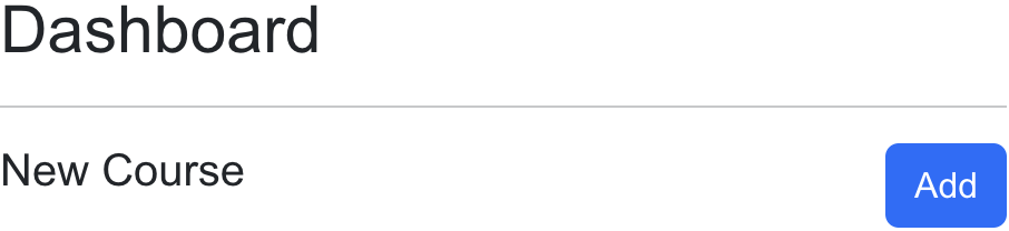
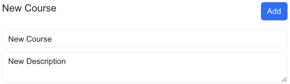
Convert the course constant into state so the fields can change and force a redraw of the form. Add an input for the course name and a textarea for the description, each bound to the matching property on the draft. At first you can set value={course.name} and value={course.description} so the fields show the placeholder text from emptyCourse. Then add onChange attributes that update each field with the same object-spread pattern as §4.2.8: setCourse({ ...course, name: e.target.value }) for the title and the same shape for description. Confirm the form shows the values of the course state variable as you type. Confirm you can type a title, click Add, and see a new card appear and the published count go up. Each card can keep the same sample image, or you can render course.image if you added image properties to courses.json in Chapter 3. The card still needs Delete and Edit, which the next two subsections add.
4.10.2.2 Deleting a Course
Now implement deleting courses by adding a Delete button to each card. The button invokes deleteCourse and passes the _id of the course to remove. The store function filters that course out of the courses array and leaves the others in place. Use the Dashboard and CourseCard samples as an example, and confirm that you can remove courses. After a successful delete the published count decreases and the card is gone; the other cards keep their titles and links.
The button sits inside a Link that navigates to the course Home screen, so you must call event.preventDefault() or the card navigates away before the course disappears. Pass the click through to onDelete so Dashboard can call deleteCourse(c._id) without the card importing the store. Style Delete as a red Tailwind button and give it id wd-delete-course-click. The Delete control looks like Figure 4.10.2c:
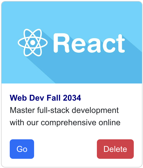
Confirm in the browser that clicking Delete removes that course and does not open /courses/…/home. Confirm that clicking Go still navigates. If Delete navigates, the preventDefault call is missing or the handler is on the wrong element.
4.10.2.3 Editing a Course
Now implement editing an existing course by adding an Edit button to each card. Clicking Edit should copy that card into the course form state so the name and description fields show the selected course. Prevent the Link's default navigation the same way Delete does, then call setCourse(c). Confirm that clicking Edit on a course copies that course into the form.
Add an Update button next to Add so the selected course can be written back with the values in the edited fields. Update calls updateCourse(course), which maps over the store and replaces the object whose _id matches the draft. Confirm you can select a course, change the name and description, and click Update, and that the original card's title and description change while its _id and link stay the same. After Edit, the form and the card should match Figure 4.10.2d:
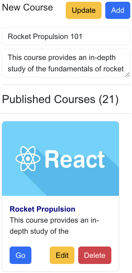
To practice the card buttons, update CourseCard so it accepts onEdit and onDelete and wires both clicks through preventDefault. Confirm Edit fills the form and Delete removes the card:
"use client";

import Link from "next/link";
import Image from "next/image";

export default function CourseCard({
  _id,
  name,
  description,
  image,
  onEdit,
  onDelete,
}: {
  _id: string;
  name: string;
  description: string;
  image: string;
  onEdit: () => void;
  onDelete: () => void;
}) {
  return (
    <div className="wd-dashboard-course w-[300px] max-w-full overflow-hidden rounded-lg border border-neutral-200 bg-white shadow-sm">
      <Link
        href={`/courses/${_id}/home`}
        className="wd-dashboard-course-link block text-neutral-900 no-underline"
      >
        {/* image, title, description */}
        <button type="button">Go</button>
        <button
          type="button"
          id="wd-edit-course-click"
          onClick={(event) => {
            event.preventDefault();
            onEdit();
          }}
        >
          Edit
        </button>
        <button
          type="button"
          id="wd-delete-course-click"
          onClick={(event) => {
            event.preventDefault();
            onDelete();
          }}
        >
          Delete
        </button>
      </Link>
    </div>
  );
}
The live dashboard below is the same component as http://localhost:3000/dashboard. Add a course, confirm the published count increases, Edit a title, Update, then Delete. Because the array lives in Zustand, a course you add here is the same object the course layout will look up in §4.10.3 — open the new card after Add and confirm the breadcrumb shows the name you typed.
Dashboard
New Course
Published Courses (0)
4.10.3 Course Navigation Toggle
Now that courses are declared in the Zustand store, the Courses layout can share them by retrieving the same array from useCoursesStore. The layout finds the course whose _id matches the cid path parameter, then renders that name in the heading and breadcrumb. In Chapter 3 the layout imported courses from the JSON database, so a course you created on Dashboard could not appear here. Refactor app/(kambaz)/courses/[cid]/layout.tsx to a Client Component, read cid with useParams, and look up the course in the store so a newly added course still has a name in the breadcrumb. Confirm you can navigate to new courses created on the Dashboard.
On the left of the course name there is a sandwich icon that should show and hide Course Navigation. Implement the toggling behavior so that when users click the icon, the sidebar hides, and if they click it again, the navigation shows again. That flag is local to the course layout, so useState is enough — leave it out of Zustand. To practice both the store lookup and the toggle, update the layout as shown below. Confirm a course you added on Dashboard opens with the name you typed, and confirm the hamburger hides and shows the sidebar.
"use client";

import { ReactNode, useState } from "react";
import { useParams } from "next/navigation";
import { FaAlignJustify } from "react-icons/fa6";
import "@/app/labs/lab2/tailwind/utilities.css";
import CourseNavigation from "./Navigation";
import Breadcrumb from "./Breadcrumb";
import { useCoursesStore } from "../../store/coursesStore";

export default function CoursesLayout({
  children,
}: Readonly<{
  children: ReactNode;
}>) {
  const { cid } = useParams();
  const courseId = typeof cid === "string" ? cid : "";
  const courses = useCoursesStore((state) => state.courses);
  const course = courses.find((c) => c._id === courseId);
  const [showCourseNav, setShowCourseNav] = useState(true);

  return (
    <div id="wd-courses">
      <h2 className="text-2xl font-semibold text-red-600">
        <FaAlignJustify
          className="me-4 mb-1 inline cursor-pointer text-xl"
          onClick={() => setShowCourseNav(!showCourseNav)}
          title="Toggle course navigation"
        />
        <Breadcrumb course={course} />
      </h2>
      <hr className="my-3" />
      <div className="flex gap-4">
        {showCourseNav ? (
          <div className="hidden w-[140px] shrink-0 md:block">
            <CourseNavigation cid={courseId} />
          </div>
        ) : null}
        <div className="min-w-0 flex-1">{children}</div>
      </div>
    </div>
  );
}
useParams can return a string or an array, so the layout normalizes cid before find. The hamburger calls setShowCourseNav(!showCourseNav) and the sidebar renders only when that flag is true. On medium viewports and wider the navigation is a narrow column; on small screens it stays hidden because the existing Tailwind hidden md:block classes already collapse it. Open /courses/RS101/home and click the hamburger (Figure 4.10.3). With the sidebar visible the screen looks like Figure 4.10.3a; after a click it looks like Figure 4.10.3b. Add a course on the dashboard, open it, and confirm the breadcrumb shows the name you typed.

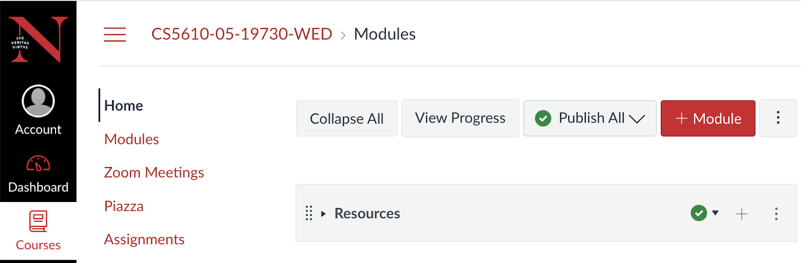
4.10.4 Adding State to the Modules Screen
SlidesNow do the same with Modules: refactor the component by adding state so that you can create, update, and remove modules. You will discover the same limitation you had with courses — new modules and edits cannot be used outside the Modules screen even though Home already embeds that page and should show the same list. Instead of moving the modules array and functions to a shared parent, we will put them in a Zustand store so the list is available throughout the application. The PDF used a modules reducer for the same array; the screens, dialog, trash can, and pencil below are the ones from that walkthrough.
The walkthrough starts from the list you already have, adds a dialog for new names, puts trash and pencil on each row, and finishes with the store so Home sees the same array. Reuse the HTML and CSS from earlier chapters for the list itself — the screenshots show the target controls, not a new visual language. You can begin by converting the modules array into local useState seeded from db.modules and confirm Modules still renders as expected. That local array is enough to prove the dialog and the row buttons; §4.10.4.4 moves it into the store once the controls work.
4.10.4.1 Creating a Module
Let us create a dialog where users can type the name of a new module. The ModuleEditor component below pops up when you click the red + Module button on Modules and on Home. You type the name in an input field. As you type, setModuleName updates the draft string, and clicking Add Module calls addModule, which actually appends the module, then closes the dialog. That is a small piece of UI state: a show boolean plus the draft moduleName string. Create ModuleEditor.tsx as a dialog with these props — show, handleClose, dialogTitle, moduleName, setModuleName, and addModule — and style it with Tailwind overlays and rounded panels. Confirm the dialog appears, accepts a name, and disappears on Cancel.
"use client";

export default function ModuleEditor({
  show,
  handleClose,
  dialogTitle,
  moduleName,
  setModuleName,
  addModule,
}: {
  show: boolean;
  handleClose: () => void;
  dialogTitle: string;
  moduleName: string;
  setModuleName: (name: string) => void;
  addModule: () => void;
}) {
  if (!show) return null;
  return (
    <div
      className="fixed inset-0 z-50 flex items-center justify-center bg-black/40 p-4"
      id="wd-add-module-dialog"
    >
      <div className="w-full max-w-md rounded-lg bg-white shadow-lg">
        <div className="flex items-center justify-between border-b border-neutral-200 px-4 py-3">
          <h3 className="m-0 text-lg font-semibold">{dialogTitle}</h3>
          <button type="button" onClick={handleClose} aria-label="Close">
            ×
          </button>
        </div>
        <div className="px-4 py-3">
          <input
            className="w-full rounded border border-neutral-300 px-3 py-1.5"
            value={moduleName}
            onChange={(e) => setModuleName(e.target.value)}
            id="wd-add-module-name"
          />
        </div>
        <div className="flex justify-end gap-2 border-t border-neutral-200 px-4 py-3">
          <button type="button" onClick={handleClose} id="wd-add-module-cancel">
            Cancel
          </button>
          <button
            type="button"
            onClick={() => {
              addModule();
              handleClose();
            }}
            id="wd-add-module-submit"
          >
            Add Module
          </button>
        </div>
      </div>
    </div>
  );
}
When show is false the component returns null, so the overlay is not in the document. The name input is a controlled field: value is moduleName and onChange calls setModuleName. Add Module runs addModule and then handleClose so the dialog does not stay open over an empty name. Cancel and the × only close the dialog — they must not append a module.
The + Module button was implemented in ModulesControls in a prior chapter. Refactor it so that it displays the ModuleEditor dialog when clicked. The toolbar that already has Collapse All, View Progress, and Publish All should own that dialog. The red + Module button sets show to true; Cancel or the × sets it back to false. The target dialog and toolbar look like Figure 4.10.4a and Figure 4.10.4b:

"use client";

import { useState } from "react";
import { FaPlus } from "react-icons/fa";
import ModuleEditor from "./ModuleEditor";

export default function ModulesControls({
  moduleName,
  setModuleName,
  addModule,
}: {
  moduleName: string;
  setModuleName: (title: string) => void;
  addModule: () => void;
}) {
  const [show, setShow] = useState(false);
  const handleClose = () => setShow(false);
  const handleShow = () => setShow(true);
  return (
    <div id="wd-modules-controls" className="mb-3 flex flex-wrap items-center gap-2">
      {/* Collapse All, View Progress, Publish All */}
      <button
        type="button"
        id="wd-add-module-btn"
        onClick={handleShow}
        className="inline-flex items-center gap-1 rounded bg-red-600 px-3 py-1.5 text-sm font-medium text-white"
      >
        <FaPlus /> Module
      </button>
      <ModuleEditor
        show={show}
        handleClose={handleClose}
        dialogTitle="Add Module"
        moduleName={moduleName}
        setModuleName={setModuleName}
        addModule={addModule}
      />
    </div>
  );
}
ModulesControls owns only the dialog visibility. The draft name and the function that appends a module stay on the Modules page so the same addModule can later call the Zustand store. Pass moduleName, setModuleName, and addModule down as props; the dialog will invoke setModuleName when you edit the text field and addModule when you click Add Module.
On the Modules page, declare a moduleName state variable that keeps track of the name edited in the dialog. Keep that string in useState. Pass it, setModuleName, and an addModule that appends { name: moduleName, course: courseId } into the store — or into a local array while you are still proving the dialog. After Add Module, clear the name with setModuleName("") so the next open starts blank. Confirm you can add modules. Confirm the new row appears on /courses/RS101/modules and that it is tagged with that course's cid so RS102 does not show it.
4.10.4.2 Deleting a Module
To delete modules, add a trash can icon to the ModuleControlButtons you implemented in an earlier chapter. Pass a deleteModule function you can call when clicking the trash can, and also pass the id of the module to be deleted as moduleId. The icon should be red so it reads as a destructive control next to the green checkmark and the ellipsis. The row with a red trash can looks like Figure 4.10.4c:

To practice the row controls, update ModuleControlButtons as shown below. The pencil is included here because the next subsection will call editModule; you can add both icons now so the row matches the screenshot, then wire the pencil in §4.10.4.3.
import { FaPencilAlt, FaTrash } from "react-icons/fa";
import { BsPlus } from "react-icons/bs";
import { IoEllipsisVertical } from "react-icons/io5";
import GreenCheckmark from "./GreenCheckmark";

export default function ModuleControlButtons({
  moduleId,
  deleteModule,
  editModule,
}: {
  moduleId: string;
  deleteModule: (moduleId: string) => void;
  editModule: (moduleId: string) => void;
}) {
  return (
    <div className="flex items-center gap-2">
      <FaPencilAlt
        className="cursor-pointer text-blue-600"
        onClick={() => editModule(moduleId)}
      />
      <FaTrash
        className="cursor-pointer text-red-600"
        onClick={() => deleteModule(moduleId)}
      />
      <GreenCheckmark />
      <BsPlus className="text-3xl" />
      <IoEllipsisVertical className="text-xl" />
    </div>
  );
}
deleteModule filters the modules array by _id, the same pattern deleteCourse used on the dashboard. Pass both the function and module._id into ModuleControlButtons from the map so each row deletes only itself. Confirm a trash click removes that module and leaves the others. Confirm the lessons nested under that module disappear with it, because they rendered as children of the removed row.
4.10.4.3 Editing a Module
In ModuleControlButtons, the pencil icon should call editModule with the moduleId of the module you want to rename. Clicking the icon sets that module's editing flag to true. While the flag is false, render the name. While it is true, render a text field bound to updateModule so each keystroke writes the new title back into the array. Pressing Enter sets editing back to false so the name shows again and the input is hidden. The pencil on the row looks like Figure 4.10.4d; the field that replaces the title looks like Figure 4.10.4e:


On the Modules page, implement editModule and updateModule. editModule maps the array and sets editing: true on the matching id so the input can appear. updateModule accepts a whole module object and replaces the corresponding object in the array, which is how the input writes the new name and how Enter clears the flag. Pass editModule to ModuleControlButtons so the pencil can turn the flag on. In the Modules map, the title is no longer a plain string:
title={
  module.editing ? (
    <input
      className="w-1/2 rounded border border-neutral-300 px-2 py-1 text-base"
      defaultValue={module.name}
      onChange={(e) => updateModule({ ...module, name: e.target.value })}
      onKeyDown={(e) => {
        if (e.key === "Enter") {
          updateModule({ ...module, editing: false });
        }
      }}
    />
  ) : (
    module.name
  )
}
If module.editing is not set, the module name is displayed. If the pencil was clicked, the name is replaced by an input whose defaultValue is the current name. Each onChange spreads the module and overwrites name. If the Enter key is pressed, editing is set to false, the input is hidden, and the name is shown again. Confirm you can edit the names of the modules. Confirm you can rename a module, press Enter, and see the new name on both Modules and Home — once the store in §4.10.4.4 is in place. Until then the edit only lives on this page.
4.10.4.4 A Modules Store
The Modules component seems to be working. You can create new modules, edit modules, and remove modules, but those new modules and edits cannot be used outside the confines of the Modules component even though you want to display the same list elsewhere, such as the Home screen. You could use the same approach as an early Dashboard sketch, by moving the state variables and functions to a higher-level component that could share the state. Instead we will use a Zustand store so you practice application-level state the same way courses moved in §4.10.1. The PDF implemented these four functions as a modules reducer and then wrapped every call with dispatch; the store below keeps the same operations as named functions on the hook.
Seed from modules.json. Export addModule, deleteModule, updateModule, and editModule — reimplemented so each one calls set with a new modules array. To practice the store, create app/(kambaz)/store/modulesStore.ts as shown below. Confirm the file compiles and that the initial array is the same seed Modules already filtered by cid.
"use client";

import { create } from "zustand";
import modulesJson from "../database/modules.json";

export type CourseModule = {
  _id: string;
  name: string;
  description: string;
  course: string;
  lessons?: { _id: string; name: string; description: string; module: string }[];
  editing?: boolean;
};

export const useModulesStore = create<{
  modules: CourseModule[];
  addModule: (module: { name: string; course: string }) => void;
  deleteModule: (moduleId: string) => void;
  updateModule: (module: CourseModule) => void;
  editModule: (moduleId: string) => void;
}>((set) => ({
  modules: modulesJson as CourseModule[],
  addModule: (module) =>
    set((state) => ({
      modules: [
        ...state.modules,
        {
          _id: crypto.randomUUID(),
          name: module.name,
          description: "",
          course: module.course,
          lessons: [],
        },
      ],
    })),
  deleteModule: (moduleId) =>
    set((state) => ({
      modules: state.modules.filter((m) => m._id !== moduleId),
    })),
  updateModule: (module) =>
    set((state) => ({
      modules: state.modules.map((m) => (m._id === module._id ? module : m)),
    })),
  editModule: (moduleId) =>
    set((state) => ({
      modules: state.modules.map((m) =>
        m._id === moduleId ? { ...m, editing: true } : m,
      ),
    })),
}));
addModule builds a new object with a generated _id, an empty lessons array, and the name and course from the dialog. deleteModule filters by id. updateModule replaces the object whose _id matches. editModule only flips editing to true so the input appears; saving the name is still updateModule.
Reimplement Modules by removing the local modules array and the local add, delete, update, and edit helpers, and replacing them with store selectors. The page then keeps only the draft name in useState. Filter the store by cid, pass store functions into ModulesControls and ModuleControlButtons, and wrap each add so it also clears moduleName. Home updates for free because it already renders Modules. Confirm you can still add, remove, and edit modules as before. Also confirm the modules still work on the Home screen: add a module on Modules, switch to Home without reloading, and confirm the new row is there.
4.10.5 Account Screens
SlidesThe Account screens provide users access to their personal information and all related data such as courses they are enrolled in and courses they might be teaching. Users use the Sign in screen to identify themselves and access their Profile screen to view their personal information. This section describes refactoring the Sign in and Profile screens to confirm a user's identity and display their personal information. Account Navigation should hide Sign in and Sign up once someone is signed in, and hide Profile when nobody is.
Put the current user in React Context, wrapped around the Kambaz layout, so Dashboard, Account, and Profile all read the same value. We could have used Zustand here as well — and we will for courses and modules — but who is signed in changes rarely, so Context is a fair fit, and it lets you practice the provider you already built in the lab. Local useState plus Zustand for everything shared would have worked, and would even have been simpler. The PDF kept currentUser in an account reducer next to the course and module lists; this book uses AccountContext for that one value and leaves the lists in Zustand.
4.10.5.1 Account Context
Implement an account context to keep track of the currently signed-in user and share it across the entire application. The pattern is a context, a provider that holds currentUser in useState, and a hook that throws if you forget the provider — the same shape as the lab counter in §4.4. Seed the type from users.json so the signed-in object has the same fields the Profile form will display. To practice the context, create app/(kambaz)/account/AccountContext.tsx as shown below. Confirm the file compiles and that currentUser starts as null until someone signs in.
"use client";

import { createContext, useContext, useState, type ReactNode } from "react";
import usersJson from "../database/users.json";

export type User = (typeof usersJson)[number];

type AccountContextValue = {
  currentUser: User | null;
  setCurrentUser: (user: User | null) => void;
};

const AccountContext = createContext<AccountContextValue | null>(null);

export function AccountProvider({ children }: { children: ReactNode }) {
  const [currentUser, setCurrentUser] = useState<User | null>(null);
  return (
    <AccountContext.Provider value={{ currentUser, setCurrentUser }}>
      {children}
    </AccountContext.Provider>
  );
}

export function useAccountContext() {
  const value = useContext(AccountContext);
  if (!value) {
    throw new Error("useAccountContext must be used inside AccountProvider");
  }
  return value;
}
setCurrentUser is the only writer. Sign in will pass a user from users.json. Sign out will pass null. The hook throws if a screen calls it outside the provider so you notice a missing wrap immediately instead of reading a silent null.
Wrap the Kambaz layout so every Kambaz screen sits inside the provider. Import the provider and render it around the existing navigation and main offset. The layout can stay a Server Component; it just renders the client AccountProvider. Confirm Sign in, Dashboard, and Profile can all call useAccountContext without throwing:
import { AccountProvider } from "./account/AccountContext";

export default function KambazLayout({
  children,
}: Readonly<{ children: ReactNode }>) {
  return (
    <AccountProvider>
      <div id="wd-kambaz" className="font-sans">
        <KambazNavigation />
        <div className="wd-main-content-offset p-3">{children}</div>
      </div>
    </AccountProvider>
  );
}
4.10.5.2 Sign in
Refactor the Sign in screen by adding a credentials state variable for users to enter their username and password. Convert the page to a Client Component so the fields can be controlled and the click handler can talk to the browser. When users click Sign in, search users.json for a user whose username and password match. If there is a user that matches, store it in the account context by calling setCurrentUser(user). Ignore the sign-in attempt if there is no match — do not navigate and do not write a user. After signing in, navigate to the Dashboard. In a click handler use the router, not the server redirect helper. To practice Sign in, update app/(kambaz)/account/signin/page.tsx as shown below. Confirm that signing in navigates to the Dashboard only if valid credentials are used.
"use client";

import { useState } from "react";
import Link from "next/link";
import { useRouter } from "next/navigation";
import * as db from "../../database";
import { useAccountContext } from "../AccountContext";

export default function Signin() {
  const [credentials, setCredentials] = useState({
    username: "",
    password: "",
  });
  const { setCurrentUser } = useAccountContext();
  const router = useRouter();

  const signin = () => {
    const user = db.users.find(
      (u) =>
        u.username === credentials.username &&
        u.password === credentials.password,
    );
    if (!user) return;
    setCurrentUser(user);
    router.push("/dashboard");
  };

  return (
    <div id="wd-signin-screen">
      <h3>Sign in</h3>
      <input
        placeholder="username"
        id="wd-username"
        value={credentials.username}
        onChange={(e) =>
          setCredentials({ ...credentials, username: e.target.value })
        }
      />
      <input
        placeholder="password"
        type="password"
        id="wd-password"
        value={credentials.password}
        onChange={(e) =>
          setCredentials({ ...credentials, password: e.target.value })
        }
      />
      <button type="button" onClick={signin} id="wd-signin-btn">
        Sign in
      </button>
      <Link href="/account/signup" id="wd-signup-link">
        Sign up
      </Link>
    </div>
  );
}
Both fields use the object-spread update from §4.2.8 so typing a username does not erase the password. The password input keeps type="password" so the value is hidden as you type. Try a user from users.json — for example iron_man / stark123. A wrong password should stay on Sign in. A match should land on Dashboard. Open /account/signin and confirm both paths before you filter the dashboard by enrollment.
4.10.5.3 Dashboard by Enrollment
Now that the current user is stored in AccountContext, the Dashboard can filter the courses and only display the courses in which that user is enrolled. Refactor Dashboard so that it only shows the courses the current user is enrolled in. Sign in as different users and confirm that the Dashboard only displays the courses a user is enrolled in. Note that new courses added will not render now since enrollments would also need to be modified. This will be addressed in §4.10.7 and in later chapters. If nobody is signed in, keep showing every course so the Add / Edit / Delete work in §4.10.2 still has something to click:
const { currentUser } = useAccountContext();
const visibleCourses = currentUser
  ? courses.filter((c) =>
      db.enrollments.some(
        (enrollment) =>
          enrollment.user === currentUser._id && enrollment.course === c._id,
      ),
    )
  : courses;
The filter uses the same enrollments.some pattern §3.9.9 used on the People table: keep a course when there is an enrollment whose user is the signed-in id and whose course is that course's _id. Map visibleCourses instead of the full store array so Add still writes every course but the grid only shows the enrolled subset. Sign in as iron_man and confirm the published list shrinks to that student's courses. Sign in as nick_fury / fury123 and compare. A course you Add while signed in will not appear until you enroll in it — that is the §4.10.7 exercise, the same limitation the original chapter called out.
4.10.5.4 Account Navigation
Users can use the Account Navigation sidebar to navigate between Sign in, Sign up, and Profile, but not all of those screens should be available depending on whether a user is logged in. Reimplement the Account Navigation sidebar so that it hides the Sign in and Sign up links if a user is already signed in, and hides the Profile link if a user is not yet signed in. If currentUser is set, the sidebar should list only Profile. If it is null, list Signin and Signup. To practice the sidebar, update app/(kambaz)/account/Navigation.tsx as shown below. Confirm the links change after a successful sign in and again after sign out.
"use client";

import Link from "next/link";
import { usePathname } from "next/navigation";
import { useAccountContext } from "./AccountContext";

export default function AccountNavigation() {
  const { currentUser } = useAccountContext();
  const links = currentUser
    ? (["profile"] as const)
    : (["signin", "signup"] as const);
  const pathname = usePathname() ?? "";
  return (
    <div id="wd-account-navigation">
      {links.map((link) => (
        <span key={link}>
          <Link href={`/account/${link}`}>
            {link === "signin"
              ? "Signin"
              : link === "signup"
                ? "Signup"
                : "Profile"}
          </Link>
          <br />
        </span>
      ))}
    </div>
  );
}
Also refactor the Account landing screen so that the default screen is Sign in if no one is signed in yet, and Profile if someone is already signed in. Confirm that the Account Navigation links are Sign in and Sign up if no one is signed in yet, and Profile if someone is already signed in. Also confirm that clicking the Account link in the Kambaz Navigation sidebar displays the Sign in screen if no one is signed in yet, and displays the Profile screen if someone is already signed in.
"use client";

import { redirect } from "next/navigation";
import { useAccountContext } from "./AccountContext";

export default function AccountPage() {
  const { currentUser } = useAccountContext();
  if (!currentUser) {
    redirect("/account/signin");
  } else {
    redirect("/account/profile");
  }
}
4.10.5.5 Profile
The Profile screen displays the current user's personal information. Refactor Profile to retrieve the current user from AccountContext. If there is no currentUser, the screen should navigate to Sign in. If there is a currentUser, the screen should populate a form with the user's information. Copy that user into a local profile state in useEffect so the form can edit fields without writing the context on every keystroke. If the current user clicks Sign out, the current user should be set to null and the app should navigate to Sign in. To practice Profile, update app/(kambaz)/account/profile/page.tsx as shown below. Confirm the form fills after a successful sign in, and confirm Sign out returns you to Sign in with Account Navigation showing Signin and Signup again.
"use client";

import { useEffect, useState } from "react";
import { useRouter } from "next/navigation";
import { useAccountContext, type User } from "../AccountContext";

export default function Profile() {
  const [profile, setProfile] = useState<User | null>(null);
  const { currentUser, setCurrentUser } = useAccountContext();
  const router = useRouter();

  useEffect(() => {
    if (!currentUser) {
      router.push("/account/signin");
      return;
    }
    setProfile(currentUser);
  }, [currentUser, router]);

  const signout = () => {
    setCurrentUser(null);
    router.push("/account/signin");
  };

  if (!profile) return null;
  return (
    <div id="wd-profile-screen">
      <h3>Profile</h3>
      <input
        id="wd-username"
        value={profile.username}
        onChange={(e) => setProfile({ ...profile, username: e.target.value })}
      />
      {/* password, firstName, lastName, email, role */}
      <button type="button" onClick={signout} id="wd-signout-btn">
        Sign out
      </button>
    </div>
  );
}
The sample shows the username field and Sign out; bind the remaining inputs the same way — password, first name, last name, email, and a role select with User, Admin, Faculty, and Student — each spreading profile and overwriting one property. Confirm the form fills with iron_man's name after a successful sign in. Confirm that editing a field does not change the name in Account Navigation until you decide to write the context later. Confirm Sign out clears currentUser and that visiting Profile while signed out sends you back to Sign in.
4.10.6 Assignments (On Your Own)
After completing the Dashboard, Courses, and Modules, refactor the Assignments and Assignment Editor screens so that faculty can create, update, and remove assignments as described in this section. Students can still view assignments. Follow the same path you used for modules: seed a Zustand store from assignments.json, filter the list by the current cid, and let the editor create or update a row before navigating back to the list. The PDF implemented this list as an assignments reducer; use an assignmentsStore the same way you used modulesStore. The list target looks like Figure 4.10.6; the editor looks like Figure 4.10.6b:
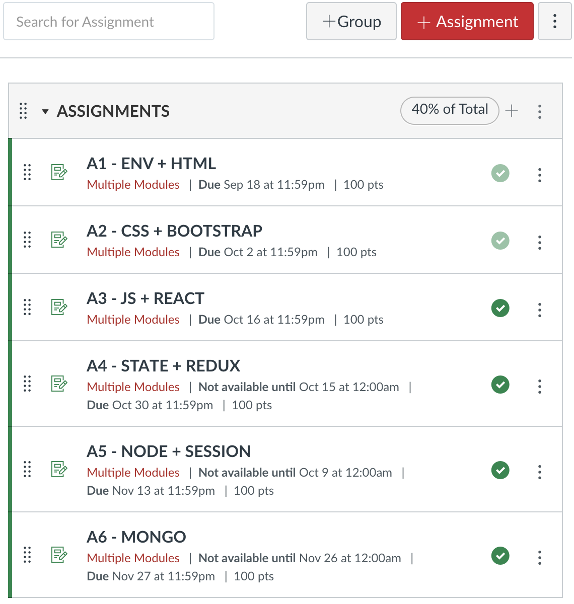
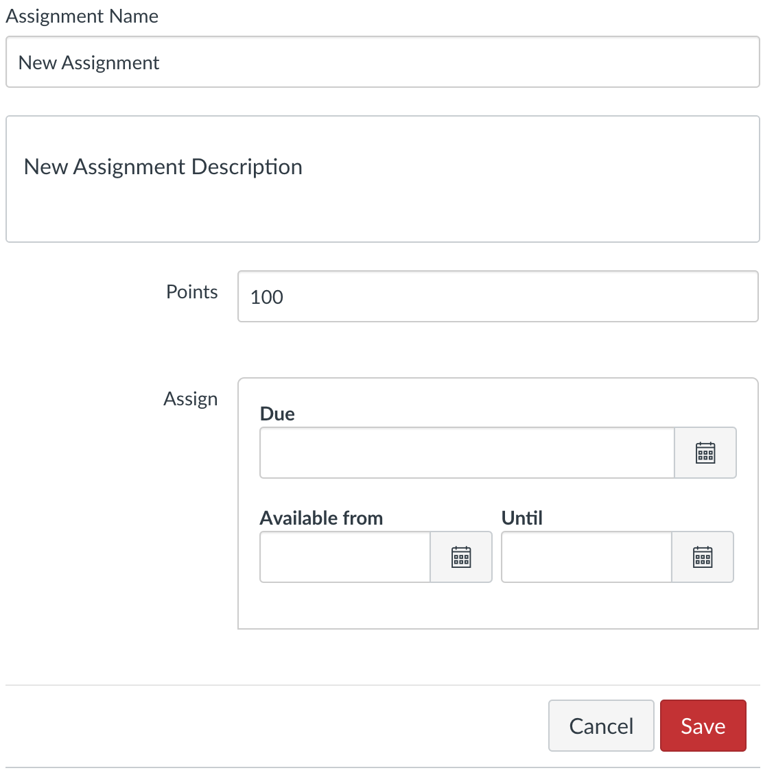
4.10.6.1 Assignments Store
Following modulesStore.ts as an example, create app/(kambaz)/store/assignmentsStore.ts initialized with the assignments from assignments.json. Implement store functions such as addAssignment, deleteAssignment, updateAssignment, and any other functions you need — for example a helper that finds one assignment by _id when the editor opens. Generate new ids with crypto.randomUUID() the same way the courses and modules stores do. Confirm the store compiles and that the Assignments page can filter the array by the current course before you wire Save and Delete.
4.10.6.2 Creating an Assignment
Refactor your Assignments screen so that creating a row goes through the editor instead of a dialog. Clicking the + Assignment button should navigate to the Assignment Editor, not append an empty title on the list. The editor should allow editing at least the name, description, points, due date, available-from date, and available-until date — the same fields §3.9.8.1 already displayed from JSON. Clicking Save creates the new assignment, adds it to the assignments array in the Zustand store, and navigates back to the Assignments screen, which must now contain the newly created assignment. Clicking Cancel does not create the new assignment and navigates back to the Assignments screen without the new row. Confirm in the browser that Save increases the list by one and that Cancel leaves the list unchanged.
4.10.6.3 Editing an Assignment
Refactor the Assignment Editor so that clicking an assignment on the list navigates to the editor and displays that assignment's name, description, points, due date, available-from date, and available-until date. The editor should allow editing those same fields for the corresponding assignment. Clicking Save updates the assignment's fields in the store and navigates back to the Assignments screen with the updated values. Clicking Cancel does not update the assignment and navigates back to the list, which shows the assignments unchanged. Confirm you can open two different assignments and see different titles, then change one title, Save, and see only that row update.
4.10.6.4 Deleting an Assignment
Refactor the Assignments list using the modules trash can as a model: add a Delete button or trash icon to the right of each assignment. Clicking Delete on an assignment should pop up a dialog asking whether you are sure you want to remove the assignment. Clicking Yes or Ok dismisses the dialog, removes the assignment from the store, and updates the Assignments screen without the deleted row. Clicking No or Cancel dismisses the dialog without removing the assignment. Confirm a delete that you confirm removes the row and that a delete you cancel leaves the title in place. Filter every list and every editor save by the current cid so an assignment created in RS101 does not appear in RS102.
4.10.7 Enrollments (On Your Own)
Currently the Dashboard allows faculty to Add, Delete, Edit, and Update courses, as well as navigate to the course content. Other users currently only see the courses they are enrolled in. Refactor Dashboard so that there is a new blue Enrollments button at the top right of the screen. Clicking Enrollments displays all the courses. Clicking it again only shows the courses the user is enrolled in. The PDF used a Redux enrollment list for the same toggle; implement app/(kambaz)/store/enrollmentsStore.ts seeded from enrollments.json with enroll and unenroll functions, then wire the Dashboard and the People table to that store.
Courses the user is enrolled in should provide a red Unenroll button, and courses the user is not enrolled in should provide a green Enroll button. When a user clicks Unenroll or Enroll, the enrollment status must actually change and the buttons should toggle to reflect the new state. If a user signs out and then signs in again, the enrollment choices should still persist for this session. If a user refreshes or reloads the page, the new enrollments are lost — that is expected until a later chapter persists them on a server. Protect the route to a course so that only users enrolled in that course can navigate to it, and stay on the Dashboard screen otherwise.
4.11 Exercises
Use this checklist to confirm the stateful Kambaz prototype covers every screen in §4.10. The labs taught events, controlled fields, Context, and Zustand one idea at a time; these items are those ideas applied to the application you keep building. Each item points back to the section where you wired the worked example. Build in order as you read — this list is for checking coverage, not a substitute for the walkthroughs. Create the store, click the buttons, and confirm the browser before you tick a line. Assignments and enrollments stay On your own: match the ids, figures, and steps in those sections. Each screen is listed once, with Lab, On your own, and With AI nested as a/b/c when those blocks exist.
- Courses store (§4.10.1)
- Lab component — Create the courses Zustand store seeded from JSON.
- Dashboard CRUD (§4.10.2)
- Lab component — Add, edit, update, and delete courses on the Dashboard.
- On your own — Add number and startDate on the course form (§4.10.2.3).
- With AI — Add a sample course-number field (wd-course-number) — leave your personal fields as yours.
- Course Navigation toggle (§4.10.3)
- Lab component — Toggle Course Navigation from the hamburger and read the course name from the store.
- Modules store (§4.10.4)
- Lab component — Add a module from the dialog, delete with trash, rename with the pencil, and share the list through the modules store.
- On your own — Complete each section's On your own in §4.10.4.1–§4.10.4.4.
- With AI — Complete each section's With AI extra in §4.10.4.1–§4.10.4.4.
- Account and enrollment (§4.10.5)
- Lab component — Sign in, filter Dashboard by enrollment, toggle Account Navigation, and fill Profile from the current user in Context.
- On your own — Complete the On your own on Profile in §4.10.5.5.
- With AI — Complete the With AI extra in §4.10.5.5.
- Assignment CRUD (§4.10.6)
- Lab component — Implement assignment CRUD in Zustand (On your own).
- On your own — Implement the assignments store, editor, confirm-delete, and filter by cid.
- With AI — Ask the assistant for a sample assignmentsStore — you still wire the screens.
- Enroll and unenroll (§4.10.7)
- Lab component — Implement enroll and unenroll from Dashboard (On your own).
- On your own — Create enrollmentsStore.ts and wire the toggle and People list.
- With AI — Add a sample enrollments toggle after your own extra control.
4.12 Delivery
In the same Next.js application created in earlier chapters, webdev-client, complete all the exercises described in this chapter — the Lab 4 components and the stateful Kambaz screens in §4.10. Submit the work as a new branch on the same repository and Vercel project from earlier chapters, so graders can compare Chapter 3's data-driven screens against this chapter's client state side by side. Do not open a second repository and do not deploy to a different host. The preview URL for branch a4 should sit next to your a3 deployment so a grader can open both.
- Finish every exercise described in this chapter inside the same
webdev-clientproject used in Chapter 1, Chapter 2, and Chapter 3. That includes the Lab 4 event, form, Context, and Zustand practice components and the Kambaz stores, dashboard CRUD, module dialog, account context, and the On-your-own assignment and enrollment work. Confirm the screens in the browser on localhost before you branch. - Create a branch named
a4, then add, commit, and push it to the same GitHub repository from §1.5. Work ona4for the rest of the chapter so thea3branch stays a snapshot of the data-driven screens. Here is an example of how to add, commit, and push your code:
git checkout -b a4
git add .
git commit -am "a4 client state"
git push -u origin a4- Deploy the
a4branch to the same Vercel project created in an earlier chapter. Configure the project to deploy every branch to its own URL: open the project's Settings → Git and enable deployments for all branches (some Vercel plans expose this under Build & Deployment → Branches). From then on, each push toa4gets its own preview URL that contains the branch name, separate from your Chapter 3a3deployment. Confirm the preview loads and that you can sign in, add a course, and add a module on that URL — not only on localhost. - Confirm
app/labs/TOC.tsxandapp/labs/page.tsxstill list every lab and Kambaz, plus a link to your GitHub repository with idwd-githuband your full name (first name first, last name second, matching Canvas) on the Labs page — the same requirements from §1.7, now revisited for this chapter. Style the Labs table of contents with the existing Tailwind pills; do not switch the course navigation to a different CSS framework for this deliverable. - Push any remaining changes to the
a4branch and confirm the branch deployment on Vercel reflects them. If you fixed a store or a button after the first push, wait for the new preview to finish building before you copy the URL. - In Canvas, submit both the GitHub repository URL (pointed at the
a4branch) and the Vercel deployment URL for that branch. Disable Vercel's Deployment Protection on that deployment, as in §1.6, so graders can open it without signing in. A protected preview that redirects to a Vercel login will not be graded as a working site.
Continue practicing in Labs, browse Lab 4 intermediate steps, or open the live Kambaz prototype to create courses and modules from the Zustand stores.
4.13 References
Client state is the subject of this chapter: local values in a component, shared values in a store, and the events that change them. The linked terms are the React APIs and libraries you installed; the topics are the patterns the labs practiced.
These ideas also matter in this chapter even though they do not have their own term pages yet:
- User events and passing data or functions to handlers
- Boolean, string, date, object, and array state
- Sharing state between parent and child
- Prop drilling
- Encoding state in the URL
- Reducers, actions, useSelector, and dispatch
- Local state versus shared application state
4.14 Tools
These official docs match the four state tools the chapter compares. React Developer Tools is the easiest way to see which component owns a value after you click.
- React — The UI library that turns components and JSX into the screens you build in the labs.
- Redux Toolkit — The official Redux helper library for a shared store, slices, and dispatch.
- Zustand — A small React store you compare with Context and Redux for shared client state.
- React Developer Tools — A browser extension that shows the React component tree and the current props and state.
- Next.js — The React framework this course uses for pages, layouts, and later the HTTP server routes.
- Chrome DevTools — Chrome's built-in inspector for HTML, CSS, the console, and the Network panel.
- GitHub — The host for your remote Git repository and the place Vercel and Render connect when you deploy.
- Vercel — The host for the Next.js client; connect the GitHub repo here to put the UI on the public Web.
4.15 AI Tools
State bugs are easier to talk through than to stare at. A coding assistant can help you choose between useState, Context, and a store — verify every suggestion against the live counter and todo labs.
- Cursor — An AI-native editor that reads your project and helps write or refactor TypeScript in place.
- Claude — A conversational assistant for explaining APIs, reviewing code, and drafting implementations.
- GitHub Copilot — An AI pair programmer that suggests code as you type in the editor.
- Google Prompt Gallery — A public collection of Gemini prompt examples you can remix for writing, coding, and multimodal tasks.