Developing Full Stack Next.js Web Applications
Chapter 1 — Building Next.js User Interfaces with HTML
Dr. Jose Annunziato
The foundation of our modern digital landscape is the Internet, a global array of interconnected computer networks. It originated in the early 1960s as a research project commissioned by the Advanced Research Projects Agency (ARPA), the research arm of the United States Department of Defense (DoD). The initial goal was to build ARPANET, a robust, decentralized, and redundant communication infrastructure capable of maintaining connectivity even in the event of major disruptions. By the 1980s, the standardization of protocols like TCP/IP allowed these isolated military and academic networks to proliferate and connect worldwide, establishing the underlying network of networks upon which modern digital communication relies.
The World Wide Web was invented in 1989 by British computer scientist Sir Tim Berners-Lee during his tenure at CERN, the European particle physics laboratory in Switzerland. The objective was to enable the efficient sharing and linking of research documents over the existing Internet. In March 1989, Sir Tim Berners-Lee proposed a system of hypertext documents connected via hyperlinks, which users access through Uniform Resource Locators (URLs) using the HyperText Transfer Protocol (HTTP). By 1990, he had created the first web browser (named WorldWideWeb), a web server, and the foundational HyperText Markup Language (HTML) language to create HTTP web pages. Browsers and servers connect to one another over the internet in a client-server architecture (Figure 1.1). Sir Tim Berners-Lee made the Web public in 1991, and on April 30, 1993, CERN released the technology into the public domain, facilitating explosive growth. Presently, billions of static and dynamic pages power various systems ranging from simple sites to complex applications.
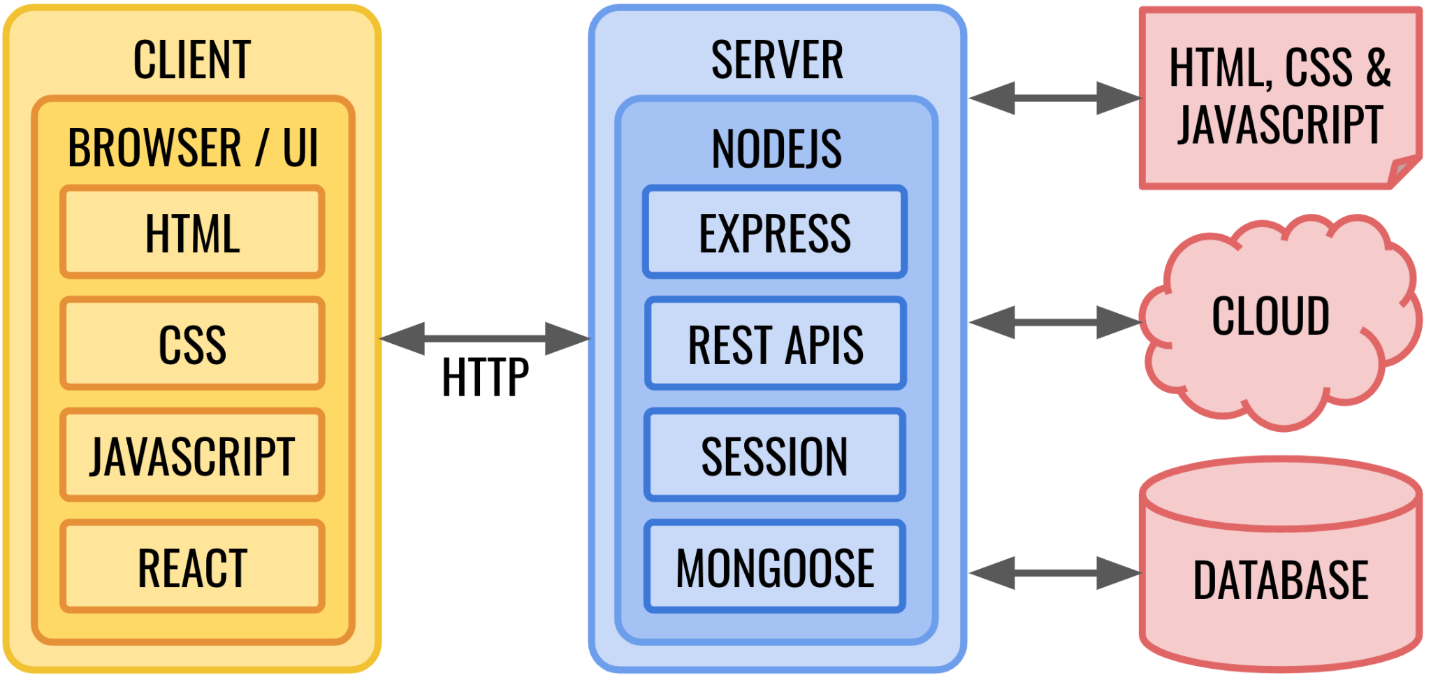
Web pages are comprised of plain text documents formatted with HTML, a dialect of XML (eXtensible Markup Language). HTML is a computer language utilized to format the content displayed in web pages, including properties such as foreground and background color, white spaces, text alignment, font, lists, tables, and forms. Browsers establish a network connection with servers to send HTTP Requests for HTML documents. These requests rely on Uniform Resource Locators (URLs). A URL such as http://www.nasa.gov names the protocol (http — Hypertext Transfer Protocol), then the server (www.nasa.gov). That hostname is mapped to an IP address so the browser can find the machine on the network. A path after the server name pinpoints a specific document. Local development uses the same pattern: http://localhost:3000/labs/lab1 — here http is still the protocol, localhost is the hostname for your own machine, 3000 is the port where the Next.js dev server listens, and /labs/lab1 is the path to Lab 1. Servers locate the requested documents, and then respond with the document's content. Browsers parse HTML documents to create in-memory object representations known as the DOM (Document Object Model). The DOM consists of a hierarchical data structure where each node is configured to render content in a specific format and style. This chapter examines using HTML for formatting web pages and creating user interfaces.
Plain HTML documents are static: the same document does not change over time, and does not depend on the data or user interactions. The Web quickly reached the limit of what could be render on a screen. — a list of courses that never changes, a heading that never knows who signed in. In the early 1990s, servers began to compute HTML on request so the content could be data driven and interact with users. Scripts on the server — CGI, then languages such as PHP — could assemble a finished document and send it to the browser. Every click still meant a full round trip for a new page. JavaScript, created by Brendan Eich at Netscape in 1995, brought that computation into the browser. HTML documents download .js files from the server; the browser runs them to manipulate the DOM and build dynamic user interfaces without a full round trip for every change. The same language now also runs on the server — in Figure 1.1, the client box is HTML, CSS, JavaScript, and React; the Node.js box is JavaScript too. This course uses both: later chapters generate HTML on the server and still use the browser for clicks, state, and anything that reads the address bar. TypeScript is a version of JavaScript developed by Microsoft that adds static types and is quickly becoming the preferred language for web development. Later chapters discuss programming server-side logic, including API (Application Programming Interface) routes and database interactions with MongoDB.
React is a popular JavaScript library developed by Meta for building dynamic and interactive user interfaces. It promotes a component-based architecture where developers break down complex UIs into small and reusable pieces of code called components. React efficiently manages the state of these components, ensuring that the user interface stays in sync with underlying data changes and user interaction. Developers use React to build Single Page Applications (SPAs), which provide a seamless, fluid user experience by updating only the necessary parts of the page without requiring full-page reloads — unlike traditional multi-page sites, where every link often fetches an entirely new HTML document from the server. Its declarative nature simplifies the process of creating complex web interfaces by describing what the UI should look like for a given state.
Next.js is a powerful framework designed to simplify the construction of full-stack web applications. Built on top of React, it provides an all-in-one solution that includes robust features such as server-side rendering (SSR), static site generation (SSG), and seamless API endpoint integration. Next.js extends React by offering built-in routing, data fetching, and performance optimizations, allowing developers to create highly scalable applications that interact efficiently with backend resources, such as MongoDB, over HTTP.
This chapter describes how to install and configure a local development environment for building Next.js applications. Development is done in the local environment and then shared in a remote GitHub source repository. The source in GitHub is then deployed to a remote server hosted on Vercel which is optimized for Next.js and provides seamless serverless deployment. This chapter introduces creating a Next.js application and explores building user interfaces using HTML and JavaScript. Various HTML elements are described to render user interface content, such as headings, paragraphs, lists, tables, and form elements. All sections in this chapter contain exercises that introduce basic HTML elements and concepts, giving an opportunity to learn and practice HTML skills. The exercises provide detailed instructions to successfully accomplish the tasks. Make sure to complete all exercises described in the book.
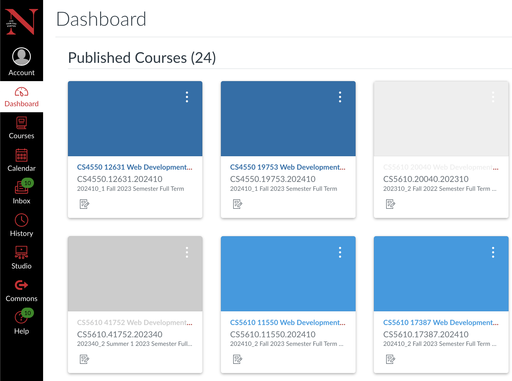
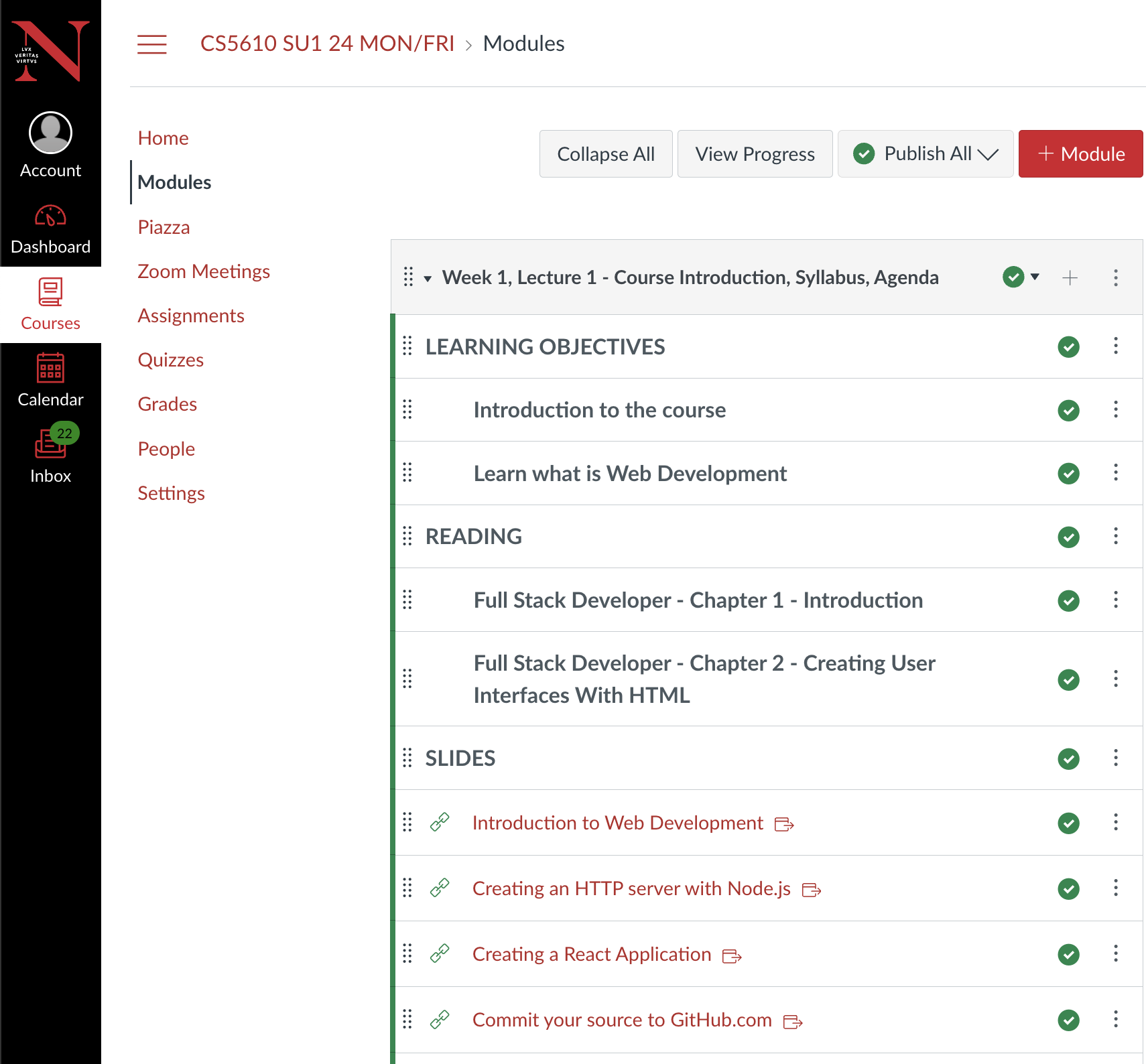
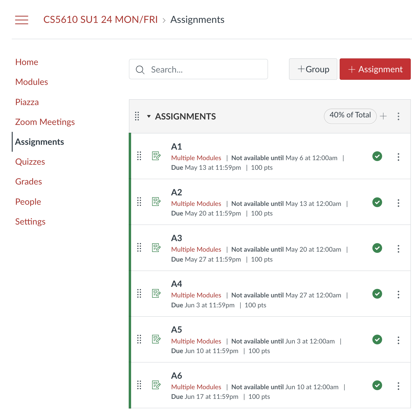
The Kambaz sections in each chapter contain exercises that ask readers to build a fully functional web application inspired by a popular Learning Management System (LMS) with a similar name. The exercises provide sample code and requirements but deliberately leave out steps where the reader is expected to experiment and discover how to implement the requirements using the skills learned in prior sections. This chapter focuses on using plain HTML within Next.js components to implement a draft, rough prototype of various Kambaz screens, which at first won't look like the target product in Figure 1a–1d. Later chapters will continue working on the Kambaz application, introducing Cascading Style Sheets (CSS) to style the Web pages so they look more like these screen shots, and integrating MongoDB for data persistence.
1.1 Learning Objectives
By the end of this chapter, you will be able to:
- Understand the fundamentals of HTML and how it structures web content.
- Set up a development environment for Next.js applications.
- Install Claude Code in the IDE and sign in with a Claude account.
- Create and organize Next.js components using JSX.
- Use Chrome DevTools to inspect and manipulate the DOM.
- Implement headings, paragraphs, lists, tables, and images.
- Build interactive web forms with different input types.
- Pass props into custom components and wrap nested content with
children. - Implement navigation in a Next.js SPA using built-in routing.
- Develop a structured approach to building UIs in Next.js.
Those objectives are best achieved by building along with the narration — each lab component and Kambaz screen as it appears — rather than reading first and coding later. Glance at the Lab 1 checklist in §1.3.12 and the Kambaz checklist in §1.4.9 so the expected coverage is visible from the start. Those lists are recaps, not a reason to skip ahead: work through each section, then use them to confirm what stuck.
1.2 Setting Up the Development Environment
SlidesHTML practice in this book happens inside Next.js components, so first install the tools that run the app on your machine. Later sections assume earlier ones, so it helps to keep the project in step as you read.
1.2.1 Installing Node.js Slides
Node.js is a JavaScript runtime that lets you run JavaScript outside the browser — typically from a terminal or console on your computer. It is essential for Next.js development: it powers the local development server, installs and manages project dependencies, and later enables server-side features such as API routes.
Installing Node.js also gives you two companion tools, npm (Node Package Manager) and npx. Think of them as the JavaScript ecosystem's equivalent of build and package tools you may already know: mvn for Java (Maven) or pip for Python. With npm you install libraries, run project scripts (for example npm run dev), and manage versions listed in package.json. With npx you can run a one-off package command without installing it globally first — which is how we will scaffold the app with npx create-next-app in §1.2.4.
In this chapter we use Node.js mainly to create and host the React user interface. Later chapters will use the same runtime to implement HTTP servers and REST APIs (Representational State Transfer), and to integrate databases such as MongoDB. Getting a solid Node.js install now sets you up for both the front end and the back end of the stack.
Navigate to https://nodejs.org/, download the latest LTS (Long Term Support) version for your operating system (recommended: version 24.x or later as of 2026), and install it. Restart your computer if prompted. Confirm the install by typing node -v in a console or terminal. The output should show the installed version (for example v24.19.0). Your exact version may differ, but it should be at least 20.9 or later, as required by Next.js.
node -v
v24.19.0
1.2.2 Installing an Integrated Development Environment (IDE)
You can edit Next.js projects in any text editor, but an Integrated Development Environment (IDE) makes the work much smoother: syntax highlighting, autocomplete, inline errors, debugging, and a built-in terminal in one place. For this course, Visual Studio Code (VS Code) or Cursor is highly recommended. Both have strong support for JavaScript, TypeScript, React, and Next.js — including IntelliSense suggestions and debugging integrations. Cursor is built on VS Code, so the menus and extensions match the screenshots in this book.
Download and install VS Code from https://code.visualstudio.com or Cursor from https://cursor.com. Once installed, open the Extensions view and add a few useful packages: ESLint for catching common code problems, Prettier for consistent formatting, and browser React Developer Tools for inspecting component trees while you run the app.
You will run many commands — npm run dev, git, and others — from a terminal. Prefer the integrated terminal inside the IDE (in VS Code or Cursor: Terminal → New Terminal) so you stay in the same window as your files and do not have to switch back and forth to a separate console.
1.2.3 Adding Claude to the IDE
Claude is an AI assistant from Anthropic. In this course you can use it inside the editor to explain code, draft a first version, and hunt down errors — still read what it writes, and keep the book and labs as the source of truth. If your school, employer, or a personal Claude plan already includes access, sign in with that account. Otherwise start at claude.ai. Claude Code — the editor extension we install next — expects a Claude subscription (Pro, Max, Team, or Enterprise) or a Claude Console account, not a one-off API key for this setup.
Open the Extensions view (Cmd+Shift+X on macOS, Ctrl+Shift+X on Windows or Linux), search for Claude Code, and install the one published by Anthropic. The same extension works in VS Code and in Cursor. Direct install links are in the Claude Code for VS Code docs. If the spark icon does not appear, reload the window from the Command Palette: Developer: Reload Window.
Open Claude from the Command Palette (Cmd+Shift+P / Ctrl+Shift+P), type Claude Code, and choose Open in New Tab. The first time, click Sign in and finish authorization in the browser. In Cursor, Claude Code is separate from Cursor's built-in chat — install and sign in even if Cursor AI already works.
1.2.4 Creating a Next.js Application Slides
With npx — the tool that shipped with your Node.js install — you can scaffold a new Next.js project from a maintained template that already follows current best practices.
Start by creating a place on disk for your coursework. From your home directory (~), make a folder for the year, the term, and the course. On macOS use Terminal; on Windows use Command Prompt or PowerShell. For example, to create ~/2049/winter/webdev:
cd ~
mkdir 2049
mkdir 2049/winter
mkdir 2049/winter/webdev
cd 2049/winter/webdev
You can pick another location if you prefer. Keep names lowercase, avoid spaces, and nest the project only under directories that follow the same rules — that prevents a lot of path and tooling headaches later.
From that folder (or from the IDE's integrated terminal), create the app with:
npx create-next-app@latestThe first time you run this, npm may ask permission to download the create-next-app package. Accept and continue:
Need to install the following packages:
create-next-app@15.3.5
Ok to proceed? (y)
When prompted for a project name, enter webdev-client. For the remaining prompts — TypeScript, ESLint, Tailwind CSS, src/ directory, App Router, Turbopack, and the @/* import alias — choose the defaults (typically Yes for TypeScript, ESLint, Tailwind, App Router, and Turbopack; No for a src/ directory and for customizing the alias). Exact wording can vary slightly by create-next-app version.
✔ What is your project named? … webdev-client
✔ Would you like to use TypeScript? … No / Yes
✔ Would you like to use ESLint? … No / Yes
✔ Would you like to use Tailwind CSS? … No / Yes
✔ Would you like your code inside a `src/` directory? … No / Yes
✔ Would you like to use App Router? (recommended) … No / Yes
✔ Would you like to use Turbopack for `next dev`? … No / Yes
✔ Would you like to customize the import alias (`@/*` by default)? … No / Yes
Wait while dependencies install (react, react-dom, next, TypeScript types, Tailwind, ESLint, and related packages). When it finishes you should see a success message and a new webdev-client directory. Change into that directory and start the development server:
cd webdev-client
npm run dev
The console should report that Next.js is ready and print a local URL, usually http://localhost:3000. Open that URL in Google Chrome and confirm the default Next.js starter page (logo and getting-started content) appears. Stop the server anytime with Ctrl+C.
Default starter app at http://localhost:3000
You should see the Next.js logo and welcome content in Chrome.
You can start the app from any terminal, but prefer running npm run dev from the IDE: open the webdev-client folder in VS Code (or Cursor), show the terminal with View → Terminal if needed, and run the command there. Other browsers and editors are fine, but this course assumes Google Chrome and VS Code or Cursor unless noted otherwise.
1.2.5 Creating Pages and Routes with the App Router
Next.js user interfaces are written as JavaScript functions (or classes) called components. A component computes HTML: it can choose markup, text, or structure from data instead of returning the same static document every time. To make that easier to write, the syntax blurs the line between JavaScript and HTML — you put HTML-like markup right in the function. That mix is called JSX (JavaScript XML). Files that use JSX typically end in .jsx. Chapter 3 covers JavaScript in more depth; for now, focus on the HTML-like markup inside each component.
TypeScript is a superset of JavaScript that adds static typing. It has become the preferred language for many React and Next.js projects because types catch mistakes early, make larger codebases easier to refactor, and improve editor tooling (autocomplete, jump-to-definition, and clearer errors). Next.js supports TypeScript out of the box, and it is what this course uses. Component files therefore end in .tsx. When people say "JSX" in conversation, they often mean the markup syntax itself, whether the file is .jsx or .tsx.
Before you create Lab 1, it helps to know how the browser address bar connects to files on disk. A URL path (for example /labs/lab1) is what the user opens. In Next.js we call that a route: a destination your app knows how to render. You do not register routes in a central config file for the basics of this course. Instead, the shape of folders under app/ defines the routes.
That folder-based system is the App Router — Next.js 's current routing model (you chose it when you answered "Would you like to use App Router?" during create-next-app). An older Next.js style put routes under a pages/ directory (the Pages Router). This course uses the App Router exclusively: look for an app/ folder, not pages/.
Inside app/, the filename page.tsx is reserved. When a folder contains page.tsx, Next.js exposes that folder as a public route. Nested folders become nested path segments:
app/page.tsx→/(the site root)app/labs/page.tsx→/labsapp/labs/lab1/page.tsx→/labs/lab1
In the IDE Explorer, open the app directory and create Lab 1 at app/labs/lab1/page.tsx with the following source:
export default function Lab1() {
  return (
    <div id="wd-lab1">
      <h2>Lab 1</h2>
    </div>
  );
}
Lab1 is a default-exported React component. Because the file is named page.tsx under app/labs/lab1/, the App Router registers the route /labs/lab1. The function returns a div (division element) that contains an h2 heading with the text "Lab 1". Save the file, keep npm run dev running, and open http://localhost:3000/labs/lab1 in the browser to confirm it renders.
Lab 1
As you add HTML examples in the next sections, keep page.tsx as a thin page that imports smaller components (one file per exercise) instead of pasting everything into this one file. Those exercise files — for example HeadingTags.tsx later in Lab 1 — are components, not new routes. Only page.tsx creates a URL; other .tsx files are imported into the page when you need them. Lab 1 stays a single URL while its content grows.
The starter project also loads Tailwind CSS through app/globals.css. For the HTML exercises in this chapter we want the browser's default styling, so comment out that import in app/layout.tsx and leave the rest of the file alone:
import type { Metadata } from "next";
import { Geist, Geist_Mono } from "next/font/google";
// import "./globals.css";
// ... leave the rest of this file alone
Later chapters return to CSS and Tailwind when we start styling Kambaz and the labs more deliberately.
1.3 Introduction to HTML
SlidesHTML (HyperText Markup Language) is a specialized dialect of XML (eXtensible Markup Language) designed for structuring and formatting plain text so web browsers can interpret and render it with specific styles, layouts, and interactivity. In Next.js you write that HTML as JSX inside React components (in .tsx files — see §1.2.5). For this chapter, focus on the tags and structure; treat the surrounding component syntax as the container that delivers HTML to the browser. A coverage checklist is in §1.3.12 — use it after you have walked through the tags, not instead of building them as you read.
Consider the following snippet, which marks the text "Labs" as a level-1 heading so the browser typically shows it large and bold:
<h1>Labs</h1>The browser shows "Labs" as a large, bold level-1 heading — the visual cue that this is a top-level title:
Labs
In that code, <h1> and </h1> are called tags. <h1> is the opening tag, and </h1> is the closing tag. The text "Labs" between them is the body (or content) of the tag. Tags add semantic meaning — for example, h1 signals a top-level heading, which browsers style with a larger font and bold weight by default.
When a browser parses this HTML (or JSX in a Next.js component), it builds an in-memory tree called the DOM (Document Object Model). Each tag becomes a node in that tree. The DOM is what the browser uses to paint the page, and JavaScript — including React in Next.js — can programmatically update nodes later without reloading the whole page.
We often say "tag" and "element" interchangeably, but there is a small distinction. A tag is the textual syntax in your source (for example <h1>), while an element is the fuller idea — the tag, optional attributes (settings on the opening tag — introduced with id in §1.3.1), its body, and the DOM node that results. Either word is fine day to day; the distinction mainly helps when you inspect the page in tools like Chrome DevTools.
1.3.1 Structuring Web Content with the HTML Heading, Div, and Span Tags
SlidesThe <h1> through <h6> tags format section titles so they render larger and bolder than the plain text that follows. Text documents are often broken up into several sections and subsections, and each section is usually prefaced with a short title that summarizes the topic it precedes. <h1> is the largest heading; <h6> is the smallest.
Another common element is the <div> tag (division tag) — a generic container used to group elements together. Unlike headings, <div> does not add much inherent visual styling beyond behaving like a block. It starts on a new line and stretches as wide as its parent. Its job is grouping a heading, paragraph, and image as one unit so you can style or lay them out together later with CSS.
The opposite of a block is an inline element. Inline tags sit in the line of text without breaking to a new row — the way a word sits among other words. The generic inline container is the <span> tag. Later you will meet other inline tags such as a (links in §1.3.9) and many form controls. Headings, p, div, lists, and form are blocks; span, a, and strong are inline. Chapter 2 lets you change that default with the CSS display property (§2.1.12); for now, notice the difference in the heading example below — the div and h4 each start on their own line, while the span stays in its sentence.
For Lab 1, keep each HTML topic in its own component under app/labs/lab1/, then import those components into app/labs/lab1/page.tsx. Start with headings by creating app/labs/lab1/HeadingTags.tsx with a div that holds an h4 plus the explanatory text about heading tags:
export default function HeadingTags() {
  return (
    <div id="wd-h-tag">
      <h4>Heading Tags</h4>
      Text documents are often broken up into several sections and subsections.
      Each section is usually prefaced with a short title or heading that
      attempts to summarize the topic of the section it precedes. For instance
      this paragraph is preceded by the heading Heading Tags. The font of the
      section headings are usually larger and bolder than their subsection
      headings. This document uses headings to introduce topics such as HTML
      Documents, HTML Tags, Heading Tags, etc. HTML heading tags can be used
      to format plain text so that it renders in a browser as large headings.
      There are 6 heading tags for different sizes: h1, h2, h3, h4, h5, and
      h6. Tag h1 is the largest heading and h6 is the smallest heading. A{" "}
      <span id="wd-inline-span">span</span> sits in this sentence without
      starting a new line.
    </div>
  );
}
Notice id="wd-h-tag" on the opening <div>. That is an attribute — a name/value pair written inside the opening tag that configures the element. Here the name is id and the value is wd-h-tag. An id gives the element a unique name on the page — useful for styling, testing, and (later) linking to a spot in the document. You will see many more attributes as you add images, forms, and links. The pattern is always name="value" on the opening tag.
The h4 stands out above the body text, and the div keeps them grouped as one block — nothing flashy yet, just structure:
Heading Tags
Text documents are often broken up into several sections and subsections. Each section is usually prefaced with a short title or heading that attempts to summarize the topic of the section it precedes. For instance this paragraph is preceded by the heading Heading Tags. The font of the section headings are usually larger and bolder than their subsection headings. This document uses headings to introduce topics such as HTML Documents, HTML Tags, Heading Tags, etc. HTML heading tags can be used to format plain text so that it renders in a browser as large headings. There are 6 heading tags for different sizes: h1, h2, h3, h4, h5, and h6. Tag h1 is the largest heading and h6 is the smallest heading. A span sits in this sentence without starting a new line.That markup is the book sample. Keep its text — the h4 titled Heading Tags and the paragraph under it — unless a step says to replace it. Do not erase the book sample every time you add something.
As practice, add h1 through h6 in the same wd-h-tag division, after the sample paragraph, so you can see the six sizes. Leave the sample h4 and its paragraph in place. Add this practice block before With AI. That later prompt refers to these practice headings. Your personal h4 in On your own stays in its own section:
<h1>h1</h1>
<h2>h2</h2>
<h3>h3</h3>
<h4>h4</h4>
<h5>h5</h5>
<h6>h6</h6>
Try Chrome DevTools. With Lab 1 open in Chrome, press F12 (or Cmd+Option+I on macOS / Ctrl+Shift+I on Windows) to open Developer Tools. Choose the Elements panel — that shows the live DOM tree the browser built from your JSX. Use Find (Cmd+F / Ctrl+F inside the panel) and search for wd-h-tag. You should land on the <div id="wd-h-tag"> node. Click it and glance at the styles and attributes on the right. This habit — find an id, inspect the node — is how you debug markup for the rest of the course.
Next, wire the component into Lab 1. In app/labs/lab1/page.tsx, add an h3 for "HTML Examples", import HeadingTags, and render it. The import line brings the default export from HeadingTags.tsx into this file so you can use <HeadingTags /> like an HTML tag:
import HeadingTags from "./HeadingTags";

export default function Lab1() {
  return (
    <div id="wd-lab1">
      <h2>Lab 1</h2>
      <h3>HTML Examples</h3>
      <HeadingTags />
      {/* do the next exercise here */}
    </div>
  );
}
At /labs/lab1 you should see Lab 1, HTML Examples, and Heading Tags appear as successively smaller headings, the original sample paragraph still inside the wd-h-tag division, and the h1–h6 you added as practice after that paragraph. Leave the {/* do the next exercise here */} comment as a marker for the following sections — you will replace it by importing more components the same way.
1.3.2 Formatting Vertical Spacing with the HTML Paragraph Tag
The <p> tag wraps a block of text so the browser adds vertical space around it. Browsers ignore extra spaces, tabs, and newlines in your source, so without paragraph tags those blocks blend together. Create app/labs/lab1/ParagraphTag.tsx for this section, then import it into Lab 1 the same way you imported HeadingTags:
import HeadingTags from "./HeadingTags";
import ParagraphTag from "./ParagraphTag";

export default function Lab1() {
  return (
    <div id="wd-lab1">
      <h2>Lab 1</h2>
      <h3>HTML Examples</h3>
      <HeadingTags />
      <ParagraphTag />
      {/* do the next exercise here */}
    </div>
  );
}
Without paragraph tags around later blocks, the browser treats the text as one contiguous stream that flows left to right and wraps only when it runs out of horizontal space. That is inline layout behavior. Even if you put blank lines between paragraphs in the source, those breaks are ignored and the text blends together:
export default function ParagraphTag() {
  return (
    <div id="wd-p-tag">
      <h4>Paragraph Tag</h4>
      <p id="wd-p-1">...</p>
      This is the first paragraph. The paragraph tag is used to format
      vertical gaps between long pieces of text like this one.

      This is the second paragraph. Even though there is a deliberate white
      gap between the paragraph above and this paragraph, by default browsers
      render them as one contiguous piece of text as shown here on the right.

      This is the third paragraph. Wrap each paragraph with the paragraph tag
      to tell browsers to render the gaps.
    </div>
  );
}
Those blank lines in the source disappear in the browser — the three chunks blend into one continuous stream of text:
Paragraph Tag
This is a paragraph. We often separate a long set of sentences with vertical spaces to make the text easier to read. Browsers ignore vertical white spaces and render all the text as one single set of sentences. To force the browser to add vertical spacing, wrap the paragraphs you want to separate with the paragraph tag
This is the first paragraph. The paragraph tag is used to format vertical gaps between long pieces of text like this one. This is the second paragraph. Even though there is a deliberate white gap between the paragraph above and this paragraph, by default browsers render them as one contiguous piece of text as shown here on the right. This is the third paragraph. Wrap each paragraph with the paragraph tag to tell browsers to render the gaps.To get the intended vertical spacing, wrap each paragraph so the browser adds margin above and below. Paragraph and heading tags are block elements. They take the full width of their parent and add vertical space before and after their content. By combining inline and block layout, you can build clearer document structures.
export default function ParagraphTag() {
  return (
    <div id="wd-p-tag">
      <h4>Paragraph Tag</h4>
      <p id="wd-p-1">
        This is a paragraph. We often separate a long set of sentences with
        vertical spaces to make the text easier to read. Browsers ignore
        vertical white spaces and render all the text as one single set of
        sentences. To force the browser to add vertical spacing, wrap the
        paragraphs you want to separate with the paragraph tag
      </p>
      <p id="wd-p-2">
        This is the first paragraph. The paragraph tag is used to format
        vertical gaps between long pieces of text like this one.
      </p>
      <p id="wd-p-3">
        This is the second paragraph. Even though there is a deliberate white
        gap between the paragraph above and this paragraph, by default
        browsers render them as one contiguous piece of text as shown here on
        the right.
      </p>
      <p id="wd-p-4">
        This is the third paragraph. Wrap each paragraph with the paragraph
        tag to tell browsers to render the gaps.
      </p>
    </div>
  );
}
With each block wrapped in <p>, the browser adds vertical gaps so the three paragraphs read as separate units:
Paragraph Tag
This is a paragraph. We often separate a long set of sentences with vertical spaces to make the text easier to read. Browsers ignore vertical white spaces and render all the text as one single set of sentences. To force the browser to add vertical spacing, wrap the paragraphs you want to separate with the paragraph tag
This is the first paragraph. The paragraph tag is used to format vertical gaps between long pieces of text like this one.
This is the second paragraph. Even though there is a deliberate white gap between the paragraph above and this paragraph, by default browsers render them as one contiguous piece of text as shown here on the right.
This is the third paragraph. Wrap each paragraph with the paragraph tag to tell browsers to render the gaps.
1.3.3 Listing Content with HTML List Tags
SlidesThe <ol>, <ul>, and <li> tags group related items into a collection the reader can scan as a unit — steps in a recipe, titles on a shelf, anything that belongs together rather than in a free-flowing paragraph. There are two primary types: ordered and unordered. Ordered lists (<ol>) are for sequences where order matters — for example, procedural steps. Unordered lists (<ul>) are for collections where order does not change the meaning; the browser uses bullets instead of numbers. Each item in either list is wrapped in a <li>. If you type numbered lines without list tags, the browser still treats them as ordinary text and blends them into one paragraph, just like unwrapped paragraphs earlier.
Create ListTags.tsx and import it into page.tsx the same way. First write the pancake steps below as plain text (no <ol> yet):
export default function ListTags() {
  return (
    <div id="wd-lists">
      <h4>List Tags</h4>
      <h5>Ordered List Tag</h5>
      How to make pancakes:
      1. Mix dry ingredients.
      2. Add wet ingredients.
      3. Stir to combine.
      4. Heat a skillet or griddle.
      5. Pour batter onto the skillet.
      6. Cook until bubbly on top.
      7. Flip and cook the other side.
      8. Serve and enjoy!
    </div>
  );
}
The numbered steps do not look like a list — they run together on one flowing line, the same way unwrapped paragraphs did:
List Tags
Ordered List Tag
How to make pancakes: 1. Mix dry ingredients. 2. Add wet ingredients. 3. Stir to combine. 4. Heat a skillet or griddle. 5. Pour batter onto the skillet. 6. Cook until bubbly on top. 7. Flip and cook the other side. 8. Serve and enjoy!The intended formatting can be achieved by wrapping the whole list in <ol> / </ol>, and each step in <li> / </li>. The browser numbers the items for you, so the sequence stays correct even if you add or remove steps. You might want to remove the unnecessary numbers added earlier.
export default function ListTags() {
  return (
    <div id="wd-lists">
      <h4>List Tags</h4>
      <h5>Ordered List Tag</h5>
      How to make pancakes:
      <ol id="wd-pancakes">
        <li>Mix dry ingredients.</li>
        <li>Add wet ingredients.</li>
        <li>Stir to combine.</li>
        <li>Heat a skillet or griddle.</li>
        <li>Pour batter onto the skillet.</li>
        <li>Cook until bubbly on top.</li>
        <li>Flip and cook the other side.</li>
        <li>Serve and enjoy!</li>
      </ol>
    </div>
  );
}
Both <ol> and <li> are block elements, so items stack vertically across the width of their container. Now each step sits on its own line with automatic numbering:
List Tags
Ordered List Tag
How to make pancakes:- Mix dry ingredients.
- Add wet ingredients.
- Stir to combine.
- Heat a skillet or griddle.
- Pour batter onto the skillet.
- Cook until bubbly on top.
- Flip and cook the other side.
- Serve and enjoy!
Unordered lists use the same <li> items inside <ul> instead of <ol>. <ul> is a block element too. Continue in the same ListTags.tsx file. After the pancake list, add an unordered list of my favorite books:
How to make pancakes:
<ol id="wd-pancakes">
{/* pancake steps */}
</ol>
<h5>Unordered List Tag</h5>
My favorite books (in no particular order)
<ul id="wd-my-books">
<li>Dune</li>
<li>Lord of the Rings</li>
<li>Ender's Game</li>
<li>Red Mars</li>
<li>The Forever War</li>
</ul>The books appear as a bulleted list — no numbers, and no blending into a single paragraph:
List Tags
Ordered List Tag
How to make pancakes:- Mix dry ingredients.
- Add wet ingredients.
- Stir to combine.
- Heat a skillet or griddle.
- Pour batter onto the skillet.
- Cook until bubbly on top.
- Flip and cook the other side.
- Serve and enjoy!
Unordered List Tag
My favorite books (in no particular order)- Dune
- Lord of the Rings
- Ender's Game
- Red Mars
- The Forever War
List Tags
Ordered List Tag
How to make pancakes:- Mix dry ingredients.
- Add wet ingredients.
- Stir to combine.
- Heat a skillet or griddle.
- Pour batter onto the skillet.
- Cook until bubbly on top.
- Flip and cook the other side.
- Serve and enjoy!
- Boil water and cook pasta until al dente.
- Sauté garlic in olive oil, then add crushed tomatoes.
- Toss pasta with sauce and top with grated Parmesan.
Unordered List Tag
My favorite books (in no particular order)- Dune
- Lord of the Rings
- Ender's Game
- Red Mars
- The Forever War
- The Pragmatic Programmer
- Clean Code
- Designing Data-Intensive Applications
1.3.4 Tabulating Data with the HTML Table Tags
The <table> tag organizes data into rows and columns. HTML began as a way to share scientific documents among physicists, and those documents often included structured measurements — speed, temperature, location — presented in tabular form, which is why the tag was added in the mid-1990s. For example, quiz grades over a semester can look like this:
| Quiz | Topic | Date | Grade |
|---|---|---|---|
| Q1 | HTML | 2/3/21 | 85 |
| Q2 | CSS | 2/10/21 | 90 |
| Q3 | JavaScript | 2/17/21 | 95 |
| Average | 90 | ||
Several things to note:
- The first row is formatted as headings for each column.
- There are data rows — one quiz per row.
- Data under the same column shares the same kind of value, e.g. name, date, grade, etc.
- The last row is formatted as a footer.
- The first three columns of the footer are merged into one cell (cells can span to adjacent rows or columns).
HTML tables use nested tags:
table— declares the tablethead— heading sectiontbody— main data rowstfoot— footer sectiontr— a rowth— a heading celltd— a data cell
Those tags define structure. Presentational attributes on the table and its cells control size, borders, merging, and alignment — useful now, before CSS in Chapter 2. In JSX some names are camelCase because they map to DOM properties:
border— ontable. Pixel thickness of the grid. Use0for none,1for a thin line (border={1}). Larger integers draw thicker lines.width— ontable,td, orth. Size as a percentage of the parent ("100%","25%") or in pixels ("200").width="100%"stretches the table across its container.colSpan— ontdorth(HTMLcolspan). How many columns this cell occupies. A positive integer; default is1. The Average row usescolSpan={3}so the label covers Quiz, Topic, and Date.rowSpan— ontdorth(HTMLrowspan). How many rows this cell occupies. A positive integer; default is1. Use it when one label should sit beside several rows — for example a unit that covers Q1–Q3.align— ontd,th, ortr. Horizontal placement of the cell's content:"left","center","right"(also"justify"). Default for data cells is left; heading cells often default to center. Numbers read more clearly when right-aligned; short labels and dates often sit in the center.valign— ontd,th, ortr. Vertical placement when a row is taller than its content:"top","middle","bottom"(also"baseline"). Default is middle. Layout tables later usevalign="top"so navigation stays at the top of a tall cell.
Put them on the quiz table: full width, a visible border, Average spanning three columns, Topic and Date centered, grade numbers right-aligned. Create Tables.tsx, import it into page.tsx, and include Q1–Q3 with sample dates and scores:
export default function Tables() {
  return (
    <div id="wd-tables">
      <h4>Table Tag</h4>
      <table border={1} width="100%">
        <thead>
          <tr>
            <th>Quiz</th>
            <th align="center">Topic</th>
            <th align="center">Date</th>
            <th>Grade</th>
          </tr>
        </thead>
        <tbody>
          <tr>
            <td>Q1</td>
            <td align="center">HTML</td>
            <td align="center">2/3/21</td>
            <td align="right">85</td>
          </tr>
          <tr>
            <td>Q2</td>
            <td align="center">CSS</td>
            <td align="center">2/10/21</td>
            <td align="right">90</td>
          </tr>
          <tr>
            <td>Q3</td>
            <td align="center">JavaScript</td>
            <td align="center">2/17/21</td>
            <td align="right">95</td>
          </tr>
        </tbody>
        <tfoot>
          <tr>
            <td colSpan={3}>Average</td>
            <td align="right">90</td>
          </tr>
        </tfoot>
      </table>
    </div>
  );
}
Apply the same align on every Topic, Date, and grade number through Q3. Leave the Grade heading with the default alignment. Quiz stays left; Average stays left under the merged cells; the average number lines up with the scores:
Table Tag
| Quiz | Topic | Date | Grade |
|---|---|---|---|
| Q1 | HTML | 2/3/21 | 85 |
| Q2 | CSS | 2/10/21 | 90 |
| Q3 | JavaScript | 2/17/21 | 95 |
| Average | 90 | ||
1.3.5 Image Tag
The <img> tag places pictures in an HTML document, whether they live at a remote URL on the internet or as files in your project. Attributes on the tag change what and how the picture displays. The src attribute points at the file, either a remote URL or a local path. The optional attributes width and height set the display size; if you provide only one, the other scales proportionally. alt holds a short text description when the image cannot load. That description matters for accessibility: it helps people and tools that cannot see the picture understand what it shows.
<img> is a void element: it has no body and no closing tag in HTML. In JSX you write it as a self-closing tag ending in />. The same pattern applies to other void elements you will meet next, including <br /> (a line break) and <input />. Void elements cannot wrap children, so attributes carry all of their configuration.
<img
  src="my-picture.jpg"
  width="200px"
  height="300px"
/>
{/* src references a local or remote image.
    width / height configure size; one alone scales the other */}
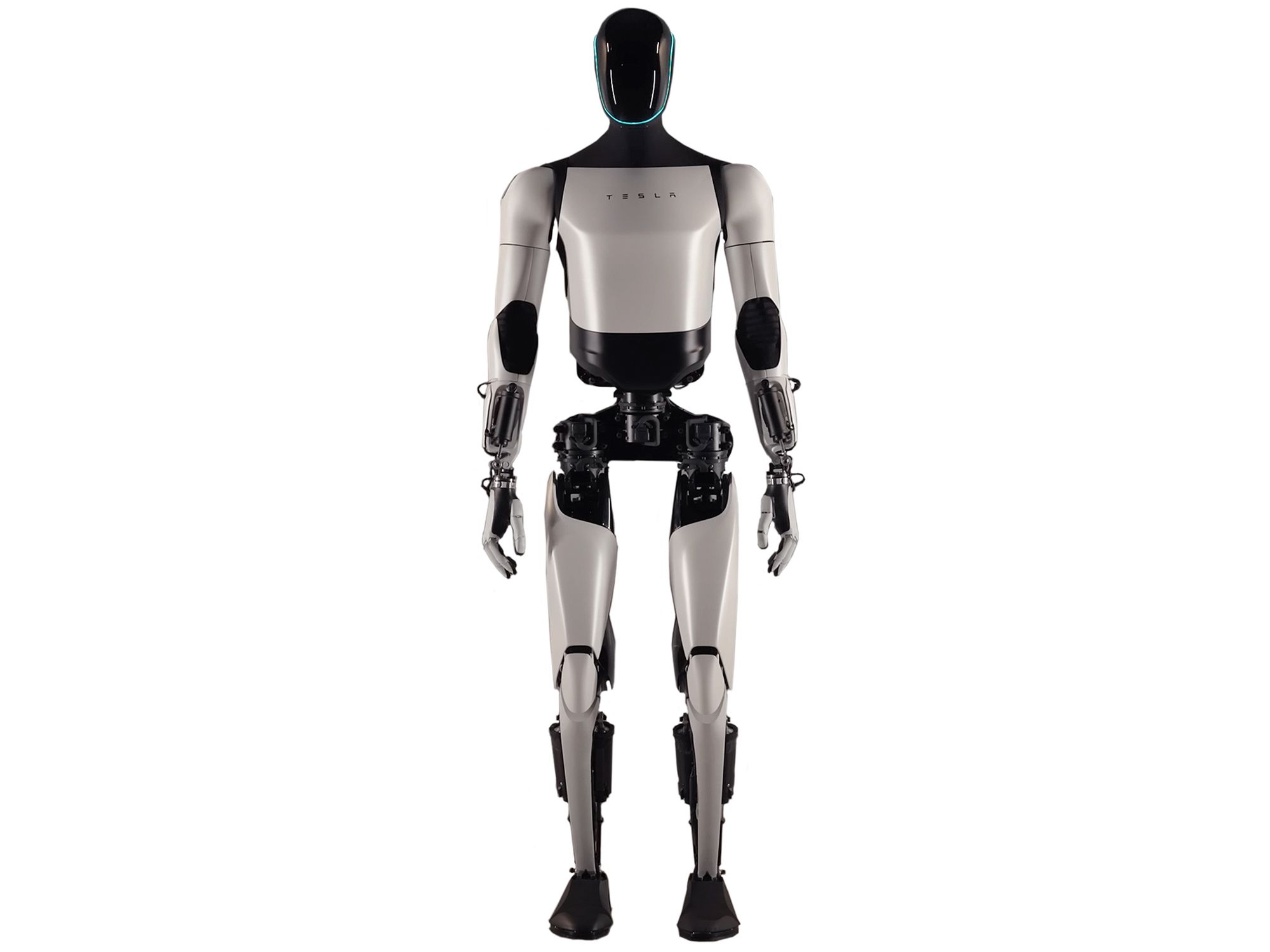
Remote images use absolute URLs, while local images in Next.js usually go under public/images and are referenced from the site root (for example /images/teslabot.jpg). Download a Tesla Bot picture and save it as public/images/teslabot.jpg, then create Images.tsx, import it into page.tsx, and add both a remote Starship image and the local bot:
export default function Images() {
  return (
    <div id="wd-images">
      <h4>Image tag</h4>
      Loading an image from the internet:
      <br />
      <img
        id="wd-starship"
        width="400px"
        alt="Starship"
        src="https://www.staradvertiser.com/wp-content/uploads/2021/08/web1_Starship-gap2.jpg"
      />
      <br />
      Loading a local image:
      <br />
      <img
        id="wd-teslabot"
        src="/images/teslabot.jpg"
        height="200px"
        alt="Tesla Bot (Optimus) humanoid robot"
      />
    </div>
  );
}
Two images stack in the page flow, Starship from a remote URL, then Tesla Bot from /images/teslabot.jpg in your public folder:
Image tag
Loading an image from the internet:
Loading a local image:
1.3.6 Creating Web Forms
SlidesThe <form> tag is different from the static markup so far — headings, paragraphs, lists, tables, and images that the browser displays. Forms let users interact with the interface, in particular to enter data such as a username, password, biography, or preferred options. That input is what applications later validate, store, or send to a server for long term storage and later retrieval.
The following sections present several kinds of input, each in turn: text fields, multi-line text areas, radio buttons, checkboxes, dropdowns, typed inputs such as email, number, range, and date, and buttons that save or cancel. A <form> wraps those controls — <input>, <textarea>, <select>, <button>, and related options — so users can fill in and submit information as one unit.
Until now each Lab 1 topic was a single file next to page.tsx. Forms is a cluster of related components — enough that dumping them all in app/labs/lab1/ would bury the rest of the lab. Put the form work in its own folder, app/labs/lab1/forms/, so related files sit together and the lab folder stays easy to browse. That folder is only for organization: do not add a page.tsx inside it, or Next.js would create a /labs/lab1/forms route. Inside the folder, files still import each other the same way (import TextFields from "./TextFields"). From page.tsx you reach one level down: import Forms from "./forms/Forms".
Each form topic lives in its own file under that folder — for example TextFields.tsx, Textarea.tsx, and so on.Forms.tsx assembles them, and page.tsx imports Forms.
1.3.6.1 Text Fields
The <input> tag is the most common way to collect short strings such as usernames, passwords, names, and similar values.
In React, form fields come in two flavors. An uncontrolled input gets an initial value and then the browser owns what the user types — React does not track every keystroke — while a controlled input is the opposite: React state holds the current text, and every change goes through onChange so your code stays in sync. For these early HTML labs, stay uncontrolled with defaultValue; controlled inputs return when you learn state in later chapters — if you set value without that state wiring, the field looks frozen because React keeps forcing the same text back onto the input. Later chapters discuss controlled inputs in detail.
Useful attributes include:
id— a unique identifier for the field so CSS, JavaScript, and other elements can refer to it.type— kind of input such astext,password,email,date,number,range, etc. The default istextso if you want a simple single-line text, omit it (or usetype="text"). Usetype="password"to mask characters as the user types. Later sections introduce other types such asemailanddate.placeholder— hint text shown inside an empty field (for examplejdoe). It disappears when the user starts typing and is not submitted as the field's value.title— advisory text, often shown as a tooltip on hover. Useful for extra guidance beyond the caption next to the field.defaultValue— initial text for an uncontrolled field; the user can edit freely afterward. Prefer this for this chapter.value— current text for a controlled field (paired with state andonChange). Skip it for now.
Beside each field, add a <label> element for the visible caption (for example "Username:"). Give the label a htmlFor attribute whose value matches the input's id. That links the two. Clicking the label focuses the field, and screen readers can announce the connection. In plain HTML the attribute is named for; in JSX it must be htmlFor because for is a reserved word in JavaScript.
Associating labels this way is good practice because it enlarges the clickable area — especially on small mobile screens, where tapping the label text is often easier than hitting a narrow input. Later examples with radio buttons and checkboxes make the point even clearer. Their controls are tiny, so being able to tap the adjacent label text is a real usability win.
Create app/labs/lab1/forms/TextFields.tsx with labeled text inputs for username, password, and name fields. The component returns a fragment (<>…</>) — a React wrapper that groups several sibling tags without adding an extra <div> to the DOM:
export default function TextFields() {
  return (
    <>
      <h5>Text Fields</h5>
      <label htmlFor="wd-text-fields-username">Username:</label>
      <input placeholder="jdoe" id="wd-text-fields-username" /> <br />
      <label htmlFor="wd-text-fields-password">Password:</label>
      <input
        type="password"
        defaultValue="123@#$asd"
        id="wd-text-fields-password"
      />
      <br />
      <label htmlFor="wd-text-fields-first-name">First name:</label>
      <input type="text" title="John" id="wd-text-fields-first-name" />{" "}
      <br />
      <label htmlFor="wd-text-fields-last-name">Last name:</label>
      <input
        type="text"
        placeholder="Doe"
        defaultValue="Wonderland"
        title="The last name"
        id="wd-text-fields-last-name"
      />
    </>
  );
}
Try clicking a label to focus its field, hover for title tooltips, type in the Username field and notice the placeholder text disappears, and notice the password hides its value while last name shows the default value Wonderland:
Text Fields
Wire TextFields into a new app/labs/lab1/forms/Forms.tsx that wraps everything in #wd-forms and a <form id="wd-text-fields">. Leave room for the later form components:
import TextFields from "./TextFields";

export default function Forms() {
  return (
    <div id="wd-forms">
      <h4>Form Elements</h4>
      <form id="wd-text-fields">
        <TextFields />
        {/* add the next form components here */}
      </form>
    </div>
  );
}
Then import Forms into page.tsx from the new folder — import Forms from "./forms/Forms" — not the same one-level ./HeadingTags path as the earlier Lab 1 components.
1.3.6.2 Textarea
Use <textarea> for longer multi-line text such as a biography. Unlike the void <input> (§1.3.5 /§1.3.6.1), a textarea is not void in HTML — it has an opening and closing tag, and the browser uses the text between those tags as the starting value:
<textarea id="wd-textarea" cols="30" rows="10">
Lorem ipsum dolor sit amet...
</textarea>
That HTML pattern does not carry over to JSX. React models every form field the same way it models <input>, so the current text is a prop (defaultValue or value), not child nodes. Through React 18, body text still rendered and you only got a development warning; React 19, which this course uses, throws: Use the defaultValue or value props instead of setting children on <textarea>. Put the biography on defaultValue instead — the same idea as on <input>, and what Lab 1 uses.
Create Textarea.tsx in the same forms folder, with the cols and rows attributes for the visible size:
export default function Textarea() {
  return (
    <>
      <h5>Text boxes</h5>
      <label>Biography:</label>
      <br />
      <textarea
        id="wd-textarea"
        cols={30}
        rows={10}
        defaultValue="Lorem ipsum dolor sit amet, consectetur adipiscing elit, sed do eiusmod tempor incididunt ut labore et dolore magna aliqua. Ut enim ad minim veniam, quis nostrud exercitation ullamco laboris nisi ut aliquip ex ea commodo consequat. Duis aute irure dolor in reprehenderit in voluptate velit esse cillum dolore eu fugiat nulla pariatur. Excepteur sint occaecat cupidatat non proident, sunt in culpa qui officia deserunt mollit anim id est laborum."
      />
    </>
  );
}
A multi-line box appears with room for longer text — taller and wider than a single-line input, sized by rows and cols:
Text boxes
Import Textarea into Forms.tsx the same way you imported TextFields, and place <Textarea /> inside the form.
1.3.6.3 Radio Buttons
The <input type="radio"> tag lets the user pick one option from a set, so choices in the same group are mutually exclusive — selecting the Comedy option clears the Drama option. The browser groups radios that share the same name attribute: give each option its own id (and usually a value when you submit the form later), but reuse one name for the whole group.
Create RadioButtons.tsx in forms with a favorite-genre radio group. Here each caption sits next to its input and uses htmlFor to match the input's id:
export default function RadioButtons() {
  return (
    <>
      <h5 id="wd-radio-buttons">Radio buttons</h5>
      <label>Favorite movie genre:</label>
      <br />
      <input type="radio" name="radio-genre" id="wd-radio-comedy" />
      <label htmlFor="wd-radio-comedy">Comedy</label>
      <br />
      <input type="radio" name="radio-genre" id="wd-radio-drama" />
      <label htmlFor="wd-radio-drama">Drama</label>
      <br />
      <input type="radio" name="radio-genre" id="wd-radio-scifi" />
      <label htmlFor="wd-radio-scifi">Science Fiction</label>
      <br />
      <input type="radio" name="radio-genre" id="wd-radio-fantasy" />
      <label htmlFor="wd-radio-fantasy">Fantasy</label>
    </>
  );
}
Four genre radios share one name, so picking Comedy clears Drama — only one choice stays selected:
Radio buttons
Import RadioButtons into Forms.tsx and add <RadioButtons /> inside the form.
Mutual exclusion applies within a name group, not across the whole page. Add a second independent choice to the same file — for example how often someone watches movies — with a different name for the second set. Selecting Weekly does not clear Comedy, because radio-frequency and radio-genre are separate groups:
export default function RadioButtons() {
  return (
    <>
      <h5 id="wd-radio-buttons">Radio buttons</h5>
      <label>Favorite movie genre:</label>
      <br />
      <input type="radio" name="radio-genre" id="wd-radio-comedy" />
      <label htmlFor="wd-radio-comedy">Comedy</label>
      <br />
      <input type="radio" name="radio-genre" id="wd-radio-drama" />
      <label htmlFor="wd-radio-drama">Drama</label>
      <br />
      <input type="radio" name="radio-genre" id="wd-radio-scifi" />
      <label htmlFor="wd-radio-scifi">Science Fiction</label>
      <br />
      <input type="radio" name="radio-genre" id="wd-radio-fantasy" />
      <label htmlFor="wd-radio-fantasy">Fantasy</label>
      <br />
      <label>How often do you watch movies?</label>
      <br />
      <input type="radio" name="radio-frequency" id="wd-radio-daily" />
      <label htmlFor="wd-radio-daily">Daily</label>
      <br />
      <input type="radio" name="radio-frequency" id="wd-radio-weekly" />
      <label htmlFor="wd-radio-weekly">Weekly</label>
      <br />
      <input type="radio" name="radio-frequency" id="wd-radio-rarely" />
      <label htmlFor="wd-radio-rarely">Rarely</label>
    </>
  );
}
Two groups, two names: pick a genre and a frequency and both selections stay selected at once:
Radio buttons
Labels work with radios in two common ways. You already used the first: keep the <input> and <label> as siblings and connect them with htmlFor / id. Alternatively, wrap the input inside the label — then you can omit htmlFor and id, because nesting creates the association. Wrapping is compact; separate labels are more flexible when the caption and control are not next to each other (for example labels in one column and radios in another). Clicking either the text or the circle still selects the option. Illustrative — optional to add to your project:
{/* Sibling label + htmlFor */}
<input type="radio" name="radio-beside" id="wd-radio-beside-yes" />
<label htmlFor="wd-radio-beside-yes">Yes</label>

{/* Wrapping label — no htmlFor needed */}
<label>
  <input type="radio" name="radio-wrap" /> Yes
</label>

{/* Separate placement still works with htmlFor */}
<label htmlFor="wd-radio-distant-a">Option A</label>
{/* ... elsewhere in the layout ... */}
<input type="radio" name="radio-distant" id="wd-radio-distant-a" />
Same radios, three label styles — click the label text in each row and the matching radio should select:
Label next to the input (uses htmlFor)
Label wrapping the input (no htmlFor needed)
Separate label and input (not side by side)
With htmlFor, the caption and control do not have to sit next to each other:
For Lab 1, keep both groups in RadioButtons.tsx with sibling labels and htmlFor. The other label patterns are here so you understand how grouping and labeling work when you design denser layouts later.
1.3.6.4 Checkboxes
The <input type="checkbox"> tag uses the same label pattern as radio buttons, but each box can be selected independently. Unlike radios, choosing Comedy does not clear Drama — the user can pick several genres at once. Create Checkboxes.tsx:
export default function Checkboxes() {
  return (
    <>
      <h5 id="wd-checkboxes">Checkboxes</h5>
      <label>Favorite movie genre:</label>
      <br />
      <input type="checkbox" name="check-genre" id="wd-chkbox-comedy" />
      <label htmlFor="wd-chkbox-comedy">Comedy</label>
      <br />
      <input type="checkbox" name="check-genre" id="wd-chkbox-drama" />
      <label htmlFor="wd-chkbox-drama">Drama</label>
      <br />
      <input type="checkbox" name="check-genre" id="wd-chkbox-scifi" />
      <label htmlFor="wd-chkbox-scifi">Science Fiction</label>
      <br />
      <input type="checkbox" name="check-genre" id="wd-chkbox-fantasy" />
      <label htmlFor="wd-chkbox-fantasy">Fantasy</label>
    </>
  );
}
Unlike radios, each box is independent — Comedy and Drama can both stay checked:
Checkboxes
Import Checkboxes into Forms.tsx and add <Checkboxes /> inside the form.
1.3.6.5 Dropdowns
Use <select> when the user can pick from a fixed list of choices. Each choice is rendered as an <option> inside that list. The text between the option tags is what people see (for example "Science Fiction"); the value attribute is what the form actually records when that option is selected and is what would be sent to the server.
Option values are typically short tokens — stable identifiers that match something in a database, an API, or application logic — rather than the display label. They are often written in capitals (for example SCIFI, COMEDY) so they read clearly as codes, not prose. The visible label can stay human-friendly and even change later without breaking stored data.
On the <select> itself, the defaultValue attribute sets the initial selection (uncontrolled, as with text fields). That value must match one of the option values — for example defaultValue="SCIFI" selects the Science Fiction option. Prefer defaultValue here; controlled value + state comes later.
Start Dropdowns.tsx with a single-choice list:
export default function Dropdowns() {
  return (
    <>
      <h4 id="wd-dropdowns">Dropdowns</h4>
      <h5>Select one</h5>
      <label htmlFor="wd-select-one-genre">Favorite movie genre: </label>
      <br />
      <select id="wd-select-one-genre" defaultValue="SCIFI">
        <option value="COMEDY">Comedy</option>
        <option value="DRAMA">Drama</option>
        <option value="SCIFI">Science Fiction</option>
        <option value="FANTASY">Fantasy</option>
      </select>
    </>
  );
}
A compact dropdown opens to the genre list; Science Fiction starts selected because defaultValue matches SCIFI:
Dropdowns
Select one
Sometimes the user needs more than one selection from the same list, which you enable by adding the multiple attribute to the <select>. Then defaultValue (or value) can be an array of tokens — for example defaultValue={["COMEDY", "SCIFI"]} — so more than one option starts selected.
In the browser, use Shift to select a contiguous range of options, and Command (macOS) or Control (Windows / Linux) to add or remove individual options without clearing the rest.
Extend Dropdowns.tsx with a second list for selecting many genres:
export default function Dropdowns() {
  return (
    <>
      <h4 id="wd-dropdowns">Dropdowns</h4>
      <h5>Select one</h5>
      <label htmlFor="wd-select-one-genre">Favorite movie genre: </label>
      <br />
      <select id="wd-select-one-genre" defaultValue="SCIFI">
        <option value="COMEDY">Comedy</option>
        <option value="DRAMA">Drama</option>
        <option value="SCIFI">Science Fiction</option>
        <option value="FANTASY">Fantasy</option>
      </select>
      <h5>Select many</h5>
      <label htmlFor="wd-select-many-genre">Favorite movie genres: </label>
      <br />
      <select
        multiple
        id="wd-select-many-genre"
        defaultValue={["COMEDY", "SCIFI"]}
      >
        <option value="COMEDY">Comedy</option>
        <option value="DRAMA">Drama</option>
        <option value="SCIFI">Science Fiction</option>
        <option value="FANTASY">Fantasy</option>
      </select>
    </>
  );
}
The multi list shows several options at once, with Comedy and Science Fiction preselected. Shift- and Command-/Control-click to change the set:
Dropdowns
Select one
Select many
Import Dropdowns into Forms.tsx and add <Dropdowns /> inside the form.
1.3.6.6 Other Field Types
Plain type="text" accepts almost any string. HTML also provides strongly typed input types that expect a particular kind of data — email addresses, numbers, dates, and more. Prefer these when you can. They nudge users toward valid input (and on phones often show a specialized keyboard), help the browser validate before submit, and reduce mistakes you would otherwise catch only in JavaScript later.
Build them one at a time in OtherFieldTypes.tsx, then import that component into Forms.tsx.
Use type="email" for email addresses. Browsers check for a basic address shape (something like name@domain), and on many mobile devices the on-screen keyboard emphasizes @ and . so typing an address is easier than with a full text keyboard.
export default function OtherFieldTypes() {
  return (
    <>
      <h4>Other HTML field types</h4>
      <label htmlFor="wd-text-fields-email">Email: </label>
      <input
        type="email"
        placeholder="jdoe@somewhere.com"
        id="wd-text-fields-email"
      />
      <br />
    </>
  );
}
An email field with a sample placeholder — on a phone (or emulator), tap it and notice the keyboard emphasizes @ and .:
Other HTML field types
Number
Use type="number" for numeric values such as a salary. On many mobiles the field brings up a numeric keypad. The optional attributes min and max limit the allowed range (for example min={0} to reject negative salaries), and some browsers also provide step buttons for incrementing the value.
export default function OtherFieldTypes() {
  return (
    <>
      <h4>Other HTML field types</h4>
      <label htmlFor="wd-text-fields-email">Email: </label>
      <input
        type="email"
        placeholder="jdoe@somewhere.com"
        id="wd-text-fields-email"
      />
      <br />
      <label htmlFor="wd-text-fields-salary-start">Starting salary: </label>
      <input
        type="number"
        defaultValue="100000"
        placeholder="1000"
        min={0}
        id="wd-text-fields-salary-start"
      />
      <br />
    </>
  );
}
Email plus a number field for starting salary — steppers or a numeric keypad often appear, and min={0} blocks negatives:
Other HTML field types
Range
Use type="range" for a value chosen along a continuum — ratings, volume, or similar. It renders as a slider. Pair it with min, max, and often defaultValue (or value) so the thumb starts in a sensible place. Here a rating runs from 1 to 5 with a default of 4.
export default function OtherFieldTypes() {
  return (
    <>
      <h4>Other HTML field types</h4>
      {/* ... email and number fields ... */}
      <label htmlFor="wd-text-fields-rating">Rating: </label>
      <input
        type="range"
        defaultValue="4"
        min="1"
        max="5"
        id="wd-text-fields-rating"
      />
      <br />
    </>
  );
}
A slider joins the typed fields — drag it and it stays between 1 and 5:
Other HTML field types
Date
Use type="date" for calendar dates. The value uses a fixed YYYY-MM-DD format (year-month-day), even if the browser displays dates according to the user's locale. On many phones, tapping the field opens a native date picker rather than a text keyboard — another reason typed fields reduce entry mistakes. min and max (also in YYYY-MM-DD form) restrict which dates are allowed.
export default function OtherFieldTypes() {
  return (
    <>
      <h4>Other HTML field types</h4>
      <label htmlFor="wd-text-fields-email">Email: </label>
      <input
        type="email"
        placeholder="jdoe@somewhere.com"
        id="wd-text-fields-email"
      />
      <br />
      <label htmlFor="wd-text-fields-salary-start">Starting salary: </label>
      <input
        type="number"
        defaultValue="100000"
        placeholder="1000"
        min={0}
        id="wd-text-fields-salary-start"
      />
      <br />
      <label htmlFor="wd-text-fields-rating">Rating: </label>
      <input
        type="range"
        defaultValue="4"
        min="1"
        max="5"
        id="wd-text-fields-rating"
      />
      <br />
      <label htmlFor="wd-text-fields-dob">Date of birth: </label>
      <input
        type="date"
        defaultValue="2000-01-21"
        min="1900-01-01"
        max="2025-12-31"
        id="wd-text-fields-dob"
      />
      <br />
    </>
  );
}
The full set includes a date of birth control — open it and try a day outside the min/max range if your browser enforces those bounds:
Other HTML field types
HTML defines many more input types than this lab covers. Explore these on your own when you need them:
tel— telephone numbers (mobile phone keypad)url— web addressessearch— search boxes (often with clear affordances)time,datetime-local,month,week— other date/time pickerscolor— color pickerfile— file uploadhidden— values included on submit but not shown
MDN's documentation for the <input> element is a good place to browse the full list and try examples in the browser.
Import OtherFieldTypes into Forms.tsx and add <OtherFieldTypes /> inside the form. Buttons come next, then the completed Forms.tsx.
1.3.6.7 Buttons
The <button> tag gives a form a way to submit or cancel. Prefer it over <input type="submit"> or <input type="button">, because the label is nested text (so later you can put an icon inside) and the type attribute says what the click should do.
Always write type explicitly. Inside a <form>, a <button> with no type defaults to submit and the browser sends the form — which reloads the page unless you stop it. Use type="submit" for Save (or Sign in). Use type="button" for Cancel and for every Kambaz action that is not sending a form — Go, Publish, + Assignment, and the rest in §1.4.3.
Create Buttons.tsx with both kinds:
export default function Buttons() {
  return (
    <>
      <h4>Buttons</h4>
      <button id="wd-html-button-save" type="submit">
        Save
      </button>
      <button id="wd-html-button-cancel" type="button">
        Cancel
      </button>
    </>
  );
}
Save submits the form; Cancel does not:
Buttons
Import Buttons into Forms.tsx. Clicking Save would reload Lab 1 (and this book page) unless the form stops that default. The onSubmit handler below is a sneak preview of event handling from later chapters: event.preventDefault() keeps you on the page so the live demo is safe to click. Because the handler is a function, the file must start with "use client" — Server Components cannot pass event handlers. Chapter 3 explains that directive; for now it is the switch that makes Save work without a reload. When all field components are wired in, Forms.tsx should look like this:
"use client";

import TextFields from "./TextFields";
import Textarea from "./Textarea";
import RadioButtons from "./RadioButtons";
import Checkboxes from "./Checkboxes";
import Dropdowns from "./Dropdowns";
import OtherFieldTypes from "./OtherFieldTypes";
import Buttons from "./Buttons";

export default function Forms() {
  return (
    <div id="wd-forms">
      <h4>Form Elements</h4>
      <form
        id="wd-text-fields"
        onSubmit={(event) => {
          event.preventDefault();
        }}
      >
        <TextFields />
        <Textarea />
        <RadioButtons />
        <Checkboxes />
        <Dropdowns />
        <OtherFieldTypes />
        <Buttons />
      </form>
    </div>
  );
}
All the field components assemble into one form — text, textarea, radios, checkboxes, dropdowns, typed inputs, and buttons in order. Click Save here; the page should stay put:
Form Elements
1.3.7 Parameterizing Components with Props
Since §1.3.1 you have been configuring HTML tags with attributes — id, then src/alt on images, type/name on form controls, and more. Your own React components can accept values the same way; in React those values are called props (short for properties). You declare them as parameters on the function, then pass them as attributes when you use the component — including the paragraph text itself via a text prop. Stay with self-closing tags for now; nested content and children come in the next section.
To make the highlight visible we need a little styling. This chapter is about HTML structure, not CSS — so treat the inline style object below as a sneak preview. Those property names (backgroundColor, borderColor, borderWidth, borderRadius) are CSS written in JavaScript camelCase.Chapter 2 covers CSS in detail; for now just copy the pattern and focus on how props flow into the component.
Create HighlightedParagraph.tsx. Define a component that takes text, backgroundColor, borderColor, borderWidth, and borderRadius as props, applies the styles on a <p>, and displays text. Show a few variations with different attribute values and import the lab into page.tsx:
function HighlightedParagraph({
  text = "This paragraph is highlighted using component props.",
  backgroundColor = "lightyellow",
  borderColor = "orange",
  borderWidth = 2,
  borderRadius = 8,
}: {
  text?: string;
  backgroundColor?: string;
  borderColor?: string;
  borderWidth?: string | number;
  borderRadius?: string | number;
}) {
  return (
    <p
      style={{
        backgroundColor,
        borderColor,
        borderWidth,
        borderStyle: "solid",
        borderRadius,
        padding: "0.5rem 0.75rem",
      }}
    >
      {text}
    </p>
  );
}

export default function HighlightedParagraphLab() {
  return (
    <div id="wd-highlighted-paragraph">
      <h3>Highlighted Paragraph</h3>
      <HighlightedParagraph text="Default highlight: light yellow background, orange border." />
      <HighlightedParagraph
        text="Custom props: light blue background, navy border, thicker width, more rounding."
        backgroundColor="lightblue"
        borderColor="navy"
        borderWidth={4}
        borderRadius={16}
      />
      <HighlightedParagraph
        text="Another variation: misty rose background, crimson border, square corners."
        backgroundColor="#ffe4e1"
        borderColor="crimson"
        borderWidth="3px"
        borderRadius="0px"
      />
    </div>
  );
}
Three highlighted paragraphs, each with different style props — change a color or radius in the code and that paragraph updates:
Highlighted Paragraph
Default highlight: light yellow background, orange border.
Custom props: light blue background, navy border, thicker width, more rounding.
Another variation: misty rose background, crimson border, square corners.
1.3.8 Wrapping Content with Children
In §1.3.7 every value — including the paragraph wording — arrived as an attribute. That works for a string, but not when you want to wrap arbitrary markup (headings, paragraphs, lists, and so on). In React, content nested between a component's opening and closing tags arrives as the special prop children. That is how you build reusable wrappers.
Create HighlightedBox.tsx with the same style props as HighlightedParagraph, but drop text. Render a <div> that displays children instead. Import it into page.tsx after the paragraph lab:
import type { ReactNode } from "react";

function HighlightedBox({
  backgroundColor = "lightyellow",
  borderColor = "orange",
  borderWidth = 2,
  borderRadius = 8,
  children,
}: {
  backgroundColor?: string;
  borderColor?: string;
  borderWidth?: string | number;
  borderRadius?: string | number;
  children?: ReactNode;
}) {
  return (
    <div
      style={{
        backgroundColor,
        borderColor,
        borderWidth,
        borderStyle: "solid",
        borderRadius,
        padding: "0.75rem 1rem",
        marginBottom: "0.75rem",
      }}
    >
      {children}
    </div>
  );
}

export default function HighlightedBoxLab() {
  return (
    <div id="wd-highlighted-box">
      <h3>Highlighted Box</h3>
      <HighlightedBox
        backgroundColor="lavender"
        borderColor="purple"
        borderWidth={3}
        borderRadius={12}
      >
        <h4>Callout</h4>
        <p>
          This box wraps <strong>any</strong>{" "}children — headings, paragraphs,
          lists, and more.
        </p>
        <ul>
          <li>backgroundColor</li>
          <li>borderColor</li>
          <li>borderWidth</li>
          <li>borderRadius</li>
        </ul>
      </HighlightedBox>
      <HighlightedBox
        backgroundColor="#e8f5e9"
        borderColor="green"
        borderWidth={2}
        borderRadius={20}
      >
        <p>
          A second box with different style props wrapping different content.
        </p>
      </HighlightedBox>
    </div>
  );
}
Two boxes share the same wrapper idea: border and background stay with the box, while nested headings, paragraphs, and lists (the children) differ — the pattern layouts reuse in §1.3.11:
Highlighted Box
Callout
This box wraps any children — headings, paragraphs, lists, and more.
- backgroundColor
- borderColor
- borderWidth
- borderRadius
A second box with different style props wrapping different content.
1.3.9 Implementing Navigation with the Anchor Tag
SlidesThe <a> tag creates hyperlinks — the ability to navigate from one document on the Web to another, or to a specific place within a document. The "Hyper" in HyperText Markup Language refers to that idea. Its href attribute, short for hypertext reference, holds the destination address the browser should load or jump to when the user follows the link.
The shape of href matters:
- Absolute URL — a full address including the scheme and host, such as
https://www.lipsum.comorhttps://github.com/…. Use this for other websites. - Relative URL — a path on the same site, such as
/labsor/labs/lab1. The browser resolves it against the current origin (for example http://localhost:3000). - Fragment (hash) — a leading
#plus an elementid, such as#wd-anchor-bottom. That scrolls to a target on the same page without loading a new document. Fragments are classic in-page navigation; they are not the same as navigating to a different route.
Optional attributes refine how the link behaves. The target attribute set to "_blank" opens the destination in a new browser tab or window — useful for external sites so users do not lose your app. When you use target="_blank", also set rel="noreferrer" (or at least noopener) so the new page cannot access window.opener — a small but important security habit.
Create AnchorTag.tsx, import it into page.tsx, and add a lipsum link plus a GitHub link with id wd-github:
export default function AnchorTag() {
  return (
    <>
      <h4>Anchor tag</h4>
      Please{" "}
      <a href="https://www.lipsum.com" id="wd-lipsum">
        click here
      </a>{" "}
      to get dummy text
      <br />
      <a href="https://github.com/jannunzi" id="wd-github">
        GitHub
      </a>
    </>
  );
}
Lipsum and GitHub appear as ordinary links — a plain <a> triggers a normal browser navigation (full page load for a new document):
The following demo is illustrative — try absolute, relative, hash, and target="_blank" links. Your Lab 1 file only needs the lipsum and GitHub anchors above.
{/* Absolute — another site */}
<a href="https://www.lipsum.com">lipsum.com</a>

{/* Relative — same site */}
<a href="/labs">Back to Labs</a>

{/* Fragment — same page, scroll to id */}
<a href="#wd-anchor-bottom">Jump to bottom</a>

{/* New tab + safer external link */}
<a
  href="https://github.com/jannunzi"
  target="_blank"
  rel="noreferrer"
>
  GitHub (new tab)
</a>
Absolute, relative, hash, and new-tab patterns side by side — use the hash link to jump within the demo without leaving the page:
Absolute URL (another site)
lipsum.comRelative URL (same site)
Back to LabsSame-page fragment (hash)
Jump to bottom of this demoOpen in a new tab
GitHub (new tab)You landed on this paragraph via the hash link above (#wd-anchor-bottom).
1.3.10 Implementing Navigation
SlidesRecall from the chapter introduction: a Single Page Application (SPA) keeps one HTML shell loaded and updates the UI as the user moves around, instead of downloading a brand-new page for every click. Next.js apps are built that way for in-app routes: navigating from Labs to Lab 1 should feel instant, without flashing a full reload.
In §1.2.5 you defined routes by adding page.tsx files under app/ (the App Router). Navigation is how the user moves between those routes. Historically, some SPAs used the URL hash (#/lab1) for client-side routes, because changing the fragment does not reload the document. That trick enabled early SPA navigation, but it is not how the App Router works. Today Next.js uses the browser History API so paths like /labs/lab1 update without a full reload — and without requiring a # prefix. Reserve hash fragments for in-page jumps (as in§1.3.9), not for app routes in this course.
A plain <a href="/labs/lab1"> still works, but it tells the browser to treat the click as a normal document request. Inside a Next.js app, prefer the built-in Link component from next/link. Link renders an anchor under the hood, yet intercepts navigation so React can swap in the next route's UI, prefetch linked pages when helpful, and keep client state where appropriate. Use <a> for true external URLs (or when you explicitly want a full reload); use Link for routes you already created with page.tsx.
Create Lab 2 and Lab 3 as new App Router routes (app/labs/lab2/page.tsx and app/labs/lab3/page.tsx — simple headings are enough), then a Labs index at app/labs/page.tsx that links to each lab with Link:
import Link from "next/link";

export default function Labs() {
  return (
    <div id="wd-labs">
      <h1>Labs</h1>
      <ul>
        <li>
          <Link href="/labs/lab1">Lab 1: HTML Examples</Link>
        </li>
        <li>
          <Link href="/labs/lab2">Lab 2: CSS Basics</Link>
        </li>
        <li>
          <Link href="/labs/lab3">Lab 3: JavaScript Fundamentals</Link>
        </li>
      </ul>
    </div>
  );
}
A Labs index lists Lab 1–3. In the running app, clicking a link changes the URL to a path such as /labs/lab1 without the full-page flash a raw external <a> would cause:
1.3.11 Implementing Layouts
In the App Router, page.tsx creates a route (§1.2.5); another reserved filename is layout.tsx, which does not create its own URL by itself. Instead it wraps the page.tsx (and nested layouts) in the same folder and below, so shared chrome — navigation, sidebars, headers — belongs in a layout and every child route gets it without copying markup into each page.
Nested folders nest layouts too. The root app/layout.tsx wraps the whole app; app/labs/layout.tsx wraps only routes under /labs. When you open Lab 1, Next.js renders the lab layout around the Lab 1 page.
Layouts receive a prop named children — the same wrapping idea you practiced with HighlightedBox in §1.3.8. You do not pass the page in by hand — the framework renders the matching page.tsx (and nested UI) into children for you. Create app/labs/TOC.tsx for a small table of contents, then app/labs/layout.tsx that places the TOC beside children:
import { ReactNode } from "react";
import TOC from "./TOC";

export default function LabsLayout({
  children,
}: Readonly<{ children: ReactNode }>) {
  return (
    <table>
      <tbody>
        <tr>
          <td valign="top" width="100px">
            <TOC />
          </td>
          <td valign="top">{children}</td>
        </tr>
      </tbody>
    </table>
  );
}
With the TOC on the left and page content on the right, the sidebar stays put while the main area (children) swaps as you open different labs:
1.3.12 Exercises
Use this checklist to confirm Lab 1 covers every HTML topic in §1.3. It is the same list, in the same order, as the A1 Lab checklist on A1 — one top-level item per Lab section, with nested a / b / c for the Lab component, On your own, and With AI extra, walking §1.3.1–§1.3.11 as you read. Each parent points back to the section where you built the worked example. When you are done, app/labs/lab1/page.tsx should import and render the components in order so the page matches the live demo below.
- HeadingTags (§1.3.1)
- Lab component — Create HeadingTags.tsx from the book sample (h4 "Heading Tags" and its paragraph). Before With AI, add h1–h6 as practice without erasing that sample text, and import the component on the Lab 1 page.
- On your own — Personal heading under wd-your-heading, including a span with id wd-your-span.
- With AI — After the practice h1–h6 headings you added, add a sample outline with id wd-ai-headings (h4 Lab notes, h5 What I built, h6 Next step). Keep the book sample text.
- ParagraphTag (§1.3.2)
- Lab component — Create ParagraphTag.tsx and wrap sample text in paragraph tags for vertical spacing.
- On your own — Two personal paragraphs with ids wd-p-your-1 and wd-p-your-2.
- With AI — Extra sample paragraph with id wd-ai-p that explains why wrapping text in p creates vertical spacing.
- ListTags (§1.3.3)
- Lab component — Create ListTags.tsx with the pancake ordered list and the sample book unordered list.
- On your own — Favorite recipe ordered list (wd-your-favorite-recipe) and favorites unordered list (wd-your-books).
- With AI — Sample HTML-tags list with id wd-ai-html-tags (at least five tags from this chapter).
- Tables (§1.3.4)
- Lab component — Create Tables.tsx with the quiz grades table (Q1–Q3) and an average row.
- On your own — Second personal table with id wd-your-table.
- With AI — Quiz rows Q4–Q10 in the sample grades table, with a recalculated average from all ten scores.
- Images (§1.3.5)
- Lab component — Create Images.tsx with the remote Starship image and the local teslabot image.
- On your own — Your image with id wd-your-image.
- With AI — Extra sample image with id wd-ai-image from a public URL.
- Forms (§1.3.6)
- Lab component — Build the form components under app/labs/lab1/forms/ (text, textarea, radio, checkboxes, dropdowns, other types, buttons) and assemble them in Forms.tsx.
- On your own — Student Profile form in the single canonical app/labs/lab1/forms/YourForm.tsx with id wd-your-form covering the field types from the chapter, plus Save and Cancel — overwrite that same path and keep that same id; Forms.tsx imports that one YourForm only.
- With AI — Overwrite the same app/labs/lab1/forms/YourForm.tsx (keep id wd-your-form; no second file; Forms.tsx imports that one YourForm only), then replace every SAMPLE default with your own details.
- HighlightedParagraph (§1.3.7)
- Lab component — Create HighlightedParagraph.tsx with text and style props (attributes only) and show a few variations.
- On your own — Extra HighlightedParagraph with your text and colors.
- With AI — Extra sample HighlightedParagraph (not your personal sentence) with different colors.
- HighlightedBox (§1.3.8)
- Lab component — Create HighlightedBox.tsx that wraps nested children with the same style props.
- On your own — Extra HighlightedBox wrapping your goals list.
- With AI — Extra sample HighlightedBox of nested tags (not your personal goals list).
- AnchorTag (§1.3.9)
- Lab component — Create AnchorTag.tsx with lipsum plus GitHub anchors and import it on the Lab 1 page.
- On your own — Personal anchors wd-your-link and wd-your-github.
- With AI — Sample docs link with id wd-ai-link (for example MDN table element).
- Labs navigation (§1.3.10)
- Lab component — Labs index at app/labs/page.tsx lists Lab 1–3 with Link, plus a Kambaz link so graders can reach every required page.
- On your own — Create Lab 4 and link to it from the Labs index (id wd-lab4-link).
- With AI — Lab 5 placeholder page and a Labs index link to /labs/lab5.
- Labs TOC and layout (§1.3.11)
- Lab component — Create app/labs/TOC.tsx and app/labs/layout.tsx so the TOC wraps lab pages via children.
- On your own — Personal note or link in the labs TOC — your name, a one-line motto, or a link back to the book.
- With AI — Chapter 1 link in the labs TOC (id wd-toc-book-link) labeled Chapter 1.
When the checklist is done, Lab 1 should match the core HTML examples below. Your On your own additions and With AI extras appear in the same page (and Labs chrome) beyond what this demo shows. Delivery (Vercel, name, GitHub) and Kambaz screens stay on the A1 page — see §1.4.9 for the Kambaz recap.
Lab 1
HTML Examples
Heading Tags
Text documents are often broken up into several sections and subsections. Each section is usually prefaced with a short title or heading that attempts to summarize the topic of the section it precedes. For instance this paragraph is preceded by the heading Heading Tags. The font of the section headings are usually larger and bolder than their subsection headings. This document uses headings to introduce topics such as HTML Documents, HTML Tags, Heading Tags, etc. HTML heading tags can be used to format plain text so that it renders in a browser as large headings. There are 6 heading tags for different sizes: h1, h2, h3, h4, h5, and h6. Tag h1 is the largest heading and h6 is the smallest heading. A span sits in this sentence without starting a new line.Paragraph Tag
This is a paragraph. We often separate a long set of sentences with vertical spaces to make the text easier to read. Browsers ignore vertical white spaces and render all the text as one single set of sentences. To force the browser to add vertical spacing, wrap the paragraphs you want to separate with the paragraph tag
This is the first paragraph. The paragraph tag is used to format vertical gaps between long pieces of text like this one.
This is the second paragraph. Even though there is a deliberate white gap between the paragraph above and this paragraph, by default browsers render them as one contiguous piece of text as shown here on the right.
This is the third paragraph. Wrap each paragraph with the paragraph tag to tell browsers to render the gaps.
List Tags
Ordered List Tag
How to make pancakes:- Mix dry ingredients.
- Add wet ingredients.
- Stir to combine.
- Heat a skillet or griddle.
- Pour batter onto the skillet.
- Cook until bubbly on top.
- Flip and cook the other side.
- Serve and enjoy!
- Boil water and cook pasta until al dente.
- Sauté garlic in olive oil, then add crushed tomatoes.
- Toss pasta with sauce and top with grated Parmesan.
Unordered List Tag
My favorite books (in no particular order)- Dune
- Lord of the Rings
- Ender's Game
- Red Mars
- The Forever War
- The Pragmatic Programmer
- Clean Code
- Designing Data-Intensive Applications
Table Tag
| Quiz | Topic | Date | Grade |
|---|---|---|---|
| Q1 | HTML | 2/3/21 | 85 |
| Q2 | CSS | 2/10/21 | 90 |
| Q3 | JavaScript | 2/17/21 | 95 |
| Average | 90 | ||
Image tag
Loading an image from the internet:Loading a local image:
Form Elements
Highlighted Paragraph
Default highlight: light yellow background, orange border.
Custom props: light blue background, navy border, thicker width, more rounding.
Another variation: misty rose background, crimson border, square corners.
Highlighted Box
Callout
This box wraps any children — headings, paragraphs, lists, and more.
- backgroundColor
- borderColor
- borderWidth
- borderRadius
A second box with different style props wrapping different content.
Anchor tag
Please click here to get dummy textGitHub
When the checklist feels solid, try the self-check in §1.3.13 before you start Kambaz.
1.3.13 Check Your Understanding
Pause and test the HTML topics from this chapter. The practice quiz draws 10 items on those topics — App Router page.tsx, headings and paragraphs, lists and tables, images, form fields, radio name groups and mutual exclusion, checkbox independence, the two label patterns (htmlFor/id vs wrapping), dropdowns, buttons, props and children, Link vs <a>, and layouts. It is a self-check, not part of your course grade. Misses link back to the subsection you should reread; each new attempt draws a different 10.
1.4 Prototyping the React Kambaz User Interface with HTML
SlidesSo far the exercises in this chapter practiced HTML pieces in isolation. The following sections put those skills to work building Kambaz — a website inspired by a popular Online Learning Management System (LMS). This chapter focuses on simple prototype screens; later chapters improve the same structure with CSS, state, and data. A single coverage checklist is in §1.4.9 — use it after you have walked through the screens, not instead of building them as you read.
Do all Kambaz work under app/(kambaz). This is still the App Router from §1.2.5 — folders plus page.tsx create routes — with one new wrinkle: parentheses make a route group. A route group organizes files and layouts without appearing in the URL. A page at app/(kambaz)/dashboard/page.tsx is still the route /dashboard, not /(kambaz)/dashboard.
1.4.1 Implementing the Kambaz Landing Page
SlidesA landing page is the primary entry point of a web application — the screen for the root route /. In the App Router that is normally app/page.tsx. To keep Kambaz modular while still owning /, put that homepage inside the (kambaz) route group (app/(kambaz)/page.tsx) instead of leaving a separate root page.tsx beside the group.
Start with a minimal landing page, remove any leftover root app/page.tsx so the route group owns /, and add a Kambaz link in both the Labs TOC and the Labs index page:
export default function Kambaz() {
  return (
    <div id="wd-kambaz">
      <h1>Kambaz</h1>
    </div>
  );
}import Link from "next/link";
export default function TOC() {
return (
<ul>
<li>
<Link href="/labs" id="wd-home-link">
Home
</Link>
</li>
{/* ... lab links ... */}
<li>
<Link href="/" id="wd-kambaz-link">
Kambaz
</Link>
</li>
</ul>
);
}At http://localhost:3000 you should see the Kambaz heading and that the Labs TOC link with id wd-kambaz-link reaches it. In the next section you will change this landing page to redirect into Sign in so authentication is the default entry.
Open the live app: /account/signin (Kambaz)
1.4.2 The Kambaz Account Screens
SlidesAccount screens manage identity and personal details. Sign up registers a new user, Sign in identifies a returning user, and Profile lets them view and edit account fields. An Account Navigation sidebar keeps those screens a click apart without reloading the whole app.
1.4.2.1 The Sign In Screen
Create app/(kambaz)/account/signin/page.tsx with username and password fields plus links to Profile and Sign up. Use defaultValue for starter credentials — useful while you prototype before real authentication exists.
You will also see className on some tags (for example className="wd-username"). In plain HTML the attribute is named class; in JSX it must be className because class is a reserved word in JavaScript — the same reason labels use htmlFor instead of for. Keep these names exactly as written: automated tests (and graders) look for them to verify your markup. They can also hook up CSS later in Chapter 2; with Tailwind commented out they may not change how the page looks yet.
Create the Sign in screen as follows:
import Link from "next/link";

export default function Signin() {
  return (
    <div id="wd-signin-screen">
      <h3>Sign in</h3>
      <input
        placeholder="username"
        className="wd-username"
        defaultValue="ada"
      />{" "}
      <br />
      <input
        placeholder="password"
        type="password"
        className="wd-password"
        defaultValue="123"
      />{" "}
      <br />
      <Link href="/account/profile" id="wd-signin-btn">
        Sign in
      </Link>{" "}
      <br />
      <Link href="/account/signup" id="wd-signup-link">
        Sign up
      </Link>
    </div>
  );
}
A minimal Sign in screen: username and password with starter defaults, plus links toward Profile and Sign up:
Make Sign in the default for both /account and the Kambaz root by redirecting with redirect from next/navigation. Unlike a Link (which the user clicks), redirect runs when the route renders and immediately sends the browser to another path — useful for default screens:
import { redirect } from "next/navigation";

export default function AccountPage() {
  redirect("/account/signin");
}import { redirect } from "next/navigation";
export default function Kambaz() {
redirect("/account/signin");
}/account and / should both land on /account/signin.
1.4.2.2 The Sign Up Screen
Sign up mirrors Sign in but adds a password-verification field. Create app/(kambaz)/account/signup/page.tsx:
import Link from "next/link";

export default function Signup() {
  return (
    <div id="wd-signup-screen">
      <h3>Sign up</h3>
      <input
        placeholder="username"
        className="wd-username"
        defaultValue="ada"
      />
      <br />
      <input
        placeholder="password"
        type="password"
        className="wd-password"
        defaultValue="123"
      />
      <br />
      <input
        placeholder="verify password"
        type="password"
        className="wd-password-verify"
      />
      <br />
      <Link href="/account/profile">Sign up</Link>
      <br />
      <Link href="/account/signin">Sign in</Link>
    </div>
  );
}
Sign up mirrors Sign in but adds a second password field for verification:
1.4.2.3 The Profile Screen
Profile shows a fuller set of user fields. Reuse typed inputs from Lab 1 — date, email, and a select for role:
import Link from "next/link";

export default function Profile() {
  return (
    <div id="wd-profile-screen">
      <h3>Profile</h3>
      <input
        defaultValue="alice"
        placeholder="username"
        className="wd-username"
      />
      <br />
      <input
        defaultValue="123"
        placeholder="password"
        type="password"
        className="wd-password"
      />
      <br />
      <input defaultValue="Alice" placeholder="First Name" id="wd-firstname" />
      <br />
      <input
        defaultValue="Wonderland"
        placeholder="Last Name"
        id="wd-lastname"
      />
      <br />
      <input defaultValue="2000-01-01" type="date" id="wd-dob" />
      <br />
      <input defaultValue="alice@wonderland" type="email" id="wd-email" />
      <br />
      <select defaultValue="FACULTY" id="wd-role">
        <option value="USER">User</option>
        <option value="ADMIN">Admin</option>
        <option value="FACULTY">Faculty</option>
        <option value="STUDENT">Student</option>
      </select>
      <br />
      <Link href="/account/signin">Sign out</Link>
    </div>
  );
}
Profile collects identity fields — try the role dropdown and date of birth control:
1.4.2.4 Account Navigation
Create app/(kambaz)/account/Navigation.tsx with links to Signin, Signup, and Profile. Then wrap account routes in app/(kambaz)/account/layout.tsx using a two-column table — navigation on the left, children on the right (same layout idea as Labs in §1.3.11):
import Link from "next/link";

export default function AccountNavigation() {
  return (
    <div id="wd-account-navigation">
      <Link href="/account/signin">Signin</Link> <br />
      <Link href="/account/signup">Signup</Link> <br />
      <Link href="/account/profile">Profile</Link> <br />
    </div>
  );
}import { ReactNode } from "react";
import AccountNavigation from "./Navigation";
export default function AccountLayout({
children,
}: Readonly<{ children: ReactNode }>) {
return (
<div id="wd-kambaz-account">
<table>
<tbody>
<tr>
<td valign="top">
<AccountNavigation />
</td>
<td valign="top" width="100%">
{children}
</td>
</tr>
</tbody>
</table>
</div>
);
}Three absolute account links — Signin, Signup, and Profile — ready to sit in the layout's left column:
With the layout in place, Sign in is the default content beside the sidebar. Nav stays on the left while Sign in fills the right column — then open /account in the running app and click the sidebar so Sign up and Profile swap into that same column. /account and / should redirect to /account/signin.
For reference, here are all four account pieces side by side — nav, Sign in, Sign up, and Profile:
1.4.3 Implementing the Dashboard Screen
SlidesThe Dashboard lists courses a student is enrolled in (or a faculty member is teaching). Clicking a course navigates to that course's route. For course thumbnails, use the Next.js Image component from next/image instead of a raw <img>. It still needs src, alt, width, and height; Next.js uses those sizes for layout and optimization. For this chapter, treat Image as the preferred way to show local files under public/images/ — look images up online or generate placeholders with an AI tool. Include at least three courses.
Each course repeats the same markup — image, title, subtitle, and a Go button — so extract that block into a CourseCard component that accepts the differing values as props. Use type="button" on Go (§1.3.6.7) so the click does not try to submit a form. Keep the markup plain for now; Chapter 2 will add Tailwind classes to this same component and lay the cards out in a responsive grid.
import Link from "next/link";
import Image from "next/image";

export default function CourseCard({
  id,
  title,
  subtitle,
  image,
}: {
  id: string;
  title: string;
  subtitle: string;
  image: string;
}) {
  return (
    <div className="wd-dashboard-course">
      <Link href={`/courses/${id}/home`} className="wd-dashboard-course-link">
        <Image src={image} width={200} height={150} alt={title} />
        <div>
          <h5>{title}</h5>
          <p className="wd-dashboard-course-title">{subtitle}</p>
          <button type="button">Go</button>
        </div>
      </Link>
    </div>
  );
}
The Dashboard page then mounts one CourseCard per course — at least three in total:
import CourseCard from "./CourseCard";

export default function Dashboard() {
  return (
    <div id="wd-dashboard">
      <h1 id="wd-dashboard-title">Dashboard</h1> <hr />
      <h2 id="wd-dashboard-published">Published Courses (3)</h2> <hr />
      <div id="wd-dashboard-courses">
        <CourseCard
          id="1234"
          title="CS1234 React JS"
          subtitle="Full Stack software developer"
          image="/images/reactjs.jpg"
        />
        <CourseCard
          id="2345"
          title="CS2345 Node JS"
          subtitle="Server side JavaScript"
          image="/images/nodejs.jpg"
        />
        <CourseCard
          id="3456"
          title="CS3456 MongoDB"
          subtitle="NoSQL Databases"
          image="/images/mongodb.jpg"
        />
      </div>
    </div>
  );
}
The prototype does not need to match the polished target below yet —Chapter 2 styles CourseCard and the courses container. Point the Sign in button at the Dashboard so a successful "sign in" lands on courses:
<Link href="/dashboard" id="wd-signin-btn">
  Sign in
</Link>
1.4.3.1 Kambaz Navigation Sidebar
Global navigation belongs in app/(kambaz)/Navigation.tsx and the app/(kambaz)/layout.tsx table layout so Account, Dashboard, Calendar, Inbox, and Labs stay visible across screens. Northeastern can stay an external <a> with target="_blank"; in-app destinations use Link:
import Link from "next/link";

export default function KambazNavigation() {
  return (
    <div id="wd-kambaz-navigation">
      <a
        href="https://www.northeastern.edu/"
        id="wd-neu-link"
        target="_blank"
        rel="noreferrer"
      >
        Northeastern
      </a>
      <br />
      <Link href="/account" id="wd-account-link">
        Account
      </Link>
      <br />
      <Link href="/dashboard" id="wd-dashboard-link">
        Dashboard
      </Link>
      <br />
      <Link href="/dashboard" id="wd-course-link">
        Courses
      </Link>
      <br />
      <Link href="/calendar" id="wd-calendar-link">
        Calendar
      </Link>
      <br />
      <Link href="/inbox" id="wd-inbox-link">
        Inbox
      </Link>
      <br />
      <Link href="/labs" id="wd-labs-link">
        Labs
      </Link>
      <br />
    </div>
  );
}import { ReactNode } from "react";
import KambazNavigation from "./Navigation";
export default function KambazLayout({
children,
}: Readonly<{ children: ReactNode }>) {
return (
<table>
<tbody>
<tr>
<td valign="top" width="200">
<KambazNavigation />
</td>
<td valign="top" width="100%">
{children}
</td>
</tr>
</tbody>
</table>
);
}1.4.3.2 Handling Missing Pages
Calendar and Inbox links will 404 until those pages exist. Handle missing routes gracefully with app/not-found.tsx — another reserved App Router filename (like page.tsx in §1.2.5 and layout.tsx in §1.3.11) — so users can return to the Dashboard. Keep the markup simple; fancy className values are optional placeholders until Chapter 2 styling is on:
import Link from "next/link";

export default function NotFound() {
  return (
    <div id="wd-not-found">
      <h2>Page Not Found</h2>
      <p>
        The requested page could not be found. Please check the page URL or
        return to the dashboard.
      </p>
      <Link href="/dashboard" id="wd-not-found-dashboard-link">
        Back to Dashboard
      </Link>
    </div>
  );
}
Kambaz chrome on the left, Dashboard courses on the right. Sign in should land here; Account still reaches the account screens; Calendar and Inbox should show the not-found page with Back to Dashboard:
DashboardPublished Courses (3) |



1.4.4 Implementing the Courses Screen
SlidesClicking a course on the Dashboard should open that course's Home screen at /courses/[cid]/home. Same App Router rule as §1.2.5 — a folder with page.tsx is a route — except [cid] is a dynamic segment: Next.js fills cid from whatever appears in that part of the URL (for example 1234 in /courses/1234/home). You do not need a page.tsx directly under [cid] — Home lives in the home folder. Start with a placeholder Home page, then add Course Navigation and a courses layout.
export default function Home() {
  return (
    <div id="wd-home">
      <h2>Home 1234</h2>
    </div>
  );
}
Point each CourseCard at that route, for example href={`/courses/${id}/home`}.
1.4.4.1 Course Navigation Sidebar
Course Navigation links to Home, Modules, Piazza, Zoom, Assignments, Quizzes, Grades, and People. Implement real screens for Home, Modules, and Assignments in this chapter. For the rest, add simple placeholder pages that only show a heading — for example app/(kambaz)/courses/[cid]/piazza/page.tsx, zoom/page.tsx, quizzes/page.tsx, grades/page.tsx, and people/table/page.tsx.
Pass cid into the navigation so links stay correct for every course. The href values use a JavaScript template literal (backticks): `/courses/${cid}/home` builds a string and inserts the current cid where ${cid} appears. Copy the pattern for now; Chapter 3 covers JavaScript strings in more depth.
import Link from "next/link";

export default function CourseNavigation({ cid }: { cid: string }) {
  return (
    <div id="wd-courses-navigation">
      <Link href={`/courses/${cid}/home`} id="wd-course-home-link">
        Home
      </Link>{" "}
      <br />
      <Link href={`/courses/${cid}/modules`} id="wd-course-modules-link">
        Modules
      </Link>{" "}
      <br />
      <Link href={`/courses/${cid}/piazza`} id="wd-course-piazza-link">
        Piazza
      </Link>{" "}
      <br />
      <Link href={`/courses/${cid}/zoom`} id="wd-course-zoom-link">
        Zoom
      </Link>{" "}
      <br />
      <Link href={`/courses/${cid}/assignments`} id="wd-course-assignments-link">
        Assignments
      </Link>{" "}
      <br />
      <Link href={`/courses/${cid}/quizzes`} id="wd-course-quizzes-link">
        Quizzes
      </Link>{" "}
      <br />
      <Link href={`/courses/${cid}/grades`} id="wd-course-grades-link">
        Grades
      </Link>{" "}
      <br />
      <Link href={`/courses/${cid}/people/table`} id="wd-course-people-link">
        People
      </Link>{" "}
      <br />
    </div>
  );
}
Wire the sidebar into app/(kambaz)/courses/[cid]/layout.tsx. In the current App Router, layouts (and some pages) receive the dynamic segment through a params prop that is a Promise — so the function is marked async and you await params before reading cid. Copy this shape for now; Chapter 3 explains async/await more carefully:
import { ReactNode } from "react";
import CourseNavigation from "./Navigation";

export default async function CoursesLayout({
  children,
  params,
}: Readonly<{
  children: ReactNode;
  params: Promise<{ cid: string }>;
}>) {
  const { cid } = await params;
  return (
    <div id="wd-courses">
      <h2>Courses {cid}</h2>
      <hr />
      <table>
        <tbody>
          <tr>
            <td valign="top" width="200">
              <CourseNavigation cid={cid} />
            </td>
            <td valign="top" width="100%">
              {children}
            </td>
          </tr>
        </tbody>
      </table>
    </div>
  );
}
Opening a course from the Dashboard should show the course id in the heading and the Course Navigation sidebar on the left. Placeholder links such as Piazza should render their simple heading pages.
1.4.5 Implementing the Modules Screen
SlidesWhen a user opens a course from the Dashboard, the default destination will be that course's Home screen. Home shows the same module list you see under Modules — Week 1 / Lecture 1 material, with nested sections such as LEARNING OBJECTIVES, READING, and SLIDES. Build the Modules screen first, then reuse that component when you assemble Home in §1.4.6.
On screen you effectively have three columns of chrome and content: Kambaz Navigation (from the Kambaz layout), Course Navigation (from the courses layout), and the Modules list in the main area. Focus now on prototyping Modules as nested lists: a top-level list of modules, each containing a nested list of lessons, each lesson containing content items. Include at least Weeks 1–3; expand Week 1 with LEARNING OBJECTIVES, READING, and SLIDES.
Same idea as CourseCard: those nested blocks repeat, so extract them into plain components before you fill the page. Keep the markup unstyled; Chapter 2 will add Tailwind and a small checkmark helper to these same files.
Start with Module: one week's title, plus a children slot where its lessons will nest (the same children pattern from §1.3):
import type { ReactNode } from "react";

export default function Module({
  title,
  children,
}: {
  title: string;
  children?: ReactNode;
}) {
  return (
    <li className="wd-module">
      <div className="wd-title">{title}</div>
      <ul className="wd-lessons">{children}</ul>
    </li>
  );
}
Next, Lesson — same shape one level down. Its title is something like LEARNING OBJECTIVES or READING; its children are the content-item lis. Always render the wd-content list (even if empty for now) so you stay with the {children} pattern and avoid new JavaScript conditionals:
import type { ReactNode } from "react";

export default function Lesson({
  title,
  children,
}: {
  title: string;
  children?: ReactNode;
}) {
  return (
    <li className="wd-lesson">
      <span className="wd-title">{title}</span>
      <ul className="wd-content">{children}</ul>
    </li>
  );
}
Assemble them on the Modules page: a short toolbar on top, then Module elements whose children are Lessons. Expand Week 1 fully; Weeks 2–3 can start thin and grow as you like:
import Module from "./Module";
import Lesson from "./Lesson";

export default function Modules() {
  return (
    <div>
      <button>Collapse All</button> <button>View Progress</button>{" "}
      <select defaultValue="publish-all">
        <option value="publish-all">Publish All</option>
      </select>{" "}
      <button>+ Module</button>
      <ul id="wd-modules">
        <Module title="Week 1, Lecture 1 - Course Introduction, Syllabus, Agenda">
          <Lesson title="LEARNING OBJECTIVES">
            <li className="wd-content-item">Introduction to the course</li>
            <li className="wd-content-item">Learn what is Web Development</li>
          </Lesson>
          <Lesson title="READING">
            <li className="wd-content-item">
              Full Stack Developer - Chapter 1 - Introduction
            </li>
            <li className="wd-content-item">
              Full Stack Developer - Chapter 2 - Creating User Interfaces
            </li>
          </Lesson>
          <Lesson title="SLIDES">
            <li className="wd-content-item">Introduction to Web Development</li>
            <li className="wd-content-item">
              Creating an HTTP server with Node.js
            </li>
            <li className="wd-content-item">Creating a React Application</li>
          </Lesson>
        </Module>
        <Module title="Week 2">{/* Expand lessons on your own */}</Module>
        <Module title="Week 3" />
      </ul>
    </div>
  );
}
Aim for the structure of the target Modules screen below; this chapter's HTML prototype stays unstyled. The nested list should read as weeks → lessons → content items. Expand Weeks 2–3 with more lessons if you want a fuller prototype:
- Week 1, Lecture 1 - Course Introduction, Syllabus, Agenda
- LEARNING OBJECTIVES
- Introduction to the course
- Learn what is Web Development
- READING
- Full Stack Developer - Chapter 1 - Introduction
- Full Stack Developer - Chapter 2 - Creating User Interfaces
- SLIDES
- Introduction to Web Development
- Creating an HTTP server with Node.js
- Creating a React Application
- LEARNING OBJECTIVES
- Week 2
- LEARNING OBJECTIVES
- Learn how to create user interfaces with HTML
- LEARNING OBJECTIVES
- Week 3
- LEARNING OBJECTIVES
- CSS Styling
- LEARNING OBJECTIVES
1.4.6 Implementing the Course Home Screen
The finished Home target shows four columns: Kambaz Navigation, Course Navigation, Modules, and a Course Status sidebar. The first two already come from outer layouts — Home only needs Modules plus Course Status side by side:
Create app/(kambaz)/courses/[cid]/home/Status.tsx. Start from the stub below, then complete the status actions on your own. Include all of these buttons (labels matter for graders):
- Unpublish and Publish
- Import Existing Content
- Import from Commons
- Choose Home Page
- View Course Stream
- New Announcement
- New Analytics
- View Course Notifications
export default function CourseStatus() {
  return (
    <div id="wd-course-status">
      <h2>Course Status</h2>
      <button>Unpublish</button> <button>Publish</button>
      <br />
      <br />
      {/* Complete the remaining status actions on your own */}
      <button>View Course Notifications</button>
    </div>
  );
}
Combine Course Status with Modules in app/(kambaz)/courses/[cid]/home/page.tsx:
import Modules from "../modules/page";
import CourseStatus from "./Status";

export default function Home() {
  return (
    <div id="wd-home">
      <table>
        <tbody>
          <tr>
            <td valign="top" width="70%">
              <Modules />
            </td>
            <td valign="top">
              <CourseStatus />
            </td>
          </tr>
        </tbody>
      </table>
    </div>
  );
}
If you still have an early page.tsx directly under courses/[cid]/, delete it — Dashboard and Course Navigation both target /courses/[cid]/home, so that extra page is unused. Home splits the screen: modules on the left, course status actions on the right. Opening a course from the Dashboard should land here:
Courses 1234
|
1.4.7 Assignments Screen (On Your Own)
SlidesBuild the Assignments screen yourself using the same HTML patterns from Dashboard, Modules, and Home — no line-by-line walkthrough this time. From the Dashboard, open a course, then choose Assignments in Course Navigation. The polished target is below; match the plain HTML LiveDemo for this chapter. Exact due dates may differ. Keep the given id and className values so later chapters and graders can find them. Chapter 2 will style this screen with Tailwind.
What to build
- Route:
app/(kambaz)/courses/[cid]/assignments/page.tsx - A search field (
id="wd-search-assignment", placeholderSearch for Assignments), plus+ Group(wd-add-assignment-group) and+ Assignment(wd-add-assignment) buttons - A group heading
id="wd-assignments-title"— text likeASSIGNMENTS 40% of Totalwith a small+button. Only the ASSIGNMENTS group is required (QUIZZES / EXAMS / PROJECT can wait) - A list
id="wd-assignment-list"with at least three assignments (A1 ENV + HTML, A2 CSS + TAILWIND, A3 JS + REACT are fine examples) - Each row: title link to
/courses/${cid}/assignments/${aid}withclassName="wd-assignment-link", plus a due-date / points blurb underneath. Wrap the row inclassName="wd-assignment-list-item" - Same idea as
CourseCard: extract a plainAssignmentItemcomponent for each row (props forcid,aid,title,details) so you are not copying the markup three times - The page needs
cidfrom the URL for those links — use the sameasync/await paramsshape as the courses layout (copy for now; Chapter 3 explains it)
Start from these stubs and fill them in:
import Link from "next/link";

export default function AssignmentItem({
  cid,
  aid,
  title,
  details,
}: {
  cid: string;
  aid: string;
  title: string;
  details: string;
}) {
  return (
    <li className="wd-assignment-list-item">
      {/* Link the title to /courses/${cid}/assignments/${aid}
          (className wd-assignment-link), then show details underneath */}
    </li>
  );
}import AssignmentItem from "./AssignmentItem";
export default async function Assignments({
params,
}: {
params: Promise<{ cid: string }>;
}) {
const { cid } = await params;
return (
<div id="wd-assignments">
{/* search input, + Group, + Assignment */}
{/* h3 wd-assignments-title */}
<ul id="wd-assignment-list">
{/* at least three AssignmentItems using cid */}
</ul>
</div>
);
}Expected result (plain HTML prototype — styling comes in Chapter 2):
Courses 1234
ASSIGNMENTS 40% of Total
|
1.4.8 Assignment Editor Screen (On Your Own)
Clicking an assignment title opens the Assignment Editor at app/(kambaz)/courses/[cid]/assignments/[aid]/page.tsx. Faculty edit the assignment's details there. The polished target is below; this chapter only needs a plain HTML form. Start from the stub (name, description, points), then complete the rest on your own. Use the ids listed so later chapters and graders can find the fields.
export default function AssignmentEditor() {
  return (
    <div id="wd-assignments-editor">
      <label htmlFor="wd-name">Assignment Name</label>
      <input id="wd-name" defaultValue="A1 - ENV + HTML" />
      <br />
      <br />
      <textarea id="wd-description">
        The assignment is available online Submit a link to the landing page of
      </textarea>
      <br />
      <table>
        <tbody>
          <tr>
            <td align="right" valign="top">
              <label htmlFor="wd-points">Points</label>
            </td>
            <td>
              <input id="wd-points" defaultValue={100} />
            </td>
          </tr>
          {/* Complete on your own — see checklist below */}
        </tbody>
      </table>
    </div>
  );
}
Complete on your own — add these controls (with htmlFor/id pairs):
- Assignment Group
select— idwd-group(options ASSIGNMENTS, QUIZZES, EXAMS, PROJECT) - Display Grade as
select— idwd-display-grade-as - Submission Type
select— idwd-submission-type - Online Entry Options checkboxes — ids
wd-text-entry,wd-website-url,wd-media-recordings,wd-student-annotation,wd-file-upload - Assign section — Assign to (
wd-assign-to), Due (wd-due-date), Available from (wd-available-from), Until (wd-available-until) - Cancel and Save links back to the assignments list — ids
wd-cancelandwd-save
Label behavior must work the way Lab 1 forms do:
- Clicking a label next to or above a text field focuses that field.
- Clicking a label next to a checkbox toggles the checkbox.
- Clicking a label above a date input focuses the date field.
For now every assignment can show the same editor content — link each title to /courses/[cid]/assignments/[aid]. Later chapters will load details for a specific aid. The editor below is a labeled form for points, dates, and description — clicking A1 should open it, and Cancel/Save should return to the assignments list.
1.4.9 Exercises
Use this checklist to confirm the Kambaz prototype covers every screen in §1.4. Each item points back to the section where you built the worked example. Build the screens in order as you read — this list is for checking coverage, not a substitute for the walkthroughs. Assignments and the Assignment Editor stay On your own: match the ids and LiveDemos in those sections.
- Create the Kambaz landing page in
app/(kambaz)/page.tsxwith idwd-kambazand anh1heading (§1.4.1). - Remove any leftover root
app/page.tsxand ensure the Kambaz folder is named(kambaz)with parentheses so it is a route group (§1.4.1). - Update
app/labs/TOC.tsxandapp/labs/page.tsxwith aLinkto/and idwd-kambaz-link(§1.4.1). - Create Sign in in
app/(kambaz)/account/signin/page.tsx(§1.4.2.1). - Redirect
app/(kambaz)/account/page.tsxandapp/(kambaz)/page.tsxto/account/signin(§1.4.2). - Implement Sign up in
app/(kambaz)/account/signup/page.tsx(§1.4.2.2). - Create Profile in
app/(kambaz)/account/profile/page.tsxwith date, email, and roleselect(§1.4.2.3). - Build
app/(kambaz)/account/Navigation.tsxand wrap account routes inapp/(kambaz)/account/layout.tsx(nav left,childrenright) (§1.4.2.4). - Extract
CourseCardand implement the Dashboard inapp/(kambaz)/dashboard/page.tsxwith at least three cards linking to/courses/[cid]/home(§1.4.3). - Create
app/(kambaz)/Navigation.tsxandapp/(kambaz)/layout.tsx(Kambaz Navigation left,childrenright). Point Sign in (wd-signin-btn) at/dashboard(§1.4.3.1). - Implement
app/not-found.tsxso Calendar and Inbox use it with a link back to the Dashboard (§1.4.3.2). - Add Course Navigation and
app/(kambaz)/courses/[cid]/layout.tsx. Include placeholder pages for Piazza, Zoom, Quizzes, Grades, and People (§1.4.4). - Create
ModuleandLesson, then the Modules page with nested weeks, lessons, and content items (§1.4.5). - Build Course Status and assemble Home (Modules plus Status). Delete any leftover
page.tsxdirectly undercourses/[cid]/(§1.4.6). - Build the Assignments screen (§1.4.7).
- Build the Assignment Editor screen (§1.4.8).
1.5 Committing Code to Source Control
SlidesSo far the app runs only on your machine. To share it — and to deploy it in the next section — you put a copy of the source on GitHub, a hosting service for Git repositories. Git is the tool that records snapshots of your project (commits) and syncs them with a remote server. Create a public repository named webdev-client on GitHub, then push from your project folder.
Before you commit, confirm the project .gitignore file lists folders that should not be uploaded — especially node_modules (huge, regenerable with npm install) and IDE folders such as .idea. The starter usually includes a suitable .gitignore; do not remove those entries.
The usual flow: git add stages files for the next snapshot, git commit saves that snapshot with a message, git remote add origin … points your local repo at GitHub, and git push uploads commits to the main branch:
git add .
git commit -m "first commit"
git remote add origin https://github.com/<you>/webdev-client.git
git push -u origin main
GitHub no longer accepts account passwords for git push over HTTPS. If authentication fails, create a Personal Access Token (PAT) under GitHub → Settings → Developer settings → Personal access tokens, then paste the token when the terminal asks for a password. Keep the token private — treat it like a password.
1.6 Deploying Next.js Projects to the Web
SlidesDeploying means hosting the running app on a public server so anyone with the URL can open it. Create a Vercel account, import the GitHub webdev-client repo, and deploy with the Next.js preset (Vercel usually detects Next.js automatically).
After the first deploy, open the project's settings and disable Deployment Protection (sometimes labeled as a Vercel Authentication / password gate on preview or production URLs). Graders must open your site without logging into Vercel. Submit both the GitHub repository URL and the Vercel deployment URL in Canvas.
1.7 Conclusion
By the end of this chapter you should have:
- Installed Node.js and created
webdev-client. - Completed all Lab 1 HTML exercises.
- Prototyped Kambaz screens with HTML and React.
- Pushed the project to GitHub.
- Ensured Labs lists your full name and a
wd-githubrepository link. - Deployed to Vercel and submitted both URLs in Canvas.
Continue practicing in Labs, browse Lab 1 intermediate steps, or open the live Kambaz prototype.
1.8 References
The names below are the ones this chapter actually introduced — the Web's history, the HTML you used to prototype screens, the Next.js App Router, and the GitHub and Vercel delivery steps. Each linked term opens the in-book term page for the official site. Explainer videos on those pages are optional reference.
- Internet
- ARPA
- DoD
- ARPANET
- TCP/IP
- World Wide Web
- Sir Tim Berners-Lee
- CERN
- URL
- HTTP
- WorldWideWeb
- HTML
- XML
- DOM
- CGI
- PHP
- JavaScript
- Netscape
- TypeScript
- API
- MongoDB
- React
- SPA
- Next.js
- SSR
- SSG
- GitHub
- Vercel
- LMS
- CSS
- Chrome DevTools
- Node.js
- npm
- npx
- mvn
- Maven
- pip
- REST
- LTS
- Integrated Development Environment (IDE)
- Visual Studio Code
- Cursor
- ESLint
- Prettier
- React Developer Tools
- git
- Claude
- Anthropic
- Claude Code
- Tailwind CSS
- Turbopack
- Google Chrome
- JSX
- App Router
These ideas also matter in this chapter even though they do not have their own term pages yet:
- HTML headings, paragraphs, lists, tables, images, and forms
- Props and children for reusable React components
- App Router pages, layouts, and anchor navigation
- Git commits, remotes, and personal access tokens
- Deploying a Next.js app and turning off Deployment Protection
1.9 Tools
Bookmark these official sites and download pages. You used them to install the runtime, create the Next.js application, inspect pages in the browser, commit the project, and put it on the public Web.
- Node.js — The JavaScript runtime you install so Next.js, npm, and later the Express server can run on your machine.
- npm — The package manager that ships with Node.js and installs the libraries this course's projects depend on.
- Visual Studio Code — A free code editor with a large extension ecosystem; a solid default if you are not using Cursor.
- Cursor — An AI-native editor, based on VS Code, that can read this project and help write or refactor TypeScript.
- Google Chrome — The browser this course assumes for DevTools, the React extension, and checking your deployed site.
- Chrome DevTools — Chrome's built-in inspector for HTML, CSS, the console, and the Network panel.
- Git — The version-control tool you use locally to commit before you push the project to GitHub.
- GitHub — The host for your remote Git repository and the place Vercel and Render connect when you deploy.
- Next.js — The React framework this course uses for pages, layouts, and later the HTTP server routes.
- React — The UI library that turns components and JSX into the screens you build in the labs.
- Vercel — The host for the Next.js client; connect the GitHub repo here to put the UI on the public Web.
1.10 AI Tools
While the screens are still plain HTML, these AI and design tools are useful for exploring layouts, icons, and prompts before you write every tag by hand.
- v0 — Generates interface mockups and React starting points from a written prompt.
- Stitch — Google's design tool for turning a product idea into screen layouts you can iterate on.
- Rocket.new — Builds a working web app from a short description so you can explore structure before coding by hand.
- Lucide — A consistent open-source icon set you can search and drop into React screens.
- Galileo AI — Turns a text description into high-fidelity UI designs for early product exploration.
- Google Prompt Gallery — A public collection of Gemini prompt examples you can remix for writing, coding, and multimodal tasks.
- shadcn/ui — Copy-and-own React components styled with Tailwind for composing a polished interface.
- Figma — Collaborative design software for wireframes, mockups, and handing layouts to developers.