Developing Full Stack Next.js Web Applications
Chapter 3 — Creating Single Page Applications with JavaScript
Dr. Jose Annunziato
Chapter 1 and Chapter 2 gave Kambaz structure and style. The screens still show the same hardcoded markup no matter who is signed in or which course you open. The goal of this chapter is to take control of data and logic — variables, functions, arrays, and objects — so the UI can change with the data instead of living as fixed HTML.
JavaScript, officially ECMAScript, is the language browsers run to script pages. The name ECMAScript comes from the European Computer Manufacturers Association (ECMA), which standardized the language in 1997 so implementations would agree. Developers still say "JavaScript"; ECMAScript is the formal name. A major milestone arrived in 2015 as ECMAScript 2015 (ES6): arrow functions, let/const, template literals, modules, and more — the dialect this course writes in. Those features are what libraries like React use to build Single Page Applications (SPAs): one HTML document whose views swap as the URL changes, without a full reload for every screen.
TypeScript, released by Microsoft in 2012, is a superset of JavaScript that adds static types. It compiles to plain JavaScript, so browsers and Node.js run the result. This course writes React in .tsx files — JavaScript with type annotations on parameters and props. The runtime behavior is still JavaScript; the types catch mistakes before the browser does.
3.1 Learning Objectives
By the end of this chapter you will be able to:
- Understand the basics of JavaScript and its role in Web development.
- Declare variables, constants, and data types, including
nullandundefined. - Work with Boolean values and conditionals.
- Use the ternary operator and short-circuit
&&to generate conditional output. - Define functions, including ES6 arrow functions and implied returns.
- Implement template literals for string interpolation.
- Manipulate arrays and objects, including
map,find,filter,findIndex,includes,some,every, andreduce. - Convert data with JSON (
JSON.stringify) and apply the spread operator, destructuring, optional chaining, and nullish coalescing. - Apply dynamic styling with HTML classes and style objects.
- Distinguish Next.js client components from server components.
- Parameterize React components with props,
children, the pathname, and path parameters. - Implement a data-driven Kambaz application — navigation, dashboard, courses, modules, assignments, and people.
- Understand the structure of a single-page application (SPA) using React.
Those objectives are best achieved by building along with the narration — each Lab 3 component and Kambaz data screen as it appears — rather than reading first and coding later. Glance at the Lab 3 checklist in §3.7.5 and the Kambaz checklist in §3.9.10 so the expected coverage is visible from the start. Those lists are recaps, not a reason to skip ahead: work through each section, then use them to confirm what stuck.
3.2 Introduction to JavaScript
SlidesHTML and CSS on their own are static: the same tags and styles render the same way every time. JavaScript adds logic to the page — conditionals, iteration, and data-driven rendering — so content can change with the data instead of living as copy-pasted markup. One map over an array of courses can replace eight nearly identical cards; a ternary can swap a login prompt for a welcome heading. The following sections walk through that logic — conditionals, iteration, and data-driven content — as components imported into a Lab 3 page you grow as you go, the same pattern as Lab 1 and Lab 2. Those lab files are throwaway drills — one idea per component. Kambaz, later in this chapter and across the rest of the course, is the application you keep. A coverage checklist for Lab 3 is in §3.7.5 — use it after you have walked through the samples, not instead of building them as you read.
Keep working in the same webdev-client project. Under app/labs, create lab3 and add page.tsx:
mkdir app/labs/lab3Start app/labs/lab3/page.tsx as a single top-level component:
export default function Lab3() {
  return (
    <div id="wd-lab3">
      <h2>Lab 3</h2>
    </div>
  );
}
Add a link to the new lab in both app/labs/page.tsx and app/labs/TOC.tsx, the same two files you updated for Lab 2 in §1.3.10–§1.3.11. Confirm you can reach http://localhost:3000/labs/lab3 from the Labs table of contents before continuing.
3.2.1 Variables and Constants
SlidesVariables can store state information about applications such as user information, preferences, courses, and enrollments. JavaScript offers three declarations: var is function-scoped and the old default; let is block-scoped and the usual choice when the value will change; and const is block-scoped and not reassigned. To practice declaring variables and constants, create the VariablesAndConstants component below and import it from the Lab 3 component. Confirm the browser displays as shown. We will be creating several components to practice various features of the JavaScript language; import them into the Lab 3 page component and confirm the output is as described for each of the lab exercises.
export default function VariablesAndConstants() {
  var functionScoped = 2;
  let blockScoped = 5;
  const constant1 = functionScoped - blockScoped;
  return (
    <div id="wd-variables-and-constants">
      <h4>Variables and Constants</h4>
      functionScoped = {functionScoped}
      <br />
      blockScoped = {blockScoped}
      <br />
      constant1 = {constant1}
      <hr />
    </div>
  );
}
Curly braces in JSX interpolate a JavaScript expression into the markup, so {functionScoped} prints 2. The constant is the difference of the other two, so the page shows -3:
Variables and Constants
functionScoped = 2blockScoped = 5
constant1 = -3
Import the new component at the top of page.tsx and render it under the Lab 3 heading — the same import-and-place pattern you will repeat for every exercise in this chapter.
3.2.2 Variable Types
SlidesJavaScript declares several datatypes such as Number, String, Date, and so on. The typeof operator reports that type as a string. To practice with variable types, create the VariableTypes component shown below and import it at the bottom of the Lab 3 component. Confirm that the browser renders as shown. Note that we had to convert the boolean variable into a string type before it could render in the browser — that conversion is explained after the sample.
export default function VariableTypes() {
  let numberVariable = 123;
  let floatingPointNumber = 234.345;
  let stringVariable = "Hello World!";
  let booleanVariable = true;
  let isNumber = typeof numberVariable;
  let isString = typeof stringVariable;
  let isBoolean = typeof booleanVariable;
  return (
    <div id="wd-variable-types">
      <h4>Variables Types</h4>
      numberVariable = {numberVariable}
      <br />
      floatingPointNumber = {floatingPointNumber}
      <br />
      stringVariable = {stringVariable}
      <br />
      booleanVariable = {booleanVariable + ""}
      <br />
      isNumber = {isNumber}
      <br />
      isString = {isString}
      <br />
      isBoolean = {isBoolean}
      <hr />
    </div>
  );
}
JSX does not render a bare boolean — {true} produces nothing on the page. Concatenating an empty string, booleanVariable + "", coerces the value to "true" or "false" so it is visible:
Variables Types
numberVariable = 123floatingPointNumber = 234.345
stringVariable = Hello World!
booleanVariable = true
isNumber = number
isString = string
isBoolean = boolean
3.2.3 Boolean Variables
SlidesTo practice with Boolean data types, create a component called BooleanVariables and import it in the Lab 3 component. Use the previous lab exercises as a guide. Booleans are the raw material of decisions: && for and, || for or, ! for not, and comparisons. Always compare with === and !== — they test value and type — not ==, which coerces types and hides bugs. The new component should add a section called Boolean Variables that displays each of the new variables so that the browser renders as shown. You might need to cast the boolean values to string by concatenating an empty string, for example false3 = {false3 + ""}.
export default function BooleanVariables() {
  let numberVariable = 123,
    floatingPointNumber = 234.345;
  let true1 = true,
    false1 = false;
  let false2 = true1 && false1;
  let true2 = true1 || false1;
  let true3 = !false2;
  let true4 = numberVariable === 123;
  let true5 = floatingPointNumber !== 321.432;
  let false3 = numberVariable < 100;
  return (
    <div id="wd-boolean-variables">
      <h4>Boolean Variables</h4>
      true1 = {true1 + ""}
      <br />
      false1 = {false1 + ""}
      <br />
      false2 = {false2 + ""}
      <br />
      true2 = {true2 + ""}
      <br />
      true3 = {true3 + ""}
      <br />
      true4 = {true4 + ""}
      <br />
      true5 = {true5 + ""}
      <br />
      false3 = {false3 + ""}
      <hr />
    </div>
  );
}
Concatenate + "" again so each boolean prints as text:
Boolean Variables
true1 = truefalse1 = false
false2 = false
true2 = true
true3 = true
true4 = true
true5 = true
false3 = false
3.2.4 Conditionals
Conditional expressions allow scripts to make decisions based on predicates that compare values and variables. Scripts can decide to execute different parts of the code based on the result of these predicates using if/else and other constructs. The most common use is an if/else that evaluates a predicate and then runs one of two code blocks depending on whether the predicate is true or false — though in JSX you more often embed that choice in the tree itself. To practice with if/else, create a component called IfElse based on the code shown below. Import it into Lab 3 and confirm it renders a section labeled If Else as shown. The true1 paragraph is only rendered if true1 is true:
export default function IfElse() {
  let true1 = true,
    false1 = false;
  return (
    <div id="wd-if-else">
      <h4>If Else</h4>
      {true1 && <p>true1</p>}
      {!false1 ? <p>!false1</p> : <p>false1</p>}
      <hr />
    </div>
  );
}
The && form is a short circuit: if true1 is true, React renders the paragraph; if it is false, the right-hand side never runs and nothing appears. The ?/: form (the ternary, next section) always picks one of two branches:
If Else
true1
!false1
3.2.5 Ternary Operator
Ternary conditional operators are a concise alternative to if/else statements. A ternary takes three pieces: a predicate expression that evaluates to true or false followed by a question mark (?); an expression that evaluates if the predicate is true followed by a colon (:); and an expression that evaluates if the predicate is false. To practice the ternary operator, create a new component called TernaryOperator based on the code shown below, import it into Lab 3, and confirm the browser renders as shown:
export default function TernaryOperator() {
  let loggedIn = true;
  return (
    <div id="wd-ternary-operator">
      <h4>Logged In</h4>
      {loggedIn ? <p>Welcome</p> : <p>Please login</p>}
      <hr />
    </div>
  );
}
With loggedIn true, the page greets the user; set it to false and the other paragraph appears instead:
Logged In
Welcome
3.2.6 Generating Conditional Output
With boolean expressions we can render content based on some logic. The following example decides rendering one content versus another based on a simple boolean constant loggedIn. If a user is loggedIn, then the component renders a greeting; otherwise it suggests the user should login. The same decision can live in the component's return path — two different trees — or inline in one tree. Implement ConditionalOutputIfElse to practice conditional rendering, starting with an if/else that returns a different heading:
export default function ConditionalOutputIfElse() {
  const loggedIn = true;
  if (loggedIn) {
    return (
      <h2 id="wd-conditional-output-if-else-welcome">Welcome If Else</h2>
    );
  } else {
    return (
      <h2 id="wd-conditional-output-if-else-login">Please login If Else</h2>
    );
  }
}Welcome If Else
A more compact equivalent keeps a single return and short-circuits each heading with &&. Here loggedIn is false, so only the login heading appears:
export default function ConditionalOutputInline() {
  const loggedIn = false;
  return (
    <div id="wd-conditional-output-inline">
      {loggedIn && <h2>Welcome Inline</h2>}
      {!loggedIn && <h2>Please login Inline</h2>}
    </div>
  );
}Please login Inline
Import both components into Lab 3. The if/else version returns early; the inline version always returns one wrapper and includes whichever heading the flags allow.
3.2.7 Null vs Undefined
SlidesTwo values mean "no value," and they are not the same. null is an assigned empty value — you put it there on purpose. undefined means nothing was assigned: a missing property, a variable declared but not initialized, a function that did not return. Create NullUndefined.tsx:
export default function NullUndefined() {
  const nullValue = null;
  const undefinedValue = undefined;
  return (
    <div id="wd-null-undefined">
      <h4>Null vs Undefined</h4>
      nullValue = {String(nullValue)}
      <br />
      undefinedValue = {String(undefinedValue)}
      <br />
      typeof nullValue = {typeof nullValue}
      <br />
      typeof undefinedValue = {typeof undefinedValue}
      <br />
      String(null) = {String(null)}
      <br />
      String(undefined) = {String(undefined)}
      <hr />
    </div>
  );
}
JSX renders neither null nor undefined — they vanish, the same way a boolean does. String(...) makes them visible. A famous JavaScript quirk: typeof null is "object", while typeof undefined is "undefined". Later, §3.4.17 uses ?. and ?? so missing values do not crash the page:
Null vs Undefined
nullValue = nullundefinedValue = undefined
typeof nullValue = object
typeof undefinedValue = undefined
String(null) = null
String(undefined) = undefined
3.3 JavaScript Functions
SlidesFunctions allow reusing an algorithm by wrapping it in a named, parameterized code block, and you can call that block from JSX the same way you call it from any other JavaScript. JavaScript supports two styles of functions based on the language history. Functions are declared using the following syntax.
function <functionName>(<parameterList>) {
  <functionBody>
}
To practice using functions, create a new component called LegacyFunctions based on the code below. Import this new component in the Lab 3 component and confirm the browser renders as shown — the sum prints both as a stored result and as a call inlined in JSX:
function add(a: number, b: number) {
  return a + b;
}

export default function LegacyFunctions() {
  const twoPlusFour = add(2, 4);
  console.log(twoPlusFour);
  return (
    <div id="wd-legacy-functions">
      <h4>Functions</h4>
      <h5>Legacy ES5 functions</h5>
      twoPlusFour = {twoPlusFour}
      <br />
      add(2, 4) = {add(2, 4)}
      <hr />
    </div>
  );
}
The TypeScript annotations a: number and b: number are compile-time only. The console.log writes to the browser console — you will inspect that output in §3.4.12:
Functions
Legacy ES5 functions
twoPlusFour = 6add(2, 4) = 6
3.3.1 Arrow Functions
A new version of JavaScript was introduced in 2015 and is officially referred to as ECMAScript 6 or ES6. A new syntax for declaring functions was introduced which is less verbose and provides features we will explore throughout this course. This function syntax is often referred to as arrow functions, and you will use it for almost every callback in this course — map, event handlers, and predicates. The name is optional; you typically store the function in a const. To practice using ES6 arrow functions, create a new component called ArrowFunctions based on the code below. Import this new component in the Lab 3 component and confirm the browser renders as shown:
const subtract = (a: number, b: number) => {
  return a - b;
};

export default function ArrowFunctions() {
  const threeMinusOne = subtract(3, 1);
  console.log(threeMinusOne);
  return (
    <div id="wd-arrow-functions">
      <h4>New ES6 arrow functions</h4>
      threeMinusOne = {threeMinusOne}
      <br />
      subtract(3, 1) = {subtract(3, 1)}
      <hr />
    </div>
  );
}
The => replaces the function keyword. Parameters still sit in parentheses; the body still sits in curly braces when it needs a return:
New ES6 arrow functions
threeMinusOne = 2subtract(3, 1) = 2
3.3.2 Implied Return
One of the new features of the new ES6 functions is implied returns: if the body of the function consists of just returning some value or expression, then the return statement is optional and can be replaced with just the value or expression. To practice this feature, create a new component called ImpliedReturn based on the code below. Import this new component in the Lab 3 component and confirm the browser renders as shown:
export default function ImpliedReturn() {
  const multiply = (a: number, b: number) => a * b;
  const fourTimesFive = multiply(4, 5);
  console.log(fourTimesFive);
  return (
    <div id="wd-implied-return">
      <h4>Implied return</h4>
      fourTimesFive = {fourTimesFive}
      <br />
      multiply(4, 5) = {multiply(4, 5)}
      <hr />
    </div>
  );
}
(a, b) => a * b is the same as (a, b) => { return a * b; }. That one-liner is the shape you will pass into map and filter in §3.4:
Implied return
fourTimesFive = 20multiply(4, 5) = 20
3.3.3 Template Literals
Generating dynamic HTML consists of writing code that manipulates and concatenates strings to generate new HTML strings based on some program logic — one language writing code in another language, similar to what a compiler does. Working with strings can be error prone especially if you have to use lots of extra operations and variables to concatenate the resulting string. JavaScript template strings provide a better approach by allowing embedding expressions and algorithms right within strings themselves, including a ternary. To practice, implement a new component called TemplateLiterals based on the code below. Import this new component in Lab 3 and confirm the browser renders as shown. In your return statement, wrap the HTML output in a div whose id is wd-template-literals. Do not hard-code the results 5, Welcome home alice, and so on; interpolate the variables result1, result2, and the rest:
export default function TemplateLiterals() {
  const five = 2 + 3;
  const result1 = "2 + 3 = " + five;
  const result2 = `2 + 3 = ${2 + 3}`;
  const username = "alice";
  const greeting1 = `Welcome home ${username}`;
  const loggedIn = false;
  const greeting2 = `Logged in: ${loggedIn ? "Yes" : "No"}`;
  return (
    <div id="wd-template-literals">
      <h4>Template Literals</h4>
      result1 = {result1}
      <br />
      result2 = {result2}
      <br />
      greeting1 = {greeting1}
      <br />
      greeting2 = {greeting2}
      <hr />
    </div>
  );
}
result1 and result2 print the same text; the backtick form is the one you will keep using:
Template Literals
result1 = 2 + 3 = 5result2 = 2 + 3 = 5
greeting1 = Welcome home alice
greeting2 = Logged in: No
3.4 JavaScript Data Structures
SlidesUp to this point we have been discussing primitive datatypes such as strings, numbers, and booleans. These can be combined into complex datatypes such as arrays and objects — an array gathers several values into a single variable, an object names each one — and those are the structures Kambaz will use for courses, modules, and people. Arrays can group values of the same datatype, such as number arrays and string arrays, or even a mix of datatypes in the same array, though you would rarely want a mixed list of primitives. Gathering JSX elements is something you will do often, so a todo list can render as HTML. To practice with arrays, create a component called SimpleArrays and copy the code below. Import the component into Lab 3 and confirm the browser renders as shown. Note that the arrays render without the commas; this feature will come in handy when the array items are HTML elements.
export default function SimpleArrays() {
  var functionScoped = 2;
  let blockScoped = 5;
  const constant1 = functionScoped - blockScoped;
  let numberArray1 = [1, 2, 3, 4, 5];
  let stringArray1 = ["string1", "string2"];
  let htmlArray1 = [
    <li key={1}>Buy milk</li>,
    <li key={2}>Feed the pets</li>,
  ];
  let variableArray1 = [
    functionScoped,
    blockScoped,
    constant1,
    numberArray1,
    stringArray1,
  ];
  return (
    <div id="wd-simple-arrays">
      <h4>Simple Arrays</h4>
      numberArray1 = {numberArray1}
      <br />
      stringArray1 = {stringArray1}
      <br />
      variableArray1 = {variableArray1}
      <br />
      Todo list:
      <ol>{htmlArray1}</ol>
      <hr />
    </div>
  );
}
JSX interpolates an array of numbers or strings without commas — handy once the items are HTML. Each li in htmlArray1 carries a key, which React uses to match list items across renders; without it, the console warns and updates can reuse the wrong DOM node. Prefer a stable id from your data; here the keys are 1 and 2 because the list is static:
Simple Arrays
numberArray1 = 12345stringArray1 = string1string2
variableArray1 = 25-312345string1string2
Todo list:
- Buy milk
- Feed the pets
3.4.1 Array Index and Length
An array's length is available as the property length. The indexOf() function finds where a particular array member sits — the first matching index, or -1 if that value is missing. To practice with array indices and length, implement a new component called ArrayIndexAndLength based on the code below. Import this new component in Lab 3 and confirm the browser renders as shown:
export default function ArrayIndexAndLength() {
  let numberArray1 = [1, 2, 3, 4, 5];
  const length1 = numberArray1.length;
  const index1 = numberArray1.indexOf(3);
  return (
    <div id="wd-array-index-and-length">
      <h4>Array index and length</h4>
      length1 = {length1}
      <br />
      index1 = {index1}
      <hr />
    </div>
  );
}
Five items, and 3 sits at index 2 (arrays are zero-based):
Array index and length
length1 = 5index1 = 2
3.4.2 Adding and Removing From Arrays
In most languages arrays are immutable, whereas in JavaScript elements can easily be added and removed from arrays. The push() function appends elements at the end of an array. The splice() function removes or adds elements anywhere in the array. To practice adding and removing data from arrays, implement component AddingAndRemovingToFromArrays based on the code below. Import this new component in Lab 3 and confirm the browser renders as shown:
export default function AddingAndRemovingToFromArrays() {
  let numberArray1 = [1, 2, 3, 4, 5];
  let stringArray1 = ["string1", "string2"];
  let todoArray = [
    <li key={1}>Buy milk</li>,
    <li key={2}>Feed the pets</li>,
  ];
  numberArray1.push(6);
  stringArray1.push("string3");
  todoArray.push(<li key={3}>Walk the dogs</li>);
  numberArray1.splice(2, 1);
  stringArray1.splice(1, 1);
  return (
    <div id="wd-adding-removing-from-arrays">
      <h4>Add/remove to/from arrays</h4>
      numberArray1 = {numberArray1}
      <br />
      stringArray1 = {stringArray1}
      <br />
      Todo list:
      <ol>{todoArray}</ol>
      <hr />
    </div>
  );
}
After a push and a splice, the number array is 1, 2, 4, 5, 6 — the 3 at index 2 is gone, and 6 was appended first. Each new li still needs its own key:
Add/remove to/from arrays
numberArray1 = 12456stringArray1 = string1string3
Todo list:
- Buy milk
- Feed the pets
- Walk the dogs
3.4.3 For Loops
SlidesWe can operate on each array value by iterating over them in a for loop, which is useful when you need the position as well as the value. Build a new array inside the loop rather than mutating the source. To practice with for loops, implement a new component called ForLoops based on the code below. Import this new component in Lab 3 and confirm the browser renders as shown:
export default function ForLoops() {
  let stringArray1 = ["string1", "string3"];
  let stringArray2: string[] = [];
  for (let i = 0; i < stringArray1.length; i++) {
    const string1 = stringArray1[i];
    stringArray2.push(string1.toUpperCase());
  }
  return (
    <div id="wd-for-loops">
      <h4>Looping through arrays</h4>
      stringArray2 = {stringArray2}
      <hr />
    </div>
  );
}
The TypeScript annotation string[] tells the compiler the empty array will hold strings. The result is STRING1STRING3 (JSX still omits commas):
Looping through arrays
stringArray2 = STRING1STRING33.4.4 Map Function
An array's map function can iterate over an array's values, apply a function to each value, and collate all the results in a new array. The first example below iterates over numberArray1 and calls the square function for each element. The square function accepts a parameter and returns the square of that parameter, and map collates all the squares into a new array called squares. The second example does the same thing, but uses an implied-return arrow that calculates the cubes of all numbers in the same numberArray1. Mapping to JSX is how Kambaz will turn a courses array into cards. To practice with map, implement a new component called MapFunction based on the code below. Import this new component in Lab 3 and confirm the browser renders as shown:
export default function MapFunction() {
  let numberArray1 = [1, 2, 3, 4, 5, 6];
  const square = (a: number) => a * a;
  const todos = ["Buy milk", "Feed the pets"];
  const squares = numberArray1.map(square);
  const cubes = numberArray1.map((a) => a * a * a);
  return (
    <div id="wd-map-function">
      <h4>Map Function</h4>
      squares = {squares}
      <br />
      cubes = {cubes}
      <br />
      Todos:
      <ol>
        {todos.map((todo) => (
          <li key={todo}>{todo}</li>
        ))}
      </ol>
      <hr />
    </div>
  );
}
The first map passes a named function; the second inlines an implied-return arrow. Mapping to JSX is how Kambaz will turn a courses array into cards. Give each sibling a key — here the todo string is unique, so key={todo} works. When two titles could collide, use a real id from the data instead:
Map Function
squares = 149162536cubes = 182764125216
Todos:
- Buy milk
- Feed the pets
3.4.5 Find Function
SlidesAn array's find function can search for an item in an array and return the element it finds, or undefined if none match. The find function takes a function as an argument that serves as a predicate. The predicate should return true if the element is the one you're looking for. The predicate function is invoked for each of the elements in the array, and when the function returns true, find stops because it has found the element it was looking for. To practice, implement a new component called FindFunction based on the code below. Import this new component in Lab 3 and confirm the browser renders as shown:
export default function FindFunction() {
  let numberArray1 = [1, 2, 3, 4, 5];
  let stringArray1 = ["string1", "string2", "string3"];
  const four = numberArray1.find((a) => a === 4);
  const string3 = stringArray1.find((a) => a === "string3");
  return (
    <div id="wd-find-function">
      <h4>Find Function</h4>
      four = {four}
      <br />
      string3 = {string3}
      <hr />
    </div>
  );
}Find Function
four = 4string3 = string3
3.4.6 Find Index
Alternatively we can use the findIndex function to determine the index where an element is located inside an array, or -1 when the predicate never matches. Copy the code below into a FindIndex component, import it in Lab 3, and confirm the browser renders as shown:
export default function FindIndex() {
  let numberArray1 = [1, 2, 4, 5, 6];
  let stringArray1 = ["string1", "string3"];
  const fourIndex = numberArray1.findIndex((a) => a === 4);
  const string3Index = stringArray1.findIndex((a) => a === "string3");
  return (
    <div id="wd-find-index">
      <h4>Find Index Function</h4>
      fourIndex = {fourIndex}
      <br />
      string3Index = {string3Index}
      <hr />
    </div>
  );
}
4 is at index 2. "string3" is at index 1:
Find Index Function
fourIndex = 2string3Index = 1
3.4.7 Filter Function
The filter function can look for elements that meet a criteria and collate them into a new array. For instance, the example below looks through the numberArray1 array for all values that are greater than 2. Then we look for all even numbers and then for all odd numbers. All the results are stored in corresponding arrays with appropriate names. Kambaz will use the same tool to show only the modules, assignments, or people for the current course. To practice, implement a new component called FilterFunction based on the code below. Import this new component in Lab 3 and confirm the browser renders as shown:
export default function FilterFunction() {
  let numberArray1 = [1, 2, 4, 5, 6];
  const numbersGreaterThan2 = numberArray1.filter((a) => a > 2);
  const evenNumbers = numberArray1.filter((a) => a % 2 === 0);
  const oddNumbers = numberArray1.filter((a) => a % 2 !== 0);
  return (
    <div id="wd-filter-function">
      <h4>Filter Function</h4>
      numbersGreaterThan2 = {numbersGreaterThan2}
      <br />
      evenNumbers = {evenNumbers}
      <br />
      oddNumbers = {oddNumbers}
      <hr />
    </div>
  );
}Filter Function
numbersGreaterThan2 = 456evenNumbers = 246
oddNumbers = 15
3.4.8 Includes, some, and every
Three more array questions, each returning a boolean: includes(value) asks whether the value is present, some(predicate) whether at least one item passes, and every(predicate) whether all items pass. To practice, implement a new component called IncludesSomeEvery based on the code below. Import this new component in Lab 3 and confirm the browser renders as shown:
export default function IncludesSomeEvery() {
const numbers = [1, 2, 3, 4, 5];
const includes3 = numbers.includes(3);
const includes8 = numbers.includes(8);
const someGreaterThan4 = numbers.some((n) => n > 4);
const everyGreaterThan0 = numbers.every((n) => n > 0);
return (
<div id="wd-includes-some-every">
<h4>Includes, Some, Every</h4>
includes(3) = {includes3 + ""}
<br />
includes(8) = {includes8 + ""}
<br />
some(n > 4) = {someGreaterThan4 + ""}
<br />
every(n > 0) = {everyGreaterThan0 + ""}
<hr />
</div>
);
}Coerce the booleans with + "" again so they print. Kambaz people-table enrollment checks will use some the same way:
Includes, Some, Every
includes(3) = trueincludes(8) = false
some(n > 4) = true
every(n > 0) = true
3.4.9 Reduce
Slidesreduce folds an array down to one value: a running total, a concatenated string, a grouped object. The callback receives the accumulator and the current item; the second argument to reduce is the starting accumulator. To practice, implement a new component called ReduceFunction based on the code below. Import this new component in Lab 3 and confirm the browser renders as shown:
export default function ReduceFunction() {
  const numbers = [1, 2, 3, 4, 5];
  const sum = numbers.reduce((total, n) => total + n, 0);
  return (
    <div id="wd-reduce-function">
      <h4>Reduce Function</h4>
      sum = {sum}
      <hr />
    </div>
  );
}
Starting from 0, the callback adds each n, so the sum is 15:
Reduce Function
sum = 153.4.10 JSON Stringify
JavaScript has a global object called JSON, which stands for JavaScript Object Notation — the text format APIs and files use to ship data. The object provides several useful formatting functions such as stringify() and parse(). stringify() converts JavaScript data structures to formatted strings; parse() reads that text back into a value. JSX prints arrays without brackets or commas; JSON.stringify puts them back so you can see the real structure — the array rendered with square brackets and items separated by commas. To practice, implement a new component called JsonStringify based on the code below. Import this new component in Lab 3 and confirm the browser renders as shown:
export default function JsonStringify() {
  const squares = [1, 4, 16, 25, 36];
  return (
    <div id="wd-json-stringify">
      <h3>JSON Stringify</h3>
      squares = {JSON.stringify(squares)}
      <hr />
    </div>
  );
}JSON Stringify
squares = [1,4,16,25,36]3.4.11 JavaScript Objects
SlidesMultiple values of various datatypes can be combined together to create complex datatypes called objects. For example the code below declares a house object collecting several numbers, strings, arrays, and other objects to represent a particular instance of a house. The house variable is assigned an object literal declared within opening and closing curly braces { and }. Objects contain pairs of properties and values separated by commas. Values can be of any datatype including Number, String, Boolean, arrays, and other objects. In the example below we declared a house with 4 bedrooms, 2.5 bathrooms, and 2000 squareFeet. The house has a nested object stored in property address which contains String properties such as street, city, and state. The owners String array declares the names of the owners. To practice with objects, create a House component as shown below, import it into the Lab 3 component, and confirm it renders as shown:
export default function House() {
  const house = {
    bedrooms: 4,
    bathrooms: 2.5,
    squareFeet: 2000,
    address: {
      street: "Via Roma",
      city: "Roma",
      state: "RM",
      zip: "00100",
      country: "Italy",
    },
    owners: ["Alice", "Bob"],
  };
  console.log(house);
  return (
    <div id="wd-house">
      <h4>House</h4>
      <h5>bedrooms</h5>
      {house.bedrooms}
      <h5>bathrooms</h5>
      {house.bathrooms}
      <h5>Data</h5>
      <pre>{JSON.stringify(house, null, 2)}</pre>
      <hr />
    </div>
  );
}
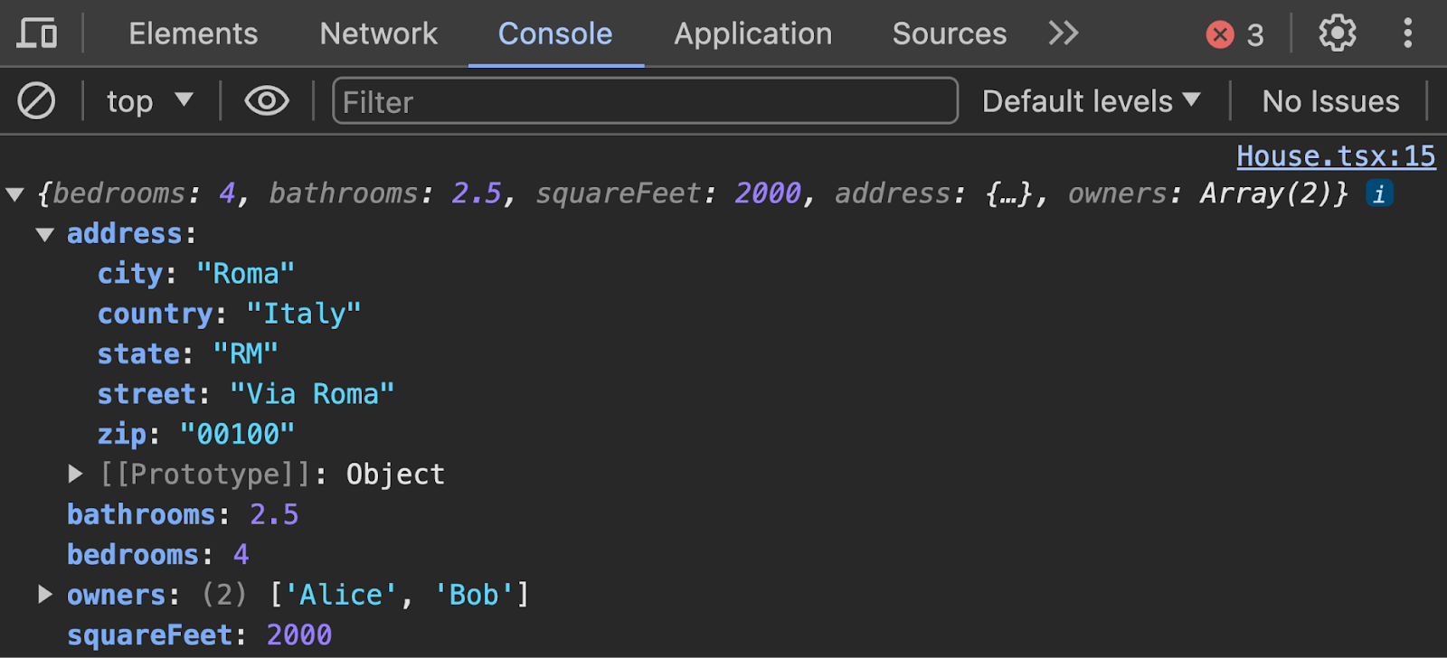
Dot notation reads a property: house.bedrooms, house.address.city. The pretty-printed <pre> uses the optional second and third arguments to stringify — a replacer (here null) and an indent width of 2. console.log(house) prints that tree in the Console tab — the next subsection:
House
bedrooms
4bathrooms
2.5Data
{
  "bedrooms": 4,
  "bathrooms": 2.5,
  "squareFeet": 2000,
  "address": {
    "street": "Via Roma",
    "city": "Roma",
    "state": "RM",
    "zip": "00100",
    "country": "Italy"
  },
  "owners": [
    "Alice",
    "Bob"
  ]
}3.4.12 Writing to the Console
DevTools' Elements tab showed the DOM in §1.3.1. Functions and objects need the Console tab as well — a place to print values without putting them on the page. Right-click the Lab 3 page and choose Inspect. Click the Console tab — empty until your scripts write to it (Figure 3.4.12a):
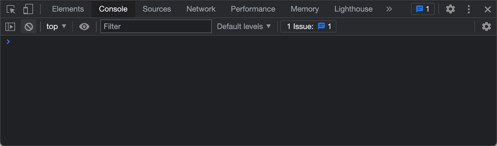
Add console.log("Hello World!") at the top of the Lab 3 function, reload, and confirm the string appears in the console:
export default function Lab3() {
  console.log("Hello World!");
  return (
    <div id="wd-lab3">
      <h2>Lab 3</h2>
      {/* ...lab components... */}
    </div>
  );
}
Objects print in the Console as expandable trees. House.tsx already logs the house — reload Lab 3, find that log, and expand address and owners (Figure 3.4.12c):
3.4.13 Spread Operator
SlidesThe spread operator ... is used to expand, or copy, an iterable object or array into another object or array. In the example below we declare array arr1 and then copy its content (spread) into array arr2. The resulting array arr2 contains the contents of arr1, followed by the rest of the items already declared in arr2. The spread operator can also be applied to objects. Below, obj1 declares an object with three properties a, b, and c. We then spread obj1 onto obj2 so that obj2 ends up with the properties from both obj1 and obj2. When declaring obj3, we first spread obj1 and then declare b with a value of 4. Since obj1 also has a property called b with a value of 2, there is a collision of properties in obj3. The collision is resolved by keeping the last declaration, so obj3.b ends up being 4. To practice the spread operator, create the Spreader component as shown below — the function inside is named Spreading, matching the lab file — import it in the Lab 3 component, and confirm it renders as shown:
export default function Spreading() {
  const arr1 = [1, 2, 3];
  const arr2 = [...arr1, 4, 5, 6];
  const obj1 = { a: 1, b: 2, c: 3 };
  const obj2 = { ...obj1, d: 4, e: 5, f: 6 };
  const obj3 = { ...obj1, b: 4 };
  return (
    <div id="wd-spreading">
      <h2>Spread Operator</h2>
      <h3>Array Spread</h3>
      arr1 = {JSON.stringify(arr1)}
      <br />
      arr2 = {JSON.stringify(arr2)}
      <br />
      <h3>Object Spread</h3>
      {JSON.stringify(obj1)}
      <br />
      {JSON.stringify(obj2)}
      <br />
      {JSON.stringify(obj3)}
      <br />
      <hr />
    </div>
  );
}
obj3.b is 4, not 2 — the later b: 4 overrides the copy from obj1:
Spread Operator
Array Spread
arr1 = [1,2,3]arr2 = [1,2,3,4,5,6]
Object Spread
{"a":1,"b":2,"c":3}{"a":1,"b":2,"c":3,"d":4,"e":5,"f":6}
{"a":1,"b":4,"c":3}
3.4.14 Destructing
While the spread operator is used to expand an iterable object into a new object or array, the destructing operator unpacks values from arrays, or properties from objects, into distinct variables. The lab file is named Destructing.tsx — the spelling used in the original assignment — but the operation in prose is destructuring. In the example below we declare object person and array numbers. These can be unpacked, or destructed, into new variables or constants by an object's property name or an array's item position. The curly brackets around constants name and age destruct the object person on the right side of the assignment and assign the properties of the same name into the new constants, so name and age end up with the values of person.name and person.age. While object destructing is based on the names of the properties, destructing arrays is based on the positions of the items: the square brackets unpack numbers into first, second, and third, which end up with the values of numbers[0], numbers[1], and numbers[2]. To practice destructing objects and arrays, create component Destructing as shown below, import it in the Lab 3 component, and confirm it renders as shown:
export default function Destructing() {
const person = { name: "John", age: 25 };
const { name, age } = person;
const numbers = ["one", "two", "three"];
const [first, second, third] = numbers;
return (
<div id="wd-destructing">
<h2>Destructing</h2>
<h3>Object Destructing</h3>
const { name, age } = { name: "John", age: 25 }
<br />
<br />
name = {name}
<br />
age = {age}
<h3>Array Destructing</h3>
const [first, second, third] = ["one","two","three"]
<br />
<br />
first = {first}
<br />
second = {second}
<br />
third = {third}
<hr />
</div>
);
}const { name, age } = person is the same as const name = person.name and const age = person.age. Array destructuring is the same as numbers[0], numbers[1], numbers[2]:
Destructing
Object Destructing
const { name, age } = { name: "John", age: 25 }name = John
age = 25
Array Destructing
const [first, second, third] = ["one","two","three"]first = one
second = two
third = three
3.4.15 Function Destructing
The destructing-objects syntax is very popular in React, especially when passing parameters to functions. React components receive props as one object, and destructuring that object in the parameter list is the usual way to name each prop. In the example below we declare two functions add and subtract using the new arrow function syntax. The add function takes two arguments a and b and returns the sum of the arguments. The subtract function takes a single object argument with properties a and b with values 4 and 2. In the argument list declaration, subtract uses object destructing to declare constants a and b which unpack the values 4 and 2 from the object argument with properties of the same name. To practice function destructing, copy the code below into a FunctionDestructing component, import it into the Lab 3 component, and confirm it renders as shown:
export default function FunctionDestructing() {
const add = (a: number, b: number) => a + b;
const sum = add(1, 2);
const subtract = ({ a, b }: { a: number; b: number }) => a - b;
const difference = subtract({ a: 4, b: 2 });
return (
<div id="wd-function-destructing">
<h2>Function Destructing</h2>
const add = (a, b) => a + b;
<br />
const sum = add(1, 2);
<br />
const subtract = ({ a, b }) => a - b;
<br />
const difference = subtract({ a: 4, b: 2 });
<br />
sum = {sum}
<br />
difference = {difference}
<hr />
</div>
);
}add takes two numbers. subtract takes one object and unpacks a and b from it — the same shape as function Add({ a, b }: { a: number; b: number }) in §3.7:
Parameters can also carry a default: (name = "Ada") => name uses "Ada" when the caller omits the argument. Destructured props work the same way — { a, b = 0 } — which §3.7.4 uses for a default todo.
Function Destructing
const add = (a, b) => a + b;const sum = add(1, 2);
const subtract = ({ a, b }) => a - b;
const difference = subtract({ a: 4, b: 2 });
sum = 3
difference = 2
3.4.16 Destructing Imports
Let's create a simple library to illustrate various ways of importing the functions and constants declared in the Math library below. The functions add, subtract, multiply, and divide are all exported with the export keyword so that they can be imported individually. The Math constant declares an object containing references to the local functions. We export the Math object as the default export so that the functions can be imported as a single object map. To demonstrate how the functions can be imported in several ways, create the DestructingImports component below. First, the functions can be imported as the single Math object that contains references to all the functions as import Math from "./Math", then accessed as Math.add(), Math.subtract(), and so on. An alternative is import * as Matematica from "./Math", where Matematica is a custom local object name, so you invoke Matematica.add() and Matematica.subtract(). Finally, the functions can be imported individually by destructing the exported functions as import { add, subtract, multiply, divide } from "./Math". Implement the Math.ts library and the DestructingImports component, import them in Lab 3, and confirm the table renders as shown:
export function add(a: number, b: number): number {
  return a + b;
}
export function subtract(a: number, b: number): number {
  return a - b;
}
export function multiply(a: number, b: number): number {
  return a * b;
}
export function divide(a: number, b: number): number {
  return a / b;
}
const Math = {
  add,
  subtract,
  multiply,
  divide,
};
export default Math;import Math, { add, subtract, multiply, divide } from "./Math";
import * as Matematica from "./Math";
export default function DestructingImports() {
return (
<div id="wd-destructuring-imports">
<h2>Destructing Imports</h2>
<table className="w-full border-collapse text-sm">
<thead>
<tr>
<th>Math</th>
<th>Matematica</th>
<th>Functions</th>
</tr>
</thead>
<tbody>
<tr>
<td>Math.add(2, 3) = {Math.add(2, 3)}</td>
<td>Matematica.add(2, 3) = {Matematica.add(2, 3)}</td>
<td>add(2, 3) = {add(2, 3)}</td>
</tr>
<tr>
<td>Math.subtract(5, 1) = {Math.subtract(5, 1)}</td>
<td>Matematica.subtract(5, 1) = {Matematica.subtract(5, 1)}</td>
<td>subtract(5, 1) = {subtract(5, 1)}</td>
</tr>
<tr>
<td>Math.multiply(3, 4) = {Math.multiply(3, 4)}</td>
<td>Matematica.multiply(3, 4) = {Matematica.multiply(3, 4)}</td>
<td>multiply(3, 4) = {multiply(3, 4)}</td>
</tr>
<tr>
<td>Math.divide(8, 2) = {Math.divide(8, 2)}</td>
<td>Matematica.divide(8, 2) = {Matematica.divide(8, 2)}</td>
<td>divide(8, 2) = {divide(8, 2)}</td>
</tr>
</tbody>
</table>
<hr />
</div>
);
}A module can export many named values (export function add) and at most one default (export default Math). Named imports use braces: import { add } from "./Math". The default import does not: import Math from "./Math" — the same pattern as import House from "./House" and as every Next.js page.tsx, which must default-export the page component. import * as Matematica gathers every export as one object. Each column of the table is the same arithmetic:
Destructing Imports
| Math | Matematica | Functions |
|---|---|---|
| Math.add(2, 3) = 5 | Matematica.add(2, 3) = 5 | add(2, 3) = 5 |
| Math.subtract(5, 1) = 4 | Matematica.subtract(5, 1) = 4 | subtract(5, 1) = 4 |
| Math.multiply(3, 4) = 12 | Matematica.multiply(3, 4) = 12 | multiply(3, 4) = 12 |
| Math.divide(8, 2) = 4 | Matematica.divide(8, 2) = 4 | divide(8, 2) = 4 |
3.4.17 Optional chaining and nullish coalescing
SlidesReading house.address.city throws if address is missing. Optional chaining ?. stops at the first null or undefined and yields undefined instead of crashing. Nullish coalescing ?? supplies a default only when the left side is null or undefined (unlike ||, which also treats 0 and "" as missing). Create OptionalChaining.tsx:
export default function OptionalChaining() {
  const house = {
    bedrooms: 4,
    address: {
      street: "Via Roma",
      city: "Roma",
    },
  };
  const missing = undefined as { prop?: string } | undefined;
  return (
    <div id="wd-optional-chaining">
      <h4>Optional Chaining</h4>
      house.address?.city = {house.address?.city}
      <br />
      missing?.prop ?? "n/a" = {missing?.prop ?? "n/a"}
      <hr />
    </div>
  );
}
house.address?.city is Roma. missing?.prop is undefined, so ?? "n/a" fills in the fallback — the same pattern the assignment editor uses for assignment?.title ?? "" in §3.9.8.1:
Optional Chaining
house.address?.city = Romamissing?.prop ?? "n/a" = n/a
3.5 Dynamic Styling
SlidesChapter 2 styled tags with CSS files and Tailwind classes. React can generate content dynamically based on algorithms written in JavaScript, and we can also dynamically style that content by programmatically controlling the classes and styles applied to it so the look follows the data. In the next couple of exercises we first learn to work with classes and then with styles.
3.5.1 Working with HTML Classes
Let's start practicing simple things, like classes and styles. Start with static classes, then build the class name from a variable, then pick a class with a ternary. Under the app/labs/lab3 folder, create a new component Classes with a matching styling file. From the Lab 3 component, import the new Classes component and confirm it renders as shown:
.wd-bg-yellow {
  background-color: lightyellow;
}
.wd-bg-blue {
  background-color: lightblue;
}
.wd-bg-red {
  background-color: lightcoral;
}
.wd-bg-green {
  background-color: lightgreen;
}
.wd-fg-black {
  color: black;
}
.wd-padding-10px {
  padding: 10px;
}import "./Classes.css";
export default function Classes() {
const color = "blue";
const dangerous = true;
return (
<div id="wd-classes">
<h2>Classes</h2>
<div className="wd-bg-yellow wd-fg-black wd-padding-10px">
Yellow background
</div>
<div className="wd-bg-blue wd-fg-black wd-padding-10px">
Blue background
</div>
<div className="wd-bg-red wd-fg-black wd-padding-10px">
Red background
</div>
<div className={`wd-bg-${color} wd-fg-black wd-padding-10px`}>
Dynamic Blue background
</div>
<div
className={`${dangerous ? "wd-bg-red" : "wd-bg-green"} wd-fg-black wd-padding-10px`}
>
Dangerous background
</div>
<hr />
</div>
);
}Importing Classes.css loads the rules. The fourth box concatenates wd-bg- with the color constant. The fifth box picks wd-bg-red or wd-bg-green from dangerous. Flip that flag to see the background change:
Classes
3.5.2 Working with the Style Attribute
In React, the style attribute accepts a JavaScript object where the properties are CSS properties — camelCase, the same object you used in §2.1.1 — and the values are CSS values. Spread smaller objects into larger ones so padding and color are reused. To practice how this works, implement the Styles component below and then import it into the Lab 3 component. The component declares constant objects that can be applied to elements using the style attribute. Alternatively, the style attribute accepts an object literal, which results in a double curly-bracket syntax. Refresh the browser and confirm it renders as expected:
export default function Styles() {
  const colorBlack = { color: "black" };
  const padding10px = { padding: "10px" };
  const bgBlue = {
    backgroundColor: "lightblue",
    color: "black",
    ...padding10px,
  };
  const bgRed = {
    backgroundColor: "lightcoral",
    ...colorBlack,
    ...padding10px,
  };
  return (
    <div id="wd-styles">
      <h2>Styles</h2>
      <div
        style={{
          backgroundColor: "lightyellow",
          color: "black",
          padding: "10px",
        }}
      >
        Yellow background
      </div>
      <div style={bgRed}>Red background</div>
      <div style={bgBlue}>Blue background</div>
    </div>
  );
}
Double curly braces on the yellow box are one pair to enter a JSX expression and one pair for the object literal. The red and blue boxes pass a named object instead:
Styles
3.6 Client and Server Components
SlidesIn Next.js, all components are Server Components by default. This means they execute only on the server during rendering, producing HTML that is sent to the browser. Server Components are fast, secure, and can directly access server-only resources such as the filesystem or environment variables, but they cannot use browser-specific features like interactivity, state, or DOM APIs, including hooks such as usePathname. If you need interactivity or browser APIs, you must explicitly turn a component into a Client Component by adding "use client" at the top of the file. Client Components run only in the browser, allowing hooks, event handlers, and browser globals — but they lose direct server access. The two simple examples below highlight exactly what each side can and cannot do.
3.6.1 Client Components
This Client Component below is marked with the "use client" directive at the top, which forces it to execute exclusively in the browser rather than on the server. The directive must be the first statement in the file. This allows safe use of browser-only features, such as hooks from next/navigation. In this example, the component uses the usePathname() hook to read the current route. This hook is client-only and would cause a server-side error if the component were treated as a Server Component. Removing the directive would result in a build or runtime failure because usePathname() is not available during server rendering. The code renders a simple heading and displays the current pathname. Create ClientComponentDemo.tsx, import it into Lab 3, and confirm it renders as shown:
"use client";

import { usePathname } from "next/navigation";

export default function ClientComponentDemo() {
  const pathname = usePathname();
  return (
    <div id="wd-client-component-demo">
      <h1>Client Component Demo</h1>
      <p>Current pathname: {pathname}</p>
    </div>
  );
}
Embedded in this book page, the pathname is the book route. Open it from http://localhost:3000/labs/lab3 to see /labs/lab3:
Client Component Demo
Current pathname: /book/ch3
3.6.2 Server Components
By default, Next.js pages and components are Server Components and are marked by omitting the "use client" directive, making the file execute exclusively on the server. The server component below demonstrates server-only capabilities by accessing Node.js globals like the process object and using fs.readdirSync() to list files from app/labs/lab3 on the server's filesystem. Adding "use client" would cause a build failure, as APIs like process and fs are unavailable in the browser environment. Create ServerComponentDemo.tsx, import it into Lab 3, and confirm it renders as shown:
import fs from "node:fs";
import path from "node:path";

export default function ServerComponentDemo() {
  const platform = process.platform;
  const nodeVersion = process.version;
  const serverRenderTime = new Date().toLocaleTimeString();
  const lab3Dir = path.join(process.cwd(), "app/labs/lab3");
  let files: string[] = [];
  try {
    files = fs.readdirSync(lab3Dir);
  } catch (error) {
    console.error("Error reading lab3 directory:", error);
    files = [];
  }
  return (
    <div id="wd-server-component-demo">
      <h1>Server Component Demo</h1>
      <h2>Server Render Time</h2>
      <p>Rendered on server at: {serverRenderTime}</p>
      <h2>Server Information</h2>
      <pre>
        {JSON.stringify({ platform, nodeVersion, serverRenderTime }, null, 2)}
      </pre>
      <h2>Filesystem Access Demo</h2>
      <pre>{JSON.stringify(files, null, 2)}</pre>
    </div>
  );
}
The file list is whatever sits in app/labs/lab3 on the machine that rendered this page — a capability the browser does not have:
Server Component Demo
Server Render Time
Rendered on server at: 9:25:18 PM
Server Information
{
  "platform": "linux",
  "nodeVersion": "v24.19.0",
  "serverRenderTime": "9:25:18 PM"
}
Filesystem Access Demo
[
  "Add.tsx",
  "AddingAndRemovingToFromArrays.tsx",
  "ArrayIndexAndLength.tsx",
  "ArrowFunctions.tsx",
  "BooleanVariables.tsx",
  "Classes.css",
  "Classes.tsx",
  "ClientComponentDemo.tsx",
  "ConditionalOutputIfElse.tsx",
  "ConditionalOutputInline.tsx",
  "Destructing.tsx",
  "DestructingImports.tsx",
  "FilterFunction.tsx",
  "FindFunction.tsx",
  "FindIndex.tsx",
  "ForLoops.tsx",
  "FunctionDestructing.tsx",
  "Highlight.tsx",
  "House.tsx",
  "IfElse.tsx",
  "ImpliedReturn.tsx",
  "IncludesSomeEvery.tsx",
  "JsonStringify.tsx",
  "LegacyFunctions.tsx",
  "MapFunction.tsx",
  "Math.ts",
  "NullUndefined.tsx",
  "OptionalChaining.tsx",
  "PathParameters.tsx",
  "ReduceFunction.tsx",
  "ServerComponentDemo.tsx",
  "SimpleArrays.tsx",
  "Spreader.tsx",
  "Square.tsx",
  "Styles.tsx",
  "TemplateLiterals.tsx",
  "TernaryOperator.tsx",
  "VariableTypes.tsx",
  "VariablesAndConstants.tsx",
  "add",
  "intermediates",
  "page.tsx",
  "todos"
]
Import both demos into Lab 3. A useful mental box: server components fetch and format data; client components handle hooks, clicks, and anything that reads the address bar.
The try/catch around readdirSync is how JavaScript handles a call that might throw. If the folder is missing, the catch logs the error and leaves files as an empty array instead of crashing the page. Use this pattern whenever Node I/O — and later, a network call — can fail.
3.7 Parameterizing Components
SlidesReact components can be parameterized by using the familiar HTML attribute syntax, which passes attribute values to the component's function as an object map parameter. The following Add component can receive properties a and b deconstructed from the attributes — the same parameter destructuring as §3.4.15. Implement the Add component below and confirm that passing it a={3} and b={4} results in a + b = 7. Note that the values of a and b are destructed from the object parameter in the Add function parameter list. Render <Add a={3} b={4} /> from Lab 3:
export default function Add({ a, b }: { a: number; b: number }) {
  return (
    <div id="wd-add">
      <h4>Add</h4>
      a = {a}
      b = {b}
      <br />
      a + b = {a + b}
      <hr />
    </div>
  );
}
The braces around 3 and 4 pass numbers, not the strings "3" and "4". The sum is 7:
Add
a = 3b = 4a + b = 7
3.7.1 Child Components
In the previous section we discussed passing data to a component through attributes. Another way to pass data to a component is in its body, that is, between the opening and closing tag of the element. In HTML it is common to wrap content with specific tags to add certain formatting. For instance the tags h1 and p format the content in their bodies with specific font sizes and margins — they take the content in the body and return a transformed version. We can implement React components the same way. The content in the body of a React component is passed to the component function as a parameter called children. For instance, the Square component below takes a number in its body and returns the square of the number. Import the new component, use it to compute the square of 4, and confirm it renders the correct result:
import { ReactNode } from "react";

export default function Square({ children }: { children: ReactNode }) {
  const num = Number(children);
  return <span id="wd-square">{num * num}</span>;
}
On the Lab 3 page, render <Square>4</Square> under a heading. The child text 4 becomes 16:
Square of 4 = 16
Highlight wraps arbitrary children in a yellow span with red text — formatting, not arithmetic:
import { ReactNode } from "react";

export default function Highlight({ children }: { children: ReactNode }) {
  return (
    <span
      id="wd-highlight"
      style={{ backgroundColor: "yellow", color: "red" }}
    >
      {children}
    </span>
  );
}3.7.2 Working with the Pathname
SlidesusePathname returns the current URL path so navigation can highlight the active screen. The Labs table of contents is already a client component: it maps a LINKS array and applies Tailwind classes when a link's match function says the pathname belongs to that lab — no Bootstrap Nav pills. Read the file you already maintain:
"use client";

import Link from "next/link";
import { usePathname } from "next/navigation";

const LINKS = [
  { href: "/labs", id: "wd-home-link", label: "Home", match: (p: string) => p === "/labs" },
  { href: "/labs/lab1", id: "wd-lab1-link", label: "Lab 1", match: (p: string) => p.endsWith("/lab1") || p.includes("/lab1/") },
  { href: "/labs/lab2", id: "wd-lab2-link", label: "Lab 2", match: (p: string) => p.includes("/lab2") },
  { href: "/labs/lab3", id: "wd-lab3-link", label: "Lab 3", match: (p: string) => p.includes("/lab3") },
  { href: "/", id: "wd-kambaz-link", label: "Kambaz", match: () => false },
] as const;

export default function TOC() {
  const pathname = usePathname() ?? "";
  return (
    <ul>
      {LINKS.map((link) => (
        <li key={link.id}>
          <Link
            href={link.href}
            id={link.id}
            className={
              link.match(pathname)
                ? "rounded bg-blue-600 px-2 py-0.5 text-white no-underline"
                : undefined
            }
          >
            {link.label}
          </Link>
        </li>
      ))}
      <li>
        <Link href="/labs/lab1/intermediates" id="wd-lab1-intermediates-link">
          Lab 1 Steps
        </Link>
      </li>
      <li>
        <Link href="/book/ch1" id="wd-book-ch1-link">
          Book Ch1
        </Link>
      </li>
      <li>
        <Link href="/labs/lab2/intermediates" id="wd-lab2-intermediates-link">
          Lab 2 Steps
        </Link>
      </li>
      <li>
        <Link href="/book/ch2" id="wd-book-ch2-link">
          Book Ch2
        </Link>
      </li>
      <li>
        <Link href="/labs/lab3/intermediates" id="wd-lab3-intermediates-link">
          Lab 3 Steps
        </Link>
      </li>
      <li>
        <Link href="/book/ch3" id="wd-book-ch3-link">
          Book Ch3
        </Link>
      </li>
    </ul>
  );
}
The file starts with "use client" because usePathname reads the address bar. Each mapped Link uses key={link.id}. Visit http://localhost:3000/labs/lab3 and confirm the Lab 3 item picks up the blue pill classes; Lab 1 and Lab 2 should do the same on their routes.
3.7.3 Encoding Path Parameters
Dynamic folders in the App Router — [a] and [b] — capture path segments as parameters. A client page reads them with useParams. Create app/labs/lab3/add/[a]/[b]/page.tsx:
"use client";

import { useParams } from "next/navigation";

export default function AddPathParameters() {
  const { a, b } = useParams();
  return (
    <div id="wd-add-path-parameters">
      <h4>Add Path Parameters</h4>
      {a} + {b} = {parseInt(a as string) + parseInt(b as string)}
    </div>
  );
}
Path values are strings (or string arrays), so parseInt turns them into numbers. Link to that route from a PathParameters component you import into Lab 3:
import Link from "next/link";

export default function PathParameters() {
  return (
    <div id="wd-path-parameters">
      <h2>Path Parameters</h2>
      <Link href="/labs/lab3/add/1/2">1 + 2</Link>
      <br />
      <Link href="/labs/lab3/add/3/4">3 + 4</Link>
    </div>
  );
}Click 1 + 2 and confirm the URL is /labs/lab3/add/1/2 and the page prints 1 + 2 = 3. The second link should print 3 + 4 = 7.
3.7.4 Rendering a Data Structure
Arrays, JSON, map, keys, default parameters, and parameterized components come together as a todo list — still throwaway Lab 3 code, now combining the ideas instead of introducing a new one. In app/labs/lab3/todos, create TodoItem.tsx that receives one todo as a prop. The todo = { … } in the parameter list is a default parameter (§3.4.15): if the parent omits todo, the milk item is used.
type Todo = {
  done: boolean;
  title: string;
  status: string;
};

const TodoItem = ({
  todo = { done: true, title: "Buy milk", status: "COMPLETED" },
}: {
  todo?: Todo;
}) => {
  return (
    <li className="flex items-center gap-2 border-b py-1">
      <input type="checkbox" className="me-2" defaultChecked={todo.done} />
      {todo.title} ({todo.status})
    </li>
  );
};

export default TodoItem;
Store the list next to the component as JSON — Next.js lets you import JSON as a value:
[
  { "title": "Buy milk", "status": "CANCELED", "done": true },
  { "title": "Pickup the kids", "status": "IN PROGRESS", "done": false },
  { "title": "Walk the dog", "status": "DEFERRED", "done": false }
]
TodoList maps that array onto TodoItem, using todo.title as the key (§3.4.4) because the titles are unique in this file:
import TodoItem from "./TodoItem";
import todos from "./todos.json";

export default function TodoList() {
  return (
    <>
      <h3>Todo List</h3>
      <ul className="list-none p-0">
        {todos.map((todo) => (
          <TodoItem key={todo.title} todo={todo} />
        ))}
      </ul>
      <hr />
    </>
  );
}
Import TodoList into Lab 3. Each row is a checkbox whose default matches todo.done:
Todo List
- Buy milk (CANCELED)
- Pickup the kids (IN PROGRESS)
- Walk the dog (DEFERRED)
3.7.5 Exercises
Use this checklist to confirm Lab 3 covers every JavaScript topic in §3.2–§3.7. Import each component into app/labs/lab3/page.tsx in order. Each topic is listed once, with Lab, On your own, and With AI nested as a/b/c. Give every mapped JSX sibling a key.
- Variables and conditionals (§3.2)
- Lab component — Create VariablesAndConstants, VariableTypes, BooleanVariables, IfElse, TernaryOperator, ConditionalOutputIfElse, ConditionalOutputInline, and NullUndefined.
- On your own — Complete each section's On your own in §3.2.1–§3.2.7.
- With AI — Complete each section's With AI extra in §3.2.1–§3.2.7.
- Functions (§3.3)
- Lab component — Create LegacyFunctions, ArrowFunctions, ImpliedReturn, and TemplateLiterals.
- On your own — Complete each section's On your own in §3.3–§3.3.3.
- With AI — Complete each section's With AI extra in §3.3–§3.3.3.
- Arrays (§3.4.1–§3.4.9)
- Lab component — Create the array samples through ReduceFunction.
- On your own — Complete each section's On your own in §3.4.1–§3.4.9.
- With AI — Complete each section's With AI extra in §3.4.1–§3.4.9.
- JSON, objects, and destructuring (§3.4.10–§3.4.17)
- Lab component — Create JsonStringify, House, Spreader, Destructing, FunctionDestructing, Math.ts, DestructingImports, and OptionalChaining.
- On your own — Complete each section's On your own in §3.4.10–§3.4.17.
- With AI — Complete each section's With AI extra in §3.4.10–§3.4.17.
- Classes and styles (§3.5)
- Lab component — Create Classes.css, Classes.tsx, and Styles.tsx.
- On your own — Complete each section's On your own in §3.5.1–§3.5.2.
- With AI — Complete each section's With AI extra in §3.5.1–§3.5.2.
- Client and server components (§3.6)
- Lab component — Create ClientComponentDemo with "use client" and ServerComponentDemo without it.
- On your own — Complete each section's On your own in §3.6.1–§3.6.2.
- With AI — Complete each section's With AI extra in §3.6.1–§3.6.2.
- Add, Square, and Highlight (§3.7–§3.7.1)
- Lab component — Create Add.tsx, Square.tsx, and Highlight.tsx.
- On your own — Complete each section's On your own in §3.7–§3.7.1.
- With AI — Complete each section's With AI extra in §3.7–§3.7.1.
- Labs TOC highlight (§3.7.2)
- Lab component — Highlight the active lab in app/labs/TOC.tsx with usePathname.
- On your own — Complete the On your own in §3.7.2.
- With AI — Complete the With AI extra in §3.7.2.
- Path parameters (§3.7.3)
- Lab component — Create the add/[a]/[b] page and PathParameters.tsx.
- On your own — Complete the On your own in §3.7.3.
- With AI — Complete the With AI extra in §3.7.3.
- Todo list (§3.7.4)
- Lab component — Create todos/TodoItem.tsx, todos/todos.json, and todos/TodoList.tsx that maps with key={todo.title}.
- On your own — Complete the On your own in §3.7.4.
- With AI — Complete the With AI extra in §3.7.4.
3.8 Check Your Understanding
Pause and test the JavaScript topics from this chapter. The practice quiz draws 10 items — var/let/const, ===, ternaries, arrows, map/filter/find, spread, destructuring, JSON, client vs server, "use client", list keys, reduce, and ?.. It is a self-check, not part of your course grade. Misses link back to the subsection you should reread; each new attempt draws a different 10.
3.9 Implementing a Data Driven Kambaz Application
SlidesChapter 1 and Chapter 2 built Kambaz screens whose markup never changed. The labs you just finished were practice — throwaway snippets that nail one idea. Kambaz is the application you keep building across the course. Wire those screens to JSON so the UI follows the data: different courses on the dashboard, and different modules, assignments, and people once the URL encodes a course id. A single coverage checklist is in §3.9.10 — use it after you have walked through the screens, not instead of wiring data as you read.
Confirm the Kambaz landing route still redirects to Sign in:
import { redirect } from "next/navigation";

export default function Kambaz() {
  redirect("/account/signin");
}
3.9.1 Data Driven Kambaz Navigation
The sidebar in §2.4.1 listed each link by hand. Replace that repetition with an array of labels, paths, and icons, then map it — the same pattern as the Labs TOC in §3.7.2. Account stays a special case (white-on-red when active). Courses intentionally points at /dashboard, because you only reach a course from a dashboard card.
The component is a Client Component: it calls usePathname to highlight the active route. Each mapped Link needs key={link.label}:
"use client";

import { AiOutlineDashboard } from "react-icons/ai";
import { IoCalendarOutline } from "react-icons/io5";
import { LiaBookSolid, LiaCogSolid } from "react-icons/lia";
import { FaInbox, FaRegCircleUser } from "react-icons/fa6";
import Link from "next/link";
import { usePathname } from "next/navigation";
import "@/app/labs/lab2/tailwind/utilities.css";

const LINKS = [
  { label: "Dashboard", path: "/dashboard", icon: AiOutlineDashboard },
  { label: "Courses", path: "/dashboard", icon: LiaBookSolid },
  { label: "Calendar", path: "/calendar", icon: IoCalendarOutline },
  { label: "Inbox", path: "/inbox", icon: FaInbox },
  { label: "Labs", path: "/labs", icon: LiaCogSolid },
] as const;

export default function KambazNavigation() {
  const pathname = usePathname() ?? "";
  const accountActive = pathname.includes("/account");

  return (
    <nav
      id="wd-kambaz-navigation"
      className="fixed bottom-0 top-0 z-20 hidden w-[120px] bg-black md:block"
    >
      <a
        href="https://www.northeastern.edu/"
        id="wd-neu-link"
        target="_blank"
        rel="noreferrer"
        className="block bg-black py-3 text-center"
      >
        {/* eslint-disable-next-line @next/next/no-img-element */}
        <img
          src="/images/NEU.png"
          width={75}
          height={75}
          alt="Northeastern University"
          className="mx-auto"
        />
      </a>
      <Link
        href="/account"
        id="wd-account-link"
        className={`block py-3 text-center text-sm no-underline ${
          accountActive ? "bg-white text-red-600" : "bg-black text-white"
        }`}
      >
        <FaRegCircleUser
          className={`inline-block text-3xl ${
            accountActive ? "text-red-600" : "text-white"
          }`}
        />
        <br />
        Account
      </Link>
      {LINKS.map((link) => {
        const active =
          link.label === "Dashboard" || link.label === "Courses"
            ? pathname.includes("/dashboard") || pathname.includes("/courses")
            : pathname.includes(link.path);
        const Icon = link.icon;
        return (
          <Link
            key={link.label}
            href={link.path}
            id={`wd-${link.label.toLowerCase()}-link`}
            className={`block py-3 text-center text-sm no-underline ${
              active ? "bg-white text-red-600" : "bg-black text-white"
            }`}
          >
            <Icon className="inline-block text-3xl text-red-500" />
            <br />
            {link.label}
          </Link>
        );
      })}
    </nav>
  );
}3.9.2 Implementing a Kambaz Database
Collect the JSON the UI will read under app/(kambaz)/database. Start with courses.json — each course has an _id (the value you will encode in the URL), name, description, and image, plus metadata such as dates and credits. Re-export every file from index.ts so screens can write import * as db from "../database":
import courses from "./courses.json";
import modules from "./modules.json";
import assignments from "./assignments.json";
import users from "./users.json";
import enrollments from "./enrollments.json";
export { courses, modules, assignments, users, enrollments };
You will add modules.json, assignments.json, users.json, and enrollments.json as the later screens need them. Keep at least three courses so the dashboard grid is obviously data-driven.
3.9.3 Data Driven Dashboard
SlidesRefactor the dashboard from §2.4.2 so it maps db.courses onto CourseCard. Spread each course into the card and key the card by course._id:
import "@/app/labs/lab2/tailwind/utilities.css";
import CourseCard from "./CourseCard";
import * as db from "../database";

export default function Dashboard() {
  const courses = db.courses;
  return (
    <div id="wd-dashboard">
      <h1 id="wd-dashboard-title">Dashboard</h1>
      <hr />
      <h2 id="wd-dashboard-published">Published Courses ({courses.length})</h2>
      <hr />
      <div
        id="wd-dashboard-courses"
        className="grid grid-cols-1 gap-8 sm:grid-cols-2 xl:grid-cols-3 2xl:grid-cols-4"
      >
        {courses.map((course) => (
          <CourseCard key={course._id} {...course} />
        ))}
      </div>
    </div>
  );
}
CourseCard destructures _id, name, description, and image. The Link encodes _id in the path so later screens can look the course up:
import Link from "next/link";
import Image from "next/image";

export default function CourseCard({
  _id,
  name,
  description,
  image,
}: {
  _id: string;
  name: string;
  description: string;
  image: string;
}) {
  return (
    <div className="wd-dashboard-course w-[300px] max-w-full overflow-hidden rounded-lg border border-neutral-200 bg-white shadow-sm">
      <Link
        href={`/courses/${_id}/home`}
        className="wd-dashboard-course-link block text-neutral-900 no-underline"
      >
        <Image
          src={image}
          width={300}
          height={160}
          alt={name}
          className="h-40 w-full object-cover"
        />
        <div className="p-4">
          <h5 className="wd-dashboard-course-title m-0 mb-2 truncate text-lg font-semibold whitespace-nowrap">
            {name}
          </h5>
          <p className="wd-dashboard-course-description m-0 mb-3 h-[100px] overflow-hidden text-sm text-neutral-600">
            {description}
          </p>
          <button
            type="button"
            className="inline-flex items-center justify-center rounded bg-blue-600 px-3 py-1.5 text-sm font-medium text-white"
          >
            Go
          </button>
        </div>
      </Link>
    </div>
  );
}
The published count interpolates courses.length. Clicking a card should land on /courses/RS101/home (or whichever _id you clicked). The target grid looks like Figure 3.9.3:

Dashboard
New Course
Published Courses (0)
3.9.4 Data Driven Courses Screen
SlidesThe course layout lives at app/(kambaz)/courses/[cid]/layout.tsx. Next.js provides params for the dynamic [cid] segment — await it, then find the course whose _id matches:
import { ReactNode } from "react";
import { FaAlignJustify } from "react-icons/fa6";
import "@/app/labs/lab2/tailwind/utilities.css";
import CourseNavigation from "./Navigation";
import Breadcrumb from "./Breadcrumb";
import { courses } from "../../database";

export default async function CoursesLayout({
  children,
  params,
}: Readonly<{
  children: ReactNode;
  params: Promise<{ cid: string }>;
}>) {
  const { cid } = await params;
  const course = courses.find((c) => c._id === cid);
  return (
    <div id="wd-courses">
      <h2 className="text-2xl font-semibold text-red-600">
        <FaAlignJustify className="me-4 mb-1 inline text-xl" />
        <Breadcrumb course={course} />
      </h2>
      <hr className="my-3" />
      <div className="flex gap-4">
        <div className="hidden w-[140px] shrink-0 md:block">
          <CourseNavigation cid={cid} />
        </div>
        <div className="min-w-0 flex-1">{children}</div>
      </div>
    </div>
  );
}
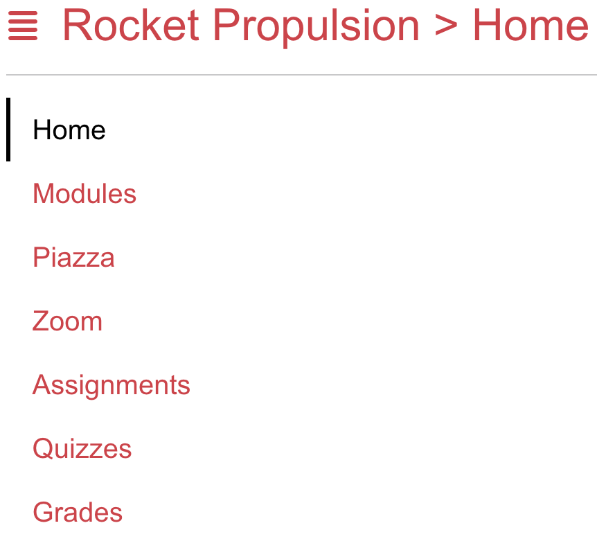
Pass cid into course navigation so its links stay inside this course. The heading should show the selected course name, as in Figure 3.9.4:
3.9.5 Data Driven Course Navigation (On Your Own)
Map the course sidebar the same way you mapped Kambaz navigation. Start from an array of sections — Home, Modules, Piazza, Zoom, Assignments, Quizzes, Grades, People — and build each href as /courses/${cid}/${segment}. Highlight with usePathname. The layout already passes cid as a prop, so this file does not need useParams.
The course Navigation.tsx in the project already follows that pattern:
"use client";

import Link from "next/link";
import { usePathname } from "next/navigation";
import "@/app/labs/lab2/tailwind/utilities.css";
import "../../kambaz.css";

const LINKS = [
  { segment: "home", id: "wd-course-home-link", label: "Home" },
  { segment: "modules", id: "wd-course-modules-link", label: "Modules" },
  { segment: "piazza", id: "wd-course-piazza-link", label: "Piazza" },
  { segment: "zoom", id: "wd-course-zoom-link", label: "Zoom" },
  { segment: "assignments", id: "wd-course-assignments-link", label: "Assignments" },
  { segment: "quizzes", id: "wd-course-quizzes-link", label: "Quizzes" },
  { segment: "grades", id: "wd-course-grades-link", label: "Grades" },
  { segment: "people/table", id: "wd-course-people-link", label: "People" },
] as const;

export default function CourseNavigation({ cid }: { cid: string }) {
  const pathname = usePathname() ?? "";
  const inCourse = pathname.startsWith(`/courses/${cid}`);

  return (
    <div id="wd-courses-navigation" className="wd list-group rounded-none text-lg">
      {LINKS.map(({ segment, id, label }) => {
        const href = `/courses/${cid}/${segment}`;
        const active = inCourse
          ? pathname === href ||
            (segment !== "home" && pathname.startsWith(href))
          : segment === "home";
        return (
          <Link
            key={id}
            href={href}
            id={id}
            className={
              active
                ? "list-group-item active border-0"
                : "list-group-item border-0 text-red-600"
            }
          >
            {label}
          </Link>
        );
      })}
    </div>
  );
}3.9.6 Implementing the Breadcrumb
A breadcrumb shows where you are in a nest of screens. The course name already identifies the course; appending the last path segment identifies the section — Home, Modules, Assignments (Figure 3.9.6a and Figure 3.9.6b):
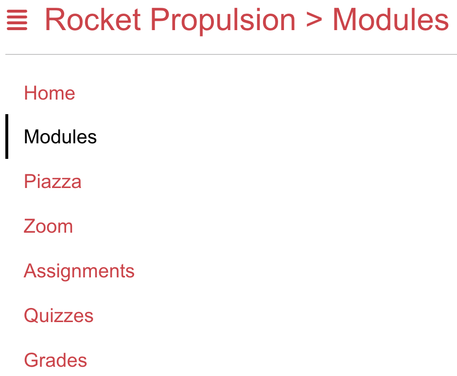
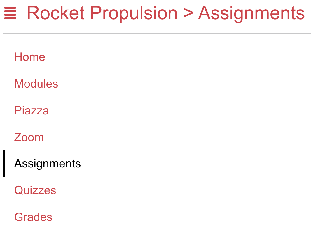
Breadcrumb is a Client Component so it can read usePathname. The layout passes the course found in §3.9.4:
"use client";
import { usePathname } from "next/navigation";
export default function Breadcrumb({
course,
}: {
course: { name: string } | undefined;
}) {
const pathname = usePathname() ?? "";
const section = pathname.split("/").pop() ?? "";
const label = section.charAt(0).toUpperCase() + section.slice(1);
return (
<span>
Course {course?.name} > {label}
</span>
);
}Optional chaining on course?.name guards the case where find returns undefined — the same ?. from §3.4.17.
3.9.7 Data Driven Modules
SlidesModules currently ignore which course you opened. Each module in modules.json has a course field that matches a course _id. Filter by the cid from useParams, then map modules and nested lessons — each with a key from _id. The target list looks like Figure 3.9.7:
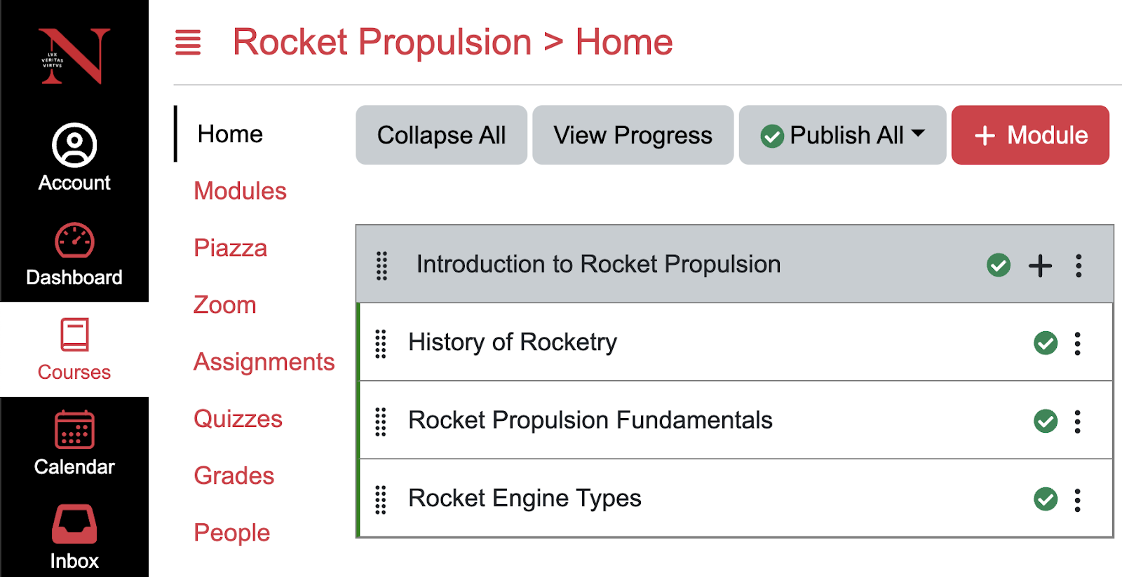
"use client";

import { useParams } from "next/navigation";
import "@/app/labs/lab2/tailwind/utilities.css";
import Module from "./Module";
import Lesson from "./Lesson";
import * as db from "../../../database";

export default function Modules() {
  const { cid } = useParams();
  const modules = db.modules.filter((module) => module.course === cid);
  return (
    <div>
      <div className="mb-3 flex flex-wrap items-center gap-2">
        <button
          type="button"
          className="rounded border border-neutral-300 bg-white px-3 py-1.5 text-sm"
        >
          Collapse All
        </button>
        <button
          type="button"
          className="rounded border border-neutral-300 bg-white px-3 py-1.5 text-sm"
        >
          View Progress
        </button>
        <select
          defaultValue="publish-all"
          className="rounded border border-neutral-300 bg-white px-3 py-1.5 text-sm"
        >
          <option value="publish-all">Publish All</option>
          <option value="unpublish-all">Unpublish All</option>
        </select>
        <button
          type="button"
          className="rounded border border-red-600 bg-red-600 px-3 py-1.5 text-sm font-medium text-white"
        >
          + Module
        </button>
      </div>
      <ul id="wd-modules" className="m-0 list-none p-0">
        {modules.map((module) => (
          <Module key={module._id} title={module.name}>
            {module.lessons?.map((lesson) => (
              <Lesson key={lesson._id} title={lesson.name} />
            ))}
          </Module>
        ))}
      </ul>
    </div>
  );
}
This page is a Client Component because it uses useParams. Nested lessons?.map uses optional chaining so a module without lessons does not throw. Open two courses and confirm the module titles change.
3.9.8 Data Driven Assignments (On Your Own)
SlidesRefactor Assignments the same way as Modules: filter db.assignments where assignment.course equals the current cid, then map each row to AssignmentItem with key={assignment._id}. Encode both course id and assignment id in the editor URL. This screen can stay a Server Component and await params instead of useParams. The list should match Figure 3.9.8:
import "@/app/labs/lab2/tailwind/utilities.css";
import { FaPlus, FaSearch } from "react-icons/fa";
import AssignmentItem from "./AssignmentItem";
import * as db from "../../../database";

export default async function Assignments({
  params,
}: {
  params: Promise<{ cid: string }>;
}) {
  const { cid } = await params;
  const assignments = db.assignments.filter(
    (assignment) => assignment.course === cid,
  );
  return (
    <div id="wd-assignments">
      <div className="mb-4 flex flex-wrap items-center justify-between gap-2">
        <div className="relative">
          <FaSearch className="pointer-events-none absolute top-1/2 left-3 -translate-y-1/2 text-neutral-500" />
          <input
            placeholder="Search for Assignments"
            id="wd-search-assignment"
            className="rounded border py-1.5 pr-3 pl-9 text-sm"
          />
        </div>
        <div className="flex gap-2">
          <button
            id="wd-add-assignment-group"
            type="button"
            className="inline-flex items-center gap-1 rounded border px-3 py-1.5 text-sm"
          >
            <FaPlus /> Group
          </button>
          <button
            id="wd-add-assignment"
            type="button"
            className="inline-flex items-center gap-1 rounded bg-red-600 px-3 py-1.5 text-sm font-medium text-white"
          >
            <FaPlus /> Assignment
          </button>
        </div>
      </div>
      <h3
        id="wd-assignments-title"
        className="mb-3 flex items-center justify-between rounded bg-neutral-200 p-3 text-lg"
      >
        <span>ASSIGNMENTS 40% of Total</span>
        <button
          type="button"
          className="inline-flex items-center rounded border bg-white px-2 py-0.5 text-sm"
        >
          <FaPlus />
        </button>
      </h3>
      <ul id="wd-assignment-list" className="m-0 list-none p-0">
        {assignments.map((assignment) => (
          <AssignmentItem
            key={assignment._id}
            cid={cid}
            aid={assignment._id}
            title={assignment.title}
            details={`Multiple Modules | Not available until ${assignment.available} | Due ${assignment.due} | ${assignment.points} pts`}
          />
        ))}
      </ul>
    </div>
  );
}3.9.8.1 Assignment Editor (On Your Own)
The editor at assignments/[aid]/page.tsx should display the assignment you clicked, not a hardcoded A1. Await cid and aid, find the row, and fill the fields with assignment?.title ?? "" and the other properties. Cancel and Save are Links back to that course's assignments list. The form should match Figure 3.9.8.1:
import Link from "next/link";
import * as db from "../../../database";

export default async function AssignmentEditor({
  params,
}: {
  params: Promise<{ cid: string; aid: string }>;
}) {
  const { cid, aid } = await params;
  const assignment = db.assignments.find((a) => a._id === aid);
  return (
    <div id="wd-assignments-editor">
      <label htmlFor="wd-name">Assignment Name</label>
      <input id="wd-name" defaultValue={assignment?.title ?? ""} />
      <br />
      <br />
      <textarea
        id="wd-description"
        defaultValue={assignment?.description ?? ""}
        rows={8}
        className="w-full"
      />
      <br />
      <table>
        <tbody>
          <tr>
            <td align="right" valign="top">
              <label htmlFor="wd-points">Points</label>
            </td>
            <td>
              <input id="wd-points" defaultValue={assignment?.points ?? 100} />
            </td>
          </tr>
          <tr>
            <td align="right" valign="top">
              <label htmlFor="wd-due-date">Due</label>
            </td>
            <td>
              <input
                type="date"
                id="wd-due-date"
                defaultValue={assignment?.due}
              />
            </td>
          </tr>
          <tr>
            <td align="right" valign="top">
              <label htmlFor="wd-available-from">Available from</label>
            </td>
            <td>
              <input
                type="date"
                id="wd-available-from"
                defaultValue={assignment?.available}
              />
            </td>
          </tr>
        </tbody>
      </table>
      <br />
      <Link href={`/courses/${cid}/assignments`} id="wd-cancel">
        Cancel
      </Link>{" "}
      <Link href={`/courses/${cid}/assignments`} id="wd-save">
        Save
      </Link>
    </div>
  );
}3.9.9 Data Driven People Screen
People currently lists the same hardcoded rows for every course.users.json holds the people; enrollments.json ties a user id to a course id. Filter users with enrollments.some — the same some from §3.4.8 — then map the enrolled users with key={user._id}:
import { FaUserCircle } from "react-icons/fa";
import "@/app/labs/lab2/tailwind/utilities.css";
import * as db from "../../../../database";

export default async function PeopleTable({
  params,
}: {
  params: Promise<{ cid: string }>;
}) {
  const { cid } = await params;
  const { users, enrollments } = db;
  const enrolled = users.filter((usr) =>
    enrollments.some(
      (enrollment) => enrollment.user === usr._id && enrollment.course === cid,
    ),
  );
  return (
    <div id="wd-people-table" className="overflow-x-auto">
      <table className="w-full border-collapse text-left text-sm">
        <thead>
          <tr className="border-b border-neutral-300">
            <th className="p-2">Name</th>
            <th className="p-2">Login ID</th>
            <th className="p-2">Section</th>
            <th className="p-2">Role</th>
            <th className="p-2">Last Activity</th>
            <th className="p-2">Total Activity</th>
          </tr>
        </thead>
        <tbody>
          {enrolled.map((user) => (
            <tr key={user._id} className="odd:bg-neutral-50">
              <td className="wd-full-name p-2 text-nowrap">
                <FaUserCircle className="me-2 inline align-middle text-3xl text-neutral-500" />
                <span className="wd-first-name">{user.firstName}</span>{" "}
                <span className="wd-last-name">{user.lastName}</span>
              </td>
              <td className="wd-login-id p-2">{user.loginId}</td>
              <td className="wd-section p-2">{user.section}</td>
              <td className="wd-role p-2">{user.role}</td>
              <td className="wd-last-activity p-2">{user.lastActivity}</td>
              <td className="wd-total-activity p-2">{user.totalActivity}</td>
            </tr>
          ))}
        </tbody>
      </table>
    </div>
  );
}
Open People for RS101 versus RS102 and confirm the names change with enrollment. Visit http://localhost:3000/dashboard to start from the data-driven dashboard, or jump to a course Home such as /courses/RS101/home.
3.9.10 Exercises
Use this checklist to confirm the data-driven Kambaz prototype covers every screen in §3.9. Each item points back to the section where you wired the worked example. Build in order as you read — this list is for checking coverage, not a substitute for the walkthroughs. Course Navigation, Assignments, and the Assignment Editor stay On your own: match the ids and LiveDemos in those sections. Each screen is listed once, with Lab, On your own, and With AI nested as a/b/c.
- Kambaz Navigation from data (§3.9.1)
- Lab component — Drive Kambaz Navigation from data.
- On your own — Complete the On your own in §3.9.1.
- With AI — Complete the With AI extra in §3.9.1.
- JSON database (§3.9.2)
- Lab component — Add the JSON database under app/(kambaz)/database/.
- On your own — Complete the On your own in §3.9.2.
- With AI — Complete the With AI extra in §3.9.2.
- Dashboard from JSON (§3.9.3)
- Lab component — Render the Dashboard from courses JSON.
- On your own — Complete the On your own in §3.9.3.
- With AI — Complete the With AI extra in §3.9.3.
- Courses from the URL (§3.9.4)
- Lab component — Drive the Courses screen from the URL course id.
- On your own — Complete the On your own in §3.9.4.
- With AI — Complete the With AI extra in §3.9.4.
- Course Navigation from data (§3.9.5)
- Lab component — Drive Course Navigation from data.
- On your own — Complete the On your own in §3.9.5.
- With AI — Complete the With AI extra in §3.9.5.
- Breadcrumb (§3.9.6)
- Lab component — Implement the breadcrumb.
- On your own — Complete the On your own in §3.9.6.
- With AI — Complete the With AI extra in §3.9.6.
- Modules from JSON (§3.9.7)
- Lab component — Drive Modules from JSON.
- On your own — Complete the On your own in §3.9.7.
- With AI — Complete the With AI extra in §3.9.7.
- Assignments from JSON (§3.9.8)
- Lab component — Drive Assignments from JSON (On your own).
- On your own — Complete the On your own in §3.9.8.
- With AI — Complete the With AI extra in §3.9.8.
- Assignment Editor from JSON (§3.9.8.1)
- Lab component — Drive the Assignment Editor from JSON (On your own).
- On your own — Complete the On your own in §3.9.8.1.
- With AI — Complete the With AI extra in §3.9.8.1.
- People from enrollments (§3.9.9)
- Lab component — Drive the People table from users and enrollments.
- On your own — Complete the On your own in §3.9.9.
- With AI — Complete the With AI extra in §3.9.9.
3.10 Delivery
Submit this chapter's work as a new branch on the same webdev-client repository and deployment from earlier chapters, so graders can compare Chapter 2's styled prototype against this chapter's JavaScript and data-driven screens side by side.
- Finish every exercise described in this chapter inside the same
webdev-clientproject used in Chapter 1 and Chapter 2. - Create a branch named
a3, then add, commit, and push it to the same GitHub repository from §1.5:
git checkout -b a3
git add .
git commit -am "a3 JavaScript"
git push -u origin a3- In Vercel, configure the project to deploy every branch to its own URL: open the project's Settings → Git and enable deployments for all branches (some Vercel plans expose this under Build & Deployment → Branches). From then on, each push to
a3gets its own preview URL that contains the branch name, separate from your Chapter 2a2deployment. - Confirm
app/labs/TOC.tsxandapp/labs/page.tsxstill list every lab and Kambaz, plus a link to your GitHub repository with idwd-githuband your full name (first name first, last name second, matching Canvas) on the Labs page — the same requirements from §1.7, now revisited for this chapter. - Push any remaining changes to the
a3branch and confirm the branch deployment on Vercel reflects them. - In Canvas, submit both the GitHub repository URL (pointed at the
a3branch) and the Vercel deployment URL for that branch. Disable Vercel's Deployment Protection on that deployment, as in §1.6, so graders can open it without signing in.
Continue practicing in Labs, browse Lab 3 intermediate steps, or open the live Kambaz prototype to see this chapter's data-driven screens.
3.11 References
This chapter turned hardcoded markup into data-driven screens. The linked terms are the languages and libraries you wrote in; the topics are the JavaScript and React techniques the labs walked through.
These ideas also matter in this chapter even though they do not have their own term pages yet:
- Variables, constants, types, and booleans
- Conditionals, the ternary operator, and short-circuit output
- Arrow functions, implied return, and template literals
- Arrays: map, find, filter, reduce, includes, some, and every
- Objects, JSON.stringify, spread, and destructuring
- Optional chaining and nullish coalescing
- Dynamic class and style values
- Client Components and Server Components
- Pathname, path parameters, and rendering a data structure
3.12 Tools
Keep these language and library docs nearby while you write Lab 3. The JavaScript and TypeScript handbooks are the best place to confirm what a method returns before you map it into JSX.
- JavaScript (MDN) — MDN's JavaScript reference for the language syntax, arrays, and functions you write in Lab 3.
- TypeScript — The typed JavaScript language this course writes in; the handbook is the official syntax reference.
- React — The UI library that turns components and JSX into the screens you build in the labs.
- Next.js — The React framework this course uses for pages, layouts, and later the HTTP server routes.
- Chrome DevTools — Chrome's built-in inspector for HTML, CSS, the console, and the Network panel.
- Node.js — The JavaScript runtime you install so Next.js, npm, and later the Express server can run on your machine.
- GitHub — The host for your remote Git repository and the place Vercel and Render connect when you deploy.
- Vercel — The host for the Next.js client; connect the GitHub repo here to put the UI on the public Web.
3.13 AI Tools
Once the work is arrays, functions, and data-driven components, coding assistants are more useful than mockup tools. Ask them to explain a method or sketch a map — then type the code yourself so the syntax stays yours.
- Cursor — An AI-native editor that reads your project and helps write or refactor TypeScript in place.
- Claude — A conversational assistant for explaining APIs, reviewing code, and drafting implementations.
- GitHub Copilot — An AI pair programmer that suggests code as you type in the editor.
- Google Prompt Gallery — A public collection of Gemini prompt examples you can remix for writing, coding, and multimodal tasks.
- v0 — Generates interface mockups and React starting points from a written prompt.