Developing Full Stack Next.js Web Applications
Chapter 2 — Styling User Interfaces with CSS and Tailwind
Dr. Jose Annunziato
Chapter 1 built Kambaz screens with plain HTML — functional, but visually flat. Browsers apply only minimal default styling to raw tags, which is why every heading, paragraph, and list rendered in the browser's stock black-on-white look. This chapter introduces CSS (Cascading Style Sheets), the language browsers use to control color, spacing, borders, layout, and responsiveness — everything beyond the browser's fixed default look for each tag.
You will practice CSS in layers of increasing convenience. First, plain CSS: the style attribute, external style sheets, and selectors that target specific tags, ids, and classes. Once the fundamentals click, the chapter introduces Tailwind CSS, a utility-class library you compose directly in JSX. Along the way you will also decorate the UI with React Icons, a library of icon components gathered from several icon families.
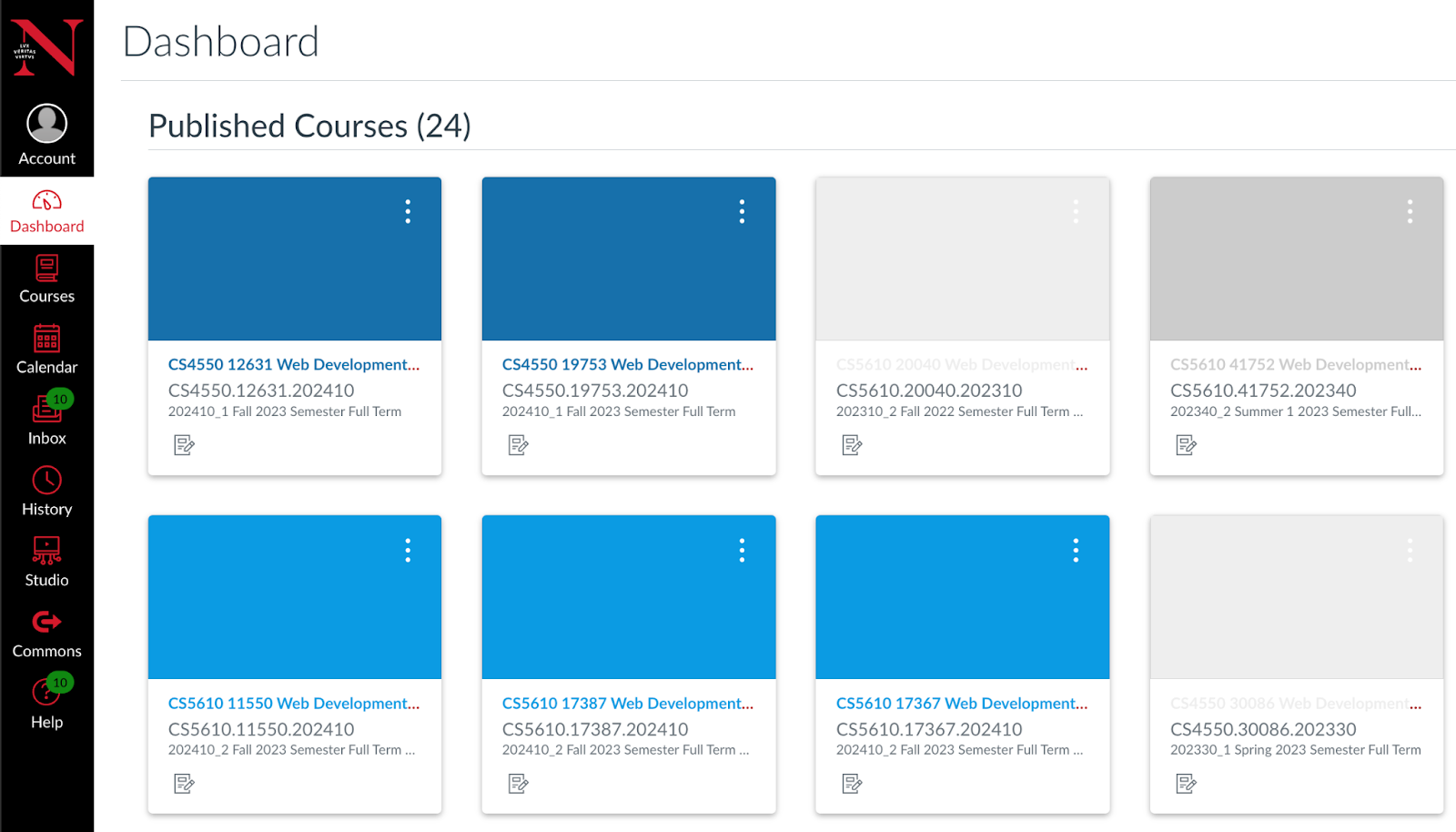
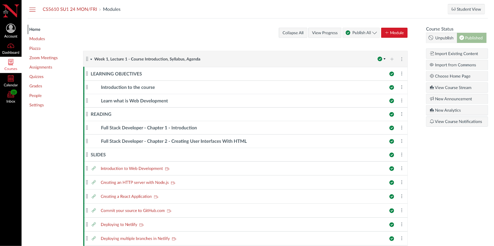
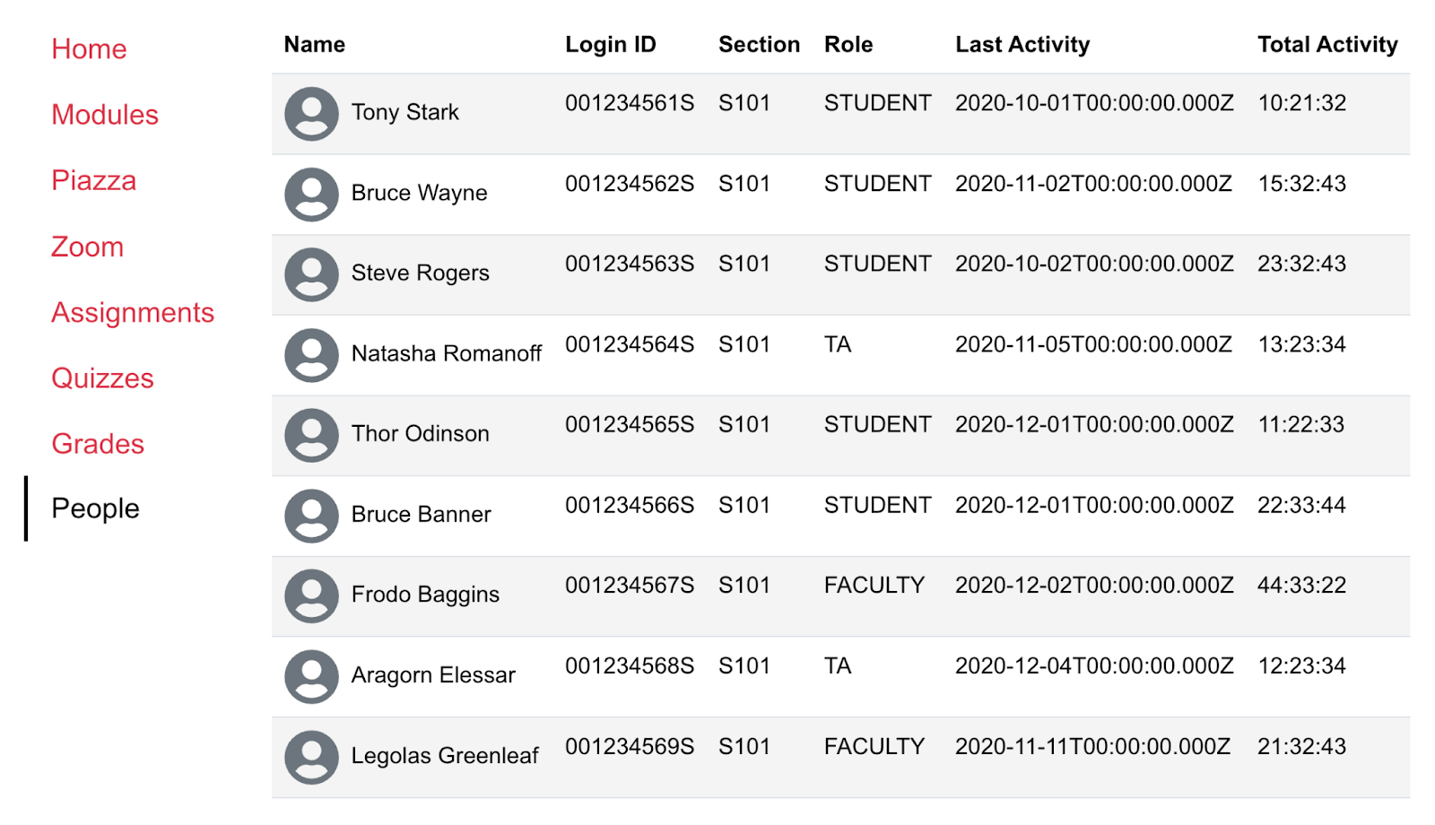
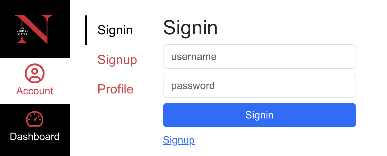
The chapter closes by returning to Kambaz: styling the components you already extracted in Chapter 1 (CourseCard, Module, Lesson, AssignmentItem) with Tailwind, and replacing table layouts with CSS so Navigation, Dashboard, Modules, Home, and People start to resemble the target product — Dashboard (Figure 2a), Home (Figure 2b), People (Figure 2c), and Account Sign in (Figure 2d). Several screens are left as guided, self-directed exercises — by now you have the tools to style them without a step-by-step walkthrough.
The chapter's objectives are best achieved by building along with the narration — each Lab 2 sample and Kambaz restyle as it appears — rather than reading first and coding later. Glance at the Lab 2 checklist in §2.3.7 and the Kambaz checklist in §2.4.10 so the expected coverage is visible from the start. Those lists are recaps, not a reason to skip ahead: work through each section, then use them to confirm what stuck.
2.1 Styling React Components with CSS
SlidesLab 1 structured the page; the browser still painted it in default black on white. The goal here is to take control of that look — color, spacing, and layout — first on a single tag, then from a CSS file whose selectors can restyle many elements at once.
Keep working in the same webdev-client project from Chapter 1. Under app/labs, create a new directory called lab2 and add page.tsx to hold the exercises, mirroring the structure you already used for app/labs/lab1:
mkdir app/labs/lab2Start app/labs/lab2/page.tsx the same way Lab 1 started — a single top-level component you will grow one exercise at a time:
export default function Lab2() {
  return (
    <div id="wd-lab2">
      <h2>Lab 2 - Cascading Style Sheets</h2>
    </div>
  );
}
Add a link to the new lab in both app/labs/page.tsx and app/labs/TOC.tsx, the same two files you updated for Lab 1 in §1.3.10–§1.3.11. Confirm you can reach http://localhost:3000/labs/lab2 from the Labs table of contents before continuing. A coverage checklist for Lab 2 is in §2.3.7 — use it after you have walked through the samples, not instead of building them as you read.
2.1.1 Styling HTML Tags with the Style Attribute
Every HTML tag accepts a style attribute — the same name/value pattern introduced with id in §1.3.1 — that configures the look and feel of that one tag directly. In JSX the value is not a plain string like in HTML — it is a JavaScript object literal (hence the double curly braces: one pair to enter a JSX expression, one pair for the object itself), and property names are camelCase instead of hyphenated, so background-color becomes backgroundColor.
<p style={{ backgroundColor: "blue", color: "white" }}>
  ...
</p>
Add a styled paragraph to app/labs/lab2/page.tsx warning readers about the very technique it demonstrates — the style attribute is convenient for a quick experiment, but scattering styles across individual tags makes a real project hard to maintain, which is why the rest of this section moves styling into separate CSS files instead:
export default function Lab2() {
  return (
    <div id="wd-lab2">
      <h2>Lab 2 - Cascading Style Sheets</h2>
      <h3>Styling with the STYLE attribute</h3>
      <p style={{ backgroundColor: "blue", color: "white" }}>
        Style attribute allows configuring look and feel right on the
        element. Although it's very convenient it is considered bad
        practice and you should avoid using the style attribute
      </p>
    </div>
  );
}
The paragraph's background turns blue and its text turns white — styling applied directly on the element, with no separate CSS file involved:
Lab 2 - Cascading Style Sheets
Styling with the STYLE attribute
Style attribute allows configuring look and feel right on the element. Although it's very convenient it is considered bad practice and you should avoid using the style attribute
2.1.2 Importing CSS Documents from React
The recommended alternative to inline styles is a dedicated CSS file: a plain text document you import into a component, the same way you import a React component or a library. Create app/labs/lab2/index.css alongside page.tsx with this content:
p {
  background-color: green;
  color: white;
}
The code snippet above is referred to as a CSS rule which consists of the following parts:
- The selector is everything before the opening curly brace — here, the tag name
p. The selector is used to refer to the HTML elements that will be styled. - The curly braces wrap a declaration block which contains the list of styles to apply to the selected elements.
- Each line inside the block is a declaration which consists of a property (what to change), a colon, a value (what to change it to), and a semicolon. So
background-coloris the property andgreenis the value.
In a CSS file, property names use hyphens — background-color — that is the original CSS syntax. The JSX style object in §2.1.1 is not a CSS document. It is a JavaScript object, so an unquoted key must be a valid identifier. Hyphens are not allowed in identifiers, which is why that object used camelCase: backgroundColor. You can keep the hyphenated CSS name in JavaScript if you quote the key, as in { "background-color": "green" }. Unquoted camelCase is the usual convention in React.
A rule, then, is a selector plus its declaration block. Later sections introduce new kinds of selectors and many more properties; they still assemble into this same shape.
Remove the style attribute from the paragraph and import index.css at the top of page.tsx instead:
import "./index.css";

export default function Lab2() {
  return (
    <div id="wd-lab2">
      <h2>Lab 2 - Cascading Style Sheets</h2>
      <h3>Styling with the STYLE attribute</h3>
      <p>
        Style attribute allows configuring look and feel right on the
        element. Although it's very convenient it is considered bad
        practice and you should avoid using the style attribute
      </p>
    </div>
  );
}
Even though the paragraph no longer has a style attribute, it now has a green background and white text — the p selector in index.css reaches every paragraph in the file, current and future, without touching the markup again:
Lab 2 - Cascading Style Sheets
Styling with the STYLE attribute
Style attribute allows configuring look and feel right on the element. Although it's very convenient it is considered bad practice and you should avoid using the style attribute
A tag selector is the broadest option: it matches every instance of that tag in the document, which is powerful but blunt. The next three sections introduce narrower selectors so you can style one element, or a chosen group, without restyling every p on the page.
2.1.3 Selecting HTML Content with CSS ID Selectors
Instead of restyling every paragraph on the page, an ID selector targets one specific tag by its id attribute — the same unique identifier introduced for styling and DOM lookups back in §1.3.1. An ID selector is written as the tag name, a #, and the id value. Comment out the blanket p rule in index.css and add two ID-scoped rules instead:
/* p {
  background-color: green;
  color: white;
} */

p#wd-id-selector-1 {
  background-color: red;
  color: white;
}
p#wd-id-selector-2 {
  background-color: yellow;
  color: black;
}
Add two paragraphs carrying those ids to page.tsx, inside a wrapping div so the exercise stays organized as the file grows:
<div id="wd-css-id-selectors">
  <h3>ID selectors</h3>
  <p id="wd-id-selector-1">
    Instead of changing the look and feel of all the
    elements of the same name, e.g., P, we can refer to a
    specific element by its ID
  </p>
  <p id="wd-id-selector-2">
    Here's another paragraph using a different ID and a
    different look and feel
  </p>
</div>
Each paragraph now carries its own color scheme — red-on-white for the first id, yellow-on-black for the second — while any other paragraph on the page is unaffected:
Lab 2 - Cascading Style Sheets
ID selectors
Instead of changing the look and feel of all the elements of the same name, e.g., P, we can refer to a specific element by its ID
Here's another paragraph using a different ID and a different look and feel
2.1.4 Selecting HTML Content with CSS Class Selectors
An id is unique — only one element on the page should carry a given id. When several elements, even of different tag types, should share the same look, use a class selector instead: a name prefixed with a dot (.) in CSS, applied through the className attribute in JSX (React reserves the plain class keyword for JavaScript classes, so JSX renames the attribute). Append a class rule to index.css:
.wd-class-selector {
  background-color: yellow;
  color: blue;
}
Apply that one class to both a paragraph and a heading in page.tsx:
<div id="wd-css-class-selectors">
  <h3>Class selectors</h3>
  <p className="wd-class-selector">
    Instead of using IDs to refer to elements, you can use an
    element's CLASS attribute
  </p>
  <h4 className="wd-class-selector">
    This heading has same style as paragraph above
  </h4>
</div>
Both the paragraph and the heading — two different tag types — pick up the identical yellow background and blue text, because both carry the same class:
Class selectors
Instead of using IDs to refer to elements, you can use an element's CLASS attribute
This heading has same style as paragraph above
2.1.5 Selecting HTML Content Based on the Document Structure
Selectors can also be combined to target tags by their position in the document tree. Separating two class names with a space, as in .wd-selector-1 .wd-selector-3, matches any element with wd-selector-3 nested anywhere inside an element with wd-selector-1 — a descendant relationship, no matter how deeply nested. Separating them with a >, as in .wd-selector-2 > .wd-selector-3, is stricter: it only matches a direct child. Nest four elements in page.tsx to see both relationships in action:
<div id="wd-css-document-structure">
  <div className="wd-selector-1">
    <h3>Document structure selectors</h3>
    <div className="wd-selector-2">
      Selectors can be combined to refer elements in particular
      places in the document
      <p className="wd-selector-3">
        This paragraph's red background is referenced as
        <br />
        .selector-2 .selector3
        <br />
        meaning the descendant of some ancestor.
        <br />
        <span className="wd-selector-4">
          Whereas this span is a direct child of its parent
        </span>
        <br />
        You can combine these relationships to create specific
        styles depending on the document structure
      </p>
    </div>
  </div>
</div>
Style .wd-selector-3 as a descendant of .wd-selector-1 (any depth), and .wd-selector-4 only when it is a direct child of .wd-selector-3, which in turn must be a direct child of .wd-selector-2:
.wd-selector-1 .wd-selector-3 {
  background-color: red;
  color: white;
}
.wd-selector-2 > .wd-selector-3 > .wd-selector-4 {
  background-color: yellow;
  color: blue;
}
The paragraph renders with a red background from the first, broader descendant rule, while the span nested directly inside it switches to yellow-on-blue from the second, stricter child rule — both rules matching the same paragraph, with the more specific one winning for the span:
Document structure selectors
This paragraph's red background is referenced as
.selector-2 .selector3
meaning the descendant of some ancestor.
Whereas this span is a direct child of its parent
You can combine these relationships to create specific styles depending on the document structure
2.1.6 CSS Selection Rule Mechanism
By the time a browser paints an element, several rules may compete to set the same property — a browser default, a tag selector, a class, an id. The "Cascading" in Cascading Style Sheets describes exactly how the browser picks a winner:
- Specificity: more precise selectors win over more general ones. An id selector beats a class selector, which beats a plain tag selector, which beats the browser's built-in default.
- Source order: if two rules have the same specificity, the rule declared later in the CSS wins — this is why the ID selectors in §2.1.3 had to come after (or replace) the tag selector from §2.1.2, not merely exist alongside it with lower specificity resolving the conflict on their own.
- Inheritance: some properties, like
colorand other font properties, pass down from a parent element to its children automatically unless overridden. Layout properties likewidthandmargindo not inherit — each element needs its own rule.
Keep this order in mind whenever a style you expect to see does not appear: check first whether a more specific selector elsewhere is winning, then whether a later rule with equal specificity is overriding it.
2.1.7 Styling an HTML Tag's Foreground Color with CSS
SlidesThe color property sets an element's foreground (text) color. CSS accepts colors in several notations: named colors such as blue or red; hexadecimal triples such as #7070ff (red, green, and blue intensity, two digits each); or the functional rgb(12, 34, 56) form. From this exercise on, move each new demo into its own file under app/labs/lab2/ and import it into page.tsx — the file is getting long enough that one exercise per component keeps it manageable, the same organization used for Lab 1's HTML exercises. Start with ForegroundColors.tsx:
.wd-fg-color-black { color: black; }
.wd-fg-color-white { color: white; }
.wd-fg-color-blue { color: #7070ff; }
.wd-fg-color-red { color: #ff7070; }
.wd-fg-color-green { color: green; }export default function ForegroundColors() {
return (
<div id="wd-css-colors">
<h2>Colors</h2>
<h3 className="wd-fg-color-blue">Foreground color</h3>
<p className="wd-fg-color-red">
The text in this paragraph is red but{" "}
<span className="wd-fg-color-green">this text is green</span>
</p>
</div>
);
}The heading renders blue, the paragraph text red, and the nested span green — three foreground colors applied through three separate class selectors on three different elements:
Colors
Foreground color
The text in this paragraph is red but this text is green
2.1.8 Styling an HTML Tag's Background Color with CSS
The background-color property works the same way, just for the area behind the content instead of the text itself. Add a matching set of background classes and a BackgroundColors.tsx component that stacks background and foreground classes on the same element:
.wd-bg-color-yellow { background-color: #ffff07; }
.wd-bg-color-blue { background-color: #7070ff; }
.wd-bg-color-red { background-color: #ff7070; }
.wd-bg-color-green { background-color: green; }
.wd-bg-color-gray { background-color: lightgray; }export default function BackgroundColors() {
return (
<div id="wd-css-background-colors">
<h3 className="wd-bg-color-blue wd-fg-color-white">Background color</h3>
<p className="wd-bg-color-red wd-fg-color-black">
This background of this paragraph is red but{" "}
<span className="wd-bg-color-green wd-fg-color-white">
the background of this text is green and the foreground white
</span>
</p>
</div>
);
}Each element now applies two classes at once — one for background, one for foreground — which is exactly how className composes multiple selectors: list them space-separated and every matching rule's properties apply together:
Background color
This background of this paragraph is red but the background of this text is green and the foreground white
2.1.9 Styling an HTML Tag's Borders with CSS
Borders are configured with border-width, border-style (solid, dotted, dashed, double, …), and border-color. Declare each aspect of a border as its own reusable class so demos can mix and match a width, a style, and a color independently:
.wd-border-fat { border-width: 20px 30px 20px 30px; }
.wd-border-thin { border-width: 4px; }
.wd-border-solid { border-style: solid; }
.wd-border-dashed { border-style: dashed; }
.wd-border-yellow { border-color: #ffff07; }
.wd-border-red { border-color: #ff7070; }
.wd-border-blue { border-color: #7070ff; }export default function Borders() {
return (
<div id="wd-css-borders">
<h2>Borders</h2>
<p className="wd-border-fat wd-border-red wd-border-solid">
Solid fat red border
</p>
<p className="wd-border-thin wd-border-blue wd-border-dashed">
Dashed thin blue border
</p>
</div>
);
}The first paragraph combines the fat width, red color, and solid style classes into one thick red border; the second combines thin, blue, and dashed into a completely different look — three small classes, many combinations:
Borders
Solid fat red border
Dashed thin blue border
2.1.10 Styling an HTML Tag's Padding, Margins, and Box Model with CSS
SlidesPadding is the space between an element's content and its border; margin is the space outside the border, separating the element from its neighbors. Both can be set on all four sides at once, or per side with -top, -right, -bottom, and -left suffixes. Add padding classes and a Padding.tsx that reuses the border and background classes from the previous two exercises so the padded regions are easy to see:
.wd-padded-top-left {
  padding-top: 50px;
  padding-left: 50px;
}
.wd-padded-bottom-right {
  padding-bottom: 50px;
  padding-right: 50px;
}
.wd-padding-fat {
  padding: 50px;
}export default function Padding() {
return (
<div id="wd-css-paddings">
<h2>Padding</h2>
<div className="wd-padded-top-left wd-border-fat wd-border-red wd-border-solid wd-bg-color-yellow">
Padded top left
</div>
<div className="wd-padded-bottom-right wd-border-fat wd-border-blue wd-border-solid wd-bg-color-yellow">
Padded bottom right
</div>
<div className="wd-padding-fat wd-border-fat wd-border-yellow wd-border-solid wd-bg-color-blue wd-fg-color-white">
Padded all around
</div>
</div>
);
}Each box's text sits a fixed distance from its border — only on the top and left for the first box, only bottom and right for the second, and evenly on all sides for the third:
Padding
Margin classes follow the identical pattern, just pushing neighboring content away from the outside of the border instead of the content in from the inside:
.wd-margin-bottom {
  margin-bottom: 50px;
}
.wd-margin-right-left {
  margin-left: 50px;
  margin-right: 50px;
}
.wd-margin-all-around {
  margin: 30px;
}export default function Margins() {
return (
<div id="wd-css-margins">
<h2>Margins</h2>
<div className="wd-margin-bottom wd-padded-top-left wd-border-fat wd-border-red wd-border-solid wd-bg-color-yellow">
Margin bottom
</div>
<div className="wd-margin-right-left wd-padded-bottom-right wd-border-fat wd-border-blue wd-border-solid wd-bg-color-yellow">
Margin left right
</div>
<div className="wd-margin-all-around wd-padding-fat wd-border-fat wd-border-yellow wd-border-solid wd-bg-color-blue wd-fg-color-white">
Margin all around
</div>
</div>
);
}Compare the gaps between these three boxes to the padding demo above — the space now shows up outside each box's border, pushing the boxes apart from one another rather than pushing the text inward:
Margins
Padding and margin are two layers of a larger picture: the CSS box model. Every element is a box made of four concentric layers, from the inside out: content (the text or children), padding (space between content and border), border, then margin (space outside the border). Background color fills the content and padding; the border sits on top of that edge; margin is transparent — you see whatever is behind the gap.
Those layers also change how width is measured: the box-sizing property chooses the rule. The CSS default is content-box: width: 200px sizes only the content, then padding and border add extra pixels outside it. border-box counts padding and border inside the 200px, so the box you see on screen stays 200px wide. Layout math is much easier with border-box, which is why many style resets (and Tailwind later) set it globally. Add the box-model classes and a BoxModel.tsx that shows the layers, then two boxes that share the same width, padding, and border but differ only in box-sizing:
.wd-box-model-margin {
  background-color: #f8d7da;
  padding: 20px;
  margin: 10px 0;
}
.wd-box-model-border {
  background-color: #fff3cd;
  border: 10px solid #c41e3a;
  padding: 20px;
}
.wd-box-model-padding {
  background-color: #cfe2ff;
  padding: 20px;
}
.wd-box-model-content {
  background-color: #d1e7dd;
  padding: 10px;
}
.wd-box-sizing-demo {
  background-color: lightgray;
  padding: 10px;
}
.wd-box-sizing-content,
.wd-box-sizing-border {
  width: 200px;
  padding: 20px;
  border: 10px solid #c41e3a;
  background-color: #ffff07;
  margin-bottom: 10px;
}
.wd-box-sizing-content {
  box-sizing: content-box;
}
.wd-box-sizing-border {
  box-sizing: border-box;
}export default function BoxModel() {
return (
<div id="wd-css-box-model">
<h2>Box model</h2>
<div className="wd-box-model-margin">
margin
<div className="wd-box-model-border">
border
<div className="wd-box-model-padding">
padding
<div className="wd-box-model-content">content</div>
</div>
</div>
</div>
<h3>box-sizing</h3>
<div className="wd-box-sizing-demo">
<div className="wd-box-sizing-content">
content-box: width 200px plus padding and border
</div>
<div className="wd-box-sizing-border">
border-box: width 200px includes padding and border
</div>
</div>
</div>
);
}The nested labels walk outward through the four layers. Below them, both yellow boxes declare width: 200px, padding: 20px, and a 10px border — but the content-box box is visibly wider (200 + 40 padding + 20 border = 260px on screen) while the border-box box stays 200px:
Box model
box-sizing
2.1.11 Styling an HTML Tag's Corners with CSS
The border-radius property rounds an element's corners. Set all four at once, or list four values (top-left, top-right, bottom-right, bottom-left) to round each corner by a different amount, or target one corner directly with properties like border-top-left-radius:
.wd-rounded-corners-top {
  border-top-left-radius: 40px;
  border-top-right-radius: 40px;
}
.wd-rounded-corners-bottom {
  border-bottom-left-radius: 40px;
  border-bottom-right-radius: 40px;
}
.wd-rounded-corners-all-around {
  border-radius: 50px;
}
.wd-rounded-corners-inline {
  border-radius: 30px 0px 20px 50px;
}export default function Corners() {
return (
<div id="wd-css-corners">
<h3>Rounded corners</h3>
<p className="wd-rounded-corners-top wd-border-thin wd-border-blue wd-border-solid wd-padding-fat">
Rounded corners on the top
</p>
<p className="wd-rounded-corners-bottom wd-border-thin wd-border-blue wd-border-solid wd-padding-fat">
Rounded corners at the bottom
</p>
<p className="wd-rounded-corners-all-around wd-border-thin wd-border-blue wd-border-solid wd-padding-fat">
Rounded corners all around
</p>
<p className="wd-rounded-corners-inline wd-border-thin wd-border-blue wd-border-solid wd-padding-fat">
Different rounded corners
</p>
</div>
);
}The four paragraphs each round a different combination of corners — top only, bottom only, all four evenly, and all four by different amounts on the last one:
Rounded corners
Rounded corners on the top
Rounded corners at the bottom
Rounded corners all around
Different rounded corners
2.1.12 Styling an HTML Tag's Dimensions and Display with CSS
SlidesBy default, block-level elements — div, headings, paragraphs — stretch to fill the full width of their parent container. The width and height properties override that default so an element only occupies the space you specify:
.wd-dimension-portrait {
  width: 75px;
  height: 100px;
}
.wd-dimension-landscape {
  width: 100px;
  height: 75px;
}
.wd-dimension-square {
  width: 75px;
  height: 75px;
}export default function Dimensions() {
return (
<div id="wd-css-dimensions">
<h2>Dimension</h2>
<div>
<div className="wd-dimension-portrait wd-bg-color-yellow">Portrait</div>
<div className="wd-dimension-landscape wd-bg-color-blue wd-fg-color-white">
Landscape
</div>
<div className="wd-dimension-square wd-bg-color-red">Square</div>
</div>
</div>
);
}Three small boxes appear where three full-width divs would have stood by default — but block elements still stack vertically even at reduced widths, since narrowing an element does not change whether it starts a new line:
Dimension
width and height apply to block boxes (and to inline-block, below). They do not apply to inline boxes — span, a, and text-level tags from §1.3.1. An inline element sizes to its content and sits in the line; assigning width: 150px is ignored. The CSS display property overrides the tag's default:
display: inline— stay in the line;width/heightare ignoreddisplay: block— start a new line; honorwidth/heightand stretch to the parent by defaultdisplay: inline-block— sit in the line and honorwidth/height— the usual choice when you want a box that still flows like a word
Add display classes and a Display.tsx that applies all three to span tags (which default to inline) so the only difference is the display value. Each span also sets width: 150px and height: 50px — watch which ones obey:
.wd-display-inline {
  display: inline;
  width: 150px;
  height: 50px;
  padding: 5px;
}
.wd-display-inline-block {
  display: inline-block;
  width: 150px;
  height: 50px;
  padding: 5px;
}
.wd-display-block {
  display: block;
  width: 150px;
  height: 50px;
  padding: 5px;
}export default function Display() {
return (
<div id="wd-css-display">
<h2>Display</h2>
<h3>Inline</h3>
<div>
<span className="wd-display-inline wd-bg-color-red">Inline 1</span>
<span className="wd-display-inline wd-bg-color-yellow">Inline 2</span>
<span className="wd-display-inline wd-bg-color-blue wd-fg-color-white">
Inline 3
</span>
</div>
<h3>Inline-block</h3>
<div>
<span className="wd-display-inline-block wd-bg-color-red">
Inline-block 1
</span>
<span className="wd-display-inline-block wd-bg-color-yellow">
Inline-block 2
</span>
<span className="wd-display-inline-block wd-bg-color-blue wd-fg-color-white">
Inline-block 3
</span>
</div>
<h3>Block</h3>
<div>
<span className="wd-display-block wd-bg-color-red">Block 1</span>
<span className="wd-display-block wd-bg-color-yellow">Block 2</span>
<span className="wd-display-block wd-bg-color-blue wd-fg-color-white">
Block 3
</span>
</div>
</div>
);
}The first row stays a single line of text-sized chips — 150px was ignored. The second row still shares a line, but each chip is a 150×50 box. The third row stacks, one per line:
Display
Inline
Inline-block
Block
2.1.13 Styling an HTML Tag's Relative Position with CSS
The CSS position property overrides where an element would normally sit. Setting it to relative nudges the element away from its default spot — using top, bottom, left, and right to say how far — while leaving a "ghost" of its original space behind, so surrounding elements do not shift to fill the gap:
.wd-pos-relative-nudge-up-right {
  position: relative;
  bottom: 30px;
  left: 30px;
}
.wd-pos-relative-nudge-down-right {
  position: relative;
  top: 20px;
  left: 20px;
}
.wd-pos-relative {
  position: relative;
}export default function Positions() {
return (
<div id="wd-css-position-relative">
<h2>Relative</h2>
<div className="wd-bg-color-gray">
<div className="wd-bg-color-yellow wd-dimension-portrait">
<div className="wd-pos-relative-nudge-down-right">Portrait</div>
</div>
<div className="wd-pos-relative-nudge-up-right wd-bg-color-blue wd-fg-color-white wd-dimension-landscape">
Landscape
</div>
<div className="wd-bg-color-red wd-dimension-square">Square</div>
</div>
</div>
);
}The "Portrait" label drifts down and right inside its own yellow box, and the landscape box drifts up and right — both nudged away from where they would otherwise sit, without the gray container or the red square reflowing around them:
Relative
2.1.14 Styling a Tag's Absolute Position with CSS
Setting position to absolute removes the element from the normal flow entirely and positions it relative to its nearest ancestor whose own position is relative, absolute, or fixed — falling back to the page itself if no such ancestor exists. Wrap three absolutely positioned boxes in a relative container so they anchor to it instead of the whole page:
.wd-pos-absolute-10-10 {
  position: absolute;
  top: 10px;
  left: 10px;
}
.wd-pos-absolute-50-50 {
  position: absolute;
  top: 50px;
  left: 50px;
}
.wd-pos-absolute-120-20 {
  position: absolute;
  top: 20px;
  left: 120px;
}<div id="wd-css-position-absolute">
<h2>Absolute position</h2>
<div className="wd-pos-relative" style={{ height: 150 }}>
<div className="wd-pos-absolute-10-10 wd-bg-color-yellow wd-dimension-portrait">
Portrait
</div>
<div className="wd-pos-absolute-50-50 wd-bg-color-blue wd-fg-color-white wd-dimension-landscape">
Landscape
</div>
<div className="wd-pos-absolute-120-20 wd-bg-color-red wd-dimension-square">
Square
</div>
</div>
</div>The three boxes stack on top of one another, each offset from the top-left corner of the shared relative container by its own top/left pair — proof that "absolute" means relative to an ancestor, not to some fixed point on the screen:
Absolute position
2.1.15 Styling an HTML Tag's Fixed Position with CSS
Setting position to fixed anchors an element to the browser's viewport instead of any ancestor, so it stays put even while the rest of the page scrolls. Add one fixed box to the bottom-right of the demo:
.wd-pos-fixed {
  position: fixed;
  right: 0px;
  bottom: 50%;
}<div id="wd-css-position-fixed">
<h2>Fixed position</h2>
Checkout the blue square that says "Fixed position" stuck all the way
on the right and half way down the page. It doesn't scroll with the
rest of the page. Its position is "Fixed".
<div className="wd-pos-fixed wd-dimension-square wd-bg-color-blue wd-fg-color-white">
Fixed position
</div>
</div>Combined into one Positions.tsx component, the relative, absolute, and fixed demos all render together — scroll this figure and the blue "Fixed position" square stays glued to the right edge instead of scrolling away with the rest of the content:
This figure box wraps the demo so the fixed square stays inside it for the screenshot — in the real Lab 2 page it anchors to the browser window itself, exactly as position: fixed intends.
2.1.16 Styling an HTML Tag's Z Index with CSS
Once elements are positioned with relative, absolute, or fixed, they can end up overlapping. By default, later elements in the HTML render on top of earlier ones. The z-index property overrides that default stacking order directly — a higher z-index always renders above a lower one, regardless of source order:
.wd-zindex-bring-to-front {
  z-index: 10;
}export default function Zindex() {
return (
<div id="wd-z-index">
<h2>Z index</h2>
<div className="wd-pos-relative" style={{ height: 150 }}>
<div className="wd-pos-absolute-10-10 wd-bg-color-yellow wd-dimension-portrait">
Portrait
</div>
<div className="wd-zindex-bring-to-front wd-pos-absolute-50-50 wd-dimension-landscape wd-bg-color-blue wd-fg-color-white">
Landscape
</div>
<div className="wd-pos-absolute-120-20 wd-bg-color-red wd-dimension-square">
Square
</div>
</div>
</div>
);
}The blue landscape box is declared before the red square in the markup, yet it renders above it, because wd-zindex-bring-to-front gives it a higher stacking order than the default:
Z index
2.1.17 Floating Images and Content with CSS
SlidesThe float property pulls an element to the left or right edge of its container and lets adjacent inline content wrap around it — the classic technique for flowing paragraphs of text around an image. Because floated elements leave the normal flow, a following element with clear: both is needed to stop the wrapping and resume normal stacking:
.wd-float-left {
  float: left;
  height: 100px;
}
.wd-float-right {
  float: right;
  height: 100px;
}
img.wd-float-left,
img.wd-float-right {
  width: auto;
  max-width: 35%;
}
img.wd-float-left {
  margin: 0 1rem 0.5rem 0;
}
img.wd-float-right {
  margin: 0 0 0.5rem 1rem;
}
.wd-float-done {
  clear: both;
}export default function Float() {
return (
<div id="wd-float-divs">
<h2>Float</h2>
<div>
<img className="wd-float-right" src={STARSHIP} alt="Starship" />
{LOREM} {LOREM}
<img className="wd-float-left" src={STARSHIP} alt="Starship" />
{LOREM} {LOREM}
<div className="wd-float-done" />
</div>
</div>
);
}Swap in some lorem ipsum placeholder text for LOREM and any image URL for STARSHIP. Keep the images small with height: 100px (and a modest max-width) so the paragraph text has room to wrap beside them instead of stacking under a full-width image. The same wd-float-left and wd-float-right classes also arrange plain colored boxes side by side, which is how the next section builds a grid out of nothing but float:
Float
 Lorem ipsum, dolor sit amet consectetur adipisicing elit. Eius hic reprehenderit doloremque adipisci iste deserunt. Inventore, hic. Esse nihil unde aut, dignissimos eos consequatur veniam distinctio? Lorem ipsum, dolor sit amet consectetur adipisicing elit. Eius hic reprehenderit doloremque adipisci iste deserunt. Inventore, hic. Esse nihil unde aut, dignissimos eos consequatur veniam distinctio?Lorem ipsum, dolor sit amet consectetur adipisicing elit. Eius hic reprehenderit doloremque adipisci iste deserunt. Inventore, hic. Esse nihil unde aut, dignissimos eos consequatur veniam distinctio? Lorem ipsum, dolor sit amet consectetur adipisicing elit. Eius hic reprehenderit doloremque adipisci iste deserunt. Inventore, hic. Esse nihil unde aut, dignissimos eos consequatur veniam distinctio?Lorem ipsum, dolor sit amet consectetur adipisicing elit. Eius hic reprehenderit doloremque adipisci iste deserunt. Inventore, hic. Esse nihil unde aut, dignissimos eos consequatur veniam distinctio? Lorem ipsum, dolor sit amet consectetur adipisicing elit. Eius hic reprehenderit doloremque adipisci iste deserunt. Inventore, hic. Esse nihil unde aut, dignissimos eos consequatur veniam distinctio?Lorem ipsum, dolor sit amet consectetur adipisicing elit. Eius hic reprehenderit doloremque adipisci iste deserunt. Inventore, hic. Esse nihil unde aut, dignissimos eos consequatur veniam distinctio? Lorem ipsum, dolor sit amet consectetur adipisicing elit. Eius hic reprehenderit doloremque adipisci iste deserunt. Inventore, hic. Esse nihil unde aut, dignissimos eos consequatur veniam distinctio?
2.1.18 Laying Out Content in a Grid Using CSS
Combine float: left with percentage widths and you can arrange any number of columns side by side — a half-and-half split, a sidebar-and-main-content layout, or anything in between. Each row needs a wrapper with clear: both so the next row starts fresh below the previous one instead of floating up beside it:
.wd-grid-row {
  clear: both;
}
.wd-grid-col-half-page { width: 50%; float: left; }
.wd-grid-col-third-page { width: 33%; float: left; }
.wd-grid-col-two-thirds-page { width: 67%; float: left; }
.wd-grid-col-left-sidebar { width: 20%; float: left; }
.wd-grid-col-main-content { width: 60%; float: left; }
.wd-grid-col-right-sidebar { width: 20%; float: left; }export default function GridLayout() {
return (
<div id="wd-css-grid-layout">
<div className="wd-grid-row">
<div className="wd-grid-col-half-page wd-bg-color-yellow">
<h3>Left half</h3>
</div>
<div className="wd-grid-col-half-page wd-bg-color-blue wd-fg-color-white">
<h3>Right half</h3>
</div>
</div>
<div className="wd-grid-row">
<div className="wd-grid-col-left-sidebar wd-bg-color-yellow">
<h3>Side bar</h3>
</div>
<div className="wd-grid-col-main-content wd-bg-color-blue wd-fg-color-white">
<h3>Main content</h3>
</div>
<div className="wd-grid-col-right-sidebar wd-bg-color-green wd-fg-color-white">
<h3>Side bar</h3>
</div>
</div>
</div>
);
}The first row splits evenly in two; the second row arranges a narrow sidebar, wide main content, and a second sidebar across the same width — the whole layout built from nothing more than float and percentage widths, no dedicated layout property required yet:
Grid layout
Left half
Right half
Left third
Right two thirds
Main content
This is the main content. This is the main content. This is the main content.
2.1.19 Laying Out Content with CSS Flex
SlidesFlexbox (display: flex) is a purpose-built alternative to float-based layout. Declaring a container's display as flex and its flex-direction as row immediately lines up its children horizontally — no floats, no clearing, no percentage math:
.wd-flex-row-container {
  display: flex;
  flex-direction: row;
}
.wd-flex-row-container > div {
  height: 100px;
  padding: 10px;
  white-space: nowrap;
}export default function Flex() {
return (
<div id="wd-css-flex">
<h2>Flex</h2>
<div className="wd-flex-row-container">
<div className="wd-bg-color-yellow">Column 1</div>
<div className="wd-bg-color-blue wd-fg-color-white">Column 2</div>
<div className="wd-bg-color-red wd-fg-color-white">Column 3</div>
</div>
</div>
);
}Three divs that would normally stack vertically instead sit in a single row. A shared rule gives each child a 100px height and a bit of padding; blue and red use wd-fg-color-white so their labels stay readable:
Flex
Flex children can also grow to absorb leftover space. Add flex-grow: 1 to the last column so it stretches to fill whatever room the other two do not use:
.wd-flex-grow-1 {
  flex-grow: 1;
}
The third column now expands to consume all the remaining width in the row, while the first two stay exactly as wide as their text:
Flex
Finally, pin the first column to a fixed width so it neither shrinks nor grows, letting the third column absorb whatever space is left after that fixed column and the second column's natural width are accounted for:
.wd-width-75px {
  /* Room for "Column 1" + 10px padding under border-box */
  width: 110px;
  flex-shrink: 0;
}
Flex
2.1.20 Media Queries
SlidesMedia queries apply a block of CSS rules only when the browser matches a condition — most commonly a viewport width range — which is the foundation of responsive design: the same markup rendering differently on a phone, a tablet, and a desktop. Give this demo its own CSS file, since the rules only make sense together as a set:
.wd-media-queries-demo {
  background-color: green;
  color: white;
  padding: 1rem;
}

.wd-media-queries-demo li {
  opacity: 0.55;
  font-weight: normal;
  text-decoration: none;
}

.wd-media-queries-demo li.wd-mq-rule-default {
  opacity: 1;
  font-weight: bold;
  text-decoration: underline;
}

@media (min-width: 750px) and (max-width: 1000px) {
  .wd-media-queries-demo {
    background-color: yellow;
    color: black;
  }
  /* Same specificity as the default highlight — must clear it here */
  .wd-media-queries-demo li.wd-mq-rule-default {
    opacity: 0.55;
    font-weight: normal;
    text-decoration: none;
  }
  .wd-media-queries-demo li.wd-mq-rule-750 {
    opacity: 1;
    font-weight: bold;
    text-decoration: underline;
  }
}

@media (min-width: 1000px) and (max-width: 1250px) {
  .wd-media-queries-demo {
    background-color: blue;
    color: white;
  }
  .wd-media-queries-demo li.wd-mq-rule-default {
    opacity: 0.55;
    font-weight: normal;
    text-decoration: none;
  }
  .wd-media-queries-demo li.wd-mq-rule-1000 {
    opacity: 1;
    font-weight: bold;
    text-decoration: underline;
  }
}

@media (min-width: 1250px) {
  .wd-media-queries-demo {
    background-color: red;
    color: white;
  }
  .wd-media-queries-demo li.wd-mq-rule-default {
    opacity: 0.55;
    font-weight: normal;
    text-decoration: none;
  }
  .wd-media-queries-demo li.wd-mq-rule-1250 {
    opacity: 1;
    font-weight: bold;
    text-decoration: underline;
  }
}import "./MediaQueriesDemo.css";
export default function MediaQueriesDemo() {
return (
<div className="wd-media-queries-demo">
<h1>Media Query Demo</h1>
<p>
This demo uses CSS media queries to change colors based on screen width:
</p>
<ul>
<li className="wd-mq-rule-default">
Default is White text on Green background
</li>
<li className="wd-mq-rule-750">
750px to 1000px: Black text on Yellow background
</li>
<li className="wd-mq-rule-1000">
1000px to 1250px: White text on Blue background
</li>
<li className="wd-mq-rule-1250">
Above 1250px: White text on Red background
</li>
</ul>
</div>
);
}Notice that only the last @media block has no max-width, so it matches every width from 1250px upward. The matching bullet is bold and underlined so you can see which rule is active. Resize the browser window to watch the background — and the highlighted bullet — cycle through green, yellow, blue, and red:
Media Query Demo
This demo uses CSS media queries to change colors based on screen width:
- Default is White text on Green background
- 750px to 1000px: Black text on Yellow background
- 1000px to 1250px: White text on Blue background
- Above 1250px: White text on Red background
2.1.21 Check Your Understanding
Before React Icons and Tailwind, pause and test the CSS topics from this section. The practice quiz draws 10 items — concepts (why the style attribute is a bad habit, padding vs margin, the box model, block vs inline), syntax (hyphens vs camelCase, # vs ., box-sizing, display), button types (§1.3.6.7), acronyms, snippets, fill-in-the-blank, and short puzzles. It is a self-check, not part of your course grade. Misses link back to the subsection you should reread; each new attempt draws a different 10.
2.2 Decorating Documents with React Icons
SlidesReact Icons bundles thousands of icons from several popular icon families — Font Awesome, Heroicons, and more — and exposes each one as a plain React component. Install it from the project root:
npm install react-iconsBrowse react-icons.github.io/react-icons and search by keyword or icon family — each result page shows the import path and component name to copy. Try a handful from different families in one component:
import { FaCalendar, FaEnvelopeOpenText, FaRegClock } from "react-icons/fa";
import { AiOutlineDashboard } from "react-icons/ai";
import { FaBookBible } from "react-icons/fa6";
import { VscAccount } from "react-icons/vsc";

export default function ReactIconsSampler() {
  return (
    <div id="wd-react-icons-sampler" className="mb-4 font-sans">
      <h3 className="text-lg font-semibold">React Icons Sampler</h3>
      <div className="flex gap-3 text-3xl">
        <VscAccount />
        <AiOutlineDashboard />
        <FaBookBible />
        <FaCalendar />
        <FaEnvelopeOpenText />
        <FaRegClock />
      </div>
    </div>
  );
}
Six icons render inline, each imported from a different icon family through a different package path — fa, ai, fa6, and vsc each group icons by their source library. The parent uses text-3xl so each icon (sized in em) scales up; that utility comes from Tailwind, introduced properly in §2.3. Icon components also accept ordinary className, style, and size props like any other element:
React Icons Sampler
Import ReactIconsSampler into Lab2 to keep it on the growing exercise page, then keep an eye out for icons that fit Kambaz screens later in §2.4 — a dashboard icon for the Dashboard link, a calendar icon for Calendar, and so on.
2.3 Styling Webpages with the Tailwind CSS Library
SlidesTailwind CSS is a utility-first framework: instead of writing custom CSS rules, you compose a look directly in className out of small, single-purpose utility classes like p-4 (padding) or bg-red-500 (background color). create-next-app already installed and configured Tailwind when you scaffolded webdev-client in Chapter 1 — you simply commented out its import in app/layout.tsx so the HTML exercises could render with plain browser defaults.
Rather than re-enabling Tailwind globally, scope it to a new tailwind sub-lab so only pages that opt in load it. Create a small CSS file that imports the library:
@import "tailwindcss";Then create the page that imports that CSS file — and, because it is its own route under app/labs/lab2/tailwind/, its own separate URL from the rest of Lab 2:
import "./index.css";

export default function TailwindLab() {
  return (
    <div className="p-8">
      <h1 className="text-4xl font-bold mb-8">Tailwind CSS</h1>
    </div>
  );
}
Link to /labs/lab2/tailwind from the main Lab 2 page so both are reachable from the Labs table of contents, then work through the utility categories below one component at a time.
2.3.1 Spacing Slides
Tailwind's spacing utilities follow a compact naming convention: classes starting with m set margin, classes starting with p set padding, and a number suffix (-4, -8, …) sets the amount on a consistent scale. Direction letters narrow which side: nothing for all sides, s/e for the logical start/end (left/right in English), t/b for top/bottom:
export default function TailwindSpacing() {
  return (
    <div>
      <h2 className="text-3xl">Margin</h2>
      <div className="bg-blue-200 mb-4 p-4">
        This div has a bottom margin of 4.
      </div>
      <div className="bg-blue-200 ms-4 me-8 p-4">
        This div has a start margin of 4 and an end margin of 8.
      </div>
      <h2 className="text-3xl mt-8">Padding</h2>
      <div className="bg-green-200 ps-2 pt-4 pb-8 mb-4">
        This div has starting padding of 2, top padding of 4, and bottom padding of 8.
      </div>
      <div className="bg-green-200 p-6">This div has padding all around of 6.</div>
    </div>
  );
}
Each box's spacing changes with nothing but its class list — no separate stylesheet, no selector to name:
Margin
Padding
2.3.2 Typography Slides
Typography utilities cover font size (text-sm through text-3xl) and weight (font-thin through font-black) with the same predictable naming:
export default function TailwindTypography() {
  return (
    <div>
      <h2 className="text-3xl">Font Size</h2>
      <p className="text-sm">This is small text.</p>
      <p className="text-3xl">This is 3x extra large text.</p>
      <h2 className="text-3xl font-bold mt-4">Font Weight</h2>
      <p className="font-thin">This is thin font weight.</p>
      <p className="font-black">This is black font weight.</p>
    </div>
  );
}
Font sizes step up visibly from text-sm to text-3xl, and weights step up from a barely-there font-thin to a heavy font-black — build the full component with every step listed in the code above to see the whole scale:
Font Size
This is small text.
This is base text.
This is large text.
This is extra large text.
This is 2x extra large text.
This is 3x extra large text.
Font Weight
This is thin font weight.
This is light font weight.
This is normal font weight.
This is medium font weight.
This is semi-bold font weight.
This is bold font weight.
This is extra-bold font weight.
This is black font weight.
2.3.3 Background Colors Slides
Background color utilities follow the pattern bg-{color}-{shade}, where the shade is a number from 50 (lightest) to 950 (darkest) in steps of 100. Pair a background with a contrasting text color so the content stays readable:
export default function TailwindBackgroundColors() {
  return (
    <div>
      <h2 className="text-3xl font-bold mb-4">Background Colors</h2>
      <div className="bg-red-500 text-white p-4 mb-4">This div has a red background.</div>
      <div className="bg-green-500 text-white p-4 mb-4">This div has a green background.</div>
      <div className="bg-blue-500 text-white p-4 mb-4">This div has a blue background.</div>
      <div className="bg-yellow-500 text-black p-4 mb-4">This div has a yellow background.</div>
    </div>
  );
}
Four bands of color render top to bottom — the same -500 shade across red, green, and blue, butyellow-500 is light enough that it needs black text instead of white to stay legible:
Background Colors
2.3.4 Responsive Design Slides
Tailwind is mobile-first: an unprefixed class applies at every width, while a class prefixed with a breakpoint like md: only takes effect once the viewport reaches that breakpoint and up. Save an image of the React logo to public/images/reactjs.jpg (already available fromChapter 1's Kambaz Dashboard exercise) and build a card that stacks vertically on narrow screens but switches to a side-by-side layout at the md breakpoint:
export default function TailwindResponsiveDesign() {
  return (
    <div className="mx-auto max-w-md overflow-hidden rounded-xl bg-white shadow-md md:max-w-2xl">
      <div className="md:flex">
        <div className="md:shrink-0">
          <img
            className="h-48 w-full object-cover md:h-full md:w-48"
            src="/images/reactjs.jpg"
            alt="ReactJS logo"
          />
        </div>
        <div className="p-8">
          <div className="text-sm font-semibold tracking-wide text-indigo-500 uppercase">
            Professional Courses
          </div>
          <a href="#" className="mt-1 block text-lg leading-tight font-medium text-black hover:underline">
            Rocket Propulsion Fundamentals
          </a>
          <p className="mt-2 text-gray-500">
            An in-depth study of the fundamentals of rocket propulsion...
          </p>
        </div>
      </div>
    </div>
  );
}
Drag this figure's panel narrower and wider — below the md breakpoint the image sits above the text in a single column; at md and above the md:flex class kicks in and the image moves beside the text:

This course provides an in-depth study of the fundamentals of rocket propulsion, covering topics such as propulsion theory, engine types, fuel chemistry, and the practical applications of rocket technology. Designed for students with a strong background in physics and engineering, the course includes both theoretical instruction and hands-on laboratory work
2.3.5 Filters
Filter utilities apply visual effects — blur, brightness, contrast, grayscale, and more — straight onto an image or element. The original exercise blurs a photo of Angel Falls at four increasing strengths; if you do not have that image handy, any photo under public/images works just as well to see the effect — the sample below reuses reactjs.jpg:
export default function TailwindFilters() {
  const src = "/images/reactjs.jpg";
  return (
    <div>
      <h3>Blurs</h3>
      <div className="flex">
        <img className="blur-none w-1/4" src={src} alt="blur none" />
        <img className="blur-sm w-1/4" src={src} alt="blur sm" />
        <img className="blur-lg w-1/4" src={src} alt="blur lg" />
        <img className="blur-2xl w-1/4" src={src} alt="blur 2xl" />
      </div>
    </div>
  );
}
Four copies of the same image sit side by side, the blur growing from imperceptible to nearly unrecognizable — each variation is nothing more than one utility class swapped for another:
Blurs
2.3.6 CSS Grid Layout Slides
Tailwind also wraps CSS Grid in utility classes: grid grid-cols-4 gap-4 turns a container into a four-column grid with consistent gutters, and children automatically wrap onto new rows once a row fills up:
export default function TailwindGrids() {
  return (
    <div>
      <h3 className="mt-6 text-3xl font-bold">4 Columns Grid</h3>
      <div className="grid grid-cols-4 gap-4">
        {Array.from({ length: 9 }, (_, i) => (
          <div key={i} className="text-center bg-blue-300 p-3">
            {String(i + 1).padStart(2, "0")}
          </div>
        ))}
      </div>
    </div>
  );
}
Nine numbered cells flow across four columns and wrap onto a third row for the last one — no manual row-breaking required:
A single class can also span multiple grid columns with col-span-{n}. Append a "Grid system" demo to the same file that mixes an even two-column split with a twelve-column split for a one-third/two-thirds layout and a sidebar/content/sidebar layout — the same page layouts §2.1.18 built with float, this time with Grid:
<div id="wd-tailwind-grid-system" className="mt-6">
  <h2>Grid system</h2>
  <div className="grid grid-cols-2 gap-2">
    <div className="bg-red-500 text-white"><h3>Left half</h3></div>
    <div className="bg-blue-500 text-white"><h3>Right half</h3></div>
  </div>
  <div className="grid grid-cols-12 gap-2 mt-2">
    <div className="col-span-4 bg-yellow-500"><h3>One third</h3></div>
    <div className="col-span-8 bg-green-500 text-white"><h3>Two thirds</h3></div>
  </div>
  <div className="grid grid-cols-12 gap-2 mt-2">
    <div className="col-span-2 bg-black text-white"><h3>Sidebar</h3></div>
    <div className="col-span-8 bg-gray-500 text-white"><h3>Main content</h3></div>
    <div className="col-span-2 bg-blue-400"><h3>Sidebar</h3></div>
  </div>
</div>
A twelve-column grid is the sweet spot for page layout because twelve divides evenly by two, three, four, and six — which is why col-span-4 (one third) and col-span-8 (two thirds) add up cleanly to twelve, and why the sidebar/content/sidebar row below it uses 2/8/2:
Tailwind Grids
4 Columns Grid
3 Columns Grid
Grid system
Left half
Right half
One third
Two thirds
Sidebar
Main content
Sidebar
2.3.7 Exercises
Use this checklist to confirm Lab 2 covers the CSS, icon, and Tailwind topics in §2.1–§2.3. Each item points back to the section where you built the worked example. When you are done, app/labs/lab2/page.tsx should import the CSS samples in order, and the Tailwind samples should live under app/labs/lab2/tailwind/. Each topic is listed once, with Lab, On your own, and With AI nested as a/b/c when that section has those blocks.
- Lab 2 page and CSS file (§2.1)
- Lab component — Create app/labs/lab2/page.tsx and index.css, and link Lab 2 from the Labs index and TOC.
- Selectors (§2.1.1–§2.1.5)
- Lab component — Practice the style attribute, then move rules into the CSS file with id, class, and document-structure selectors.
- On your own — Complete each section's On your own in §2.1.1–§2.1.5.
- With AI — Complete each section's With AI extra in §2.1.1–§2.1.5.
- Color, border, and box model (§2.1.7–§2.1.12)
- Lab component — Create the color, border, box-model, corner, dimension, and display samples and import them.
- On your own — Complete each section's On your own in §2.1.7–§2.1.12.
- With AI — Complete each section's With AI extra in §2.1.7–§2.1.12.
- Position, float, flex, and media queries (§2.1.13–§2.1.20)
- Lab component — Create the position, z-index, float, grid, flex, and media-query samples and import them.
- On your own — Complete each section's On your own in §2.1.13–§2.1.20.
- With AI — Complete each section's With AI extra in §2.1.13–§2.1.20.
- React Icons (§2.2)
- Lab component — Create ReactIconsSampler.tsx and import it.
- On your own — In ReactIconsSampler.tsx, import two more icons from families you have not used yet, give them a className for size or color, and keep them on the Lab 2 page.
- With AI — Ask the assistant to add two sample icons from other families — leave your personal pair as yours.
- Tailwind samples (§2.3)
- Lab component — Create the Tailwind samples under app/labs/lab2/tailwind/ — spacing, typography, backgrounds, responsive prefixes, filters, and grids.
- On your own — Complete each Tailwind section's On your own (spacing, typography, backgrounds, responsive, filters, grids).
- With AI — Complete each Tailwind section's With AI extra.
2.4 Styling Kambaz with CSS and Tailwind
SlidesChapter 1 prototyped Kambaz with nothing but plain HTML, including table/tr/td elements to force content into side-by-side columns — functional, but exactly the kind of layout-via-table this chapter has spent §2.1.18–§2.1.19 replacing with CSS. Before restyling each screen, we wire Tailwind into the Kambaz shell the right way, then swap those tables for flex layouts. A single coverage checklist is in §2.4.10 — use it after you have walked through the screens, not instead of restyling them as you read.
In §2.3 the Tailwind lab imports the full library (@import "tailwindcss"), which includes Preflight — a base reset that would also wipe plain HTML defaults elsewhere. For Kambaz we use a smaller entry that loads only the theme and utilities:
/* Utilities + theme only — safe for Kambaz without Preflight reset */
@import "tailwindcss/theme" layer(theme);
@import "tailwindcss/utilities" layer(utilities);
If we import that file once from the Kambaz layout (individual screens can import it too, but once at the layout is enough), and pair it with kambaz.css for a few app-wide rules — a system sans-serif base (without Preflight the browser often falls back to Times), box-sizing, and later the fixed-sidebar offset — the shell stays consistent. Putting font-sans on the root as well means Tailwind's system stack applies even if the CSS rule is incomplete:
/* System sans-serif — Tailwind utilities alone do not set the body font */
#wd-kambaz {
  font-family: system-ui, -apple-system, "Segoe UI", Roboto, "Helvetica Neue",
    "Noto Sans", "Liberation Sans", Arial, sans-serif;
  color: #212529;
  line-height: 1.5;
}
#wd-kambaz,
#wd-kambaz * {
  box-sizing: border-box;
}import "@/app/labs/lab2/tailwind/utilities.css";
import "./kambaz.css";
import KambazNavigation from "./Navigation";
export default function KambazLayout({ children }) {
return (
<div id="wd-kambaz" className="font-sans">
<KambazNavigation />
<div className="wd-main-content-offset p-3">{children}</div>
</div>
);
}With that shell in place, the remaining table wrappers come out of app/(kambaz)/layout.tsx (if any), app/(kambaz)/courses/[cid]/layout.tsx, and app/(kambaz)/courses/[cid]/home/page.tsx, replaced with flex containers so the Course Navigation sidebar and Course Status column sit beside the main content through CSS instead of table cells. Both course files come back into focus below once Navigation and Status are styled — including the responsive hide order (hidden lg:block for Status first, then hidden md:block for both sidebars together).
Each Kambaz screen below follows the same arc: a target screenshot, the plain Chapter 1 prototype already built, the code that closes the styling gap, and a styled result we can compare live.
2.4.1 Styling the Kambaz Navigation Sidebar Slides
The Kambaz Navigation sidebar from §1.4 was a plain vertical list of links. Pin it to the left edge as a fixed black column of icon-and-label tiles so the rest of Kambaz can scroll beside it.
The finished sidebar is expected to look like a narrow black column of centered icon links, with the active route highlighted in white and red (Figure 2.4.1):
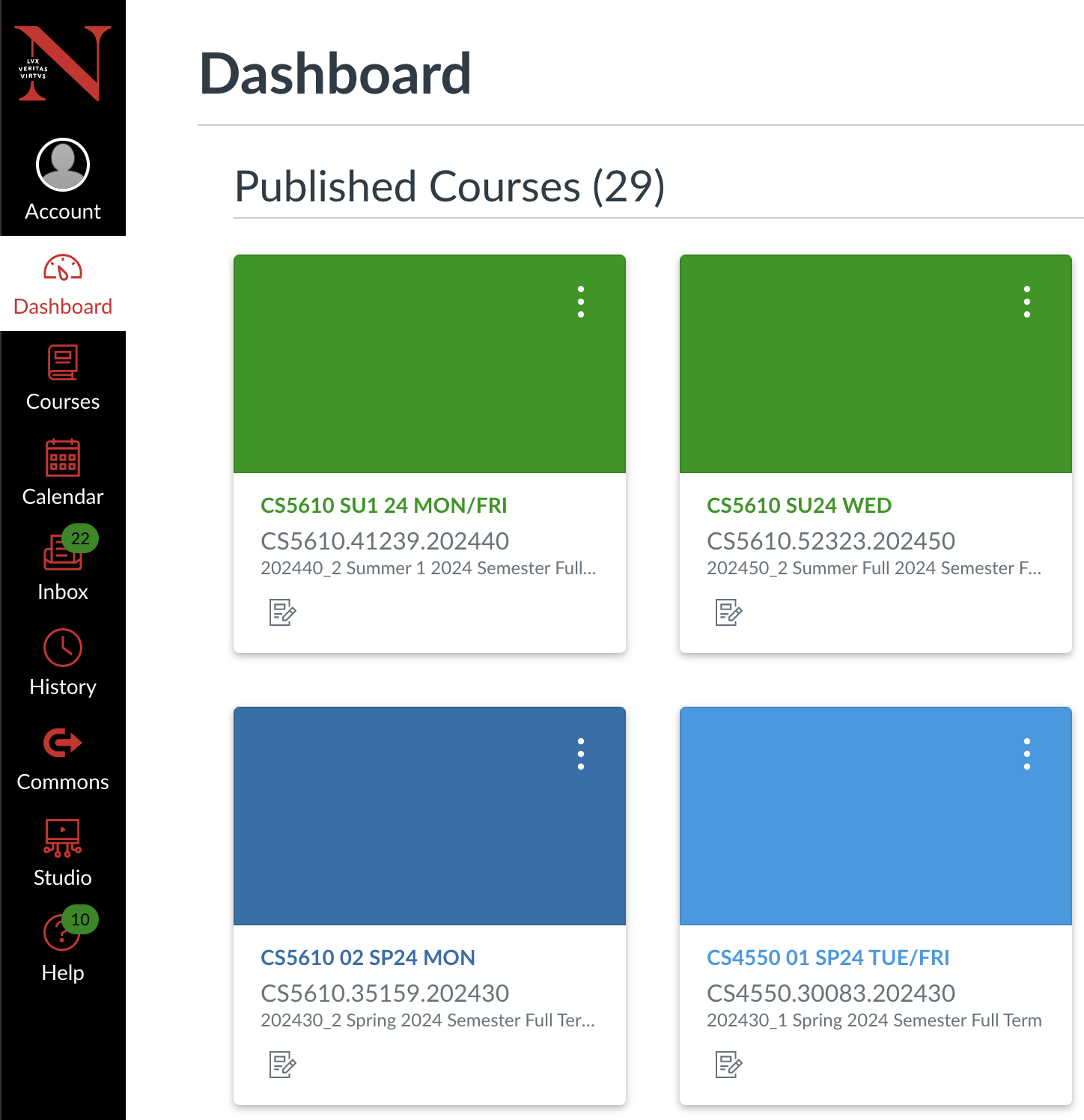
In Chapter 1 it was left looking like this — functional HTML, no real styling:
If we rebuild the sidebar with React Icons and Tailwind so each link becomes an icon-and-label tile, then pin the whole bar to the window, the gap closes. The markup can stay inline as in the starter below:
"use client";

import { AiOutlineDashboard } from "react-icons/ai";
import { FaRegCircleUser } from "react-icons/fa6";
import Link from "next/link";
import "@/app/labs/lab2/tailwind/utilities.css";

export default function KambazNavigation() {
  return (
    <nav
      id="wd-kambaz-navigation"
      className="fixed bottom-0 top-0 z-20 hidden w-[120px] bg-black md:block"
    >
      <Link
        href="/account"
        id="wd-account-link"
        className="block bg-black py-3 text-center text-sm text-white no-underline"
      >
        <FaRegCircleUser className="inline-block text-3xl text-red-500" />
        <br />
        Account
      </Link>
      <Link
        href="/dashboard"
        id="wd-dashboard-link"
        className="block bg-white py-3 text-center text-sm text-red-600 no-underline"
      >
        <AiOutlineDashboard className="inline-block text-3xl text-red-600" />
        <br />
        Dashboard
      </Link>
      {/* ...Courses, Calendar, Inbox, Labs... */}
    </nav>
  );
}
A handful of Tailwind utilities do the positioning work: fixed with top-0 bottom-0 stretches the sidebar the full height of the window and keeps it from scrolling with the page; hidden md:block hides it below the md breakpoint and reveals it again at md and up; and z-20 keeps it above the page content it now overlaps. That overlap is the catch: once the sidebar leaves the normal flow, the content beside it no longer knows to leave 120 pixels of room. If we append this to the kambaz.css base started above, scoped inside a media query, the offset only applies when the sidebar is visible:
@media (min-width: 768px) {
  .wd-main-content-offset {
    margin-left: 120px;
  }
}
Optionally the Northeastern logo sits above Account (a plain <img> to /images/NEU.png) so the bar matches the target screenshots. With those classes in place, the live component looks like this (contained so fixed does not escape this figure):
The finished sidebar is expected to:
- be a narrow black column about 110–120 pixels wide
- use red icons, except the Account icon, which is white
- highlight the active link with a white background and red text; leave the others black with white text
- center icons and labels in the bar
2.4.2 Styling the Kambaz Dashboard Screen Slides
In §1.4.3 a plain CourseCard was already extracted and several of them rendered inside #wd-dashboard-courses. Those cards still look like unstyled HTML — add borders, shadows, and a responsive grid that wraps as the window narrows.
The finished Dashboard is expected to show a titled page of course cards in a responsive grid — four across at the widest width, fewer columns as the window shrinks — Figure 2.4.2a at a wide width, Figure 2.4.2b as it narrows:
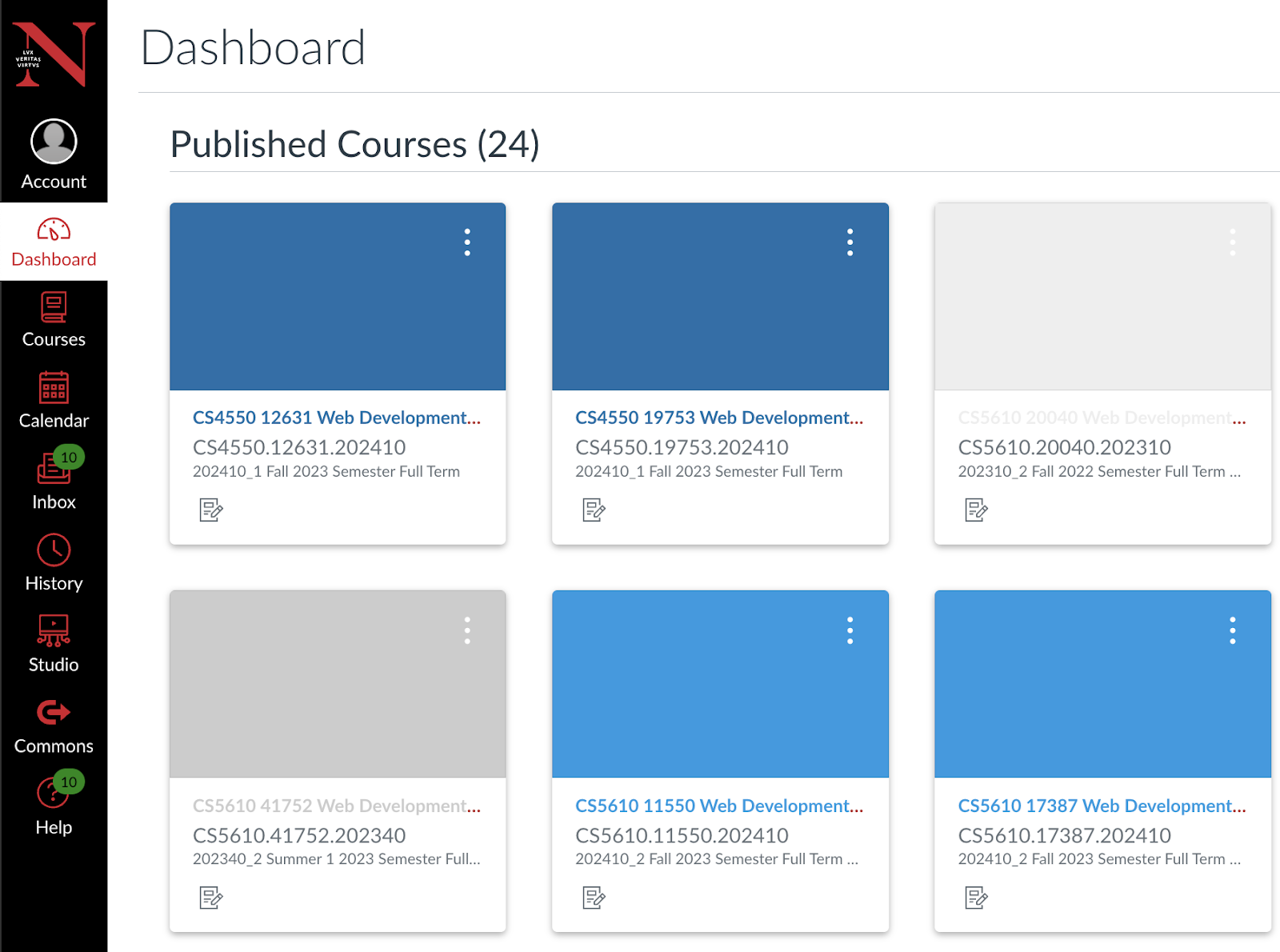
In Chapter 1 it was left looking like this — functional HTML, no real styling:
DashboardPublished Courses (3) |



If we add Tailwind utilities to CourseCard itself, then turn the courses container into a responsive grid with gap-8, the cards close the gap. No compound Card/CardBody kit and no custom Row/Col — the same HTML from Chapter 1 stays in place and gets dressed with utility classes. Starting with CourseCard, the structure from §1.4.3 remains; border, shadow, fixed width, image crop, title truncation, and a primary-looking Go button do the rest:
import Link from "next/link";
import Image from "next/image";

export default function CourseCard({
  id, title, subtitle, image,
}: {
  id: string;
  title: string;
  subtitle: string;
  image: string;
}) {
  return (
    <div className="wd-dashboard-course w-[300px] max-w-full overflow-hidden rounded-lg border border-neutral-200 bg-white shadow-sm">
      <Link
        href={`/courses/${id}/home`}
        className="wd-dashboard-course-link block text-neutral-900 no-underline"
      >
        <Image
          src={image}
          width={300}
          height={160}
          alt={title}
          className="h-40 w-full object-cover"
        />
        <div className="p-4">
          <h5 className="m-0 mb-2 truncate text-lg font-semibold whitespace-nowrap">
            {title}
          </h5>
          <p className="wd-dashboard-course-title m-0 mb-3 h-[100px] overflow-hidden text-sm text-neutral-600">
            {subtitle}
          </p>
          <button
            type="button"
            className="inline-flex items-center justify-center rounded bg-blue-600 px-3 py-1.5 text-sm font-medium text-white"
          >
            Go
          </button>
        </div>
      </Link>
    </div>
  );
}
After that, the Dashboard container becomes one column by default, two from sm, three from xl, four from 2xl, with gap-8 (~32px) between cards. The existing CourseCard calls stay the same:
import "@/app/labs/lab2/tailwind/utilities.css";
import CourseCard from "./CourseCard";

export default function Dashboard() {
  return (
    <div id="wd-dashboard">
      <h1 id="wd-dashboard-title">Dashboard</h1>
      <hr />
      <h2 id="wd-dashboard-published">Published Courses (3)</h2>
      <hr />
      <div
        id="wd-dashboard-courses"
        className="grid grid-cols-1 gap-8 sm:grid-cols-2 xl:grid-cols-3 2xl:grid-cols-4"
      >
        <CourseCard
          id="1234"
          title="CS1234 React JS"
          subtitle="Full Stack software developer"
          image="/images/reactjs.jpg"
        />
        {/* ...two more CourseCards... */}
      </div>
    </div>
  );
}
With those classes in place, the live component looks like this:
Dashboard
New Course
Published Courses (0)
The finished Dashboard is expected to:
- show the Dashboard link selected in the sidebar (red text, red icon, white background)
- start with a
Dashboardtitle and horizontal rule, then aPublished Coursessubtitle and a second rule - render at least 3 courses as cards, each linking to the course Home screen
- keep cards roughly 300 pixels wide regardless of window width, with 30–40 pixels of white space between them
- fit at least 4 course cards in a row at the widest window size, wrapping remaining cards as the window narrows
2.4.3 Styling the Course Navigation Sidebar Slides
Clicking a course from the Dashboard opens that course's Home screen with its own Course Navigation sidebar from §1.4.4. Style that sidebar as a narrow list group with red idle links and a black left border on the active route.
The finished Course Navigation is expected to be a compact vertical list — red text for idle links, black text plus a left border for the active route (Figure 2.4.3):
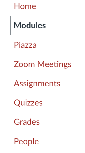
In Chapter 1 it was left looking like this — functional HTML, no real styling:
If we keep the sidebar narrow (~140px) — only the label column — and refactor the plain links into a list group, the gap closes. Here usePathname highlights the active route. Nested paths count as active too (so /assignments/123 still lights up Assignments) with startsWith:
"use client";
import Link from "next/link";
import { usePathname } from "next/navigation";
import "@/app/labs/lab2/tailwind/utilities.css";
import "../../kambaz.css";

export default function CourseNavigation({ cid }: { cid: string }) {
  const pathname = usePathname() ?? "";
  const home = `/courses/${cid}/home`;
  const assignments = `/courses/${cid}/assignments`;
  return (
    <div id="wd-courses-navigation" className="wd list-group rounded-none text-lg">
      <Link
        href={home}
        id="wd-course-home-link"
        className={
          pathname === home
            ? "list-group-item active border-0"
            : "list-group-item border-0 text-red-600"
        }
      >
        Home
      </Link>
      <Link
        href={assignments}
        id="wd-course-assignments-link"
        className={
          pathname === assignments || pathname.startsWith(assignments + "/")
            ? "list-group-item active border-0"
            : "list-group-item border-0 text-red-600"
        }
      >
        Assignments
      </Link>
      {/* ...Modules, Piazza, Zoom, Quizzes, Grades, People... */}
    </div>
  );
}
With list-group rules in kambaz.css, the column stays narrow, idle links are red, and the active link is black with a 3px left border:
.list-group.wd {
  display: flex;
  flex-direction: column;
  width: 100%;
}
.list-group.wd > .list-group-item {
  display: block;
  padding: 0.4rem 0.75rem;
  text-decoration: none;
  border: 0;
  border-left: 3px solid transparent;
  color: #dc2626;
  background-color: transparent;
  white-space: nowrap;
}
.list-group.wd > .list-group-item.active {
  color: black;
  background-color: white;
  border-left: 3px solid black !important;
  font-weight: 600;
}
With those classes in place, the live component looks like this:
2.4.4 Styling the Modules Screen
The Modules list is shared between the Modules screen and the Home screen, so it gets styled once here. In §1.4.5 plain Module and Lesson components were already extracted — this section adds gray module headers, green lesson borders, and checkmark controls.
The finished Modules screen is expected to show a toolbar above a list of modules with gray title bars and green-bordered lessons, each with a checkmark on the right (Figure 2.4.4):
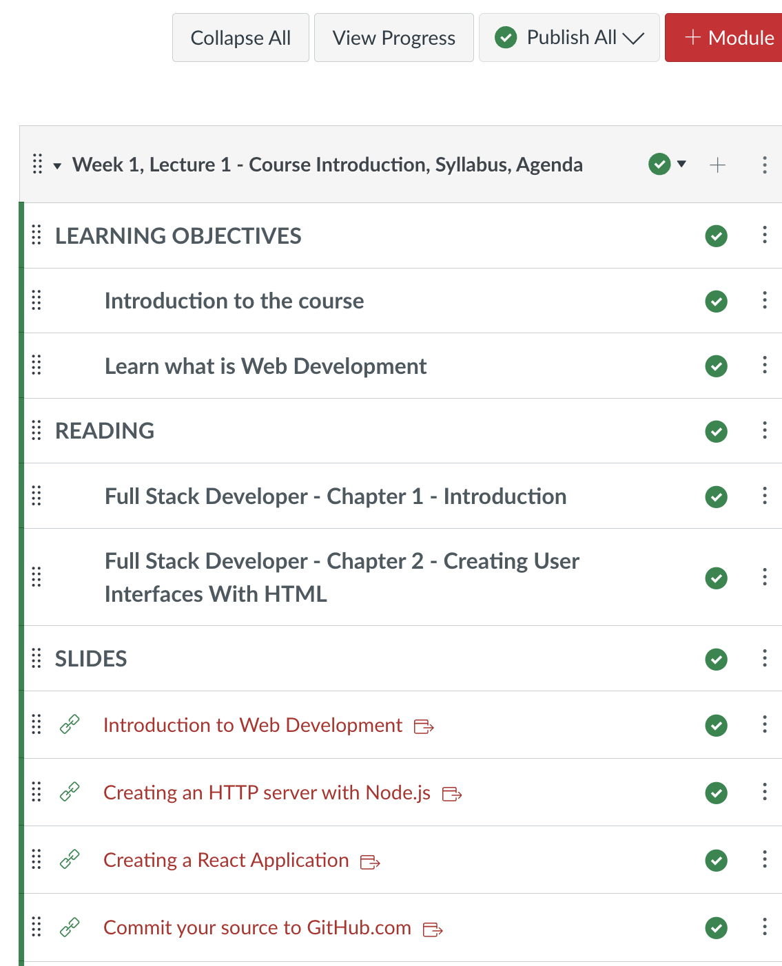
In Chapter 1 it was left looking like this — functional HTML, no real styling:
- Week 1, Lecture 1 - Course Introduction, Syllabus, Agenda
- LEARNING OBJECTIVES
- Introduction to the course
- Learn what is Web Development
- READING
- Full Stack Developer - Chapter 1 - Introduction
- Full Stack Developer - Chapter 2 - Creating User Interfaces
- SLIDES
- Introduction to Web Development
- Creating an HTTP server with Node.js
- Creating a React Application
- LEARNING OBJECTIVES
- Week 2
- LEARNING OBJECTIVES
- Learn how to create user interfaces with HTML
- LEARNING OBJECTIVES
- Week 3
- LEARNING OBJECTIVES
- CSS Styling
- LEARNING OBJECTIVES
If we keep the HTML from Chapter 1 and add Tailwind classes, the Modules list closes the gap. A small GreenCheckmark helper covers the publish indicator every module and lesson needs:
import { FaCheckCircle, FaCircle } from "react-icons/fa";

export default function GreenCheckmark() {
  return (
    <span className="relative me-1 inline-flex">
      <FaCheckCircle
        className="absolute text-xl text-green-600"
        style={{ top: "2px" }}
      />
      <FaCircle className="text-base text-white" />
    </span>
  );
}
If we drop that checkmark into Module and add a gray header bar plus spacing:
import type { ReactNode } from "react";
import GreenCheckmark from "./GreenCheckmark";

export default function Module({
  title,
  children,
}: {
  title: string;
  children?: ReactNode;
}) {
  return (
    <li className="wd-module mb-5 overflow-hidden border border-neutral-400 p-0 text-xl">
      <div className="wd-title flex items-center justify-between bg-neutral-200 p-3 ps-2">
        <span>{title}</span>
        <GreenCheckmark />
      </div>
      <ul className="wd-lessons m-0 list-none p-0">{children}</ul>
    </li>
  );
}
After styling Lesson the same way — checkmark on the right, green left border for the accent (plain CSS in kambaz.css works too if preferred):
import type { ReactNode } from "react";
import GreenCheckmark from "./GreenCheckmark";

export default function Lesson({
  title,
  children,
}: {
  title: string;
  children?: ReactNode;
}) {
  return (
    <li className="wd-lesson border-l-[3px] border-green-600 p-3 pl-1">
      <div className="flex items-center justify-between">
        <span className="wd-title">{title}</span>
        <GreenCheckmark />
      </div>
      <ul className="wd-content mt-2 list-disc pl-6">{children}</ul>
    </li>
  );
}
The Modules page keeps mounting the same Module/Lesson tree from Chapter 1. With the toolbar styled via flex and explicit light borders — bare border often renders near-black — the controls match Canvas with border-neutral-300 on secondary buttons and border-red-600 on the red + Module button:
<div className="mb-3 flex flex-wrap items-center gap-2">
  <button
    type="button"
    className="rounded border border-neutral-300 bg-white px-3 py-1.5 text-sm"
  >
    Collapse All
  </button>
  <button
    type="button"
    className="rounded border border-neutral-300 bg-white px-3 py-1.5 text-sm"
  >
    View Progress
  </button>
  <select
    defaultValue="publish-all"
    className="rounded border border-neutral-300 bg-white px-3 py-1.5 text-sm"
  >
    <option value="publish-all">Publish All</option>
  </select>
  <button
    type="button"
    className="rounded border border-red-600 bg-red-600 px-3 py-1.5 text-sm font-medium text-white"
  >
    + Module
  </button>
</div>
{/* ...Module / Lesson tree... */}
With those classes in place, the live component looks like this:
The finished Modules screen is expected to:
- show a row of controls (Collapse All, View Progress, a Publish All dropdown, and an Add Module button) above the module list
- give each module title a gray header bar, and each lesson a green left border
- show a green checkmark control on the right of both modules and lessons
2.4.5 Styling the Home Screen
Since the Home screen's main content is the Modules list just styled, only the Course Status column on the right remains — plus swapping the table layout for flex so four columns sit side by side on a wide screen.
The finished Home screen is expected to show Course Navigation, the Modules list, and a Course Status column of styled action buttons on a wide layout (Figure 2.4.5):
In Chapter 1 it was left looking like this — functional HTML, no real styling:
Courses 1234
|
If we restyle the Course Status buttons with Tailwind and React Icons — splitting Unpublish/Publish into a two-column row, and stacking the rest full width — the Status column closes the gap:
import { FaCheckCircle } from "react-icons/fa";
import { MdDoNotDisturbAlt } from "react-icons/md";

export default function CourseStatus() {
  return (
    <div id="wd-course-status">
      <h2 className="mb-3 text-xl font-semibold">Course Status</h2>
      <div className="flex gap-1">
        <button
          type="button"
          className="inline-flex min-w-0 flex-1 items-center justify-center rounded border border-neutral-300 bg-white px-1.5 py-1.5 text-xs"
        >
          <MdDoNotDisturbAlt className="me-1 shrink-0 text-base" /> Unpublish
        </button>
        <button
          type="button"
          className="inline-flex min-w-0 flex-1 items-center justify-center rounded bg-green-600 px-1.5 py-1.5 text-xs text-white hover:bg-green-700"
        >
          <FaCheckCircle className="me-1 shrink-0 text-base" /> Publish
        </button>
      </div>
      <button
        type="button"
        className="mb-1 flex w-full items-center rounded border border-neutral-300 bg-white px-3 py-2 text-left text-sm"
      >
        {/* icon */} Import Existing Content
      </button>
      {/* ...repeat full-width bordered buttons for Import from Commons,
             Choose Home Page, and the rest... */}
    </div>
  );
}
Once the pieces are styled, the course layout and Home page can replace remaining tables with flex: app/(kambaz)/courses/[cid]/layout.tsx and home/page.tsx swap their remaining table elements for flex divs. On a wide screen the result is four columns — Kambaz Navigation, Course Navigation, Modules, and Course Status. As the window narrows, columns hide in this order (matching the PDF figures):
- Course Status first — wrapped in
hidden lg:blockso it disappears below thelgbreakpoint while both sidebars stay visible. - Kambaz Navigation and Course Navigation together — both use
hidden md:block(Kambaz Navigation already does; Course Navigation gets the same treatment in the course layout) so they leave at the samemdwidth, leaving Modules full width.
<div className="flex gap-4">
  <div className="hidden w-[140px] shrink-0 md:block">
    <CourseNavigation cid={cid} />
  </div>
  <div className="min-w-0 flex-1">{children}</div>
</div><div id="wd-home" className="flex gap-4">
<div className="min-w-0 flex-1">
<Modules />
</div>
<div className="hidden w-[250px] shrink-0 lg:block">
<CourseStatus />
</div>
</div>With those classes in place, the live component looks like this:
Course Status
2.4.6 Implementing the People Screen Slides
The People screen lists the students, teaching assistants, and faculty enrolled in a course as a table. Unlike the screens above, there is no Chapter 1 prototype — this screen is built and styled entirely in this chapter.
The finished People screen is expected to show a clean roster table with a user icon beside each name and alternating row shading (Figure 2.4.6):
If we style a plain HTML table with Tailwind — one row per person — the roster takes shape:
import { FaUserCircle } from "react-icons/fa";

export default function PeopleTable() {
  return (
    <div id="wd-people-table" className="overflow-x-auto">
      <table className="w-full border-collapse text-left text-sm">
        <thead>
          <tr className="border-b border-neutral-300">
            <th className="p-2">Name</th>
            <th className="p-2">Login ID</th>
            <th className="p-2">Section</th>
            <th className="p-2">Role</th>
            <th className="p-2">Last Activity</th>
            <th className="p-2">Total Activity</th>
          </tr>
        </thead>
        <tbody>
          <tr className="odd:bg-neutral-50">
            <td className="p-2 text-nowrap">
              <FaUserCircle className="me-2 inline text-4xl text-neutral-500" />
              Tony Stark
            </td>
            <td className="p-2">001234561S</td>
            <td className="p-2">S101</td>
            <td className="p-2">STUDENT</td>
            <td className="p-2">2020-10-01</td>
            <td className="p-2">10:21:32</td>
          </tr>
          {/* ...at least 3 more rows, e.g. Bruce Wayne, Steve Rogers, Natasha Romanoff... */}
        </tbody>
      </table>
    </div>
  );
}
With those classes in place, the live component looks like this. The People link in the Course Navigation sidebar should reach this table:
| Name | Login ID | Section | Role | Last Activity | Total Activity |
|---|---|---|---|---|---|
| Tony Stark | 001234561S | S101 | STUDENT | 2020-10-01 | 10:21:32 |
| Bruce Wayne | 001234562S | S101 | STUDENT | 2020-11-02 | 15:32:43 |
| Steve Rogers | 001234563S | S101 | STUDENT | 2020-10-02 | 23:32:43 |
| Natasha Romanoff | 001234564S | S101 | TA | 2020-11-05 | 13:23:34 |
| Thor Odinson | 001234565S | S101 | STUDENT | 2020-12-01 | 11:22:33 |
| Nick Fury | 001234566F | S101 | FACULTY | 2020-11-15 | 40:12:18 |
2.4.7 Styling the Assignments Screen
Same arc as Dashboard and Modules: the plain AssignmentItem from §1.4.7 stays, and each row plus the search/toolbar layout get Tailwind and React Icons.
The finished Assignments screen is expected to show a search field on the left, action buttons on the right, a gray group header, and green-bordered assignment rows (Figure 2.4.7):
In Chapter 1 it was left looking like this — functional HTML, no real styling:
Courses 1234
ASSIGNMENTS 40% of Total
|
If we add Tailwind to AssignmentItem (green left border like Lesson, title weight, muted details), then lay out the search field and toolbar with flex utilities, the gap closes:
import Link from "next/link";
import { FaFileAlt } from "react-icons/fa";

export default function AssignmentItem({
  cid, aid, title, details,
}: {
  cid: string;
  aid: string;
  title: string;
  details: string;
}) {
  return (
    <li className="wd-assignment-list-item mb-3 flex gap-3 border border-neutral-300 border-l-[3px] border-l-green-600 bg-white p-3">
      <FaFileAlt className="mt-1 shrink-0 text-xl text-green-700" />
      <div>
        <Link
          href={`/courses/${cid}/assignments/${aid}`}
          className="wd-assignment-link font-semibold text-neutral-900 no-underline"
        >
          {title}
        </Link>
        <div className="mt-1 text-sm text-neutral-600">{details}</div>
      </div>
    </li>
  );
}
On the Assignments page, the search field sits on the left (with a magnifying-glass icon) and the + Group / + Assignment buttons on the right. The group header can reuse the same gray bar treatment as a module title:
import "@/app/labs/lab2/tailwind/utilities.css";
import { FaPlus, FaSearch } from "react-icons/fa";
import AssignmentItem from "./AssignmentItem";

export default async function Assignments({
  params,
}: {
  params: Promise<{ cid: string }>;
}) {
  const { cid } = await params;
  return (
    <div id="wd-assignments">
      <div className="mb-4 flex flex-wrap items-center justify-between gap-2">
        <div className="relative">
          <FaSearch className="pointer-events-none absolute top-1/2 left-3 -translate-y-1/2 text-neutral-500" />
          <input
            placeholder="Search for Assignments"
            id="wd-search-assignment"
            className="rounded border py-1.5 pr-3 pl-9 text-sm"
          />
        </div>
        <div className="flex gap-2">
          <button
            id="wd-add-assignment-group"
            type="button"
            className="inline-flex items-center gap-1 rounded border px-3 py-1.5 text-sm"
          >
            <FaPlus /> Group
          </button>
          <button
            id="wd-add-assignment"
            type="button"
            className="inline-flex items-center gap-1 rounded bg-red-600 px-3 py-1.5 text-sm font-medium text-white"
          >
            <FaPlus /> Assignment
          </button>
        </div>
      </div>
      <h3
        id="wd-assignments-title"
        className="mb-3 flex items-center justify-between rounded bg-neutral-200 p-3 text-lg"
      >
        <span>ASSIGNMENTS 40% of Total</span>
        <button type="button" className="rounded border bg-white px-2 py-0.5 text-sm">
          <FaPlus />
        </button>
      </h3>
      <ul id="wd-assignment-list" className="m-0 list-none p-0">
        <AssignmentItem
          cid={cid}
          aid="123"
          title="A1 - ENV + HTML"
          details="Multiple Modules | Not available until May 6 at 12:00am | Due May 13 at 11:59pm | 100 pts"
        />
        {/* ...remaining AssignmentItems... */}
      </ul>
    </div>
  );
}
With those classes in place, the live component looks like this:
The finished Assignments screen is expected to:
- float the
+ Groupand+ Assignmentbuttons to the right, colored like the buttons in Modules, each with a plus icon - render a
Search for Assignmentsfield on the left with a placeholder and a magnifying-glass icon - use Tailwind margin and padding utilities for white space around and between assignment groups, not manual pixel values
- give each
AssignmentItema green left border, matching the lesson border style from §2.4.4 - render each assignment title (A1, A2, …) and its due-date/points subtext as shown in the screenshots — exact dates and times may differ
2.4.8 Styling the Assignment Editor Screen (On Your Own)
Clicking an assignment's title opens the Assignment Editor from §1.4.8 — for now every assignment opens the same editor content; a later chapter wires each assignment to its own data. Tailwind form utilities turn Assignment Name, Description, Points, and Due Date into a clean, labeled form instead of a raw HTML table.
The finished editor is expected to look like a structured form with labeled fields, aligned controls, and Cancel/Save actions at the bottom (Figure 2.4.8):
In Chapter 1 it was left looking like this — functional HTML, no real styling:
The full form markup already lives in assignments/[aid]/page.tsx. Starting from that structure, Tailwind form utilities — labels above fields, full-width inputs, and spacing instead of table cells — produce the labeled layout:
export default function AssignmentEditor() {
  return (
    <div id="wd-assignments-editor">
      <label htmlFor="wd-name">Assignment Name</label>
      <input id="wd-name" defaultValue="A1 - ENV + HTML" />
      <br />
      <br />
      <textarea id="wd-description">
        The assignment is available online Submit a link to the landing page of
        your Web application running on Vercel.
      </textarea>
      <br />
      <table>
        <tbody>
          <tr>
            <td align="right" valign="top">
              <label htmlFor="wd-points">Points</label>
            </td>
            <td>
              <input id="wd-points" defaultValue={100} />
            </td>
          </tr>
          {/* ...remaining fields from Chapter 1... */}
        </tbody>
      </table>
      <br />
      <Link href="/courses/1234/assignments" id="wd-cancel">Cancel</Link>{" "}
      <Link href="/courses/1234/assignments" id="wd-save">Save</Link>
    </div>
  );
}
The starting markup is still the Chapter 1 form; Tailwind form utilities turn it into the labeled layout in the target. The demo below shows the current starting point — it should still look unstyled until the Tailwind classes are in place:
2.4.9 Styling the Account Screens (On Your Own) Slides
The Sign in, Sign up, and Profile screens from §1.4.2, along with the Account Navigation sidebar, get Tailwind form and button classes next. The Course Navigation sidebar from §2.4.3 is a model for the Account Navigation sidebar so the whole account section feels consistent with the rest of Kambaz.
The finished Account screens are expected to show a narrow navigation sidebar beside clean, centered form fields and primary action buttons —Figure 2.4.9a (Sign in) and Figure 2.4.9b (Profile):
In Chapter 1 it was left looking like this — functional HTML, no real styling:
If we start with Sign in and apply Tailwind form utilities for full-width inputs, spacing, and a primary Sign in button — then reuse the same patterns on Sign up and Profile — the account forms close the gap:
<div id="wd-signin-screen" className="max-w-sm">
  <h1 className="mb-3 text-2xl font-semibold">Sign in</h1>
  <input
    id="wd-username"
    placeholder="username"
    className="mb-2 w-full rounded border border-neutral-300 px-3 py-2"
  />
  <input
    id="wd-password"
    placeholder="password"
    type="password"
    className="mb-2 w-full rounded border border-neutral-300 px-3 py-2"
  />
  <Link
    id="wd-signin-btn"
    href="/account/profile"
    className="mb-2 block w-full rounded bg-blue-600 px-3 py-2 text-center text-white no-underline"
  >
    Sign in
  </Link>
  <Link id="wd-signup-link" href="/account/signup">
    Sign up
  </Link>
</div>
With those patterns in place on Sign in, Sign up, Profile, and account/Navigation.tsx, the account section matches the target. The demo below shows the current Sign in file — still unstyled until the Tailwind classes land:
Sign up and Profile follow the same way, reusing the classes above as a template, and /account/signin remains the first screen a visitor sees when navigating to Kambaz.
2.4.10 Exercises
Use this checklist to confirm the Kambaz restyle covers every screen in §2.4. Each item points back to the section where you styled the worked example. Restyle the screens in order as you read — this list is for checking coverage, not a substitute for the walkthroughs. Assignment Editor and Account stay On your own: match the figures and LiveDemos in those sections. Each screen is listed once, with Lab, On your own, and With AI nested as a/b/c.
- Kambaz Navigation (§2.4.1)
- Lab component — Style Kambaz Navigation and replace the table layout with flex.
- On your own — In Navigation.tsx, finish remaining sidebar links with fitting React Icons, then confirm the active link and wd-main-content-offset still keep content clear of the fixed bar.
- With AI — Add a second sample tile (wd-ai-nav-help to /labs) — leave your personal icons as yours.
- Dashboard (§2.4.2)
- Lab component — Style the Dashboard and CourseCard.
- On your own — Personalize a card and confirm the responsive grid.
- With AI — Add a fourth sample course card — leave your personal card as yours.
- Course Navigation (§2.4.3)
- Lab component — Style Course Navigation.
- On your own — Finish the list-group links, active border, and ~140px sidebar.
- With AI — Add a second sample course link — leave your personal link as yours.
- Modules (§2.4.4)
- Lab component — Style Modules, Module, and Lesson.
- On your own — Add a module or lesson with your title.
- With AI — Add a second sample module — leave your personal title as yours.
- Home (§2.4.5)
- Lab component — Style Home and Course Status.
- On your own — Finish the Status buttons and confirm Status stacks below lg and sidebars below md.
- With AI — Add a second sample status action — leave your personal button as yours.
- People (§2.4.6)
- Lab component — Style the People table.
- On your own — Show at least three people rows.
- With AI — Add three sample roster rows — leave your personal rows as yours.
- Assignments (§2.4.7)
- Lab component — Style the Assignments screen.
- On your own — Add one more assignment row.
- With AI — Add a second sample assignment — leave your personal row as yours.
- Assignment Editor (§2.4.8)
- Lab component — Style the Assignment Editor to match the figures and LiveDemo (On your own).
- On your own — Apply Tailwind form utilities on the editor; Cancel and Save return to the list.
- With AI — Add a second sample field on the editor — leave your personal labels as yours.
- Account screens (§2.4.9)
- Lab component — Style Sign in, Sign up, Profile, and Account Navigation (On your own).
- On your own — Style the account screens and nav so /account/signin is still the first Kambaz screen.
- With AI — Add a sample note field on Sign in — do not change Sign up, Profile, or routing.
2.5 Delivery
Submit this chapter's work as a new branch on the same webdev-client repository and deployment from Chapter 1, so graders can compare Chapter 1's HTML-only prototype against this chapter's CSS, Tailwind, and Tailwind version side by side.
- Finish every exercise described in this chapter inside the same
webdev-clientproject used in Chapter 1. - Create a branch named
a2, then add, commit, and push it to the same GitHub repository from §1.5:
git checkout -b a2
git add .
git commit -am "a2 CSS and Tailwind"
git push -u origin a2- In Vercel, configure the project to deploy every branch to its own URL: open the project's Settings → Git and enable deployments for all branches (some Vercel plans expose this under Build & Deployment → Branches). From then on, each push to
a2gets its own preview URL that contains the branch name, separate from your Chapter 1maindeployment. - Confirm
app/labs/TOC.tsxandapp/labs/page.tsxstill list every lab and Kambaz, plus a link to your GitHub repository with idwd-githuband your full name (first name first, last name second, matching Canvas) on the Labs page — the same requirements from §1.7, now revisited for this chapter. - Push any remaining changes to the
a2branch and confirm the branch deployment on Vercel reflects them. - In Canvas, submit both the GitHub repository URL (pointed at the
a2branch) and the Vercel deployment URL for that branch. Disable Vercel's Deployment Protection on that deployment, as in §1.6, so graders can open it without signing in.
Continue practicing in Labs, browse Lab 2 intermediate steps, or open the live Kambaz prototype to see this chapter's styling applied.
2.6 References
This chapter is about how a page looks: CSS rules, selectors, the box model, layout, React Icons, and Tailwind utility classes. The linked terms open the in-book pages; the list after that names the CSS and layout ideas you practiced that do not have their own term pages.
These ideas also matter in this chapter even though they do not have their own term pages yet:
- Style attribute versus imported style sheets
- ID, class, and document-structure selectors
- Foreground and background color, borders, and corners
- Padding, margins, and the CSS box model
- Dimensions, display, relative, absolute, and fixed position
- Z-index, float, flex, and CSS Grid
- Media queries and responsive Tailwind breakpoints
2.7 Tools
These are the official references for the styling stack you used in Lab 2 and when restyling Kambaz. Chrome DevTools is the fastest way to see which rule actually won.
- CSS (MDN) — MDN's CSS reference — properties, selectors, and the box model you used to style Lab 2.
- Tailwind CSS — The utility-class CSS framework you apply in className strings instead of writing every rule by hand.
- React Icons — A React wrapper around popular icon sets so you can import icons as components.
- Chrome DevTools — Chrome's built-in inspector for HTML, CSS, the console, and the Network panel.
- Next.js — The React framework this course uses for pages, layouts, and later the HTTP server routes.
- GitHub — The host for your remote Git repository and the place Vercel and Render connect when you deploy.
- Vercel — The host for the Next.js client; connect the GitHub repo here to put the UI on the public Web.
2.8 AI Tools
Styling is the chapter where design helpers earn their keep. Use them to try color, spacing, and icon choices, then rebuild the look yourself in CSS or Tailwind so you still understand every class.
- v0 — Generates interface mockups and React starting points from a written prompt.
- Stitch — Google's design tool for turning a product idea into screen layouts you can iterate on.
- Rocket.new — Builds a working web app from a short description so you can explore structure before coding by hand.
- Lucide — A consistent open-source icon set you can search and drop into React screens.
- Galileo AI — Turns a text description into high-fidelity UI designs for early product exploration.
- Google Prompt Gallery — A public collection of Gemini prompt examples you can remix for writing, coding, and multimodal tasks.
- shadcn/ui — Copy-and-own React components styled with Tailwind for composing a polished interface.
- Figma — Collaborative design software for wireframes, mockups, and handing layouts to developers.